
FanFrancisco
7501

New Blue vs Old Blue Dial
ALS has recently launched four new blue dials for Lange 1, Daymatic, Saxonia and Saxonia Automatic.
I have visited the boutique and tried it on and compared them against my old blue dial Lange 1 and my friend’s old blue dial 1815.
Interestingly, although both old and new dials are blue color per se, when carefully comparing them side by side, I found the old blue dial is a bit darker and vibrant while the new blue dial is a bit litter.
I did a quick pic posted up to my IG and the quick feedbacks tend to like the old blue dial.
Which one do you like more?
Stefan 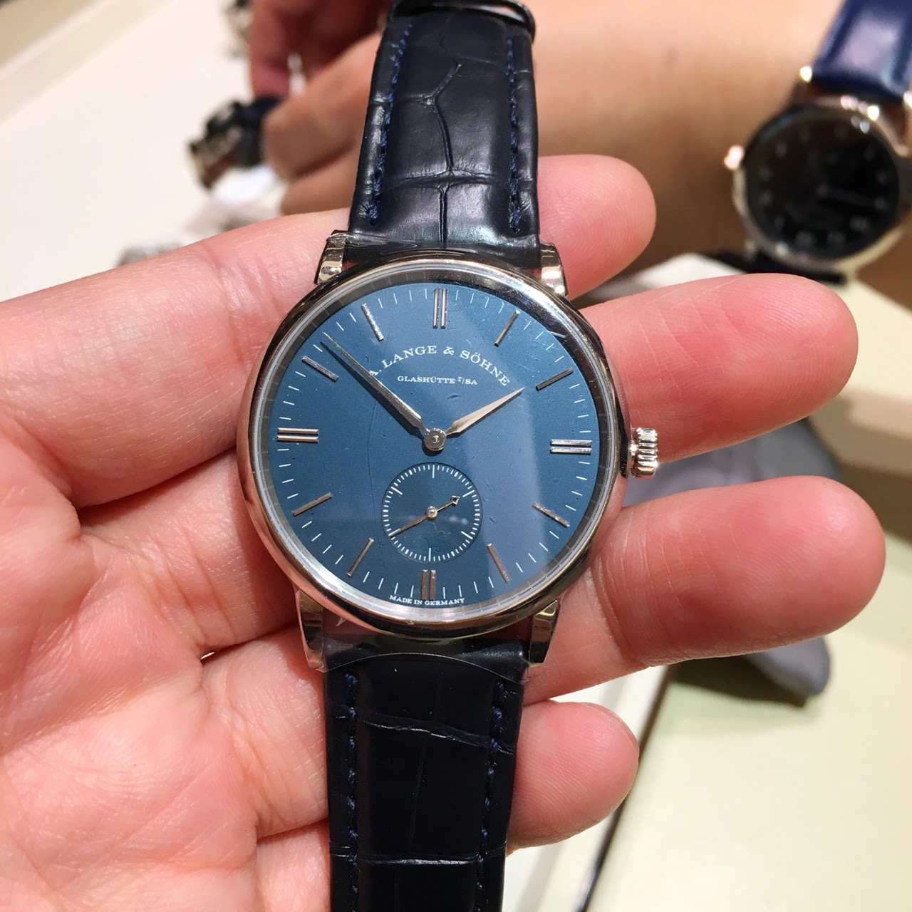
New Saxonia 
New Saxonia Automatic 
New Daymatic 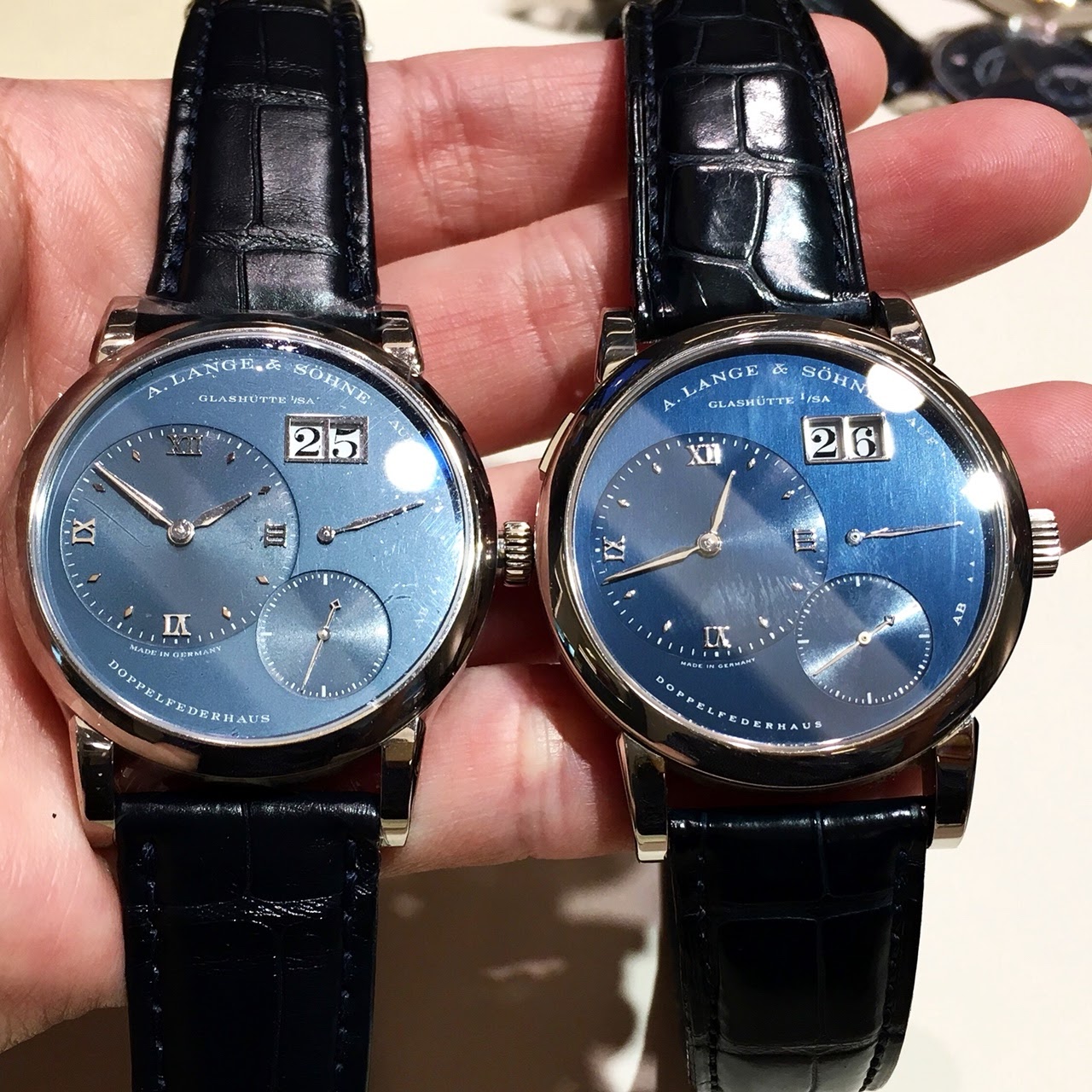
L: new blue vs R: old blue
From L to R: New Saxonia, new Daymatic, old 1815, old L1, new L1, new Saxonia Automatic
More posts:
New Blue vs Old Blue Dial
ALS has recently launched four new blue dials for Lange 1, Daymatic, Saxonia and Saxonia Automatic. I have visited the boutique and tried it on and compared them against my old blue dial Lange 1 and my friend’s old blue dial 1815. Interestingly, although ...


Thanks for posting this!
I recently posted a similar comparison here , and I was hoping to see additional comparisons, like yours, with other older models such as the Lange 1 and 1815. The current version has a bit more of a metallic sheen. I have a slight preference for the olde...
You are absolutely right...
Both are actually nice, sometimes it is a matter of and down to individual taste imho Stefan


Thank you Stefan for these shots and side by side comparison. I wanted to make a comparison too between my “old” blue dial Lange 1 and the new one. I missed an opportunity but I’ve had, at least, the chance to see them both in real
Well, I’m probably biased but I prefer the former version. From my recent memories, the new one doesn’t offer the same richness of blue hues than the former one, especially when it comes to the main and sub dials differences. Here a link to my post where ...
Thanks Alkiro...
I may have missed your previous post which displayed the richness of former blue dial. Stefan

very intereresting comparison
thanks. The older, richer looks nicer in the direct comparison to me but they are both beautiful versions. Best Andreas

Thanks for the lineup!
Im somehow more attracted to the new dials! i love metallic blue, looks very german and modern to my eyes! also, the font is crisper and more elegant. that being said, i would mind owning either!

The darker one for me, deeper & nicer contrast with the hands
For a second I thought the newer one was the darker....

I still think the dials are very close. The big difference comes from the glass.
Because in different contextes, the new blue dials can also be very dark. Thanks a lot Stefan for these pics! Fx


Thanks for this line up! Nice to see the difference old vs new
I think I like the old blue better. But if I didn’t see this pictures I would have never known there was a difference so both blue colors are great!
