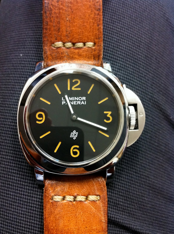
FAT comparison on 412/339/360


It looks like FAUX AGED PATINA is executed to some degrees on 412 and 366 with more CREMA on the LUMINOVA but they really went out of their ways to make sure 360 has the closest and best RIPE FAT!
I see this as a trend and I wouldn't be surprised to see more and more FAT after 2011 SIHH which is both good and bad. Good in that it gives the vintage flavour to all modern PAMs. Bad is that then it makes the 203a 201a's patina less special as more and more modern PAMs own the vintage looks. Inputs?


IMO
it ads a more appealing charachter to the watch YES , would it make the patina of PAM 21 and PAM 203 less appealing never . the degree of the color is different ...
however i see the vintage luminova on all pams as a thing related to their roots...
Faisal
I suspect 2011 we will see a lot of BROWN HUE
Brown is the new black for let's see how long... maybe 2011 at least.
very true a matter of a trend
which always make me wonder which brand will do it best in creating a timeless watch within the sarrounding trend in the time its being created in .
Faisal

I don't see that this trend may be a problem for the Pre Vs.
First of all, this kind of " patina " looks like the non matching TRUE patina of the Pre V 201/ A, 202/A, not the others.
A Vintage is a Vintage, and any Beautiful Pre V can't compete with them, as any modern can't compete with the Pre Vs.
They are all particular, they have all their interest, and only those who don't know the Vintage and the Pre V can make such a confusion, in my opinion.
Which is not a problem, as the Vintage and the Pre Vs deserve some good knowledge to fully appreciate them.
Indeed, how can we compare an artificial patina with a natural one?
How can we be confused with a " cosmetic " patina versus the soul, the charm of a natural one?
Best,
Nicolas.

On the positive side, it'd create awareness to
 So it's a good thing when those interested would explore the past and appreciate them better.
 Mech.
Agreed, Mech. It is a good introduction to the Pre V and Vintage world...
And comestically, a nice one.
Best,
Nicolas.
The current new dials ....
The current new dials of the 360 and the those of 359, 412 etc, are awesome, imo.
But the true aged tritium dials are truly a breed on its own, and appreciated by many till today.
I look at these new dials as a diversity from OP and variety to the consumers.
The thing is, I am still loving them and looking forward to every new releases.
Cheers,

+1...Nico...
I never really appreciate it until I saw a NM 201A..
WOW...yummy...
I do think that Panerai
did go the extra mile to make sure the Faux tina on the 360 will look a lot more orange compared to the yellowish 412 and 366. The Faux tina on the Pam 341 is also very nice. I think it will be a trend, but remains to be seen if Panerai will use it more in the 2011 releases. Only a week left before we find out.
agree and I'm glad they have a different look,

chalk and cheese....
both very useful, for different reasons. Just don't mix them and don't...compare them, IMO of course.
Cheers - Sergio

I think the vinatge patina look, does work....but
on certain models only, I think it looks great on your pieces for sure, and would look nice on say a historic 47mm,
but would be doubtfull if they start introducing on all models.
just my opinion
Imran
No way it will have any effect on the PreV´s,
but that´s not something I want to point out. If you want to know why the PreV dials are special you can read up on it on the web. About the font though. Clearly panerai chose to use the same painted font (but vintage patina colour) on the 360 as has been used on all painted L SWISS L dials. If you compare the font of the 360 to a 000 or 2BL dial you will notice the same font. The 360 has been designed by Paneristi (so they say) but clearly the request to use a PreV like font has not been honoured or taken into account by Panerai. Why??? The 412 however has a font that is much closer to PreV/PreA. Why didn´t Panerai use this same font on the 360?? Your guess is as good as mine. They probably didn´t want to make the 360 too perfect. Imagine the look of the 360 with 412 font!!!!!! The 360 could have been the first panerai introducing the PreV font. Unfortunately this was not meant to be. Surprisingly this honour was awarded to the Boutique LUMINOR MARINA SE´s . IMO a very special watch wich will blow you away in the flesh. I really love the piggy as it adds something extra to the dial without being overkill. First LUMINOR MARINA with piggy and PreV font....A real winner....
Best regards guillermo
Totally agreed with what you have written, I too have
have places 360, 2a , 415 together. IMO, 415 is the way to go, Yes, the 360 should have the 415 fonts, it would be perfect . You wiil slowly apperciate the all the boutique SE time to time. I am enjoying every moment.
Thanks for posting a simple but important fact.
John