
TT Polaris 68 – dial variations
This weekend one of my friends was visiting and he had a little surprise on his wrist – a TT Polaris 68!

His has the 6/9/12 luminous dial while mine have the full luminous version.
As we have been discussing the two different dial versions I thought a side-by-side shot would be interesting to see.
6/9/12 vs. Full luminous.
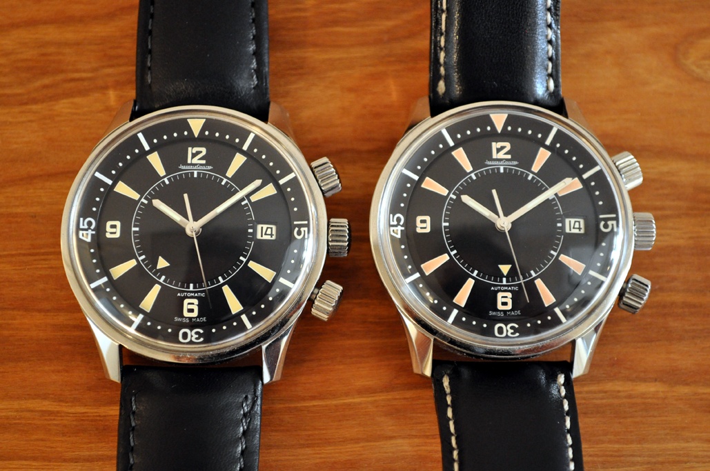
Difficult to see in the pic, but the 6/9/12 is much paler then the other.
OK, let turn down the light…
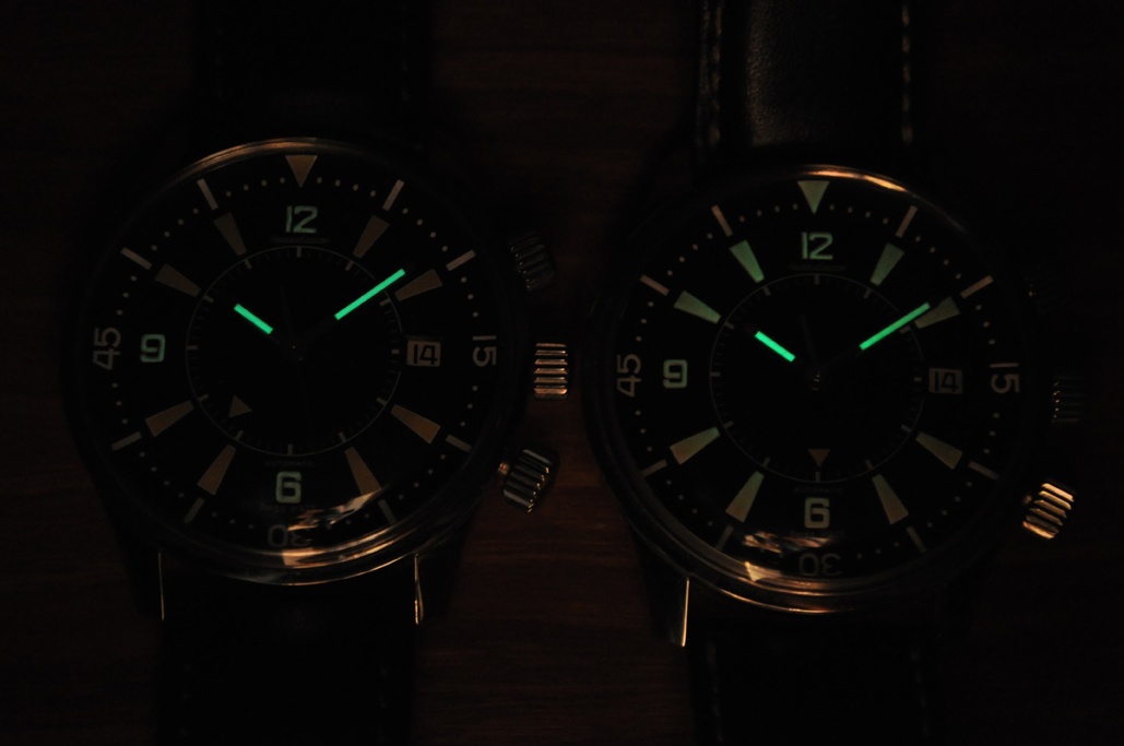
And here in the dark!
No difficulty to see the difference…
Another interesting observation is that even if they have different dials both watches are No. 0NN in the lower register.
Best
Blomman

Mine was Nr 7, and was all luminous.
I know much higher numbers which had all lumnous dials...
The Charm fo the random numbers... There is no arithmetic logic, here.
Thanks for these interesting side by side pics, Blomman.
Best,
Nicolas
Sorry about the reminder…
No. 7 – well these are not that low in number but not far…
No logic… Sounds familiar…
Thank you, Nicolas.
Best
Blomman
No problem, Blomman... I have to live with, or better... Without.
Maybe a close Future will bring me some good surprises?
Best,
Nicolas.
I hope so!
And that the TT Polaris will find it’s way back to your watch box!
Best
Blomman
I have been hoping to see such a side-by-side comparison
Thanks, Blomman. Nicolas addressed this question for me and others in the past, but it is good to have both in the light and in the dark side by sides like this. Just so we're clear, the "incorrect" dials are the 6-9-12 luminous only, right? The "correct" full luminous are more pletiful since JLC caught the mistake and fixed the problem before too many of the incorrect dials were released, right?
Thanks again,
respo

I think it's just the opposite, Respo...
Thanks for the clarification
That's why I asked. I appreciate the response!
Best,
respo
Yes, the other way around…
I know the 6/9/12 is supposed to be closer to the original but I must say I prefer the full luminous dial.
In daylight the 6/9/12 comes off as a bit pail and in the dark…
Well, you saw…
Thank you, Respo.
Best
Blomman

2 lume sisters .. Former headscratcher revisited .. Thanks ! :)
First ti see the 2 dials side by side:
- one ( the "correct" 6/9/12) more peach colored:
very nicely fitting, IMO (also that's mine BTW)
- one ( the "incorrect" but rarer) apparently much more orange ..
Mine (6/8/12) also belongs to the ones with low number (0xx), and number-wise way below
the magic reported 190, that came with the full lume including the exchange-option
letter, as I had learned from extensive posts here..
- initially I had been wondering, almost headscratching - but as Nicolas had
kindly & repeatedly pointed out, no arithmetic logic , as it appears.
- Higher or lower numbers, I understood, could have one dial or the other.
Back then I had also asked myself, wouldn't it maybe have been equally desirable for some
at least, to have the option to change 'back' the correct dial into the full lume version;
but, alas JLC made the decision for us, ( better matching color over lume) and that was
a sensible one, at least for me ..
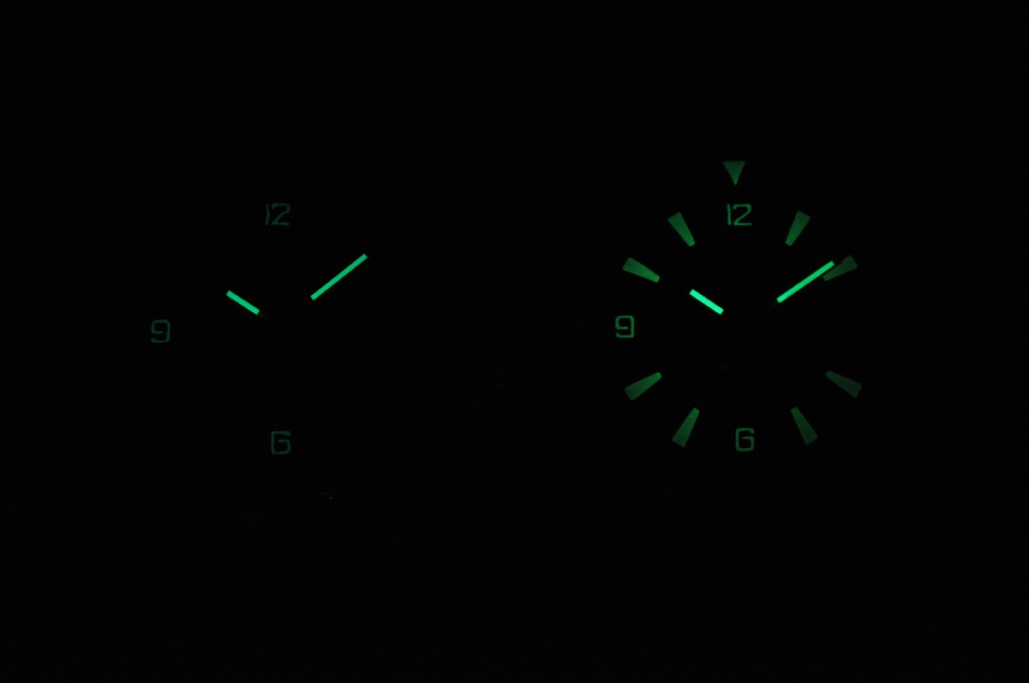
The only thing, and that is true , also confirmed by your sisterly lume shots:
- the lume- intensity of the dial numbers 6/9/12 is pretty weak, but the hands quite well visible.
- for such a sportive beauty- beast, sometimes I had already wished to have a bit more on the numbers as well.
Other than that, I absolutely adore my TT Polaris 68- maybe my
No 1 favorite piece, up to now, when sportive is the theme.
Simply love it , really..
This may experience some re- consideration of emotions,
When ? - well , when the DSA's will arrive, the emotions and pleasure- scale
might be reset ..
Thanks, Blomman for the nice pics and the notions:
- another little twist on one of our most appreciated ones,
ar least for me.
Best, hs.
)The TT Polaris 68 is…
A wonderful watch!
Interesting is that I never received any letter about the dial change offer…
But that doesn’t matter, I would have declined anyway!
The TT DSA, yes I do hope I will get the same feeling about the TT DSA…
Still haven’t seen that one in the metal.
Thank you, HS!
Best
Blomman
Well, my friend .. Again the other way round , it would have been..
1/ it was the recipients of the (orange/ full lume) "wrong but rare" dial, who got the letter..
- so ,it would have been your friend who should have got the letter !
- And NOT you and me !
2/ Thus, correctly so, following the JLC decision:
- you, like myself ( pale, lume on 6/9/12), "right" dial did not get a letter
( although some of us might have changed into the "wrong" camp, maybe..)
Thus, how nice are these little twist & tweaks and - well," sweet imperfections"
which make us chat, make us reflect, be food for our thoughts:
- a fate , a genese, and a passion even more beloved, and the stories connected,
even more worthwile to be told - aren't they ? ..
( think of the non- movable bezel on the expected DSA - imperfect,
-- " heresy", if I say so, almost..)
in a way but trustful, credible and along the historical predecessor , lovable no less for sure, these will be again !)
So, to make the long story short,
what would we and our objects of desire and joys be without those little puzzles,
those thoughts connected, those riddles ?
With full - hearted re- iteration about my love to the Polaris 68,
I sincerely remain saluting you, Blomman - friend in possession !
- continue to enjoy her and the others of the Sea to follow ..
Best, hs
)Oh, I have the orange/full luminous dial..!
My friend is the one with the 6/9/12 dial.
Wrong or right, rare or not – I have the version I like the most!
So, no letter needed!
And I do hope we have a chance to meet when it’s time for our next sea creature!
Best, my friend
Blomman
OK, got'cha now .. My little mistake.. But happiness to you !!
- Congrats to the "wrong" - but THE "right" for you , how nice !
As I had said, I - conversely - am really loving my "peachy" TT68- 6/9/12, (no diver I am, less intense orange fine for me)
But I do realize, the Vintage is/ was full lume..
- Thus: " Chacun a son gout !" - Everbody to his/ her taste ..
Here now the very little personal BUT: only sometimes, I wished, that the lume present on these 3 figures, would be a little bit stronger,
pretty much as you observed on your friend's one; thereby then getting closer to the intensity of the hands .
- Following your lume shot , I had tested mine: Yes, hands stronger than figures, but not as weak as on your friends,
but maybe it's simply the photo and / ir ibtensity of (UV) - light exposure, more..
You said it, right or wrong - brothers in passion for this piece and great sisters, these TT68's.
Finally - yes, really great, if we could meet, and even maybe on the occasion of the
2 "D"- mermaids setting foot on land..
What again, a nice reflection-topic that was - trusty companions of oyr life & love revisited !
Best for your mid- week, my friend !
hs
Ps:
- BTW: Would be curious:
a) if really 190 letters have been sent out to all ( ?)the owners of the "super- lumes" ( ie if all got it)
- if it was not sequential low first 190/768, but the "wrongies" were also randomly distributed on LE- numbers;
not easy to have kept track of those owners
b)AND: how many subsequently in fact ( or the percentage) opted for the change ..
No problem, HS! :)
Yes, to keep track JLC failed already (I didn’t receive any letter).
Imagine collectors 50 years from now – they won’t stand a chance…
In passion there is not “wrong” or “right”!
Best, my friend
Blomman

Thanks for sharing.
I just love my TT Polaris 68 that is the full lume version.
Best regards,
George

Great comparison photo...
and a great opportunity for discussion on the TTP68!
I recently came close to pulling the trigger on a TTP68 and was inquiring about the two different dial variations. The deal fell thru but this comparison picture is perfect!
I find it interesting that JLC would replace the full lum dial (error) with the 6/9/12 dial just due to the color of the orange hue? Wouldn't the full lum be more useful and utilitarian for the piece (diver and all)? What was more historically correct?
Sorry for the newbie question!
I love the Polaris, it had passed me by when I finally came upon JLC...Sigh...
Historically…
The Polaris 68 dial was full luminous.
But more pale then the “orange” full luminous TT version.
The colour on the 6/9/12 is closer to the original but not correct in luminous…
For someone who like to use the TT Polaris for diving the full luminous would be better.
On the 6/9/12 the bezel ring counter is not glowing in the dark…
Thank you, OC.
Keep looking, one day you will find yours!
Best
Blomman

Is it correct to say that the
colour on the 6/9/12 is close to the original? The original, pre-aging, would have been white.
The watch you posted below...definitely stuff wrong with that - as you pointed out: plexi, hands, centre crown (no hatching, wrong knurling, diameter and height), on and on.
In that case...
...my point about the faux patina is even stronger!
I haven't seen any high-quality contemporary photos of the original. (Can you point me to any?) My assumption was based on those photos of lumed indices that have been of sufficient quality to confidently guess the original lume colour.
Am I wrong to say that, at this time, the photos were only in Black and White.
If so, I think it is impossible to get a contemporary picture of the Polaris ( 1968 ).
I was 4 years old when the Polaris with luminous indexes was born, so it would not be true for me to say that I saw one in the flesh at this moment.
I'm a watch nut but not since I am 4 years old.
My guess is that the original color of the indexes was green, and that it turned to a more creamy color with time.
About the faux patina, would you have preferred to have greenish indexes?
You can compare with the so called IWC Aquatimer Vintage, released 3 years ago... I find them ... Well... Let's say not very appealing.
But it is a matter of taste, indeed.
Best, Ben.
Nicolas.
This message has been edited by amanico on 2011-05-17 21:11:194 years old?
I know JLC is one of the more venerable companies, but the 15th century?
That's the problem with these 'reissues'. What are they reissuing?
Green? well, if that is how someone in the late 60's bought one...then...
Faux patina is something that I find....tricky.
I get your point, Ben.
Yes, somewhat JLC was contemporary with Vlad... The Arriere arriere arriere arriere Antoine LeCoultre's Grand Son had interest in horology, at this moment.
As for the faux patina, I get your point, so the creamy dial was, in my opinion, the best compromise.
Hence JLC called the orange dial " wrong dial ".
But the greenish indexes of the " Vintage " Aquatimer lack of a total sex appeal, in my opinion.
What is worst?
Best,
Nicolas.
No doubt...
...the JLC
But that is, in some ways my point, even when a reissue is done as well as the Polaris, it is still a compromise.
But better that minor compromise than no watch or an ugly one.
Point taken.
An aged dial of course!
Yes, the scan is form a quite big and serious book covering many brands that make/made alarm watches.
But so far all that has been written in the book concerning JLC is so-and-so.
And when I saw this “Polaris” as an example in the book I felt a bit disappointed about the purchase…
I do hope it is more accurate about other brands.
Best
Blomman