A bespoke watch with an embroidered silk dial
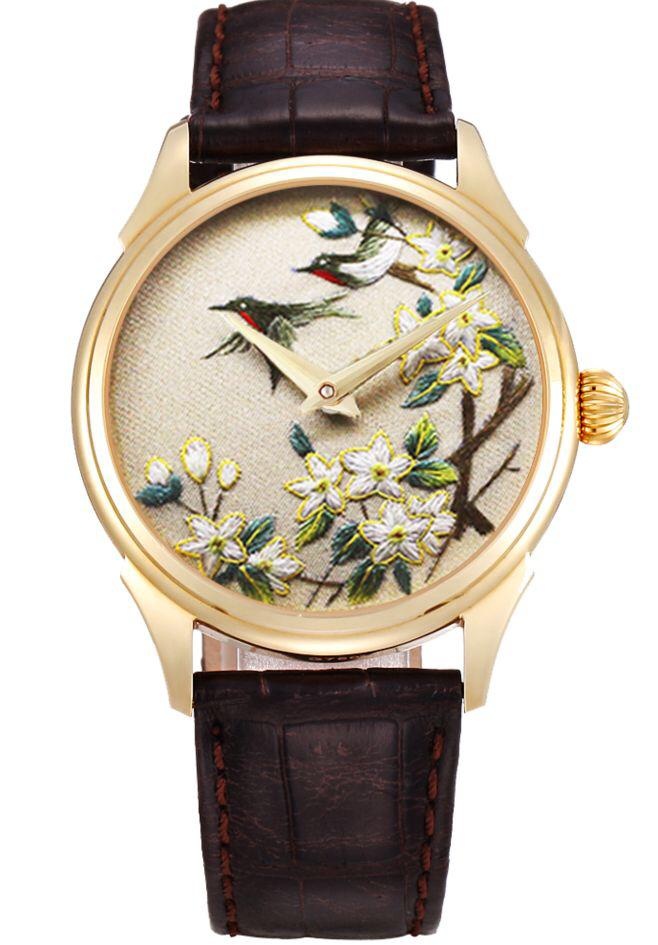
So some time ago I commissioned a group of embroidery artists to create a silk dial of Suzhou embroidery (suxiu) out of my own personal design for installation into a piece unique watch. The design was to be painstakingly hand-stitched in silk in the traditional centuries-old method, made even more difficult given the small size of the dial. Typical Suzhou embroidery art pieces are quite large and rectangular.
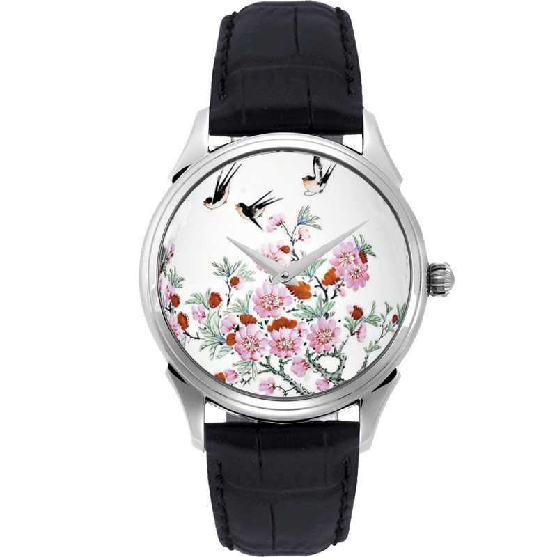
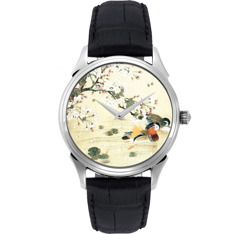
The final watch will be slightly different from the render - it'll be cased in steel to be more affordable, have blued steel hands, and my seal will be silk-screened under the watch crystal. The movement top plate will also be engraved with my monogram.
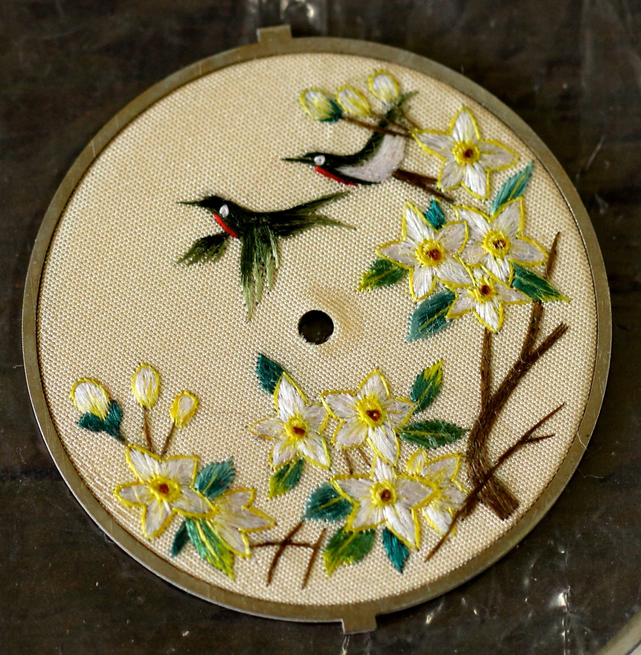
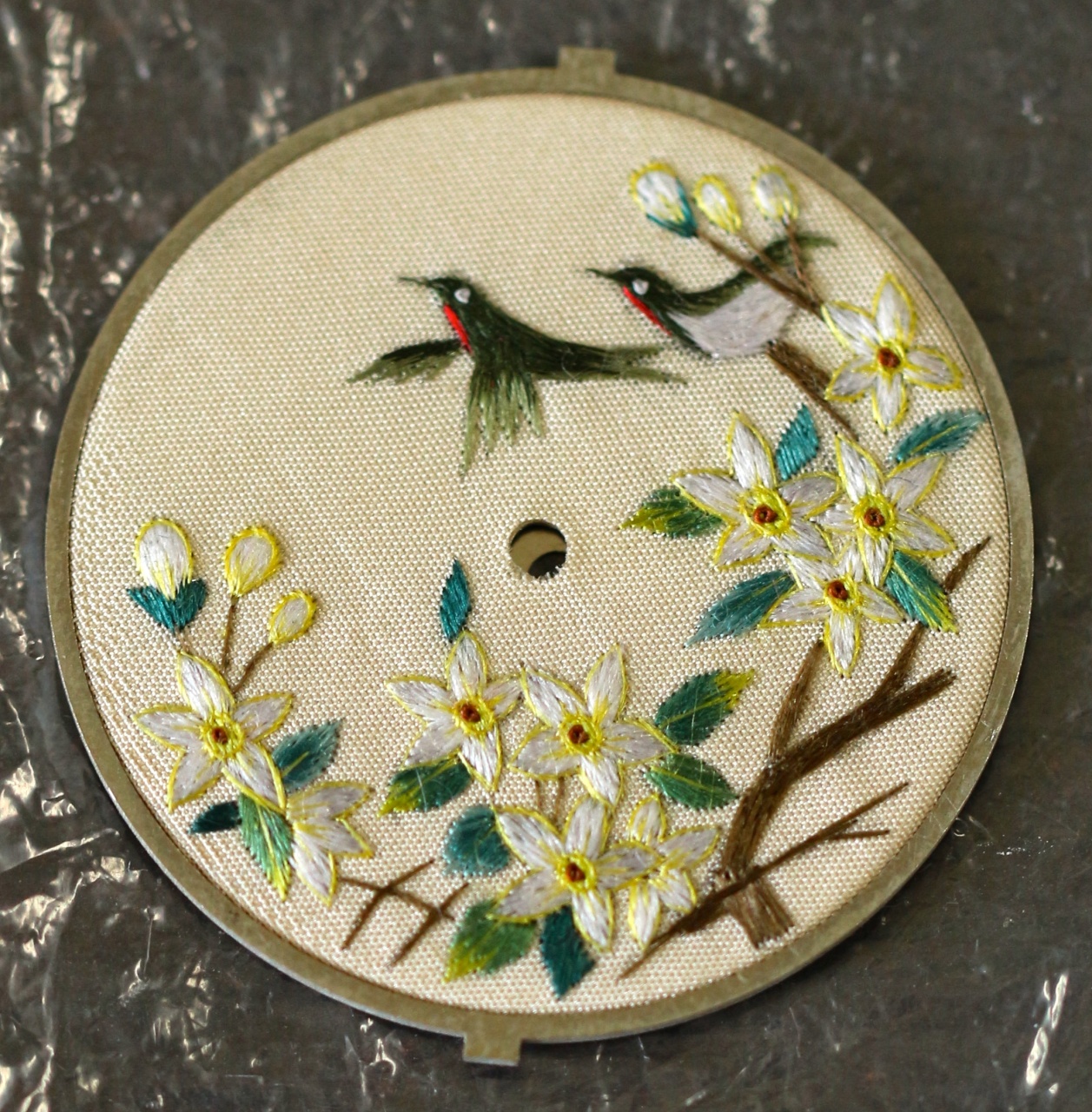
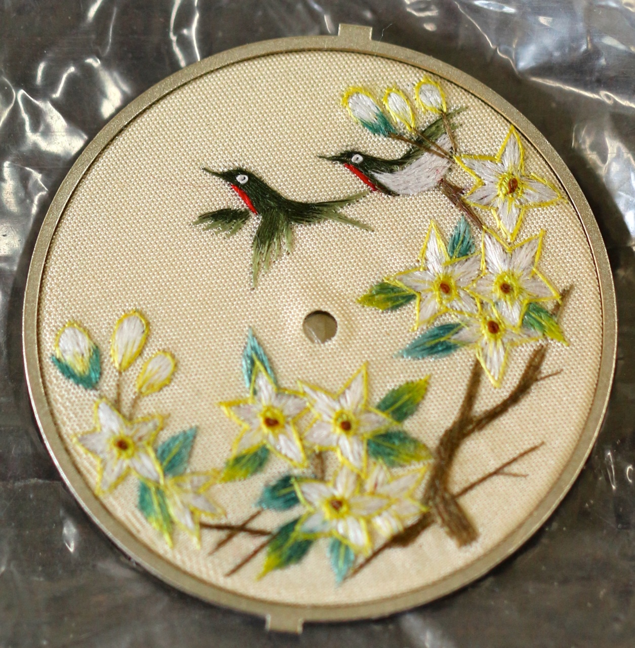
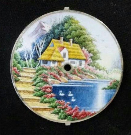
Notice the filigree details of the three dials, and how they all consistently adhere to the given design, while having just an iota of individualism, indicative of their hand-stitched nature.

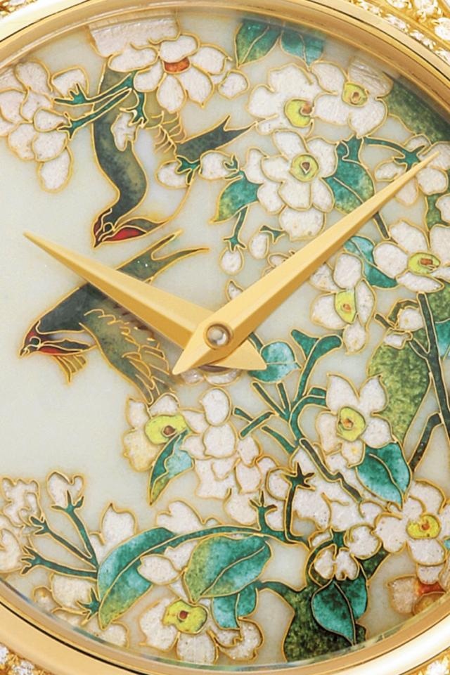


congrats BCHIH - with the design, the final product will be a very equisite piece!!
Based on the photos, I prefer number 1 given the vibrancy of the colors. Perhaps it is due to lighting, clarity level and angle of the photo, number 1 does seem to have stronger yellow lines outlining the flowers and these brighter lines bring more life to the overall design. On the other hand, the eyes of the swallows (which give them life) appear sharper in number 3.
Did you previously tell Chanel about your silk embroidery idea ?? You should charge them license fee for theirs. 
Cheers,
Gordon
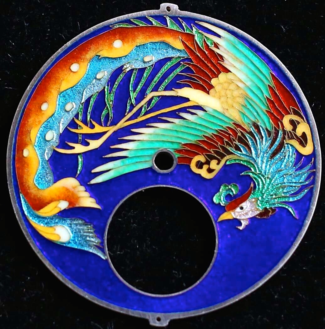
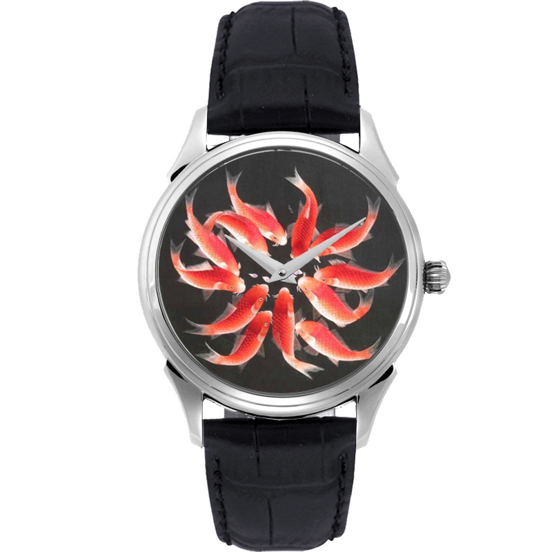
P.S. The last photo shows a well done cloisonné dial. Is this piece yours as well given that it contains the same design??
Thanks guys!
One step nearer to completion...
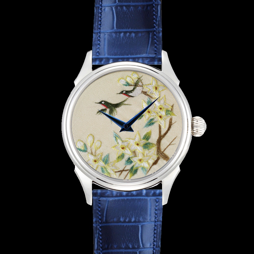
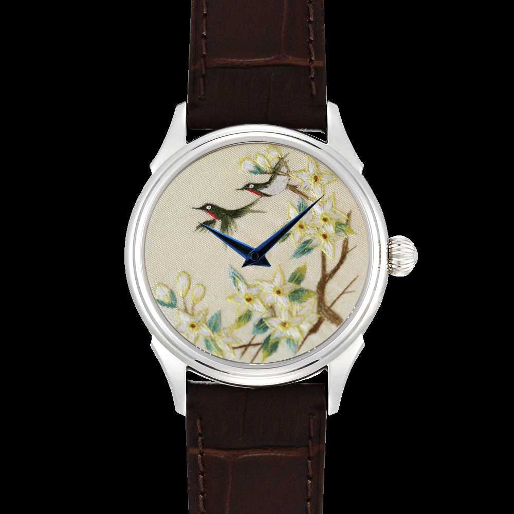
Brown strap for me.
But I will choose no.1 piece due to its more lively and brighter colour.
Are both side of the dials identical? This is the speciality of suxiu.
Regards
Ling
Thanks Ling
Hi BCHIH, in terms of the strap, IMO...
the blue strap matches the white case and blue hands very well, while the brown strap complements the colors in the embroidery dial better.
I would suggest to use the blue strap as version one of this watch, and use brown strap (with another piece of embroidery) but change the case to rose gold as version two
With two versions, you can cater to different occasions and attires, and put to good use the second piece of embroidery !!
Good luck with your selection.
Gordon
Great idea GLau! Good thing these watches are affordable enough!
Hi BCHIH, to take my suggetion further, I would recommend that...
... you have all three metals, white, rose and yellow and use all three embroidery pieces !!
Do you have photos for the dragon dial ??
Thanks GLau, but
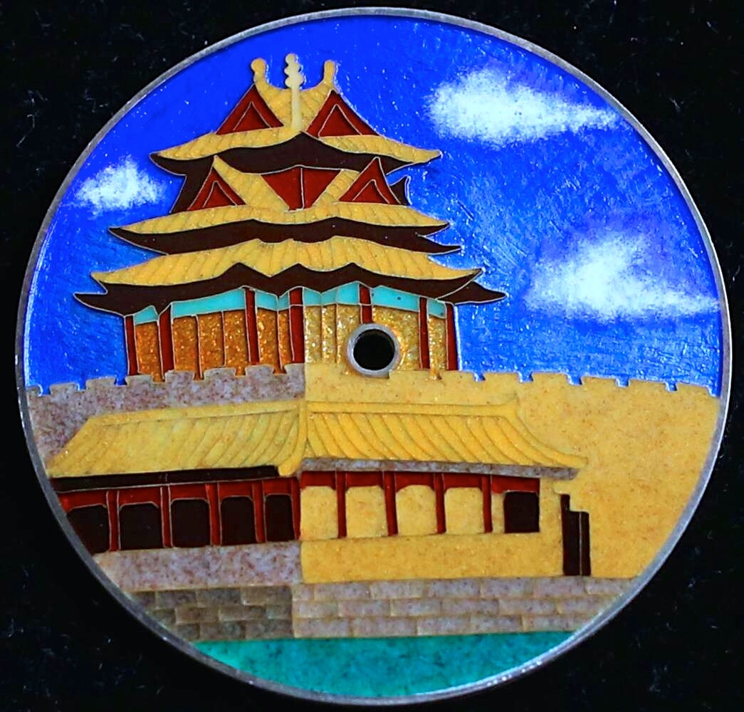
The finished masterpiece!
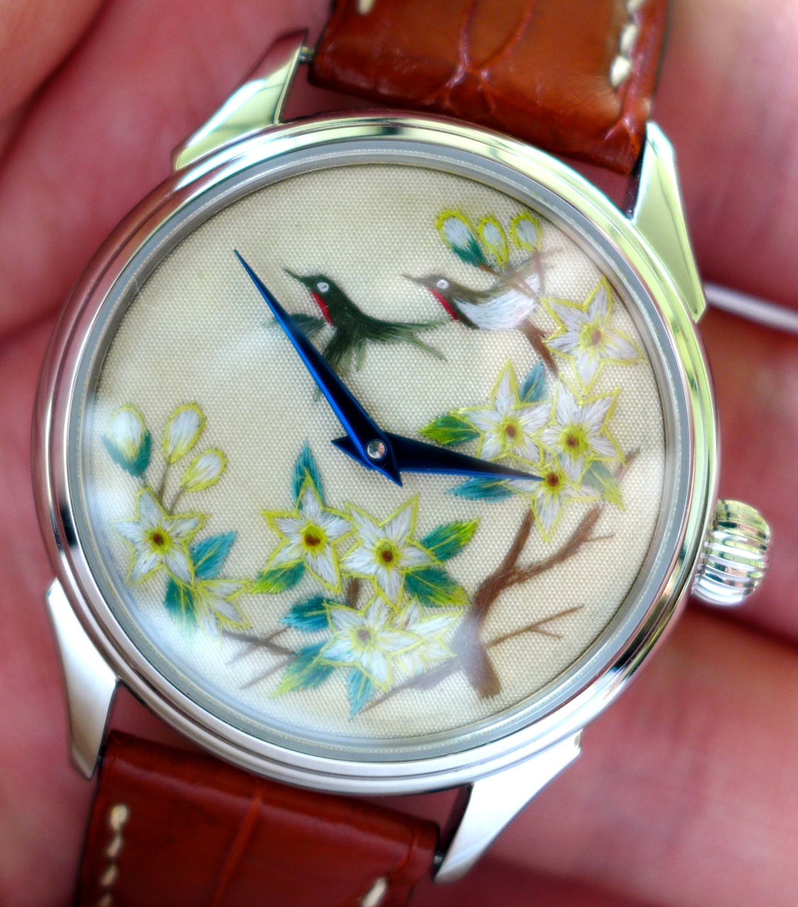
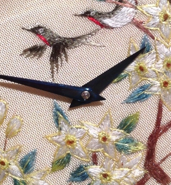
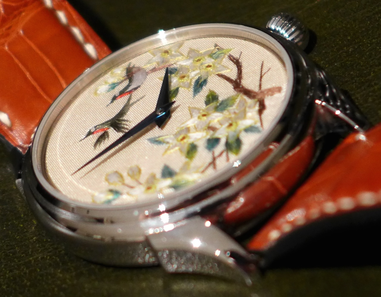
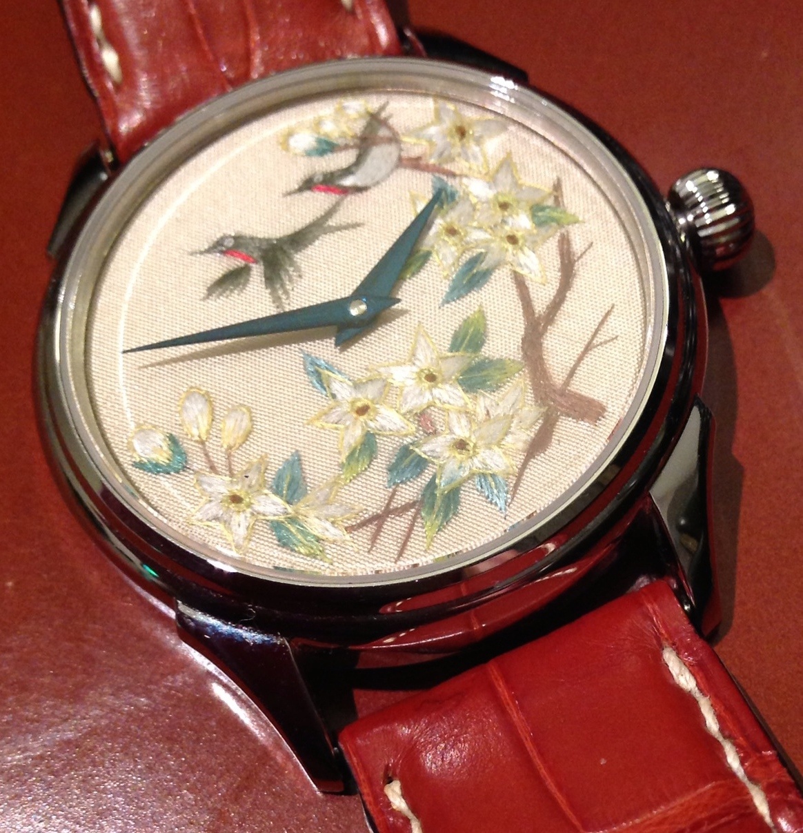
Nice embrodiary !! Glad it all worked out
With white metal, I prefer the blue strap (in your earlier post)
Enjoy !!
When do we get to see the other enamel dials ??