Comments:

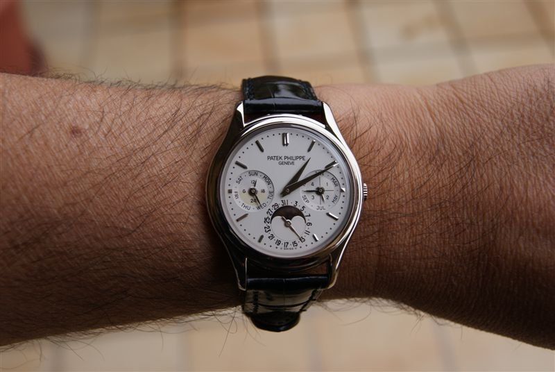


A beautiful perpetual calendar: 3940G
Found sealed and immediately got it.
A real beauty!
Enjoy
Fabio
Lucky man!
Great, great watch!
Congratulations!
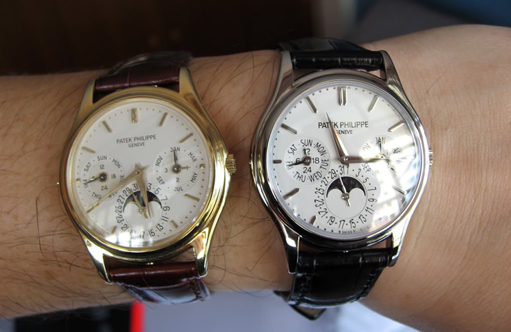
The 3940 is an example for "old" still better than new model: I very much prefer the 3940 over the current 5140.
It is also an example of trying to make things better,more legible in a new model and how it fails.
Great catch!
Regards
Moritz
Congratulations!
The 3940 is an example for "old" still better than new model: I very much prefer the 3940 over the current 5140.
It is also an example of trying to make things better,more legible in a new model and how it fails.
Great catch!
Regards
Moritz
5140
I do not agree with the coments on the 5140. The newer case is not as round ish and has a nicer flow and balance. The left dial on the 3940 is light and weak, whereas the 5140 is bolder and yes the day dial is bolder, brighter and far easier to read. All in all great improvements in my mind. But such is all left to personal opinion and therefore, no one is right or wrong. Love your 3940 by the way.
3940 is just a tad more legible... But both are stunning PP!
Very precise observations about the case design, I must say.
When I come across an 3940 again, I will compare with your criterions again.
Many thanks for the tip.
Regards
Moritz
When I come across an 3940 again, I will compare with your criterions again.
Many thanks for the tip.
Regards
Moritz
5140
fully agree with watch-er re comparison b/w 3940 and 5140.
BTW, have seen 5140P and 5140R in the metal........the white lettering/numbering is unusual, and not to all tastes, as is the brown dial on the R. Neither really works for me.
5140 is one of the few PP's that I find most desireable in YG.
BTW, have seen 5140P and 5140R in the metal........the white lettering/numbering is unusual, and not to all tastes, as is the brown dial on the R. Neither really works for me.
5140 is one of the few PP's that I find most desireable in YG.
3940 and 5140 are two lovely watch!
Hi,
Congratulations for your catch!
Cheers
Dje
ps: 3940 or 5140, saying that one is better than the other, certainly not for me. But a 5140P!!!!
Congratulations for your catch!
Cheers
Dje
ps: 3940 or 5140, saying that one is better than the other, certainly not for me. But a 5140P!!!!
5140 P: was it a dream or real...
I know it sound very weird, but I "believe" I saw it already in the flesh, the 5140 P with the blue dial.
Did not have the time to inspect it in the shop, but it looked a bit playful, this blue dial with (bussy) white printings.
Maybe I should take the time for a thorough inspection...
Rergards
Moritz
Did not have the time to inspect it in the shop, but it looked a bit playful, this blue dial with (bussy) white printings.
Maybe I should take the time for a thorough inspection...
Rergards
Moritz
Great watch!
The 5140 and the 3940 are my favorite perpetual calendars.
Thanks for sharing!
Thanks for sharing!
The PP statement
I think that the 3940/G timeless elegance and simple perfection match adequately the PP statement <
Great piece
My sentiments are probably with CdM in preferring the 3940 over the 5140, both from the aesthetic perspective and the philosophical. On the first, my take is that the text/numerals on the 5140 are too cramped, and the non-uniform size of the numbers on the date indicator are a deal breaker for me. (Interestingly, the uneven size of the numerals on the FPJ CS are not a deal breaker; probably since they don't highlight a cramped dial.) On the second, I think the case, while only millimetres larger, is now a little too large for the movement (or, at least, compares somewhat poorly).
Big Congrats Fabios. A beautiful and elegant watch.nt
nt This message has been edited by arolex on 2010-10-15 18:01:17
Excellent piece Fabio!
3940 is a true classic Perpetual made to perfection! Mine has been with me the longest time and it still sings to me everyday!
I'm a loyal fan, quite obviously
Enjoy!
Mech
I'm a loyal fan, quite obviously
Enjoy!
Mech