
Patek Philippe 5296R: Comparison of Standard or Sector dial versions
Hi,
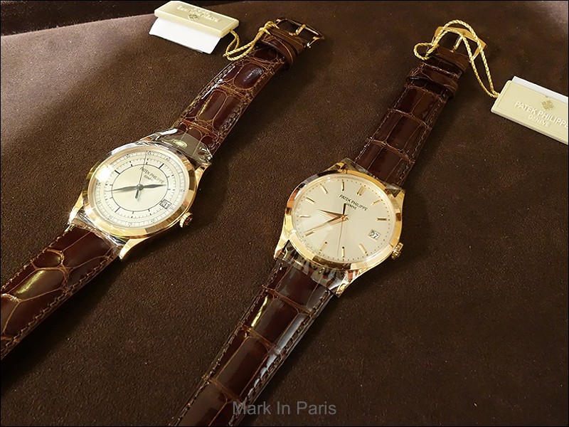
I have inspected the two Patek Philippe Ref. 5296R dial versions in rose gold cases and can now share some thoughts that are illustrated with photographs.
While the standard version is very elegant and already a classic Calatrava design, the sector dial variant is inspired from much older references and is less “dressy”. Indeed, I wouldn't even say that the sector dial is more ‘modern’ or ‘sportier’ etc. – you know – all the terms that we use when a watch has a more casual look. I can't really define it or give it a name. To me, it has a sector dial and thus it is a unique model with its own spirit.
I'm fond of the sector dials in vintage Patek Philippe timepieces and especially, as I already posted in the past, when it is available in chronographs. It gathers the engineering world of planes with the watches used as navigation instruments. There is an atmosphere in this dial orientation that I like a lot.
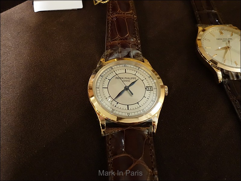
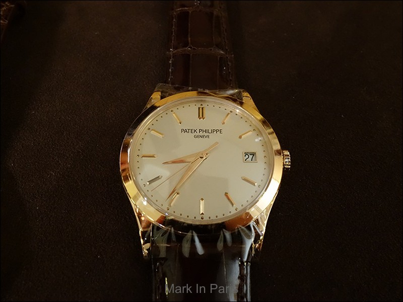
The case is 38mm wide which corresponds to the spirit of a classical and discreet Calatrava piece. The design of the case is a purer version from the array available from the Collection of 3-handers and thus a little more contemporary than a rounder model (viz. ref. 5227 or 5127 for instance, or even ref. 5153).
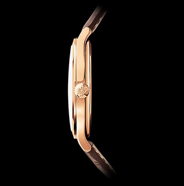
From the profile, the style is quite different and less geometric than the front side may lead you to think; especially in the lug sections where we can admire very soft curves giving a welcomed warmth to the watch. The long side-band going uncut from north to south is polished like the rest of the case and is not brushed.
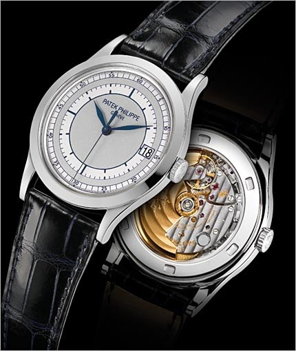
The sector dial model is 2-toned silvery-gray with blue transfer-prints. The sector printing is a little thicker and has a very different look from the vintage versions. I must say that I prefer the latter more. In fact, I think it looks nice on the ref. 5296 but suffers a little compared to the original sketches. This is may be due to the fact that I like thinner printings, although it may look more cluttered to other people.
An interesting detail is that the 2 tones of the metallic dial are spread like rings. It is not only a tone difference but also a difference in texture because light does not reflect the same way from them.
The dial
decoration as well as the colour and shapes of the hands are what make these
two references very different. In the sector dial version, we observe the dark
blue hour and minute leaf-shaped hands together with a blued stick central sweep
seconds hand.
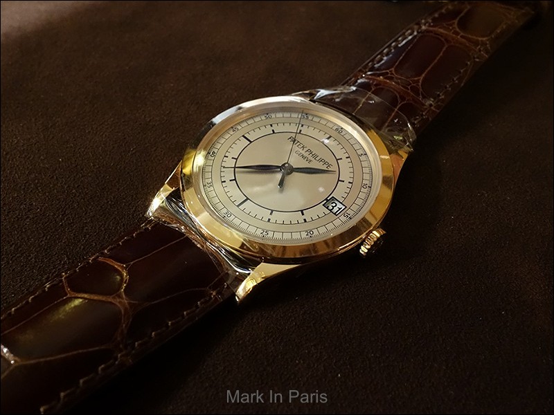
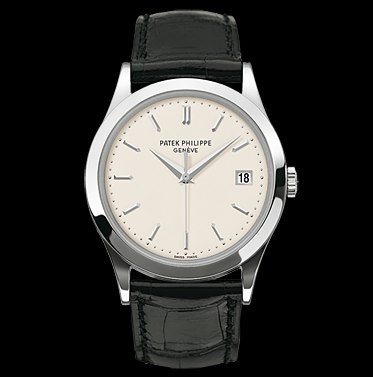
On the classical version, the choice is totally the opposite and much dressier: no printings but rose gold applied markers and Dauphine-shaped hands. The latter is very elegant and can sometimes be mistaken for vintage references.
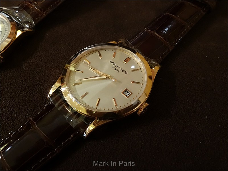
The date window at 3 o'clock is integrated into the sector dial scales and does not interfere with the whole picture. On the cleaner dial version, it is like the ref. 5227: a feature that people may find very useful as well as suitably integrated for a 3-hander.
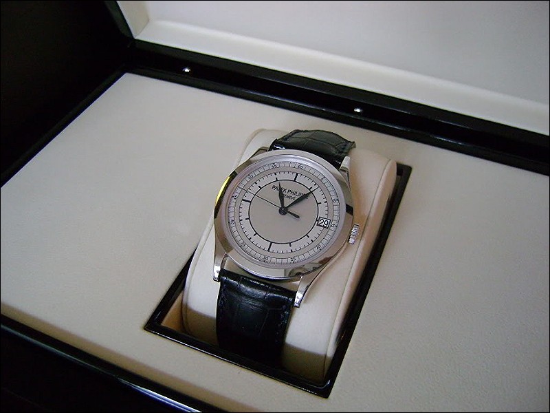
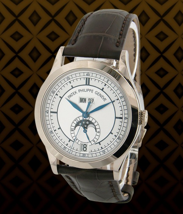
Here are the official pictures of the white gold versions for info:
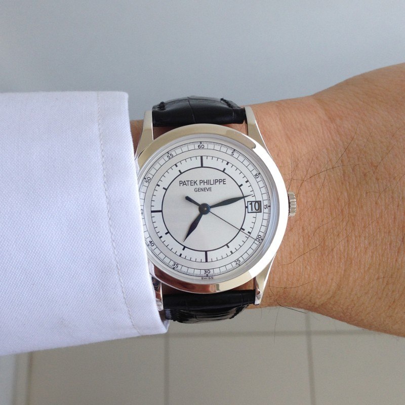
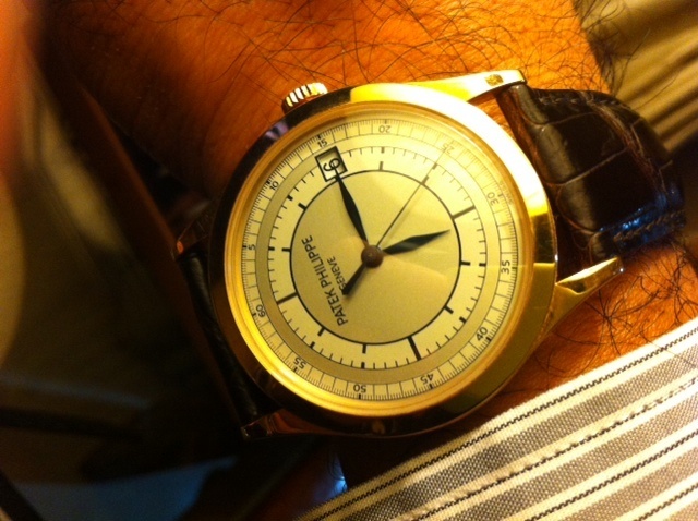
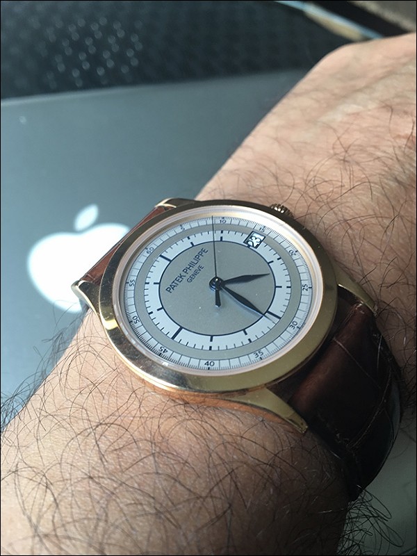
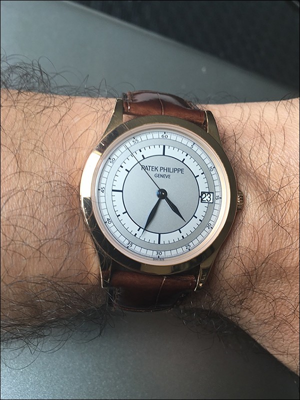
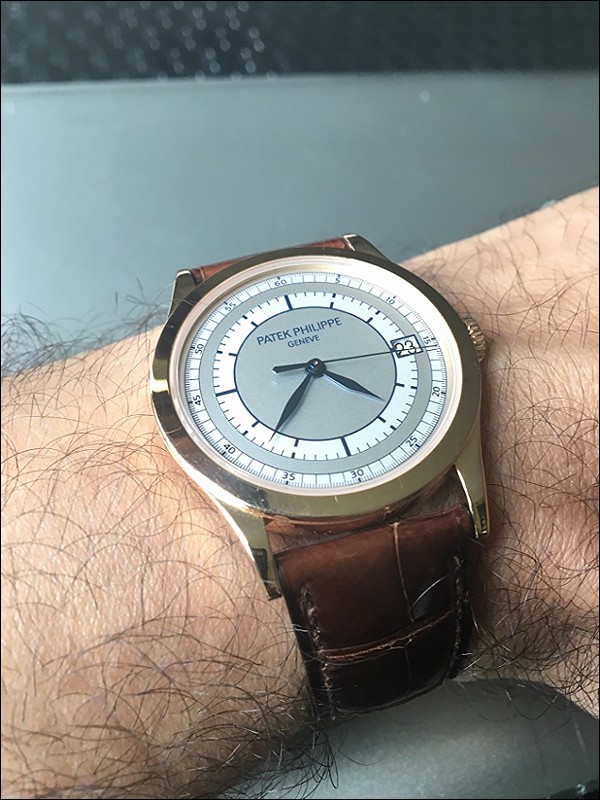
And a couple of wristshots from our members:
Credit: TonyR
Credit: NT931
The movement is the well-known 324SC caliber that, as usual, you can see through the sapphire caseback.
In the end, these two interpretations from the Calatrava line-up originate from two different worlds and are not meant to communicate the same message. I think the sector dial version brings a different and distinct identity than the usual classicism of elegant and dressy 3-hands watches.
Which is your favorite?
Do you have a preference for the traditional version or for the more original but still old-school sector dial interpretation?
I know some of our members are proud owners of these models, so please feel free to share some pictures!
Cheers,
Mark
This message has been edited by Mark in Paris on 2016-06-22 14:37:09 This message has been edited by MTF on 2016-06-22 15:00:13

Yes, it feels more "modern"
Cheers, Mark

Both are very well made , beautiful.
Cheers Mark.
Versatile versus dressy
The latter is a way of wearing a dressy watches I like a lot.
Thanks for sharing yours and your experience Geross, it has a unique look really...
Cheers, Mark

What a coincidence...
I am in love with the sector dial of this watch and have managed to source one in a very good condition (but not perfect) from 2009. I wish Patek was still making this watch. It looks so desirable with the dial and blued hands.
Any opinion why the sector dial was discontinued? Is there a point of purchasing the discontinued model?
I think it is very difficult to choose...
However, the 5396 looks really cool and I think I could only make my decision if I could experience them for a longer period of time.
I don't know why it was discontinued but usually it is in a way not to have too much volumes compared to the market demand.
Furthermore, for such pieces (less classical) I think it is good not to have too many of them, as long as they aren't too rare and that their prices don't rise too much.
If you don't have enough answers on my thread, then feel free to post a spearate post if you need feedback

Thanks for your input!
Cheers, Mark
I prefer the standard version ...
I think also it has a fantastic pure Calatrava look
Cheers, Mark

Love the sector dials
But if ever there was a Calatrava that should have omitted the date, the sector dial is it!
Go all the way, Patek: if you're going to genuflect to the past, then at least do it right. Every vintage sector dial time-only Patek I've seen had no date.
How about a re-issue in 39mm with no date? That would be compelling.
Cheers,
John
Thanks for the vote :)
I must say I love the secor decoration in the chronos, without date too.
Your 39mm suggestion is something that Patek should consider indeed!
Thanks for yoour input
Cheers, Mark
Standard
Thanks Bob.
Cheers, Mark

Thanks Mark for showing the picture of the 5296 sector dial
The watch is an interesting one. Off the wrist, it looks pretty bland, but it comes alive on the wrist. I came across it at a JLC boutique launch last year on the wrist of another guest, Mr J. I was quite taken with it, J let me try it, and bam! it was instant attraction. Somehow the differing tonal shades of the rings don't always come through in pictures but it's pretty evident on the wrist. And it's still quite a stealth watch; not immediately noticeable as a Patek, which is what I like!

This message has been edited by NT931 on 2016-06-22 17:49:50 This message has been edited by NT931 on 2016-06-22 17:50:36 This message has been edited by NT931 on 2016-06-22 17:51:26
This wrisshot is really beautiful
It is interesting what you say about the date. Indeed some purists always have a problem with dates (to each his own perception of a date in a dial, suitable or not) but it really seems that more of them don't like the date, especially in this sector dial version.
Very good to know for someone who is looking to purchasing one.
It is not a bling watch but shows a great presence indeed when on the wrist.
Thanks a lot for sharing your impressions and pictures, they are not easy to find in that sector versions.
Enjoy it!
Cheers, Mark
This message has been edited by Mark in Paris on 2016-06-23 05:50:27
Thanks for your kind words Mark, and for starting this stimulating 5296 thread! [nt]
This message has been edited by NT931 on 2016-06-23 08:09:22

Both are nice.. but
... it depends what you want to wear it with .....
Personally I like the standard 5296 with the dauphine hands and hour markers. The almost laser finishing of the hour markers is what mesmerizes me the most especially when light bounces off them. Seems many hours of workmanship was spent to achieve this level of finishing. . The colored metal goes well with this version.
The sector dial is also very special and as mentioned in previous comments, gives a more casual feel and perhaps more versatile. For this version, I prefer the white gold version.
Can't go wrong with either versions..
Cheers !
They have indeed a different way of showing themselves
Thank for your input and vote!
Cheers, Mark

Sector Dial.
If it didn't have a date, I think I'd have moved some pieces to acquire it.
Clear choice
Thanks for the vote!
Cheers, Mark

No question:
Sector indeed for you
Thanks for your vote!
Cheers, Mark
This message has been edited by Mark in Paris on 2016-06-23 09:05:34
If Patek would just make 5975

Of course sector dial !
It is very unique indeed
The occasion for you to share but especially for us to admire and see pieces we don't see that much.
Thanks a lot for your nice comments and input Gautam!
Cheers, Mark

Sector dial on this watch is really cool ! I feel that 5296 sector dial can do...
without the date window because the railway tracks are interrupted. :-(
The blue hands are great and IMO they match best with white gold.
In terms of the 5396 AC sector dial, I find the dial busy because I am a simple guy. LOL !
Thanks for another good post.
Cheers,
Gordon