
SIHH 2014: Lange & Söhne, the full report
The main complication of the year is, as you already know, the moonphase display. 2 of 3 of the key watches of the 2014 collection offer it but in each time through unusual displays:
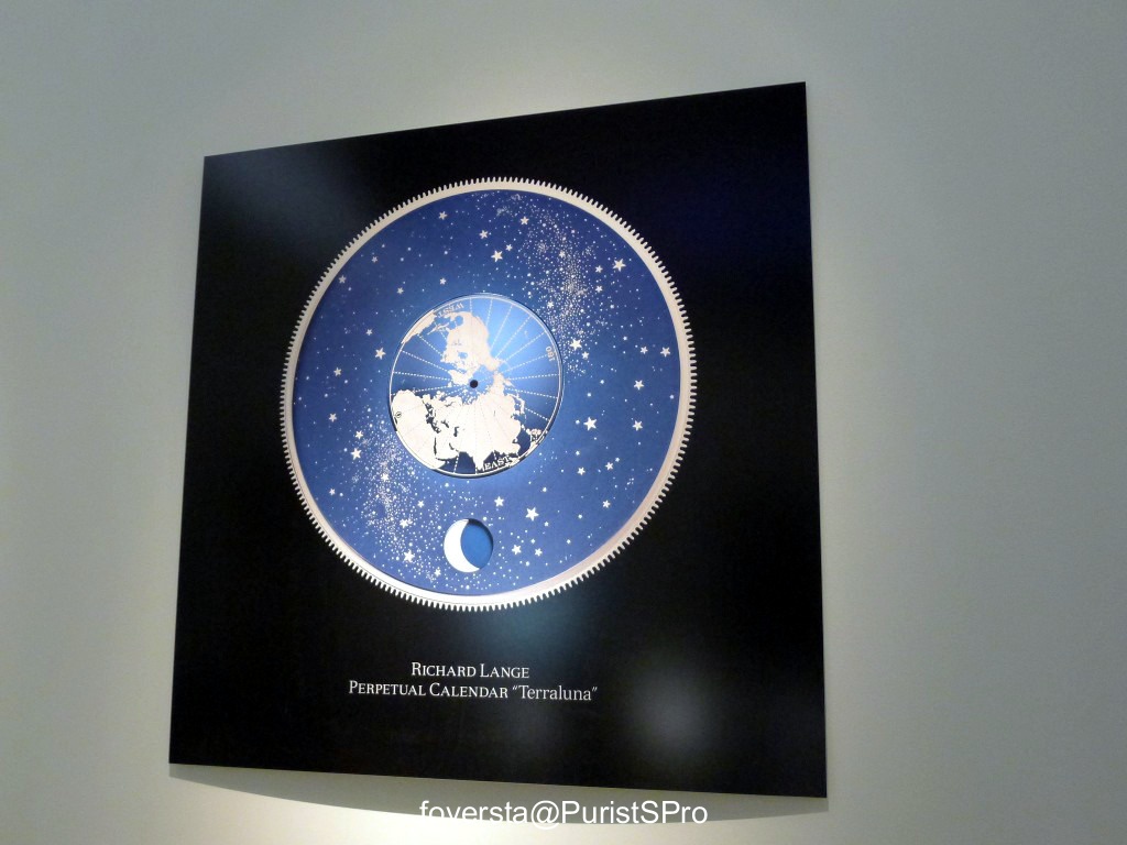
- a stunning orbital display with the 1058 years accuracy for the Richard Lange PC "Terraluna"
- a large moonphase display integrated inside the time subdial for the Grand Lange 1 Moon Phase
The 2014 collection is also made of an 1815 Tourbillon which gathers two technical characteristics well known in Lange world (the zero reset and the stop tourbillon) which come together in this context, an evolution of the 1815 which is now proposed with a 38,5mm case (taking advantage of the warm welcome of the 1815 up and down), PG versions of the Lange 1 Tourbillon PC and of the Zeitwerk Striking Time without forgetting the Saxonia with mother of pearl dial and diamond set bezel.
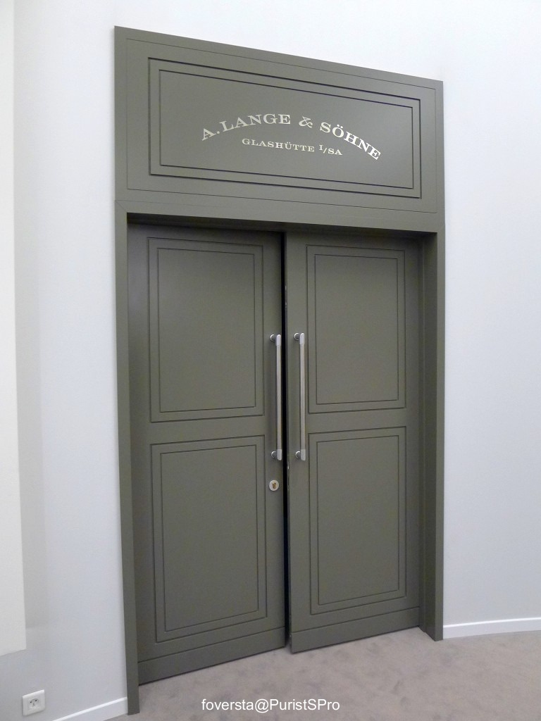
I propose you to open the door and to discover this collection. But let's start with a visit of the booth!
alang.watchprosite.com
Part 2: Richard Lange PC "Terraluna"
alang.watchprosite.com
Part 3: Grand Lange 1 Moon Phase
alang.watchprosite.com
Part 4:1815 Tourbillon
alang.watchprosite.com
Part 5: 1815 (38,5mm)
alang.watchprosite.com
Part 6: Lange 1 Tourbillon PC
alang.watchprosite.com
Part 7: Zeitwerk Striking Time (PG)
alang.watchprosite.com
Part 8: Saxonia MOP dial and siamond set bezel
alang.watchprosite.com
Conclusion:
alang.watchprosite.com
Fr.Xavier
This message has been edited by foversta on 2014-01-26 08:24:03 This message has been edited by foversta on 2014-01-26 11:01:32
This message has been edited by foversta on 2014-02-01 02:18:02
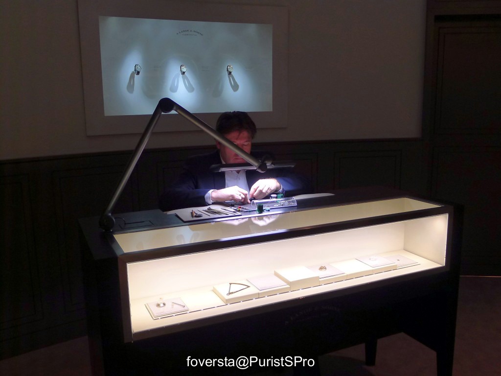
Part 1: the booth
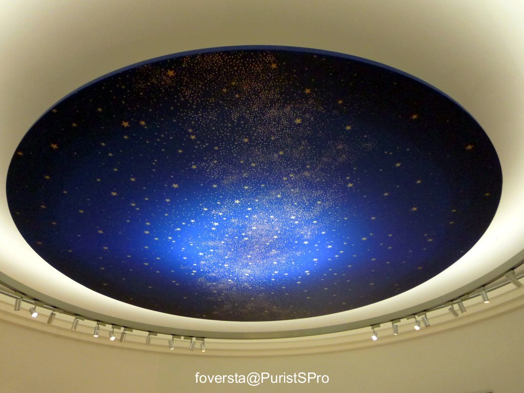
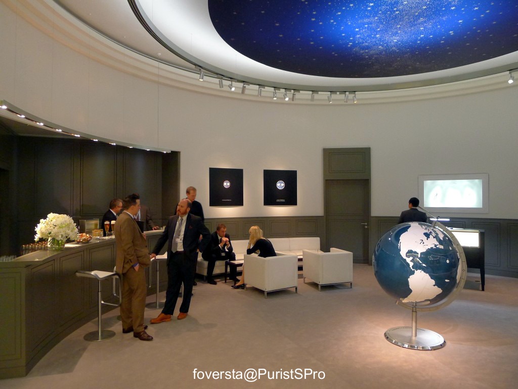
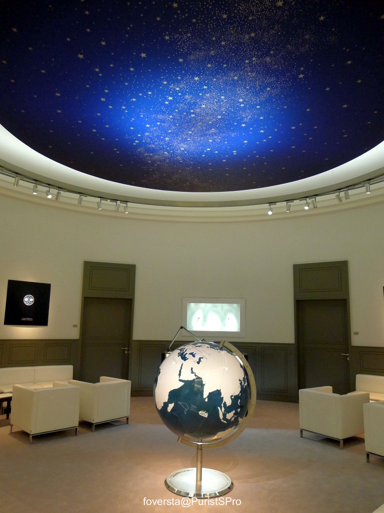
The first element was the superb starry sky on the ceiling of the main room with the bar in where all the guests relax, discuss and meet. This ceiling was obviously a true homage to the celestial disk of the Richard Lange PC "Terraluna"! By the way, some moonphase disks were displayed on the wall in order to see the differences between them. Lange has several moonphase watches in its collection but they are far from sharing the same mechanical system!
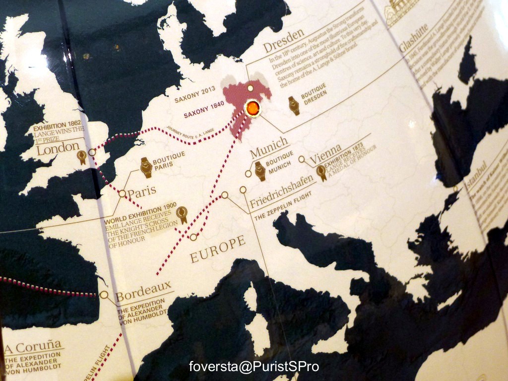
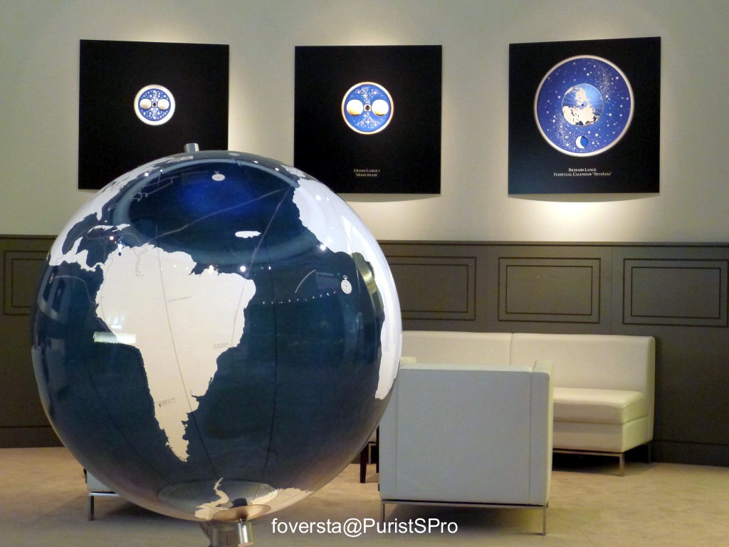
The second element was the globe in the center of the room who was indicating the cities which had a great influence on the history of the Manufacture. I was glad to see that my homecity, Bordeaux, had one!
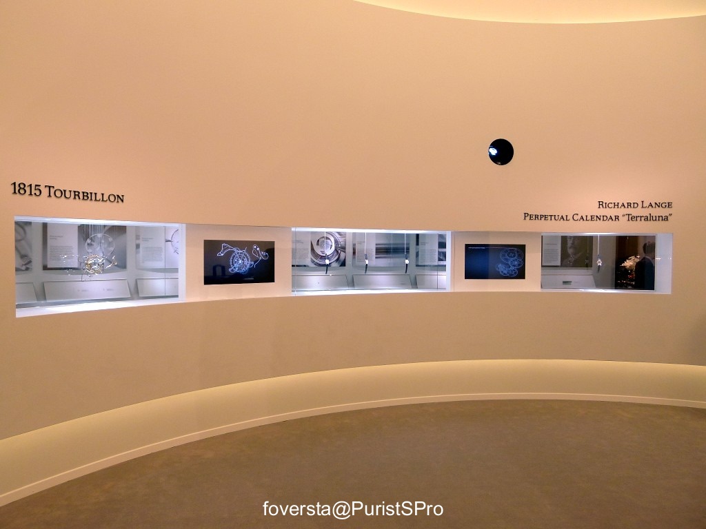
The third element was a narrow corridor at the back of the entrance room which gave us the opportunity to find explanation of historical technical features from Lange and to enjoy a view of some watches like the Richard Lange PC "Terraluna" and 3 important Tourbillon watches: the Tourbillon PLM, the Cabaret Tourbillon (the first with the stop-tourbillon) and the 1815 Tourbillon.
I can tell you that it was a great pleasure for me to relax at the booth between two appointments, it was like being at home! It is a nice feeling to know that such place is available during the crazy atmosphere of the Salon!

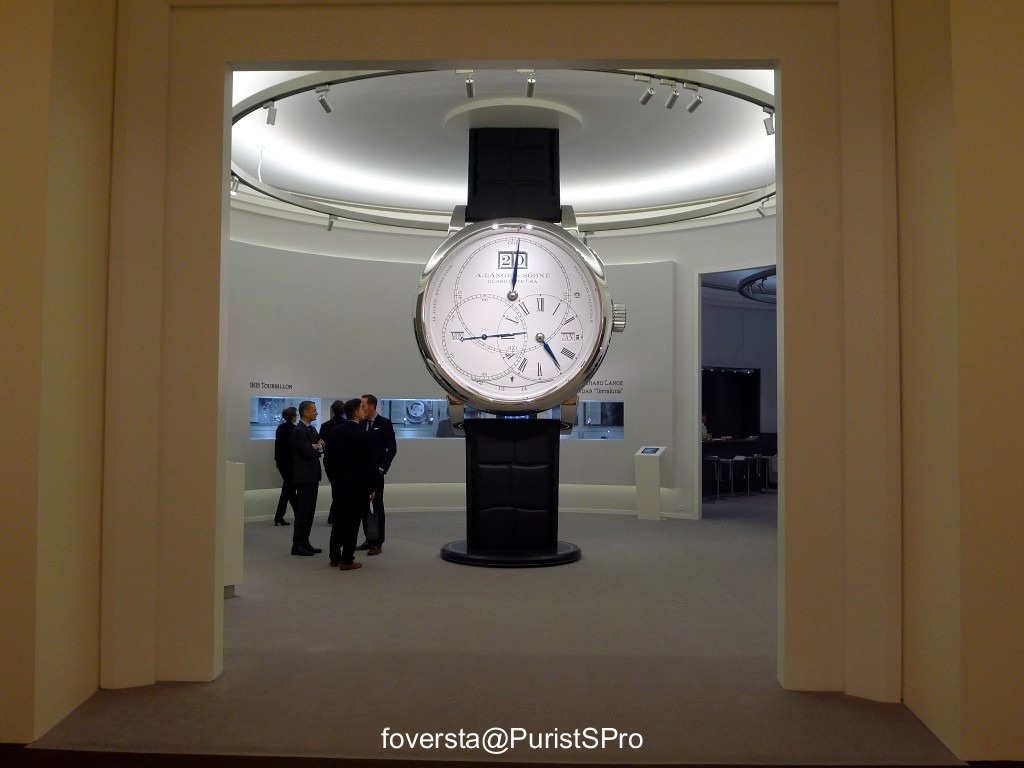
The main entrance:

If you don't understand it, this is a big reminder: the Richard Lange PC "Terraluna" is the star of the 2014 collection!
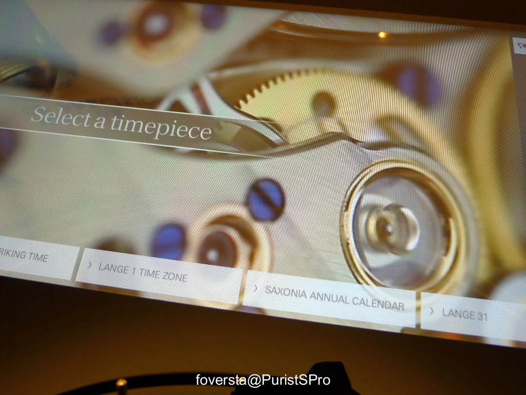
A movie displayed on the back was explaining the complication:
The starry sky:
My fav place of the SIHH:
The corridor is located beneath the windows:
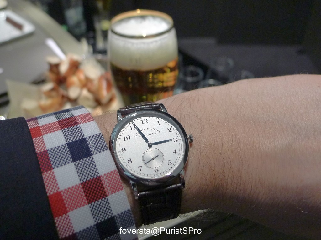
1815 on the wrist, German beer and bretzel, a good way to enjoy the visit at the Lange booth!
My home city, Bordeaux, played a role in the history of the Manufacture!
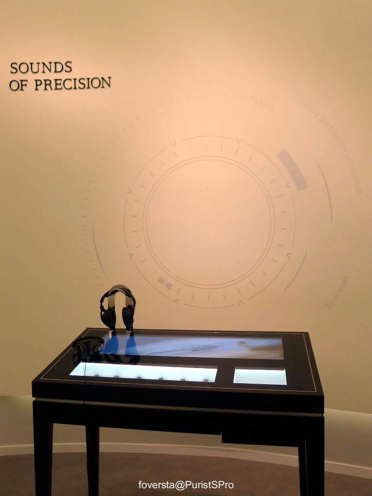
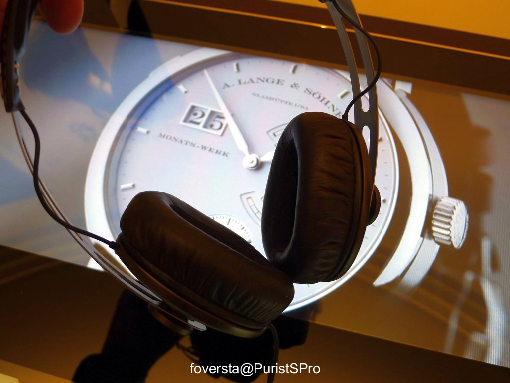
Watches also have a sound... the sound of their mechanisms! The guests could hear them thanks to earphones and appreciate the differences between a 2,5 and a 3hz watch:
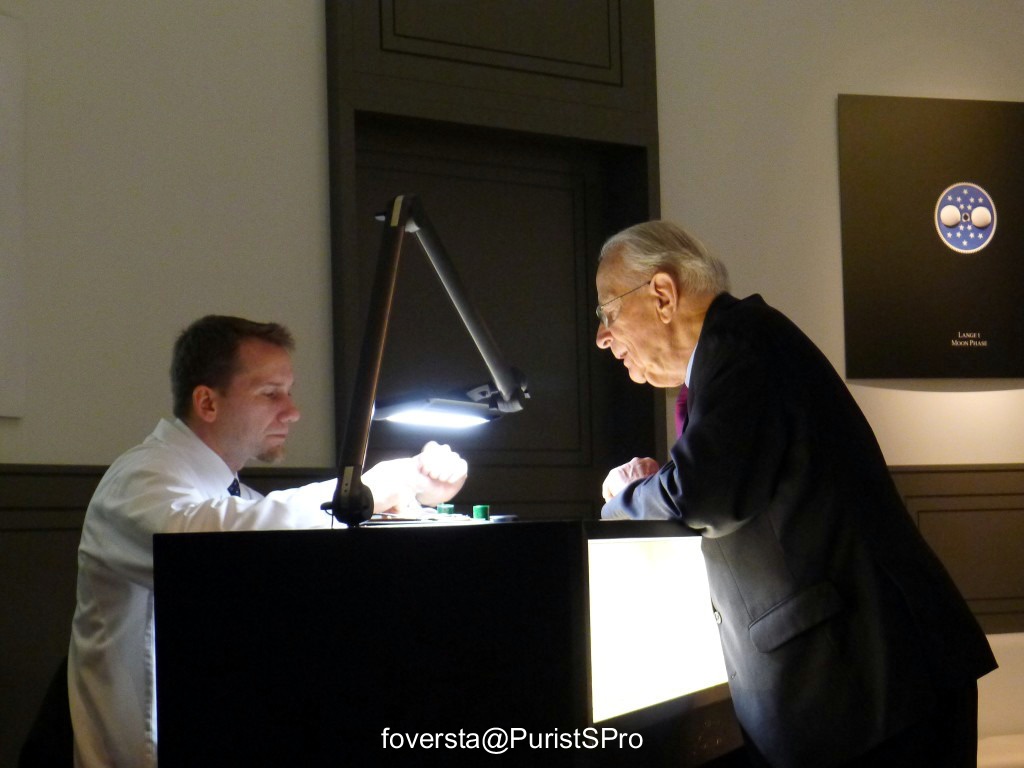
Martin Jonas and Walter Lange, two generations of watchmakers and the same passion for fine watchmaking:
The globe and the moonphase disks:
Fr.Xavier
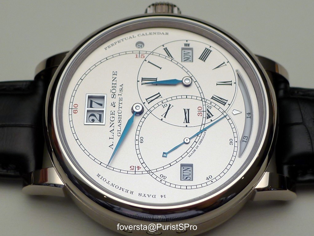
Part 2: Richard Lange Perpetual Calendar "Terraluna"
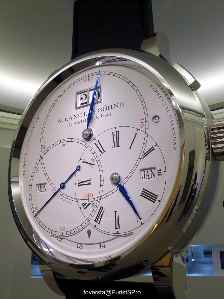
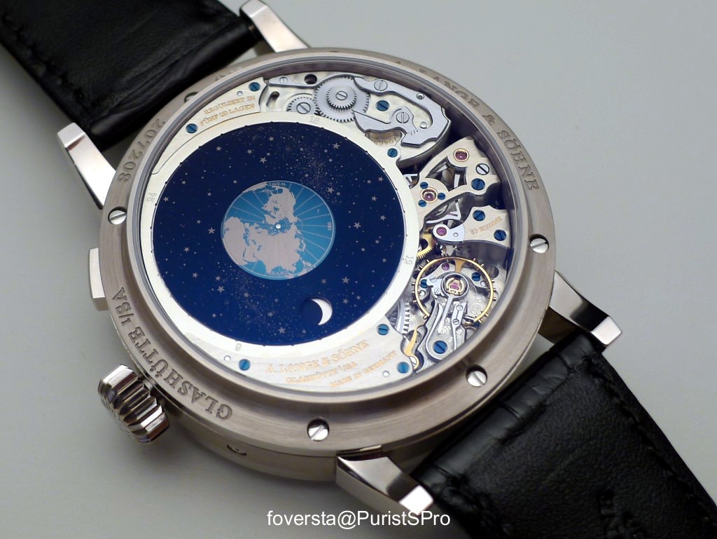
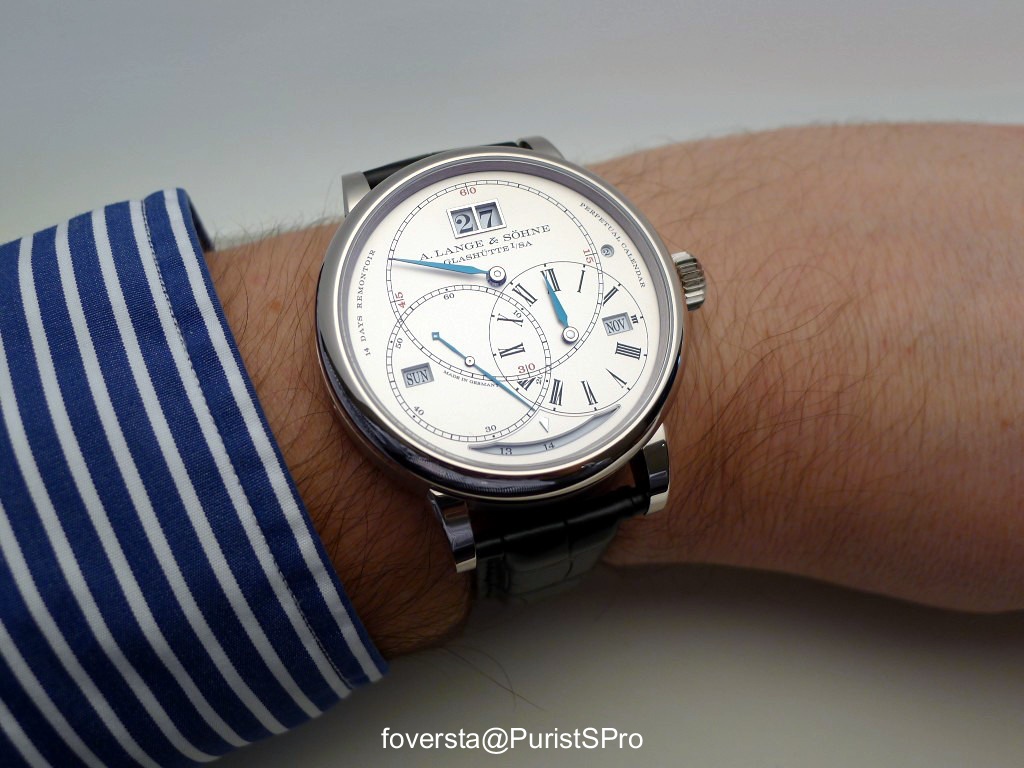
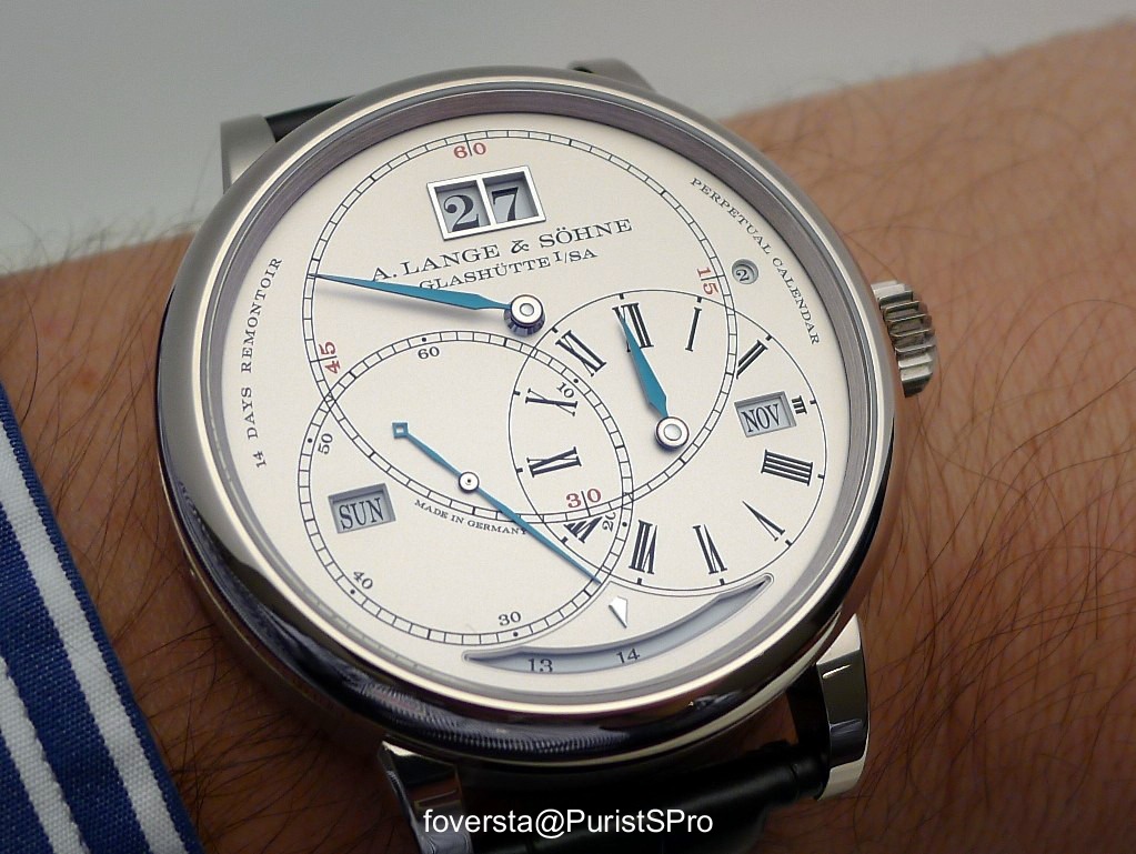
As you know, the Richard Lange Perpetual Calender "Terraluna" is the star of the 2014 collection. Star is the right word since its celestial disk is sprinked with thousands of stars (more than two thousands if I remember well).
This watch belonging to the Richard Lange collection, it is focused on accuracy. It is the reason why its large power reserve (14 days) is accompanied with a constant force escapement to control the energy delivered by the twin mainspring barrels. The dial lay-out is, like the Richard Lange Tourbillon, inspired by the Seyffert pocket watch. A regulator dial needs time to get used with it, even more when there is also PC data on it. I will be frank with you: at the beginning the dial is quite disturbing but I could quickly appreciate its originality and the discretion of the power reserve indicator.
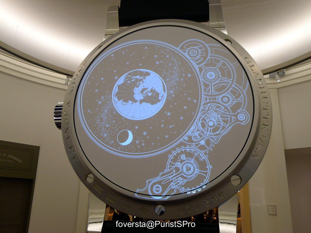
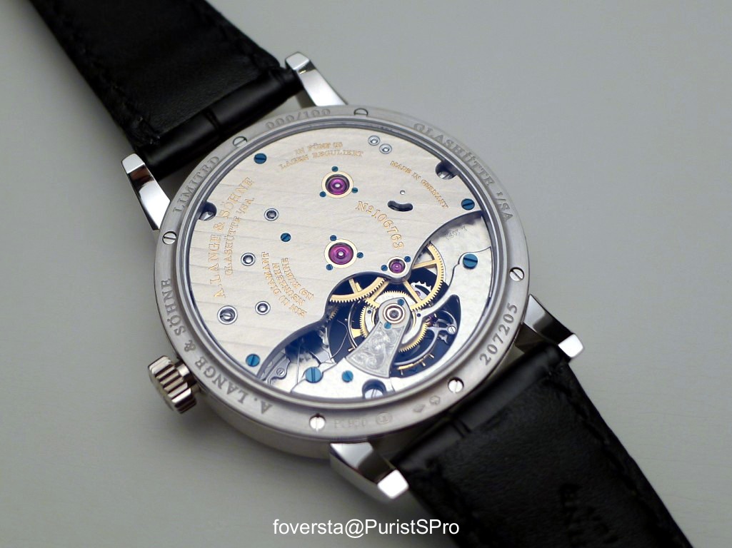
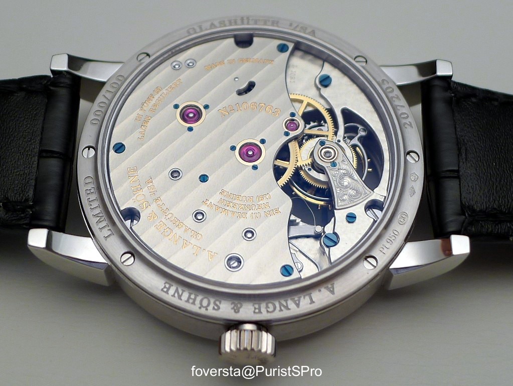
The watch is large (45,5mm) and thick (16,5mm) but there are reasons behind these dimensions. The twin barrels are one, the size of the celestial disk is another one. Because, for the first time with a Lange watch, there is a display on the back of the watch. And what a display!
We are not talking here about a mere moonphase display.
The moonphase display of the Richard Lange PC "Terraluna" is accurate (a deviation of 1 day every 1058 years) but it is also an orbital display with a nigh/day indicator and a rough indicator of the 24 timezones. It is the first time a Lange watch reaches this monphase accuracy in a context of the complex watch because the 1815 Emil Lange or the Homage to F.A.Lange didn't have additional complications.
The question is: if there is a night/day indicator, where is the sun? The balance wheel plays the role of the sun! It is a true symbol since the sun gives life... like the balance wheel in a sense!
The celestial disk is so large, so beautifu that I would have preferred to wear the watch upside down!
The dial of the Richard Lange PC "Terraluna":
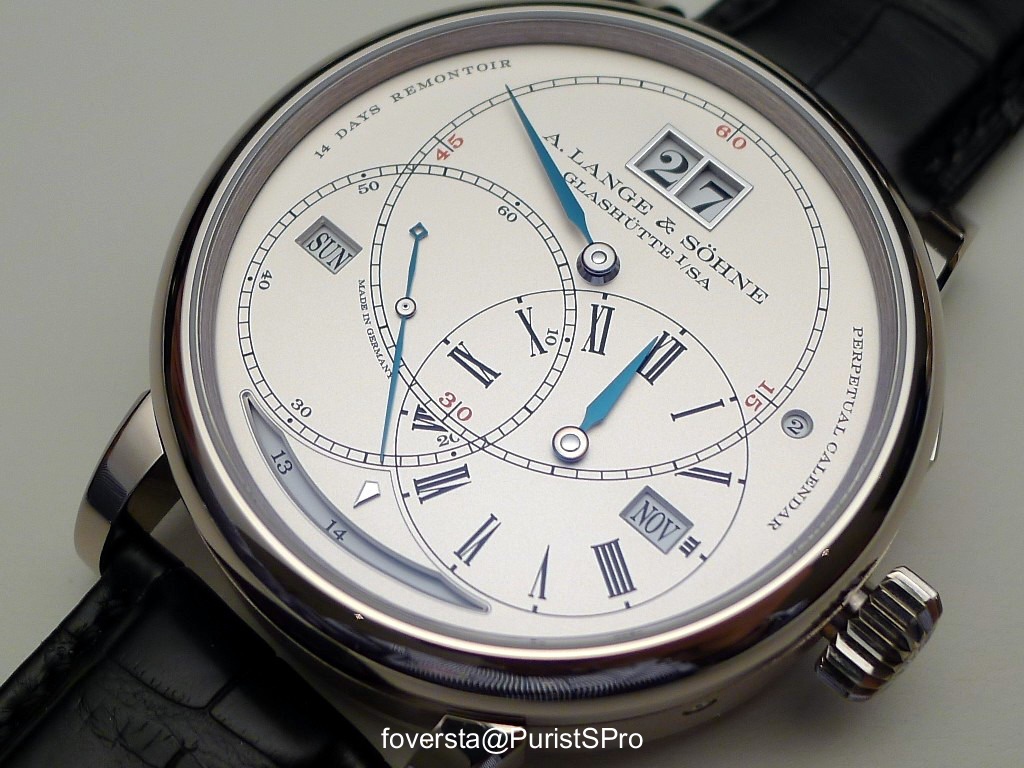
The leap year is indicated by the small window close to the crown:
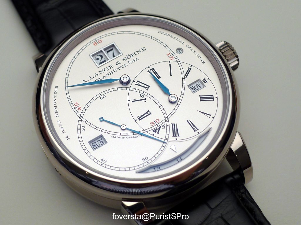
The dial may appear to be confusing at its bottom due to the intersectons but I got used with it and the legibility was fine at the end even if the hands are overlapping sme windows (hours hand the month window, minutes hands the date):
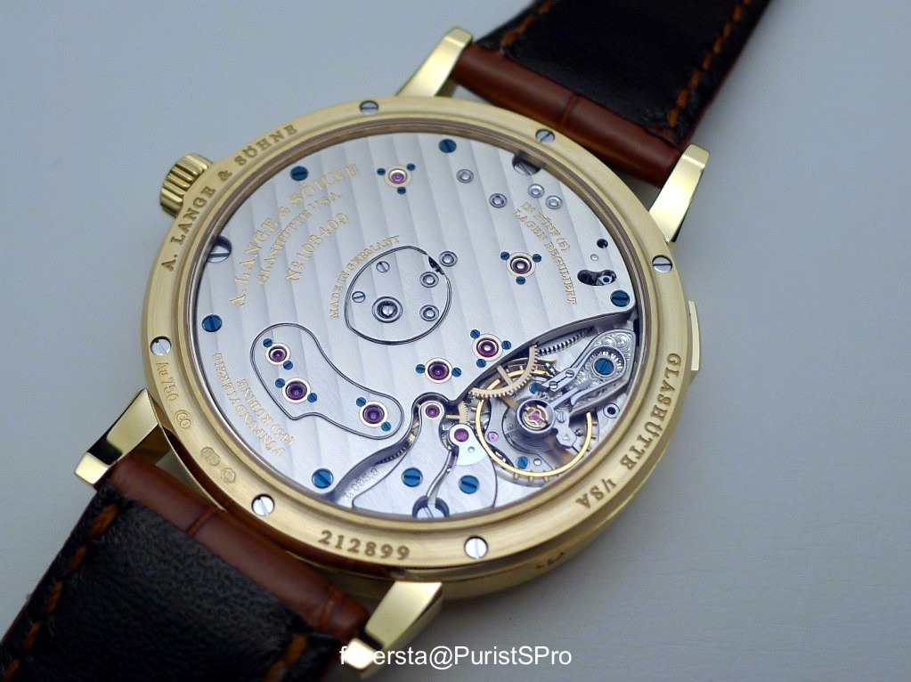
A spectacular caseback:
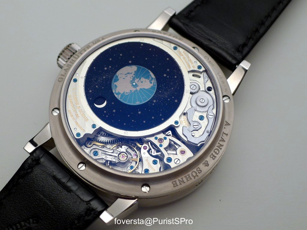
Never forget that the balance wheel symbolizes the sun. So you can see the positions of the moon facing the Earth and the night&day indicator. It is roughly 6pm in Mexico.
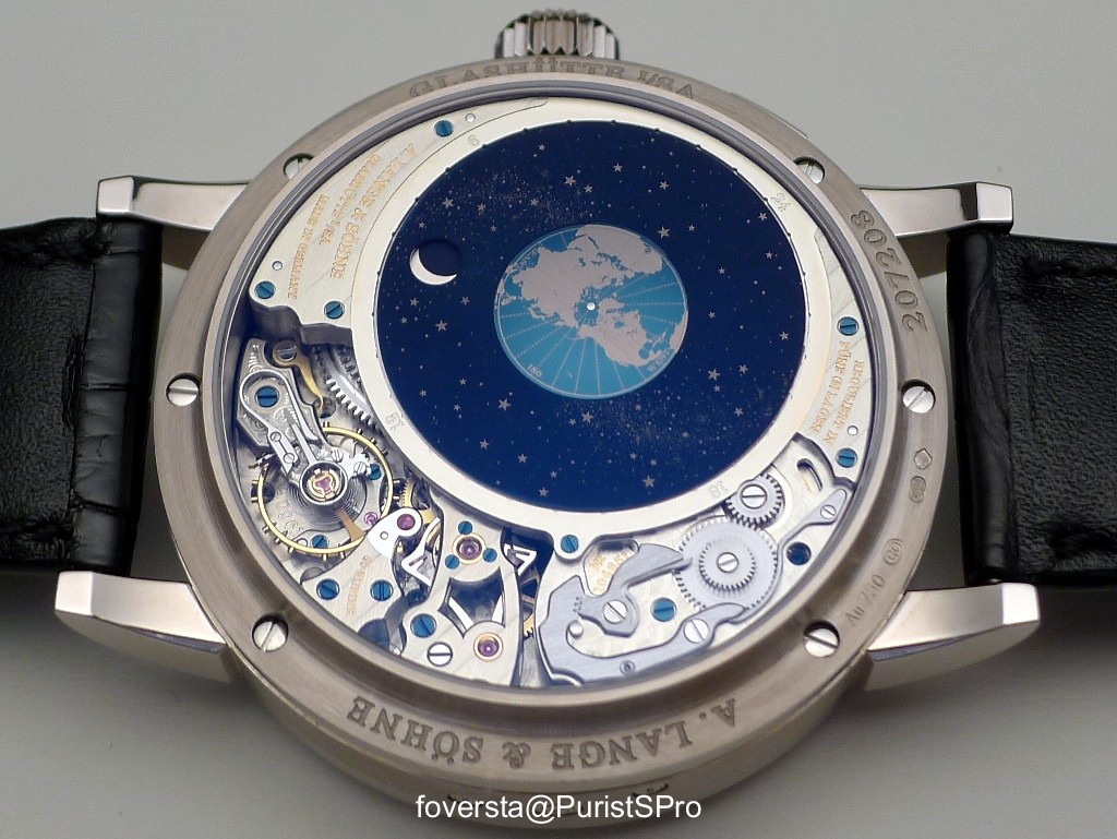
The combo between the finishings of the movement and the beauty of the disk is truly amazing:
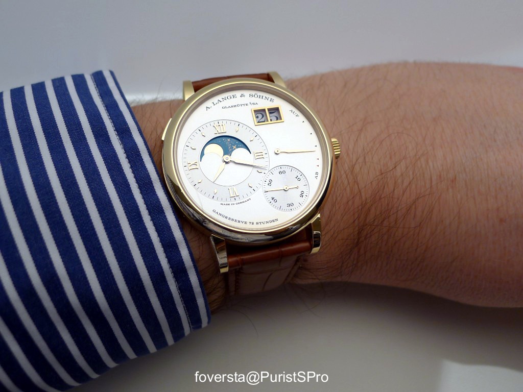
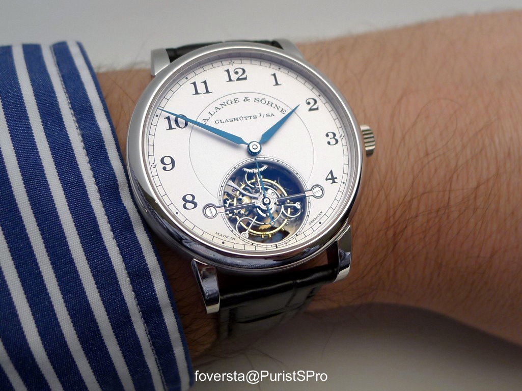
On the wrist:
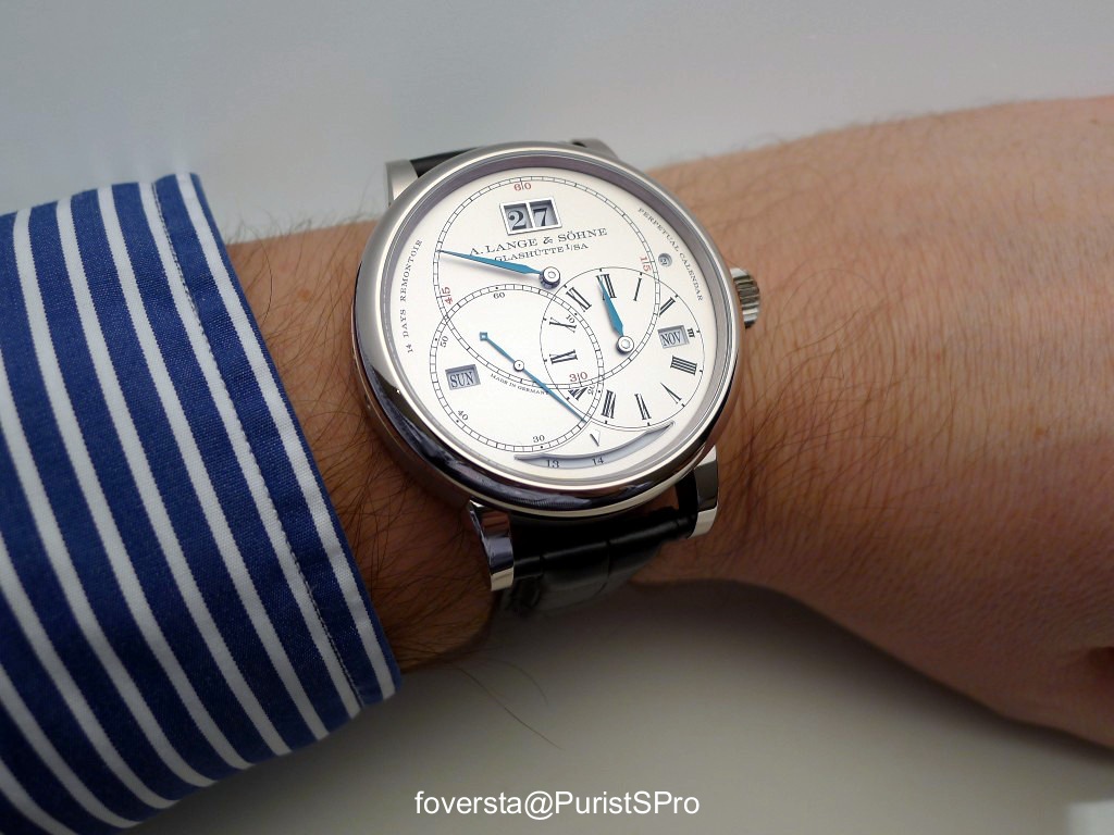
The watch is large and heavy (the case is made of WG but it is also available in PG) and requires to be well put on the wrist to be comfortable:
An intriguing and superb watch but also a bit selfish since only the owner of the watch knows the hidden magic, the celestial disk:
I was under the charm of this superlative watch which is another proof of the skills of the Lange Manufacture. I would have preferred it without the PC complication (a simple regulator dial like the pocket watch would have been stunning) but the combo of complications is truly amazing.
Some data:
Case: WG, PG
Diameter: 45,5mm
Height: 16,5mm
Power reserve: 14 days
Handwind movement, 787 parts and 80 jewels
Pros:
+ a superlative watch at the level of the skills of the Manufacture
+ the beauty of the celestial disk
+ the long power reserve, perfect in the context of a PC watch
+ the discreet power reserve display
Cons:
- the dial may be confusing and needs time to get used with it
- I would love to wear the watch upside down...
This message has been edited by foversta on 2014-01-26 07:46:28

As you do, I love this dial
I was about to add this size as an issue but...
So I preferred to keep a neutral point of view here.
Thanks Mark!
Fx

Hi FX. thank you for the nice review and pictures....
To me the SIZE is THE BIG issue. We are talking wrist watch not pocket watch! I kind of understand brands like U-Boat for example making huge watches as trendy object showing the time but these are cheapish I believe and for a different market. Now when we are talking L&S making exquisite, expensive and complicated horological instruments, I would expect something more classy. The size alone, to me, shows a lack of class which is very unusual for L&S. As a pocket watch it would be very nice indeed. Although I find the dial to "busy" I really love the back complication, it is as I said exquisite and beautiful.
Cheers
Francois from Down Under

Thank you for the pros/cons summary...
You are right, the watch is rather thick.
But the celestial sky is worth of the effort!
Fx

As a lover of celestial skies,I love the back of this watch..
Thanks a lot for your comments Mo!
The Terraluna dial is busy but once you are used with it, it works fine at least for me.

Best.
Fx
Great Engineering with an uninspiring Dial Design
A brilliant caliber that truly sets apart Lange from the crowd. But IMHO German engineering has overshadowed design from an aesthetic perspective.
So what is wrong.
Here goes...
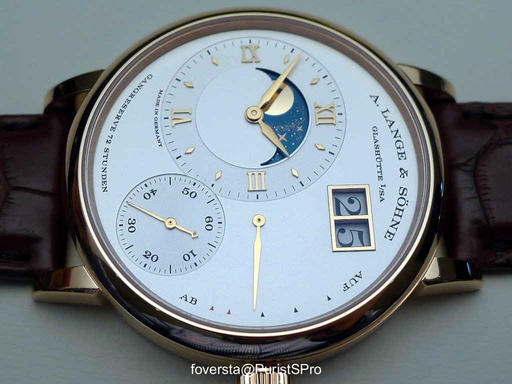
1. Three literally intersecting registers. One has to simply let the minute hand reach the 20 - 30 minutes position when the hour hand is in the 10- 1 O'clock position; Combine with the seconds hand between 8 - 18 seconds position. A veritable chaos of overlapping hands and a sight that may not be the prettiest. Also the minutes register track does not have the number markings for 5 minute intervals, making it difficult to actually read off the exact minute at a glance. You may wish to try reading the minutes register and check if you can make out instinctively that it is at the 51st minute in Peter's image. I believe that Lange chose a regulator display layout essentially to enhance readability of hours minutes and seconds at all times and the effect here is the opposite.
2. The two window displays for day and month - Too small and seem too far apart, given the over dominance of the three interlocking registers. The oversized date in fact makes the other two apertures look smaller in relation.
3. The power reserve indicator at 6'O clock will perhaps only confuse the viewer with a linear set of numbers again!
4. The number of announcements cluttering the dial serve to add to the confusion - " Lange & Sohne", "Glashutte I/SA"; "14 Days Remontoir"; "Perpetual Calendar"!!; "Made in Germany". I really cannot imagine if any buyer that knows this watch (and I am sure a discerning one) will need to be reminded on the dial that he is looking at a perpetual calendar that has 14 day power reserve and has a constant force escapement. I am surprised that Lange chose to do this when refined understatement has been their hall mark.
Since the actual production pieces may still be some months away, perhaps it is not too late for Lange to revise the dial so that a brilliant piece of work is not let down simply because of a poor dial design. Lange has contrived to make their dial look like a Jacquet Droz..
Regds
Narsi
Thanks Narsi about your detailed comments!
Best.
Fx
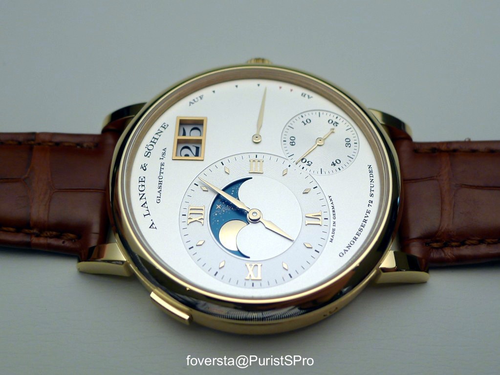
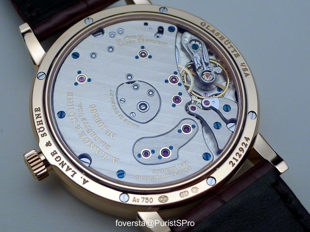
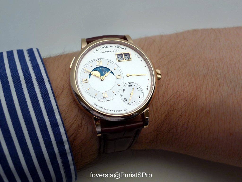
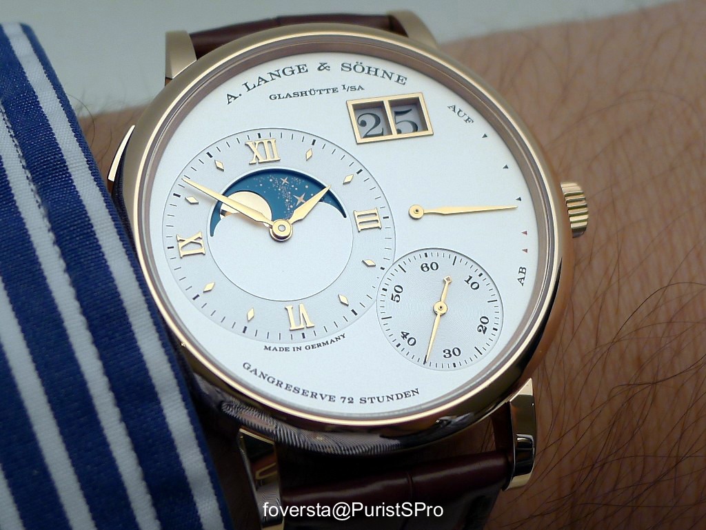
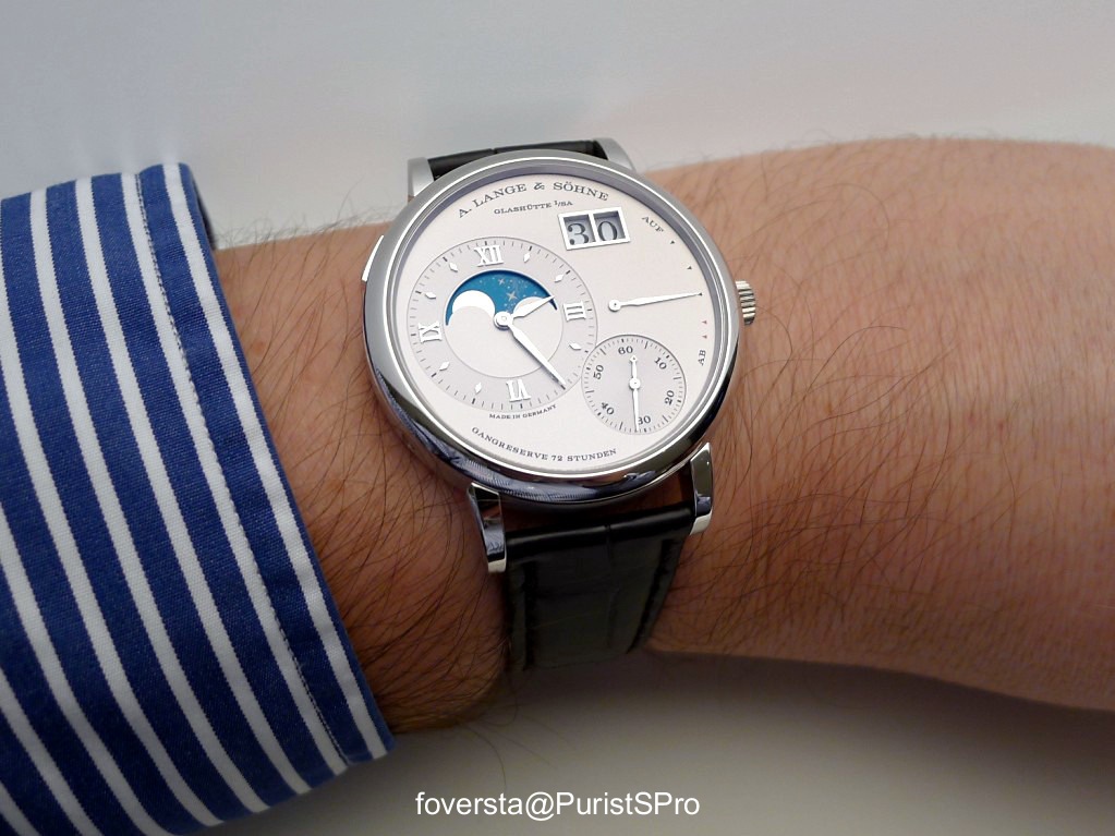
Part 3: Grand Lange 1 Moon Phase
For the comprehensive presentation of the watch, click on the link below:
alang.watchprosite.com
The Yellow gold version:
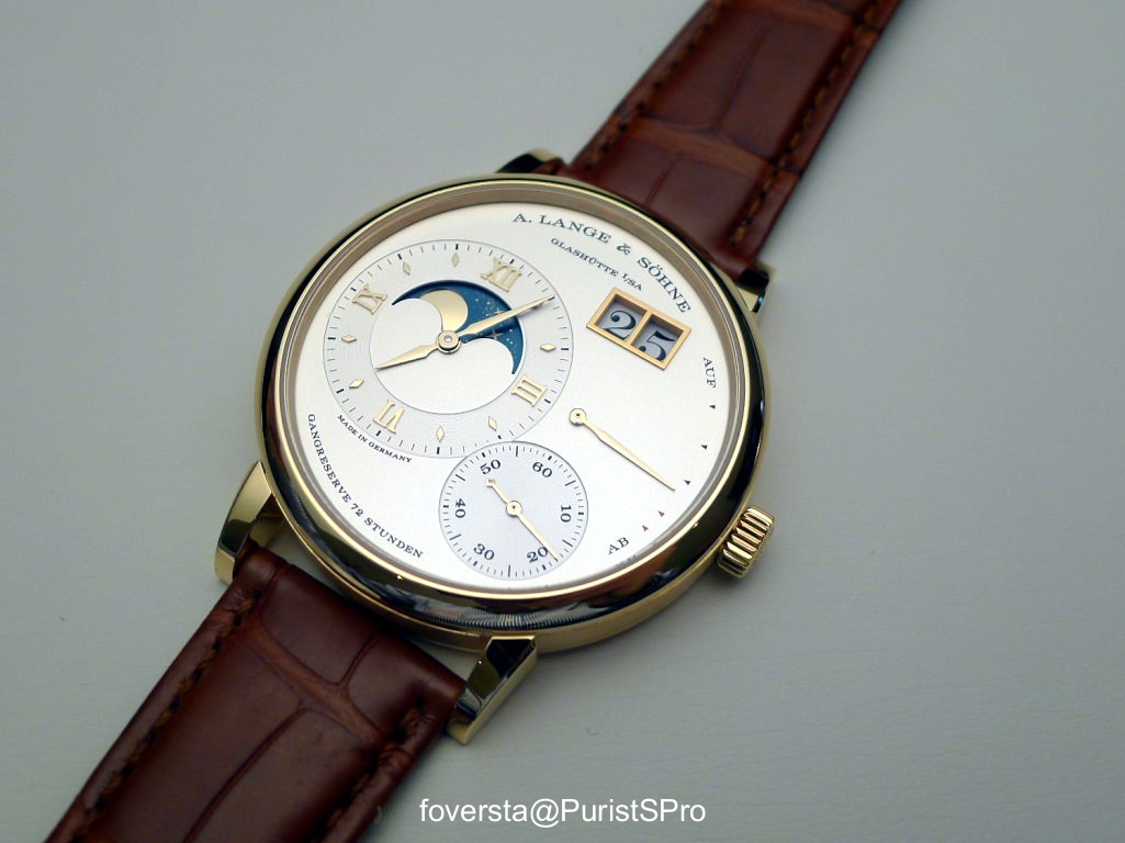
The Pink Gold version:
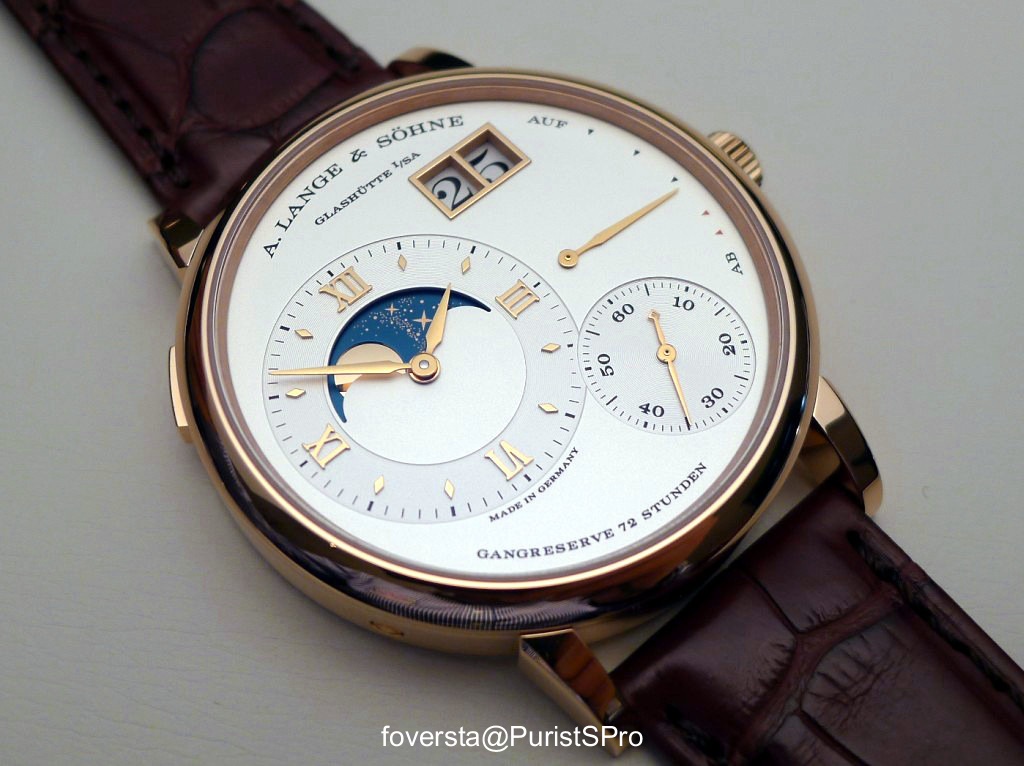
The Platinum version:
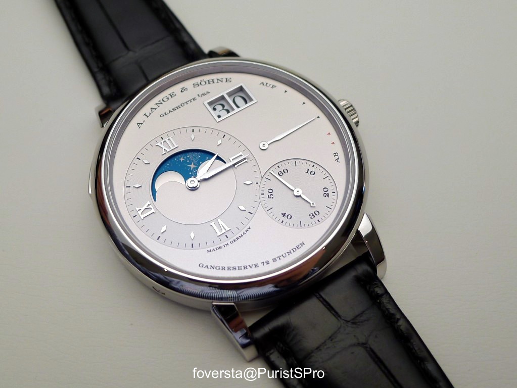
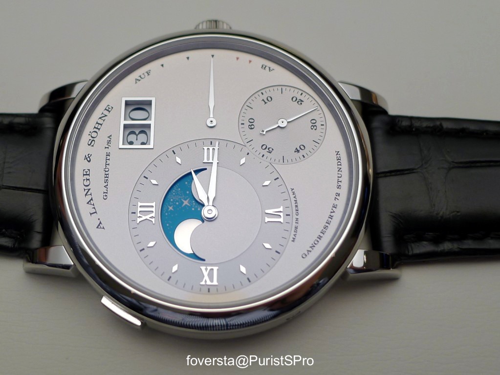
Some data:
Case: PG, YG and PT
Diameter: 41mm
Thickness: 9,5mm
Power Reserve: 72 hours
Handwind movement, 446 parts, 45 jewels
Pros:
+ a great use of the assets of the Grand Lange 1 (slender and elegant style, balanced dial)
+ an unusual location for the Moon Phase display and the size of the disk
+ the decoration of the Moon Phase disk
+ the continuous Moon Phase display
Cons:
- the zone below the display is a bit too empty for my taste.
Pros or Cons?
+/-: the luminous hands of the Lange 1 Moon Phase are replaced by classic hands. What we gain in terms of elegance, we lose it in terms of character.
"the zone below the display is a bit too empty for my taste"
They could have put "Moon Phase" just to be sure to be sure
Cheers
Francois from Down Under
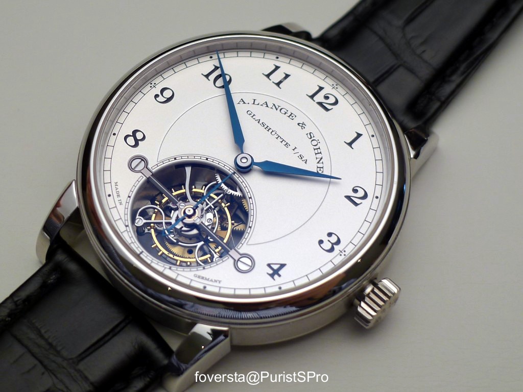
Part 4: 1815 Tourbillon
- the stop-tourbillon (unveiled with the Cabaret Tourbillon)
- the zero-reset of course offered by each and every Sax-O-Mat movement but seen for the first time in a handwind movement at Lange with the Richard Lange Referenzuhr.
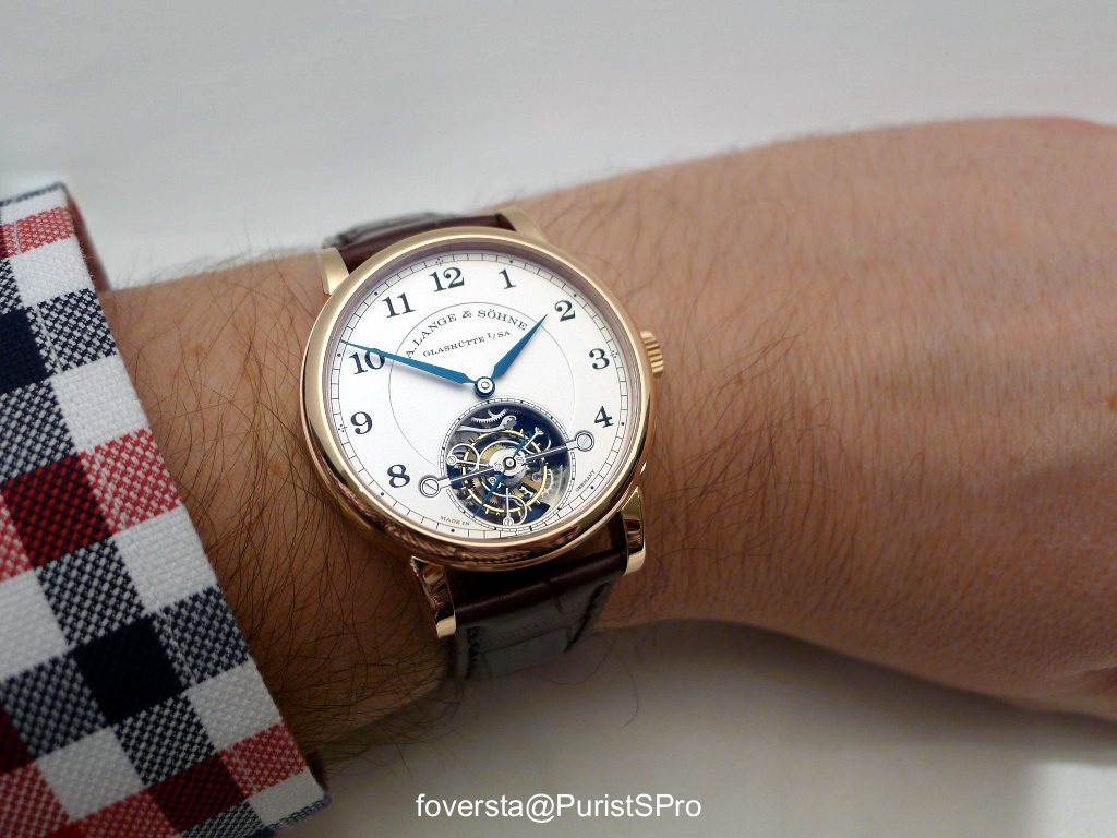
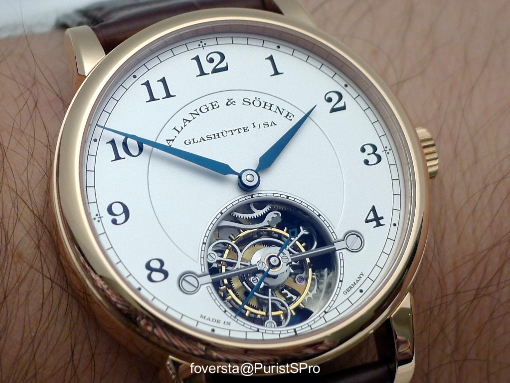
The 1815 Tourbillon is a very classic watch at first glance (diameter of 38,5mm, usual 1815 features (railroad, arabic figures, Alpha hands), the way the Tourbillon is displayed) but I could appreciate the large opening on the dial which allows to have a clear view on the Tourbillon despite the overlapping bridge.
Without any doubt, the main asset of the watch is its flawless finishings and the feeling to handle a watch which symbolizes perfectly classic and fine watchmaking. On the other hand, I was not surprised by its design and if you would asked me to imagine what could be an 1815 Tourbillon, I think that I would have been close to this version. The lack of surprise is not a problem by itself but despite its overall quality, the watch lacks the little something to become fully desirable. But it will fulfill the expectations of the collectors who look for a watch which strictly follows the path of tradition.
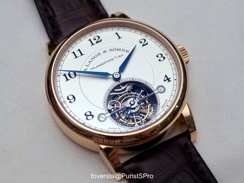
The Platinum version is my fav one:
The large opening on the dial allows to take advantage of the Tourbillon behaviour The finishings of the Tourbillon cage are perfect.
Pull the crown and the Tourbillon stops and the second hand goes instantaneously to zero in order to set the time with precision:
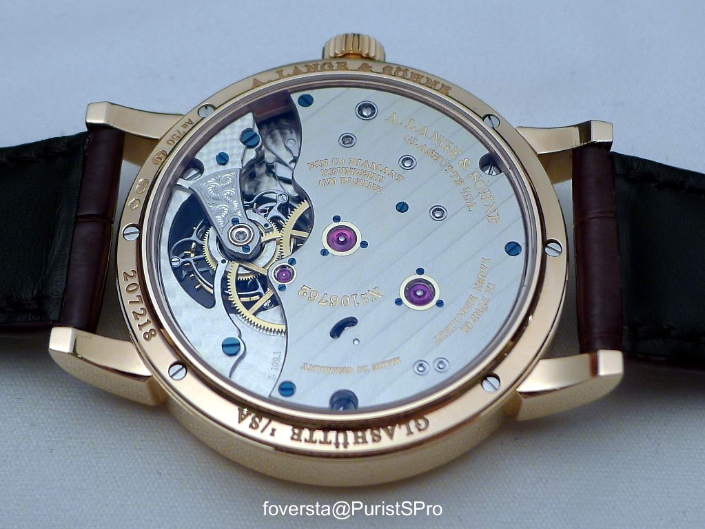
The movement with the diamond endstone:
You will notice the large chatons and jewels:
On the wrist, a balanced watch with a perfect size (39,5mm):
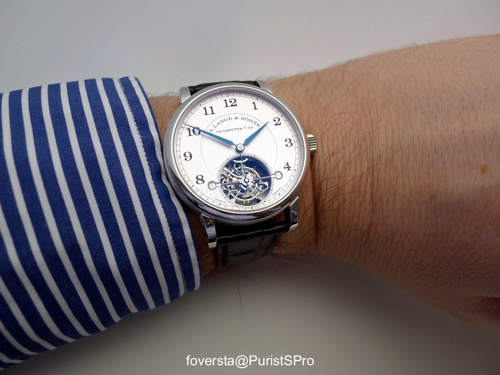
The PG version:
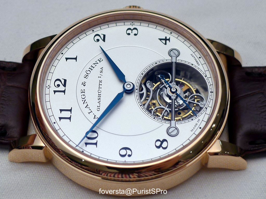
The Tourbillon does a full revolution every minute but it features a second hand to take advantage of the stop-tourbillon and of the zero-reset:
Despite its indisputable qualities, I was not as attracted by this watch than with the Richard Lange Terraluna. Maybe it is because its design is without any surprise. On the other hand, seeing the Tourbillon stop and resume its revolution brings a lot of pleasure.
Some data:
Case: PT (100 pieces), PG
Diameter: 39,5mm
Thickness: 11,1mm
Handwind movement, 262 parts, 20 jewels including 1 diamond endstone
Pros:
+ the combo of the stop-tourbillon with the zero-reset
+ the large opening which allows to observe the superb Tourbillon cage
+ a balanced size
Cons:
- the watch lacks some surprises especially when it comes to design
This message has been edited by foversta on 2014-01-26 08:08:50
A normal 1815 looks just as good to me...

Idea of Terraluna is great,not the complication. Still: 1815 tourbi my fav
Thanks again for the stunning pics.
As mentioned: the Terraluna's complication is not that breath-taking as not difficult to realize.
The idea to have it was genius.
Regarding 1815: I can hear from your comment that it is possibly a bit on the big side?
A great show from Lange this year again!
Best
Moritz
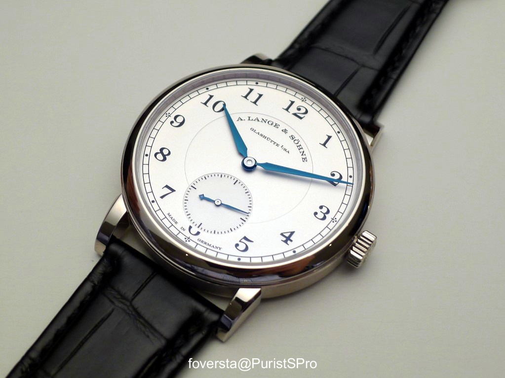
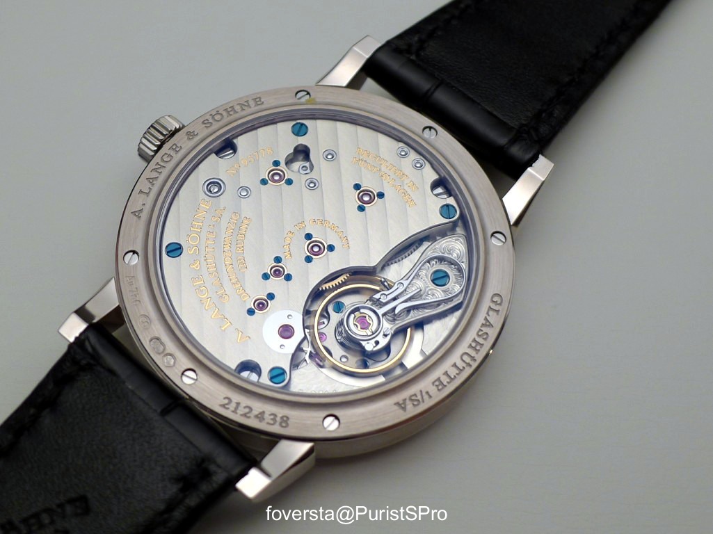
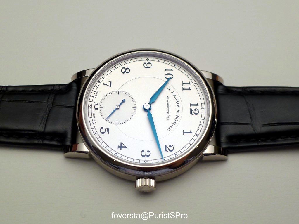
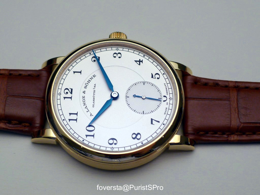
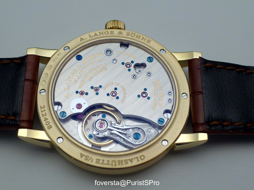
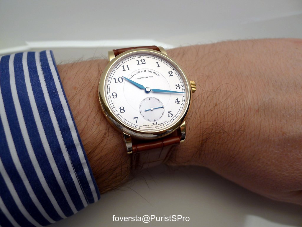
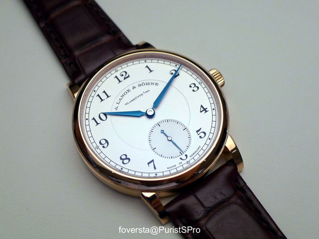
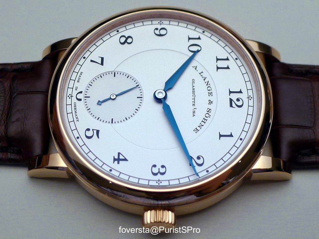
Part 5: 1815 (38,5mm)
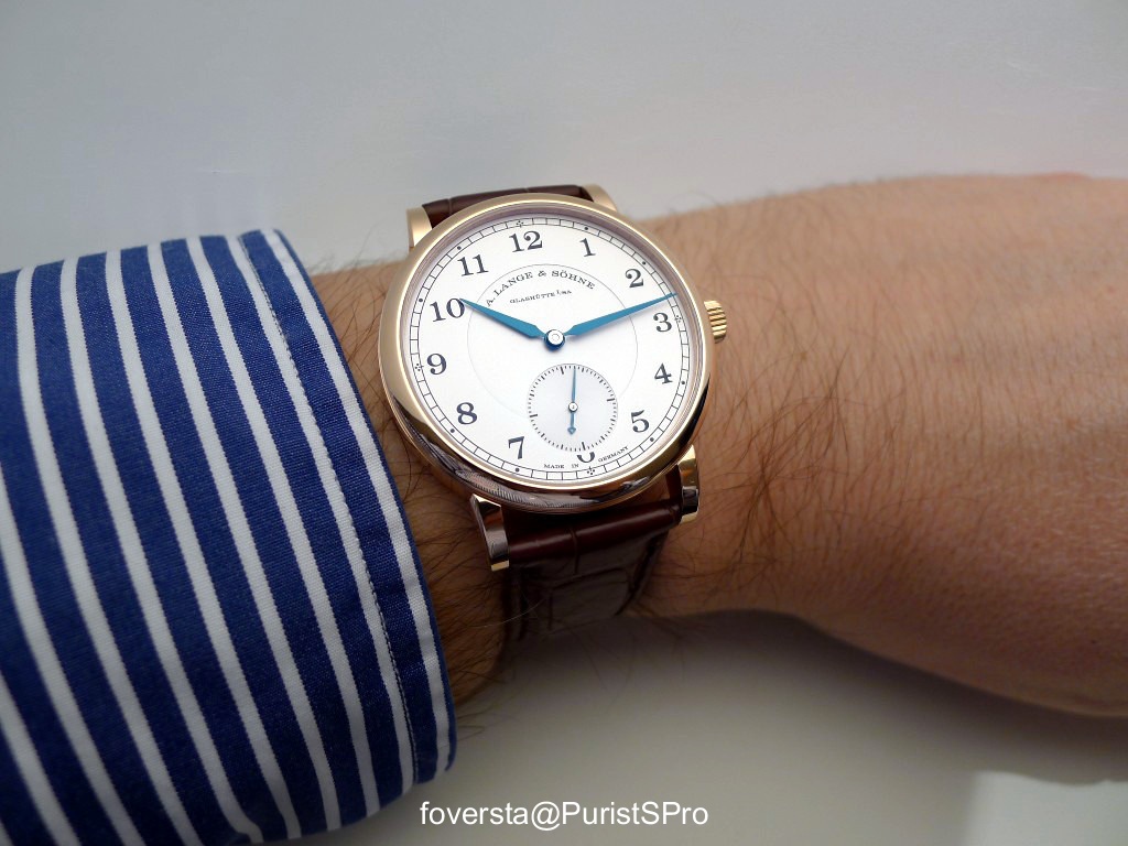
This 38,5mm 1815 is available in PG, YG and WG.
Thanks to its reduced size, it has a very balanced design and it becomes more "dressed and elegant" than its 40mm sister.
The WG version:
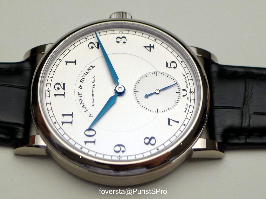
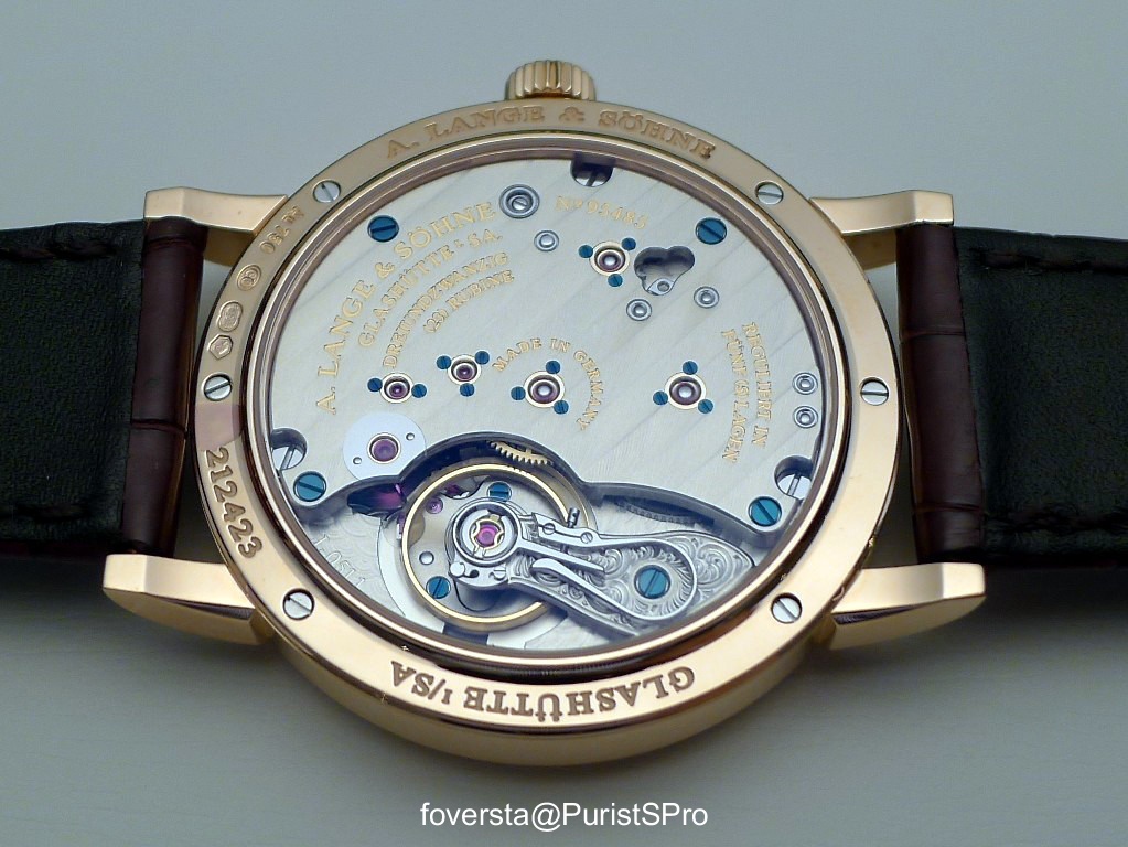
The movement, the L051.1 is the same than the 40mm version and so has a 3hz frequency and 55 hours of power reserve. I love to wind this movement, it gives a lot of nice feelings:
The Yellow Gold version:
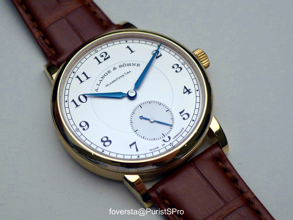
The Pink Gold version:
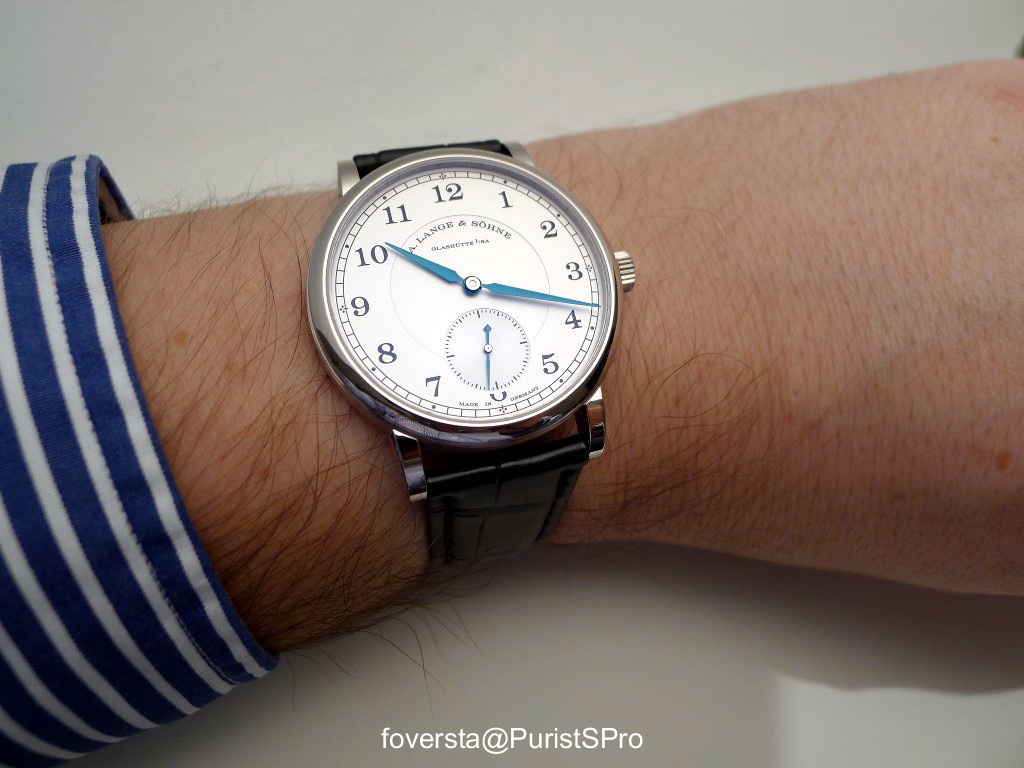
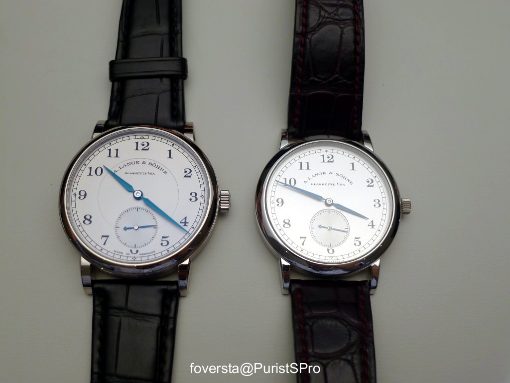
The picture below shows you the new version on the wrist and the 36mm version, the first 1815 (here in its Platinum version). As you can see, 2,5mm more are already very significant.
It is the reason why 38,5mm are, in my humble opinion, large enough due to the purpose of the watch.
I was seduced by this version which is more elegant and more subtle than the 40mm 1815. The question I have is to know if in the future both matches will remain in the catalogue. It is currently the case. And would be the impact on the Saxonia? Lange has to be careful with its entry-level collection and not to propose too many watches in a similar segment.
Some data:
Case: WG, PG, YG
Diameter: 38,5mm
Thickness: 8,8mm
Power reserve: 55 hours
Handwind movement, 188 parts, 23 jewels
Pros:
+ a perfect size for a dressed watch
+ the pleasure to find again the L051.1 and the feeling when I wind it
+ the shape of the new case
Cons:
- Lange needs to rationalize its entry-level segment because with the Saxonia and the 1815 40mm, several simple handwind watches are available now.
An interesting offer...finally.
Thanks Mark.
Thanks!
Fx
38 vs 40
Thank you! I really like this one, and am glad they now have a larger crown than the 36mm [nt]

I find that...
Thank goodness the 40mm remains in the catalogue...
Only time will tell Patrick!
Fx
Extremely nice, thank you FX, the 38.5mm size...
fits this time keeper much better and is more in keeping with the elegance and simplicity of the product. From my point of view of course
Cheers
Francois from Down Under
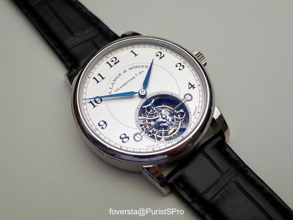
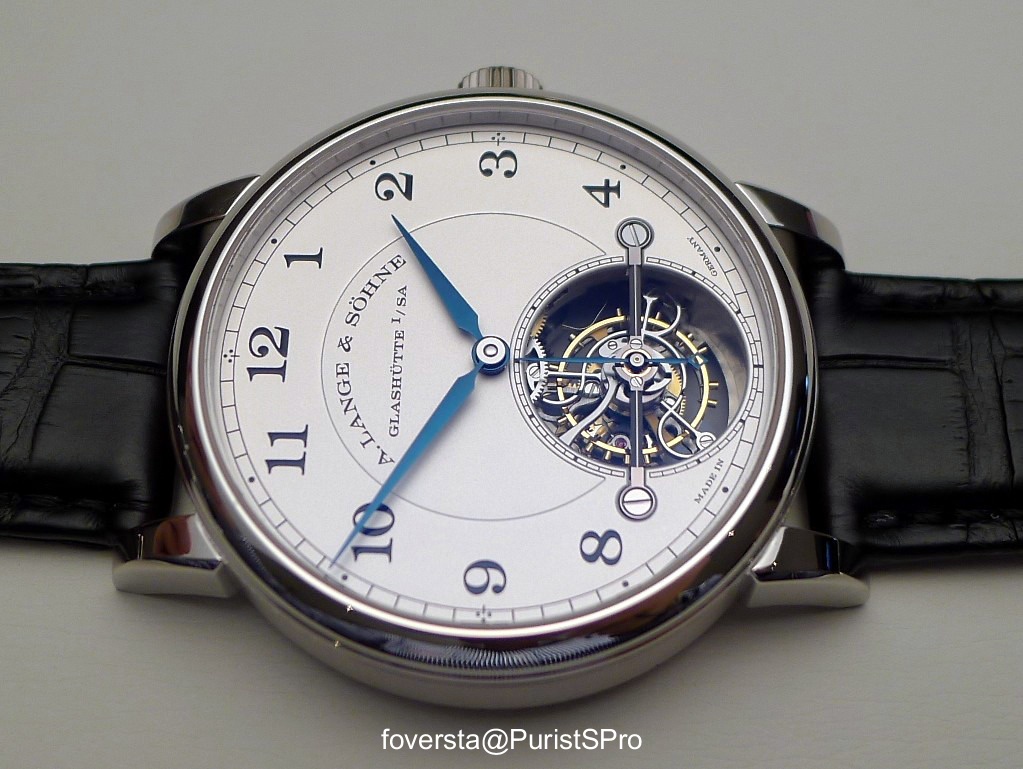
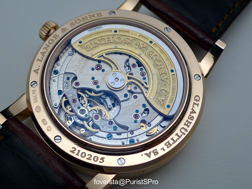
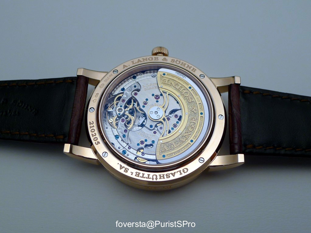
Part 6: Lange 1 Tourbillon Perpetual Calendar (PG)
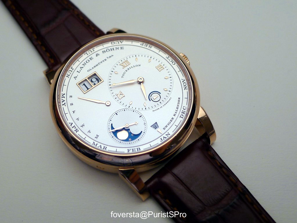
Only the Tourbillon written on the dial reminds us the presence of the complication:
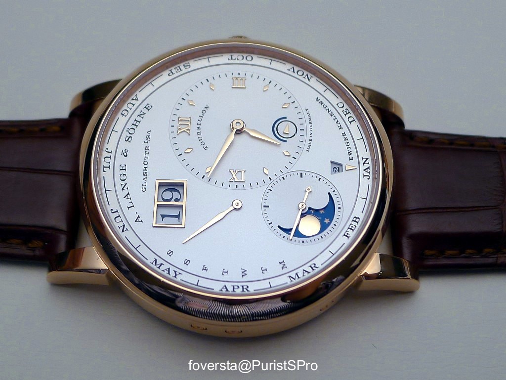
The watch uses a central rotor automatic movement. The choice of a central rotor was made to make the movement as thin as possible.
On the wrist, still a very legible dial despite an original lay-out:
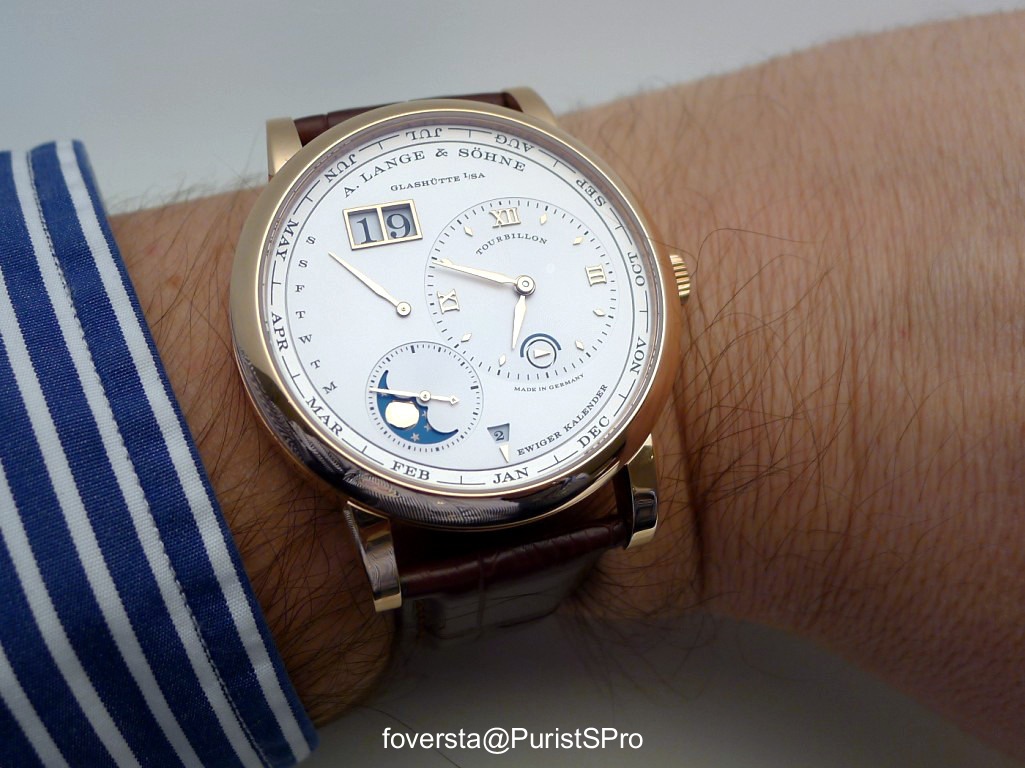
Some data:
Case: PG
Diameter: 41,9mm
Thickness: 12,2mm
Power Reserve: 50 hours
Automatic movement, 624 parts, 76 jewels
Pros:
+ the warm touch of the material
+ still an impressive watch which takes advantage of the Lange 1 dial lay-out
+ the instantaneous jump of the data
+ a very legible dial
Cons:
- the power reserve is short for a PC watch but a winder can be used of course