Tony C.
1239

I tend to agree...
with Ben. Placement, font size and style are important variables, and can make all of the difference in whether or not I find a double signed dial to be attractive.
Here's one that I believe works well. (I don't know the source, so if the owner of the image would like it removed, please contact me.) 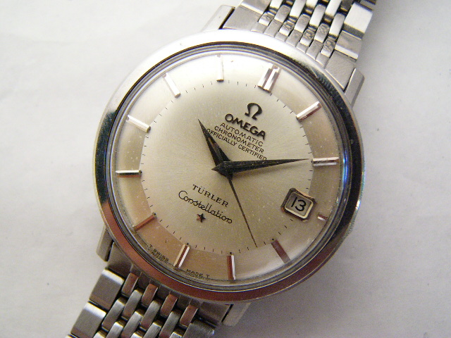
Double signed Dials ..... what are your thoughts ?
Hello everyone... GregB brings up a good point... When you see a watch that is double signed , an Omega with a Tiffany Co signed dial... Are you more attracted to that example or one in the same condition that is not double signed ? Here is an example fro...

when printed on..
..a (pocket/ wrist) watch from the period between the two world-wars Bill, it can sometimes be charming. On this Rg however it looks a bit like a ridiculous 'afterthought' - much too close to the brandname and wrong typo font + way too large. I would almo...
here is another one.....
Hi Ben this is an uncommon steel seamaster (same as a Seamaster XVI but in steel!). good hunting Bill...
I tend to agree...
with Ben. Placement, font size and style are important variables, and can make all of the difference in whether or not I find a double signed dial to be attractive. Here's one that I believe works well. (I don't know the source, so if the owner of the ima...

As far as I know
Hi Bill, as far as I know there is some appreciation of "Tiffany" or "Serpico y Laino" and other co-signatures on Patek Philippe as I experienced myself (have a couple of Pateks besides my Omegas). I don´t know how it is in other brands.....

love 2X
As I have 4 of these 168.023 and 166.032 Seamasters, I would love to have a double signed, such as your Türler. You've chosen an example that is a great watch

value added?.... it depends...
at one time, i also wanted and tried to hunt for double signed dial Omega... i personally found it very interesting and thought it must be relatively rare out there.... i think i am just a very typical thinking as a vintage watch collector who likes to lo...

For those who collect the branded watches...
Maybe. While I don't own any Omegas like this, I have collected watches like the Bulova Accutron, that had a good part of their business doing custom printed dials for companies. These were often the "gold watch" that one received after retiring from 20+ ...