
Mitch K
2576

Saw posting about this piece but was amazed at how much I like it when I saw it in the metal.
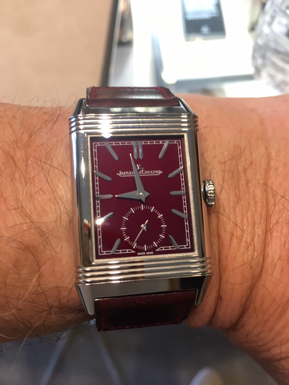

The deep burgundy red is fantastic.
With projects upcoming do I dare?
Saw posting about this piece but was amazed at how much I like it when I saw it in the metal.
The deep burgundy red is fantastic. With projects upcoming do I dare? ...


The blue dial is nice but frankly blue in its various shades is the color of the year. This read is richer and with the strap calls to me so much louder then the blue. Of course it’s a matter of personal preference. Also with the blue dialed piece I have
no other blue in this line will take its place b

Relative to the 1931 Rouge
-the hour hand indicator is asthetically not pleasing vs sword hand of rouge -the circular vs rectangular subs seconds loses its Art Deco feel -the x2 JLc logo is redundant, less is more -makes the Reverso Rouge even more desirable Photo credit included ...


Like that lie-de-vin dial color a lot. But is the strap too “matchy-matchy?”
I wonder whether a complementary (rather than matching) strap color would set off the dial to its full advantage. Ano “Mr. Burnt Sienna plus two parts Chartreuse and a touch of Cerulean ;-)” Nuevo
True. It’s easier to change the strap than to repaint the dial!
Hmmmm...Burgundy with chartreuse...Sounds like something Natalie Kalmus would love. Ano “Bring back the 1953 Technicolor palette, please” Nuevo
Sorry, Mitch, but a chartreuse strap doesn’t work. 😢😢
Ano “Why, yes, I AM a PhotoShop expert!” Nuevo 🤡 ...
Don’t sue me, please, Mitch!
Do I get to try the “Imitation is the sincerest form of flattery” defense? Oh, if only I knew a qualified French avocat who would take my case...Anyone??? Someone smart, mais pas trop cher. 🏦 Ano “I throw myself upon the mercy of the court” Nuevo 🏛 ⚖️ Pos...
..
Love the dial colour, but agree with comments above regarding strap colour, something with more contrast could set the dial of better.