Morten
23

5170j and some "blue" dial Pateks
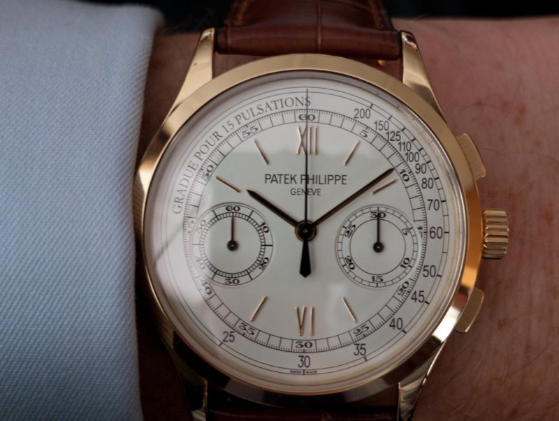
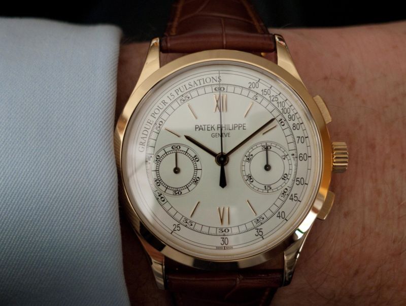
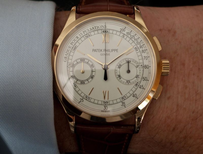
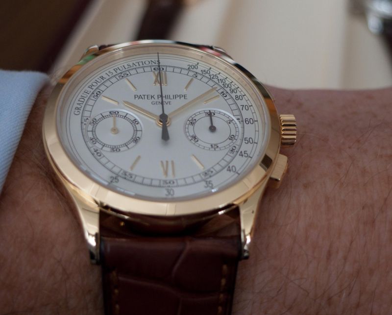
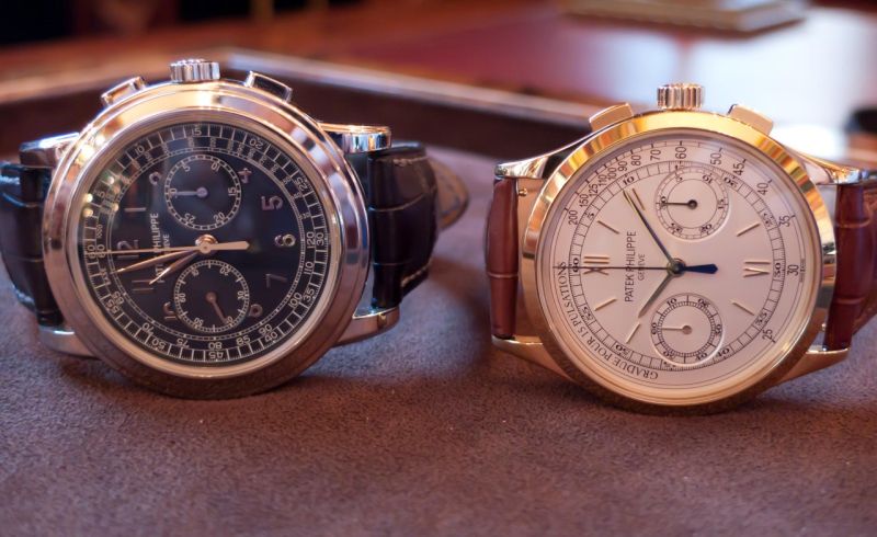
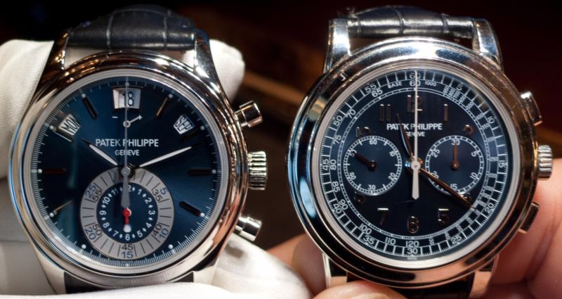
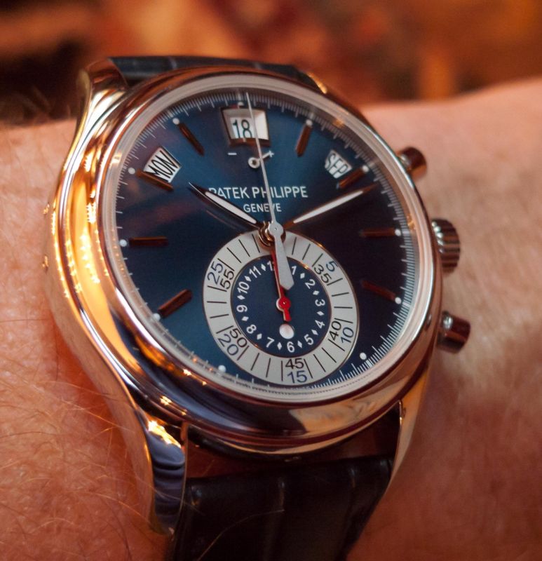
Recently I got the chance to see the new chronograph 5170j on a couple of occasions. I was very curious as the official Patek photos looked like they were computer renditions and other published photos either were taken in harsh lightning or with poor white balance. I appearance in the metal were, not unexpectedly, very positive. It is a very nice classical chronograph. The look is quite different from the 5070 but and it would be nice to have both. I took a few photos in slightly varying lightning situations and you can see how the appearance subtly changes. Technically the photos are not good as they are taken handheld in available light with a simple camera, but I hope they will give a hint on what is to be expected.
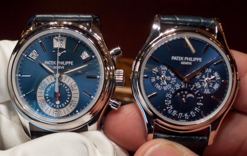
I particularly like the blue colours offered by the current range of Pateks. I think I captured the colour nuances of the new 5960P. The fact that the centre of the chrono subdial is also blue makes it more harmonious to me than the grey and dial platinum and the red gold version - a very nice watch. The perpetual calendar 5140P is also extremely appealing.

Collection
Patek Philippe 5170P: A collector's first impressions of the platinum chronograph with black and blue dial and diamond markers. Includes wristshots.
37 replies7088 views

Collection
Explore anaroku's journey with Patek Philippe black dial watches, from the 5140P to the 5370P, discussing legibility, design, and collector insights.
9 replies4206 views

Discussion
Explore the debate between Patek Philippe's Lemania-based chronographs (5070) and in-house movements (5270). Collectors weigh in on technical merits, aesthetics, and market trends.
29 replies8567 views
5170j and some "blue" dial Pateks
Recently I got the chance to see the new chronograph 5170j on a couple of occasions. I was very curious as the official Patek photos looked like they were computer renditions and other published photos either were taken in harsh lightning or with poor whi...

Many, many thanks for sharing these magnificent pictures !!!
Blue sunburst used in a PP works always perfect, no matter what watch ! Very nice posts, both ! Regards Moritz

For a true blue check out the FP JOURNE CHRONO BLEU
I have seen all the pateks but the fpj dial is mesmerizing


I could never feel blue with that blue...
I really like that 5070P. Good heavens I like that watch!

Always better in person
I've always been impressed as to how Patek timepieces generally always give a more positive impression on the wrist than in press-release or official pictures; your first four photos really convey the "live" experience beauty of this watch. Thanks for pos...