
Review
Jrwong23 (aka watchthebin) provides a hands-on wrist review of the Montblanc Star Twin Moonphase, a new reference introduced at SIHH 2014. He shares his evolving impressions of the watch, from initial skepticism about its asymmetrical dial and 42mm size to a growing appreciation for its intricate details and comfortable wear.


In SIHH 2014, Montblanc has added a new reference to its Star collection, the Star Twin Moonphase.
An introduction of this watch can be found in my previous post here:
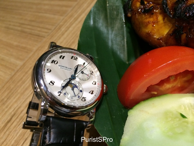
The main theme of this watch is a poetic and timeless complication, the moonphase. What makes it even more special is the twin moonphase function, which means the watch displays how the moon looks from both the Northern and Southern hemispheres.
I have the good fortune to receive this watch (not out in boutiques yet, at least in Singapore!) for a wrist review recently, thanks to Montblanc global HQ and Montblanc Singapore.
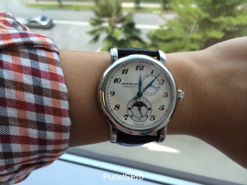
My first impression of this watch, to be honest, was that whilst it looks elegant and feels nice with a balanced wrist presence, it didn’t excite me at first glance. Perhaps it looked a bit too big on my small wrist. Perhaps I was not used to its asymmetrical dial. Perhaps I like pure classical designs more than avant garde designs. I am not sure what exactly was it but it didn’t excite me at first glance, although I could appreciate its overall elegance.
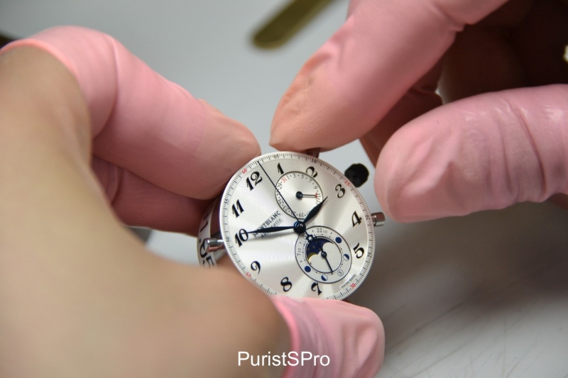
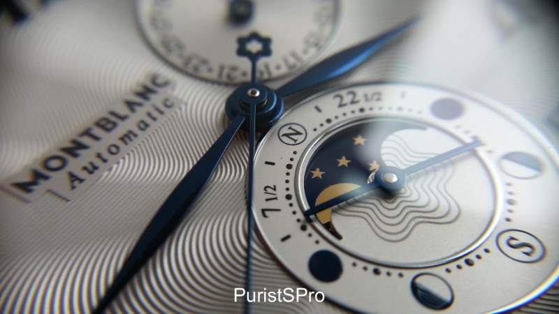
However, after spending a few hours with it on my wrist, I started to appreciate the finer details of the watch, especially the very beautiful guilloche dial, the blued Feuille hands and the details on the twin moonphase. I tried to take some macro photos to bring to life these features and will share them below. It wasn’t love at first sight I admit, but within a day on my wrist, I started to like this watch more and more. It also felt very comfortable to wear and I started to get used to its case size at 42mm, especially for a more casual look.
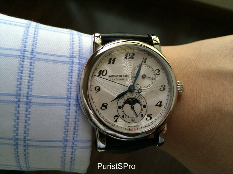
I had this watch over 10 days and wore it almost daily (except for the hot weekends in Singapore when I am outdoors). I found that the watch, like most references in the Montblanc Star collection is causal enough to wear with jeans and also formal enough to wear to the office with business attire. It is not a formal dress watch for say, black tie events, as it is considered too thick and complicated (looks of the dial) but for 90% of occasions, this watch is versatile enough. It even goes well with berms and tees!
Gradually over the next few days, my love for the watch developed as I started appreciating its finer qualities more and more. The aesthetics of the watch, including the asymmetrical dial design also started to sing to me as I find it quite refreshing and bold vs being predictable (which is rare for me as I am very much into dial symmetry). In the end, the dial’s looks won me over. My only small complaint will be the date sub-dial overlapping the numerals ‘1’ and ‘2’ but it is not a major issue for me as I also love the details on the date sub-dial. The date sub-dial is highly legible and I didn’t have problems reading the date from the watch when it’s on my wrist.
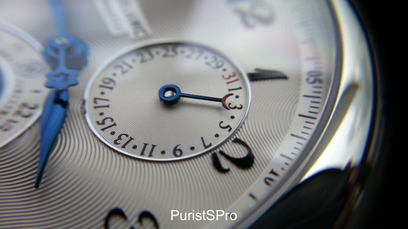
Blued date indicator hands with a red crescent – in line with the moonphase theme of this watch. The nice details make up for the date sub-dial overlapping the numerals ‘1’ and ‘2’
After seeing so many different lines in Montblanc’s watch collection, I think the Star line is more avant garde (except for the Star Classique which is quite formal in design) whereas the new Meisterstuck Heritage series has become the classical line for Montblanc.
Let’s look at the watch in more details.
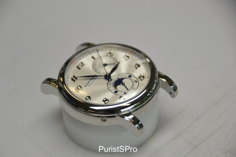
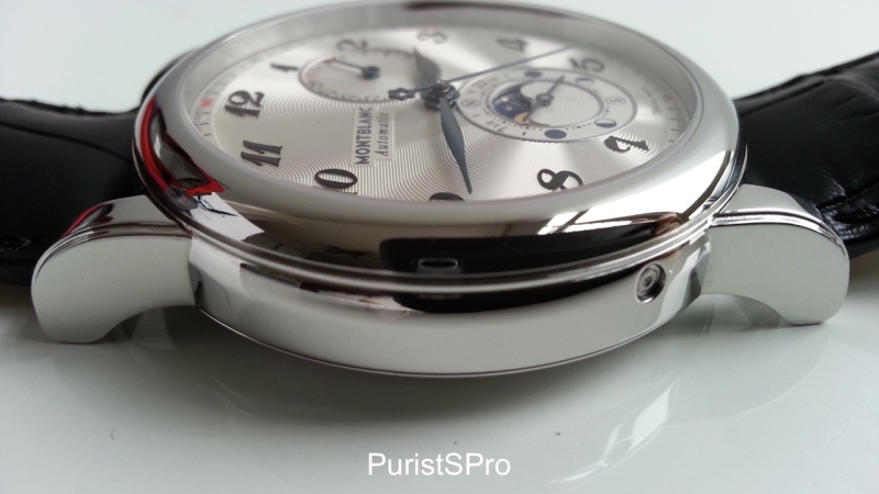
The case and dial design are very consistent to the Montblanc Star’s design DNA which I had covered in an earlier post. The onion shaped crown with the Montblanc emblem, the Arabic numerals on the dial, the feuille hour and minute hands and the round case with the distinctive stepped lugs and domed sapphire crystal. I like it when a reference in a series is consistent with the design DNA and I applaud Montblanc for combining classic cues in its Star line with hints of avant garde design cues.
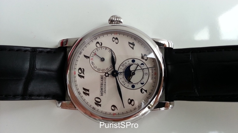
One feedback I made on the Star line was the “over-branding” on the Star watches. Besides the Montblanc branding on the dial and the emblem on the crown, the words “Montblanc” and “Meisterstuck” also appear on each side of the case. In the earlier Star models, the sides of the case were showing the 3 rings of the Meisterstuck fountain pen and hence the labels “Montblanc” and “Meisterstuck” were on each side of the case.
To my pleasant surprise, on this new Star Twin Moonphase, these words on either side of the case are now removed, making the case much cleaner looking from the sides. I like this change a lot and hope that all future Star models will continue this trend. There is no need for over-branding as Montblanc is already a much stronger watch brand today, compared to 1997 when it first started.
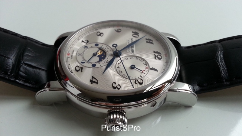
The twin moonphase sub-dial has the Montblanc emblem in the center of it and it is also from here the emblem’s ‘guilloche waves’ radiates outwards to the bezel. I like this feature a lot and the guilloche pattern is nice to look at either up close in macro views or from afar as it reflects lights playfully with different angles.
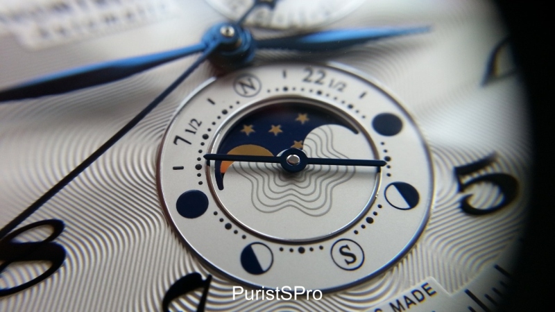
The twin moonphase indicators are very legible and look pretty nice. I can clearly see the moonphase display from both the northern and southern hemispheres. A poetic complication indeed.
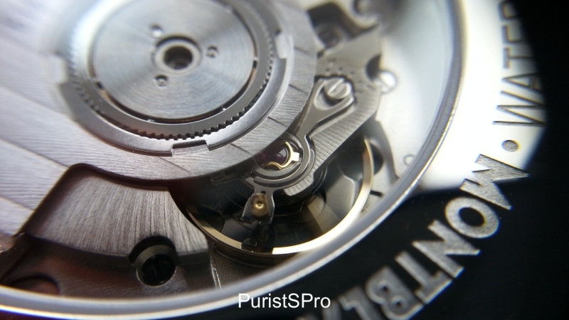
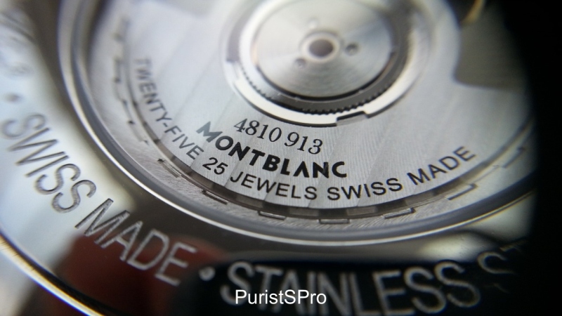
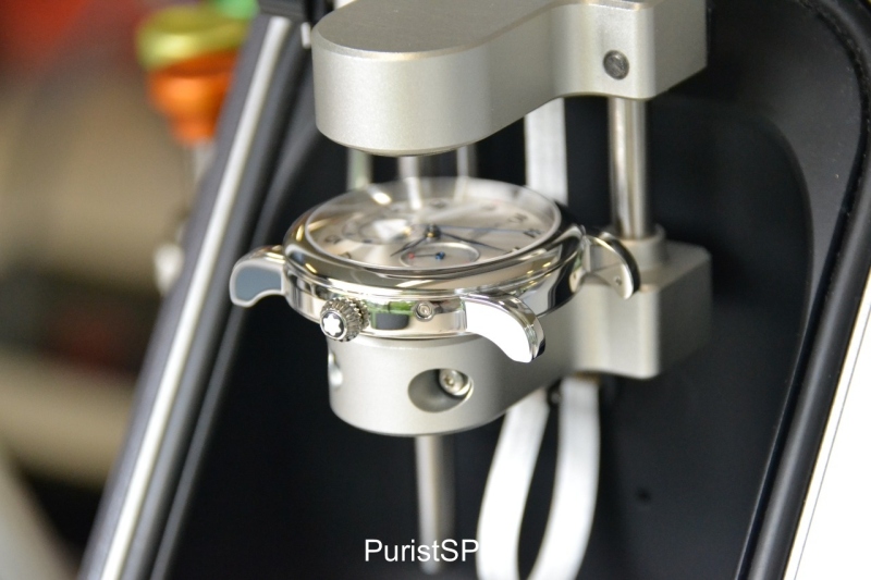
The Montblanc Star Twin Moonphase is equipped with a new movement exclusively used by Montblanc, i.e. the Montblanc calibre MB29.13. The automatic calibre has a Sellita movement as its base, with a Dubois-Depraz module, which is developed exclusively for Montblanc's use. The finishing of the movement is very basic and doesn’t look that fantastic overall to be honest. As the Star collection is positioned as one of Montblanc’s entry level collection and at this price point, I would say it is of an acceptable finish. My macro shots actually made me appreciate the finishing of the movement more, even if industrial and basic (still looks quite nice to me under the lens).
Conclusion
After wearing this watch for 10 days or so, I must admit even though it was not love at first sight, I can see myself attracted to this watch and its poetic complication. The beautiful guilloche dial and blued feuille hands are features I can look at and smile. I like blued hands and the Star’s feuille shaped hands are especially appealing to me, maybe as they are broader in shape and hence brings out the blued hands even more aesthetically.
I did find myself looking at the dial many times whenever I wore this watch. It also sat very comfortably on my wrist, even though it looks a tad too big for my very small wrist (39mm is my sweet case size). A black dial at 42mm would have made it look smaller optically for me. It became my faithful companion for work and lunch/dinners mostly during the review period.
It is an attractive watch, with a twin moonphase complication at an accessible price point. I tend to say the Star collection is the entry level watch collection for Montblanc but from a pricing accessibility perspective, it will face competition from its new sister line, the Meisterstuck Heritage series, which is also very competitive priced. From my observations, I believe both lines have their roles to play for Montblanc’s watch category. The Star line remains distinct with an established Montblanc design DNA with both classical yet avant garde looks. The Meisterstuck Heritage line on the other hand, has very pure classicism in its design DNA and it’s very traditional in looks and feel.
Here’s my overall assessment of the watch:
What I like:
> Good looking watch with an excellent guilloche dial that reflects light beautifully
> Bold and refreshing asymmetrical dial layout and design (something different)
> A pretty rare twin moonphase complication at an attractive price point
> Intuitively positioned pushers for the date and moonphase settings
> Consistent design cues with the Star collection minus the over-branding on the case sides
Areas that can be improved/wishlist for future Star collection watches:
> A smaller case size for gentlemen with smaller wrists, say 39mm?
> Would have been great if the date sub-dial didn’t overlap with the ‘1’ and ‘2’ hour indicators
> Would have preferred the word “Automatic” below the Montblanc label on the dial to be removed.
Hope you have enjoyed this review.
Thank you Montblanc HQ and Singapore for allowing me to review the new Star Twin Moonphase.
Cheers
robin
Not to be overly critical, but I find the positioning of the date layout to be at an odd place. While I can agree with you that a bold asymmetrical dial makes life more interesting, sometimes bold is just not my thing. Functionally, the date dial is at a good place, because sometimes you want the date to be on the right-side of the dial since the watch is partially covered by the shirt cuff on the left; you don't have to go through the full motions of uncovering the cuff. It's shocking this watc
Agree I am mostly a classical watch guy and didn't appreciate the date sub dial's position too. Only after spending more time with the watch did I find it refreshing and different from my other watches and I grew to like the bolder design. Didn't realize it has a functional purpose like you described. Quite true ! Appreciate your feedback Patrick thank you Cheers Robin
If you wore your watch on your right wrist, then that date at the right-side of the dial would have an opposite effect! Sometimes certain designs really grow on me with time. When certain cars came out, I thought they were strange and too modern, but eventually came to like them. Hasn't happened with watches yet, but it probably can!
Glad you shared your thoughts... The Star collection, as a whole, causes different emotions. Some view this collection as a "hold over" from the old Montblanc...and so sadly there is some negative bias. But these watches offer an affordable entry to the "new" Montblanc...perhaps a toe dip for pen collectors who are not used to spending thousands on a watch but want to be loyal to the brand. In the future I'd love to see details "trickle" down from Minerva or some of the newer ideas from messr. G
I know Montblanc fans who are non watch collectors or young watch collectors who appreciate the design DNA of the Star line so I think it has its fair share of supporters. The Star Quantieme Complet is indeed a handsome watch with a very balanced dial. I like it too and I suspect it will have more fans than the Star Twin Moonphase. The Star Twin Moonphase probably caters to a slightly different watch buyer - someone who wants something a little different - a rarer twin moonphase complication wit
... i remember i have seen this watch in internet, but have not had chance to see this one in metal. at the first sight, i quite like the dial layout, especially the off-center dial for the date, not usual design by MB. hope to see this in metal and try it on my wrist, then tell how nice of it! thanks once again for wonderful post. stefan
This thread is active on the Montblanc forum with 10 replies. Share your knowledge with fellow collectors.
Join the Discussion →


