Ornatus-Mundi offers a compelling look at Maîtres du Temps' Chapter Three, a collaboration between Kari Voutilainen and Andreas Strehler. This article delves into how the brand's unique collaborative model evolved, addressing initial skepticism to reveal the distinct contributions of master watchmakers. Readers will gain insight into the design philosophy behind Chapter Three and its innovative approach to integrating complications with aesthetics.
Les Maîtres du Temps (MdT) is a brand I put not much attention to when I first heard of them in 2008. What MdT's CEO and founder Steven Holtzman had in mind was:
"developing teams of outstanding watchmakers who would work together to develop and craft incredible timepieces. Each master watchmaker brings his own ideas, his own style, and his own approach, and by providing the opportunity for them to work together, Maîtres du Temps harnesses and maximizes their incredible talent." [MdT website]
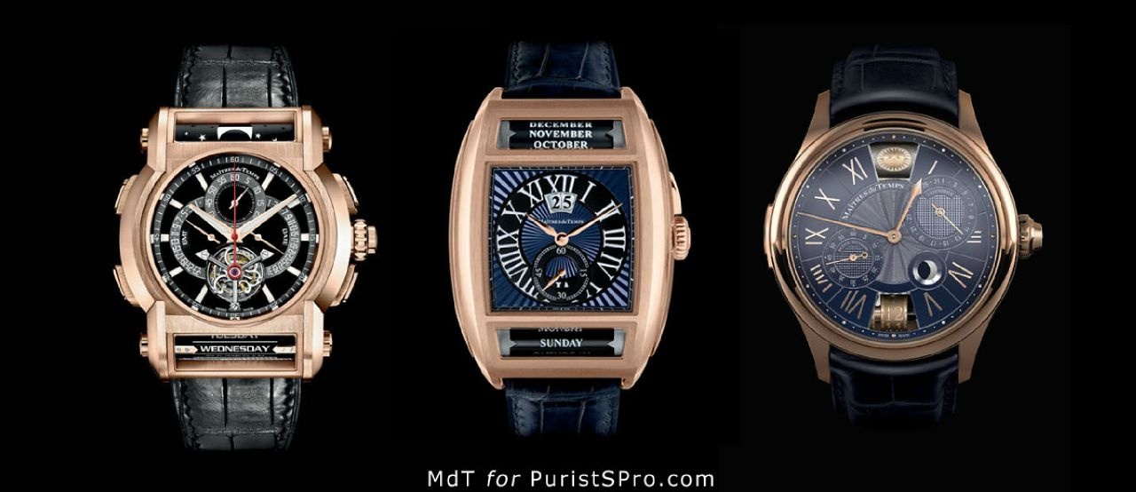
The first two products of this concept were Chapter One (left; a collaboration between Christophe Claret, Peter Speake-Marin and Roger Dubuis) followed by the Chapter Two (centre; Peter Speake-Marin and Daniel Roth):
All of the above a highly complicated timepieces that share one common denominator: the use of a roller to display those calendar functions that indicate longer timeframes, like moonphase or weekday.
But if you look at the watches above you may understand why I had a problem with this new collective: Read the names of the watchmakers and then try to identify their respective contribution to the final piece. Its difficult! In fact have to admit that the watches looked like someone is trying to monetise on famous watchmakers' names. But you need to discuss intensively with Mr Holtzman in order to find out. I did and I was quite surprised what happened behind the scenes. Roger Dubuis for example was instrumental to get the retrograde date and GMT hands, respectively, working perfectly.
Finally, with this year's advent of - and here I come to the topic of this article - Chapter Three (top right; devised by Kari Voutilainen and Andreas Strehler) the fog finally vanishes and I saw much clearer! Chapter Three is devised as a new solution in the eternal struggle between function and aesthetics: The appeal of a watch in terms of complications is often in an inverse relation to its design appeal!
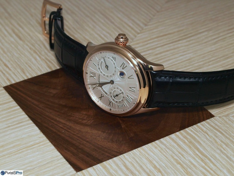
Upon the first view already one could attest to the successful implementation of the latter objective:
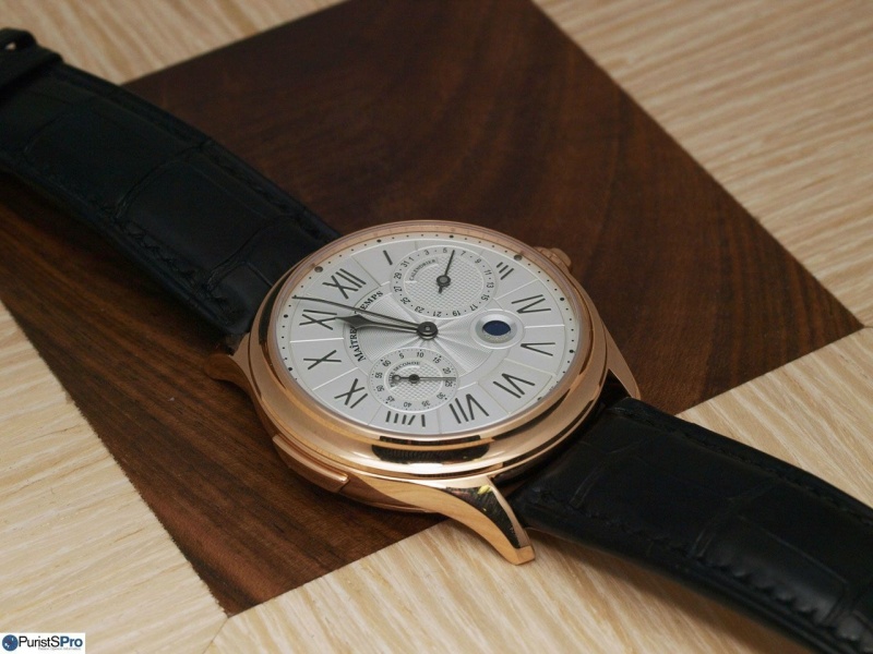
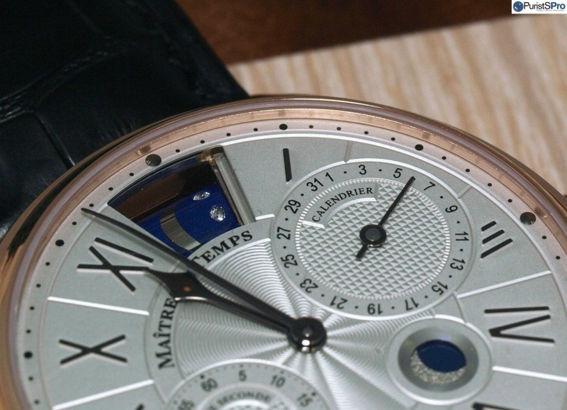
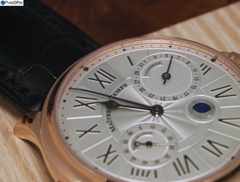
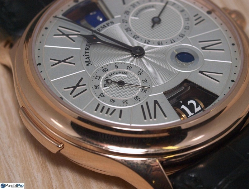
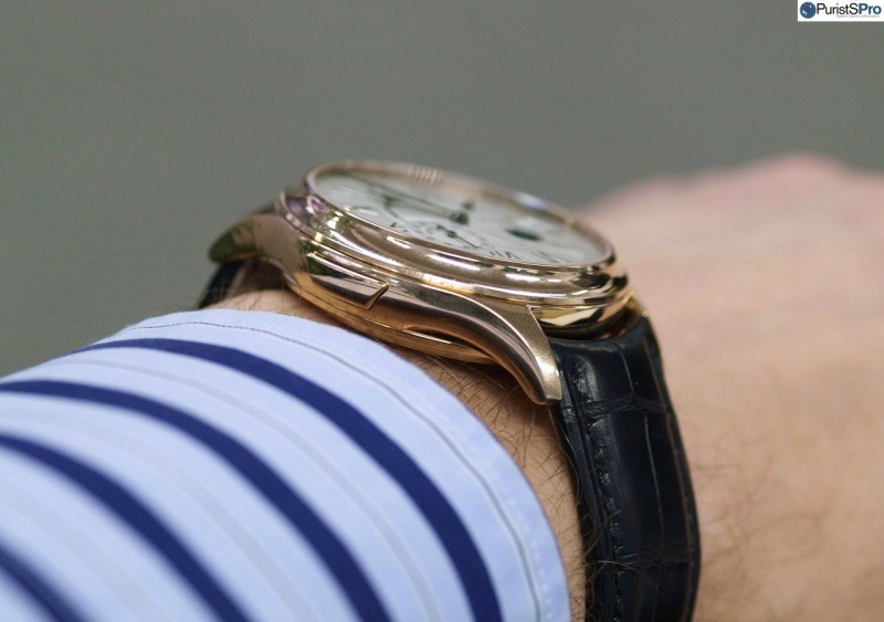
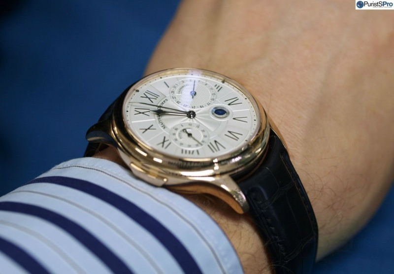
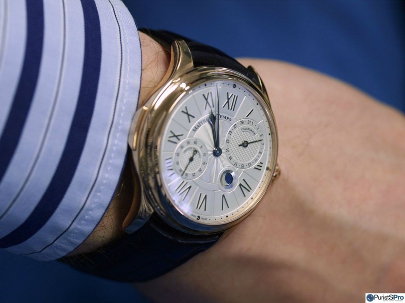
Chapter Three is a really elegant timepiece with a contemporary but not excessive diameter of 42mm. The shaped pusher is used to de-synchronise the second timezone from the main clockwork if it is to set for a different location. The dial showcases a 'balanced asymmetry' (if I may use this term) that is nicely accentuated with different finishes:
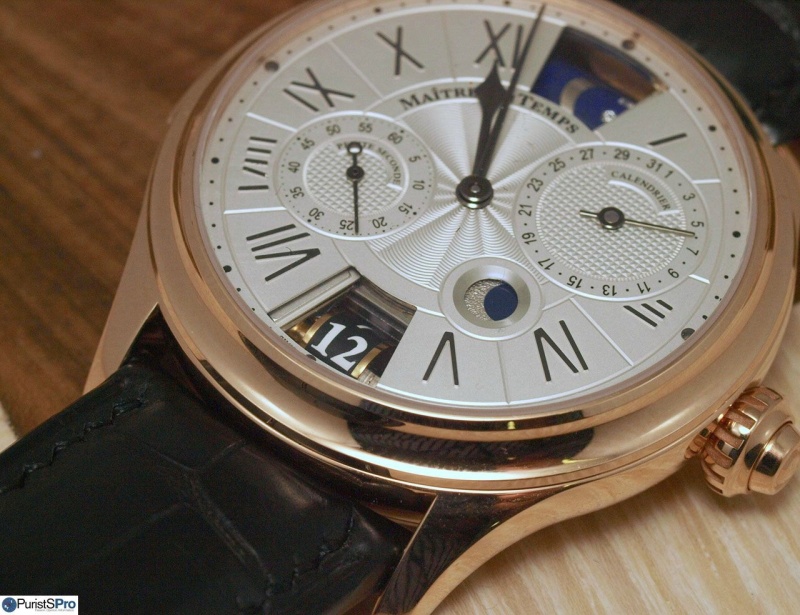
But its real secret lies literally under the hood:
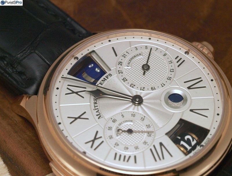
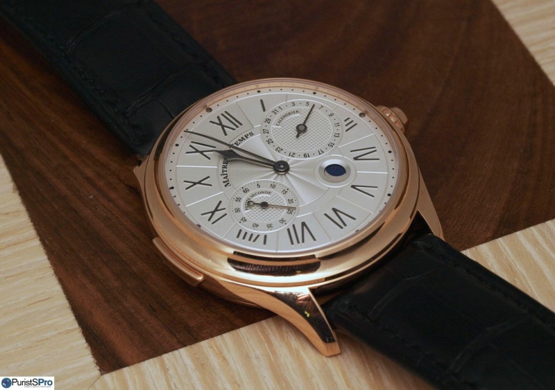
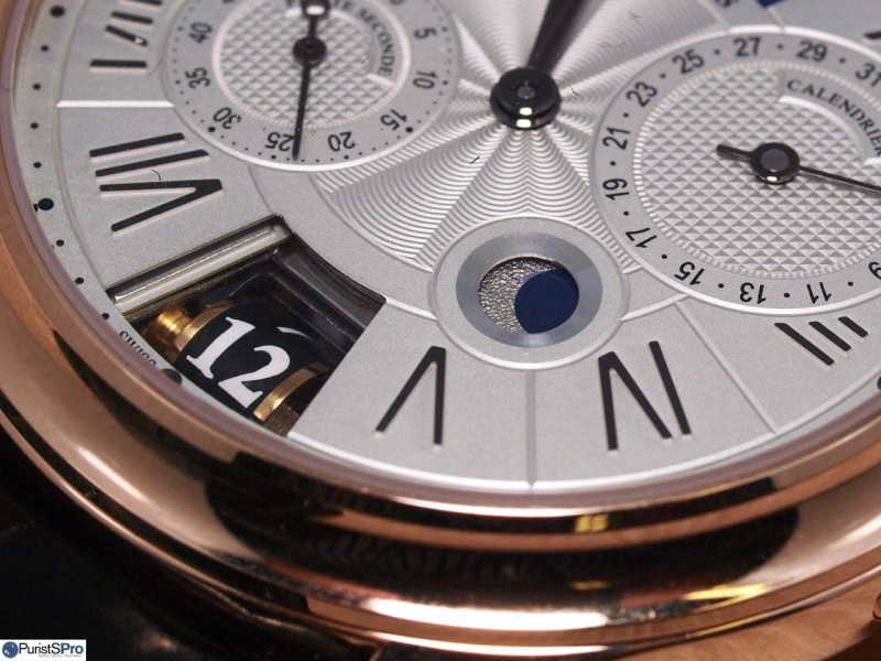
Below the 12 o'clock panel a day/night indication on a roller is hidden:
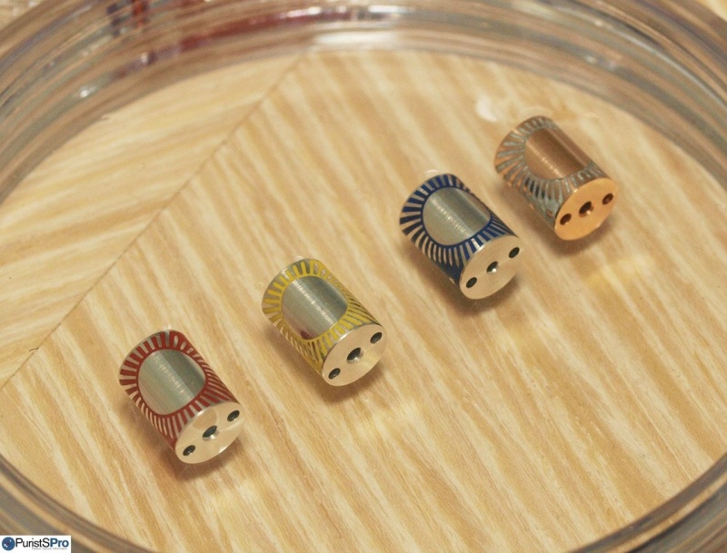
The roller btw is engraved and subsequently hand-painted:
At 6 o'clock a second timezone roller magically appears:
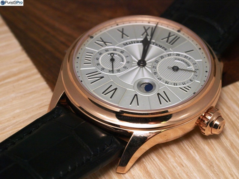
As romantic complement we'll find a moonphase at 4:30, tastefully implemented and not too prominently placed:
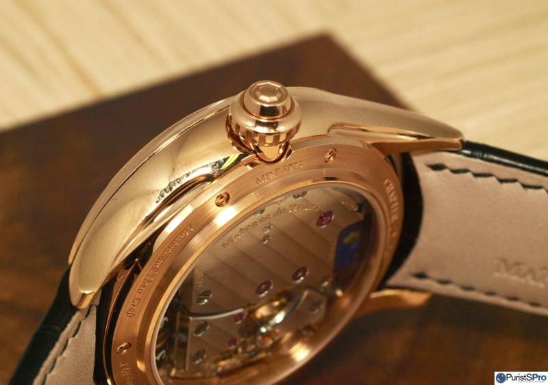
Opening and closing of the two panels is controlled by the pusher located coaxially in the crown.
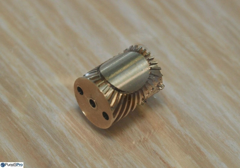
The whole mechanism for the second timezone has been devised by Andreas Strehler and is of fascinating sophistication: The panels first lower and then slide below the dial to reveal the respective roller underneath. The process is well controlled and shows its finesse even in the precise and confident pusher feel. But this is not all: In order to allow for a sufficiently large second timezone display Mr Strehler employed two adjacent rollers, one for 1-6h and a second one for 7-12h. They automatically slide sideways according to the respective time setting:
Its worth paying close attention to magic in this video:
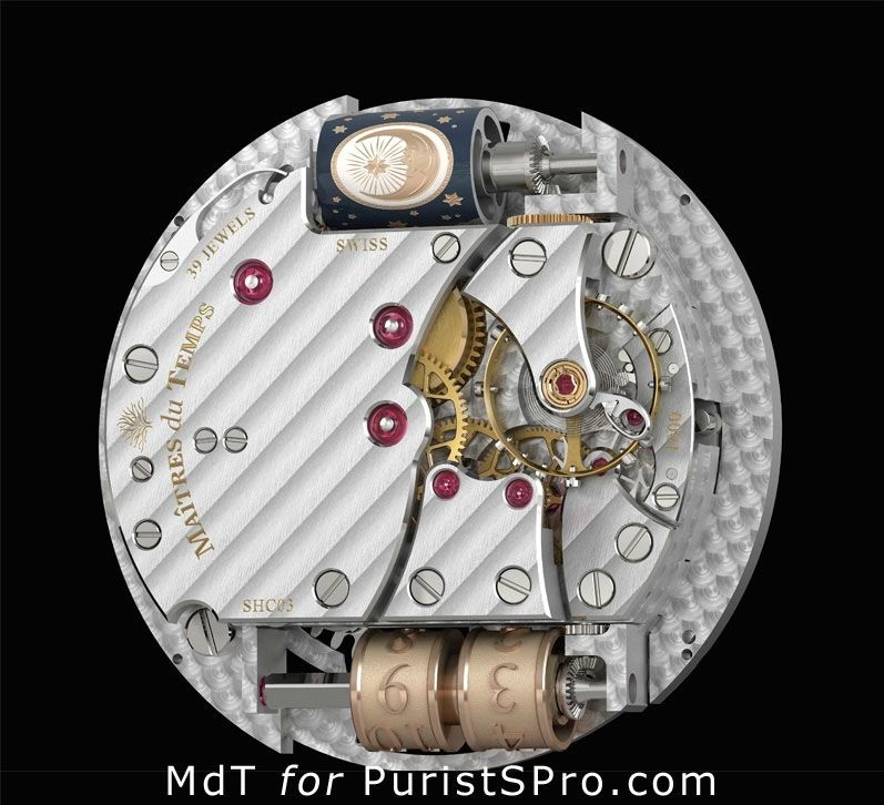
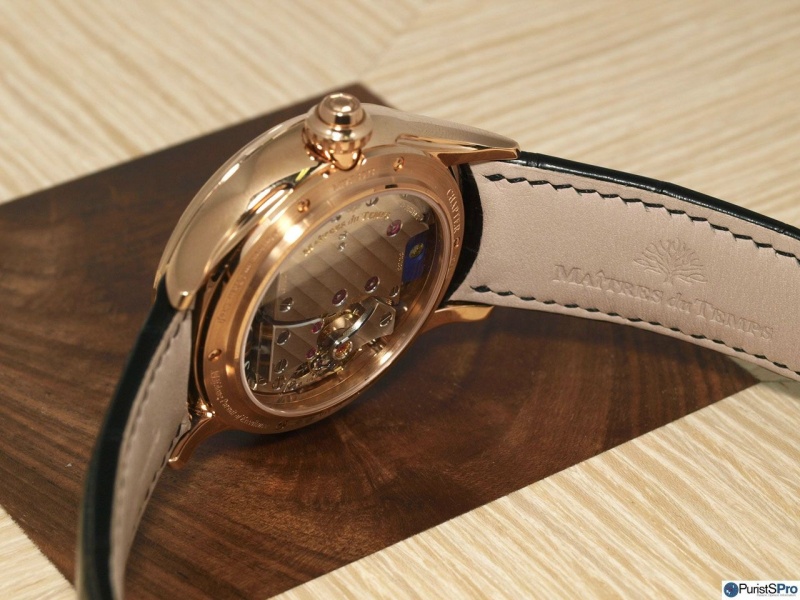
The main movement (hand wound, 36h power reserve) has been constructed and finished by Kari Voutilainen:
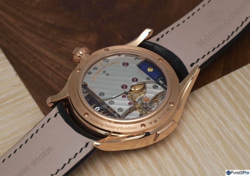
Its of almost square construction (will this be employed later in a shaped watch?) and shows excellent finishing that is very (but not quite) close to Kari's own movements.
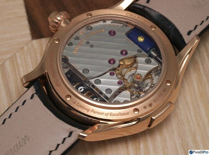
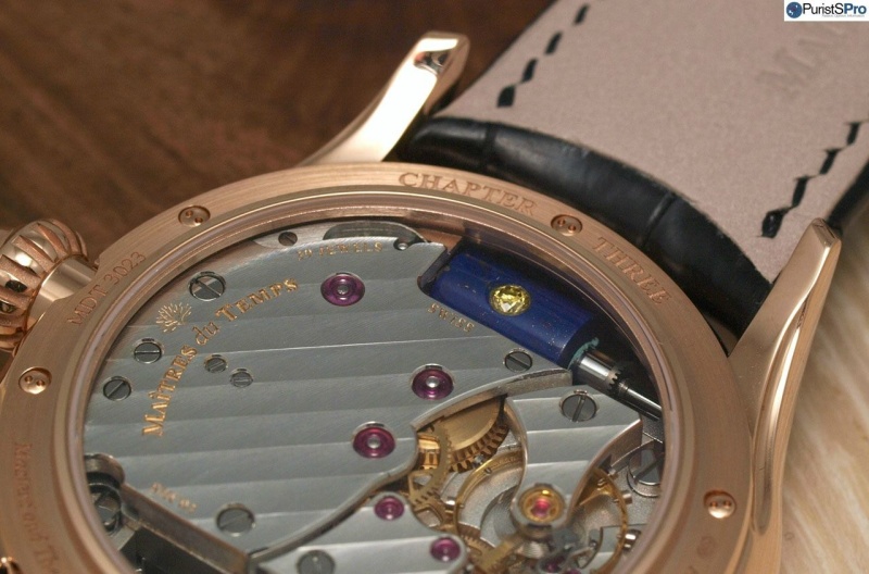
All finishing (Geneva stripes, bevelling, and anglage) is very well done and shows Kari's magic input. The shapes to be finished however are fewer and of simpler design than in Kari' own timepieces. Note the Straumann balance spring with Breguet overcoil:
Also in the dial layout and execution I find a lot of 'Kari-DNA', particularly if you look at the permanent seconds hand:
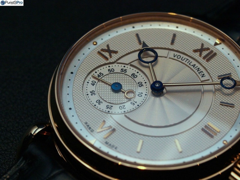
However, if you compare it to one of his own pieces the difference is quite visible. Kari uses stronger contrasts in terms of different guillochage techniques and dial levels. Furthermore, I find his hands to be more elaborated in contruction and finishing:
On the wrist it really shines and is just fine even if worn with business attire.
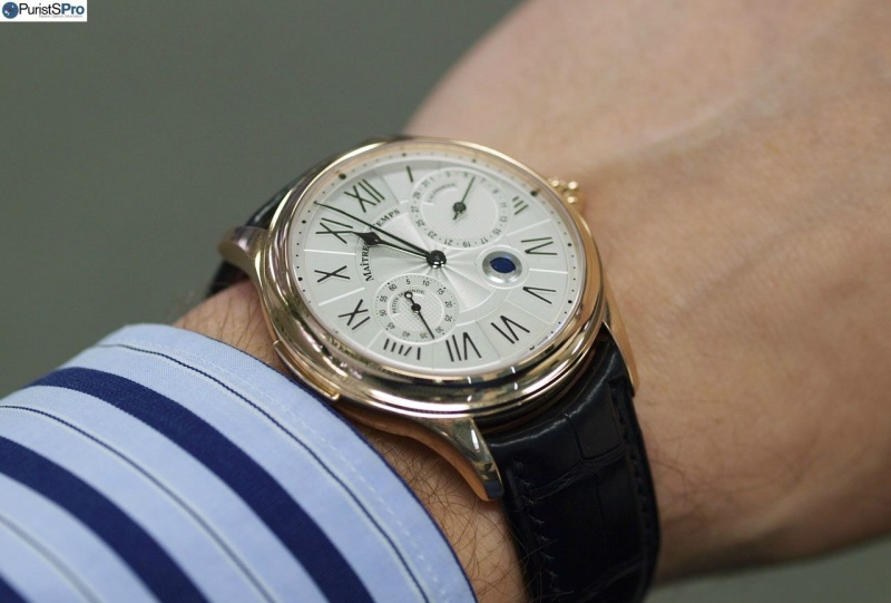
Despite a movement thickness of 8.2 mm (and an accordingly well-dimensioned case) it is not obtrusive at all.
Bottom line: MdT came very close to a squared circle with this timepiece. Its a complicated watch that does not (really) look like that. Like a well-mannered lady it knows when to take the centre of the stage and when to retreat. It has (lots) of personality on its own but clearly shows its ancestry. Its parents are famous (to us) and have bequeathed a well-defined amount of traits to give the watch its own identity and leave lots of room for themselves.
In terms of functionality I think the solution to the problem is indeed a very clever one. It avoids unnecessary clutter and improves readability at the same time, thus solving two problems with one solution. A permanently displayed second timezone is rarely needed but if so a simply pusher actuation will get you there. If not, you carry an unassuming and elegant timepiece.
If I were to offer a critical word I would propose a re-design of the pusher at 9 o'clock. It looks too much like a minute repeater lever, and this 'lookalike' is absolutely not necessary for such a timepiece. Furthermore, I would wish the roman numerals had a bit more 'life' in them. But that's all.
As skeptical I might have been towards such 'marriage' concepts I have to confess that I am (quite a bit) taken by this watch. This says a lot about the watchmaking sensitiveness of Mr Holtzman.
In fact, I urge anybody to seize the opportunity to engage in horological conversations with him. His passion is intoxicating and does not need loud extroversion.
Cheers,
Magnus
This message has been edited by Ornatus-Mundi on 2013-08-05 23:51:37 This message has been edited by DonCorson on 2013-08-16 06:28:22 About the H. Moser Concept Ref. concept
The H. Moser Concept represents the brand's contemporary automatic offering, distinguished by its fumé dial treatment within the Concept series. This reference showcases the manufacturer's approach to modern watchmaking through its 40mm proportions and palladium case construction.
The 40mm palladium case houses the automatic HMC 200 caliber, providing 42 hours of power reserve. The watch features a sapphire crystal and fixed bezel configuration, with water resistance rated to 30 meters. The fumé dial is complemented by a leather strap, creating a refined aesthetic profile.
This reference appeals to collectors seeking contemporary H. Moser craftsmanship in precious metal casing. The palladium construction and fumé dial combination positions this piece within the brand's modern offerings, suitable for those appreciating the manufacturer's current design language. Production commenced in 2015 and continues to present.
Specifications
- Caliber
- HMC 200
- Case
- Palladium
- Diameter
- 40 mm
- Dial
- Fumé
- Water Resist.
- 30m
- Crystal
- Sapphire crystal