
Collection
Chronometer (aka yacomino) shares a captivating image of the Chopard L.U.C XPS 1860, prompting a discussion on its aesthetic and functional appeal. His post highlights how the watch, a potential 'office distraction,' sparks contemplation on dial color nuances and their impact on a watch's overall character. This article synthesizes community insights on why this particular reference resonates so strongly with collectors.
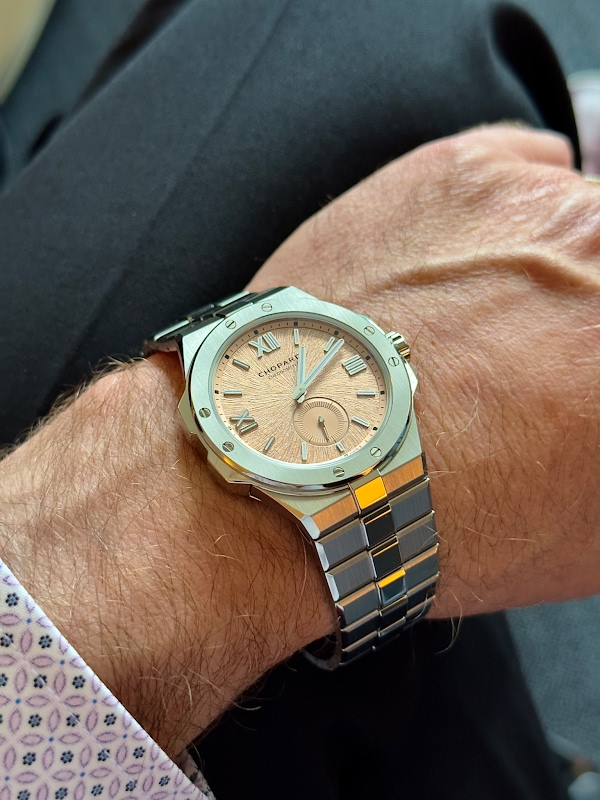

I'm enjoying this distraction looking at your watch!
I am afraid I have to look for one, too. Even though I really vowed not to buy another watch this year…
Personally the only thing i would change is I would have made the dial color just a bit darker but i am sure others might prefer it like this one. Then again a lighter dial makes the watch looks probably a bit more refine and dressier maybe?
I will be surprised you managed to get any work done with that wrapped around your wrist!
I am anxious to receive mine, but welcome such photos in the meantime!! How about the movement side my Friend?!?
This XPS can definetly be a single watch collection. It just has it all. beauty, sporty, and such a high quality, you can aspire for nothing else.
This thread is active on the Chopard forum with 29 replies. Share your knowledge with fellow collectors.
Join the Discussion →


