Collection
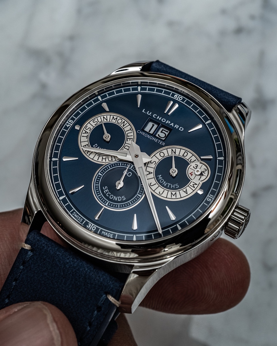
Chronometer (aka yacomino) initiates a timely discussion on the Chopard L.U.C Perpetual Twin, a reference he finds compelling for its versatile aesthetic. His post invites the WatchProSite community to share hands-on experiences and opinions, focusing on how this perpetual calendar, despite its 42mm size, bridges the gap between office and weekend wear. This article synthesizes the collective insights, offering a comprehensive perspective on a distinctive Chopard L.U.C timepiece.

...I bought the watch, I know how it works : )
Agree with the comment above to the extent that it would be better if months days and seconds weren't there. Very attractive nevertheless.
amnesiac customers 🤪....
I love that watch, and the labels don’t bother me. There are various colors and dial designs: But you can’t get away from the labels unless you go to the chrono / moon version. Cazalea
Do not take the comments too serious. I know you adore the watch, and i like the watch too. Sure, the labels are prominent on the dial, but as the watch world is not ugly with printing words all over watches. Chopard is not a different. If labels are too much, they have also something against printed days on the dial Sun Mon Teu, or J F M A M etc with months. For some people the mark Swiss Made would to be busy on a dial.
Giving encouragement. Our friends are honest explain their taste. That said, i have not any watch in my collection with too much wording, but on one of my watches Inca Block printed under the brand name. But many here have a watch with the words superlative chronometer. Or more than 2, when their focus lay on Rolex. Have a nice weekend Chronometer.
This thread is active on the Chopard forum with 36 replies. Share your knowledge with fellow collectors.
Join the Discussion →


