
Mark in Paris
[Purist]
10488

I don't know if it looked weird
as it doesn't bother me when I have the watch in hands but, in the 5327, they indeed adopted the 3940's date homogen size all around the moonphase subdial.
Nevertheless, they even improved it in the 5327 by keeping a date font size more in line with the other day/leap texts whereas the date was much bigger in the 3940/5140 than the other wordings/figures in other subdials.
Thus more balance imho in the new 5327 you can see in G and R here below:
...compared to the 3940 here:
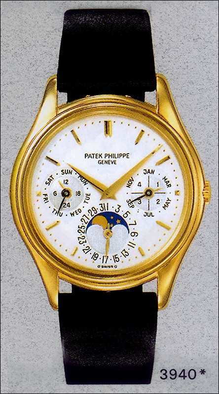
Interesting picture input.
Cheers, Mark
This message has been edited by Mark in Paris on 2016-04-29 05:44:06
A wristshot of the new Patek Philippe 5327R Perpetual Calendar
Hi everyone, I could handle several of Baselworld 2016's novelties lately and I will prepare some reviews for later in the year but I will try to select a few pictures showing what the watches are about. When we are flooded during two weeks with hundreds ...

Thanks Mark..I like everything about the watch but the bigger fonts on subdials..
...They appear too clustered too busy here. We realize the cases have gotten bigger from 34-36mm to 39-41mm, so to accommodate the same old movements the dials are laterally spread..that shearing can give us two results - this one with bigger subdials nec...
My pleasure, this is a beauty indeed
I think that from the 3940, 5140 to the 5327, one can find one of the finest elegant and refined perpetual calendars choice available. Thinness, shape, size, dial decoration etc... it can fit, from one generation to the next one, a wide array of tastes in...
could not agree more
"to accommodate the same old movements the dials are laterally spread." An opportunity was missed here to create something.

Thanks again Mark. I have only one
major issue: the case has grown but the dial looks busier and less readable/sober than the dial of the original 3940. It's funny; 3940 was so close to perfection that it seems there's no way to improve that without doing something to the engine (240Q). St...
My pleasure Kari
Well, I think you also bring a point that 3940 people will emphasize. And this is perfectly understandable. On the other hand, if I take 5327 front pictures and forget the 3940, I think it is perfectly balanced. The thing is that the hour numerals are pla...
The issue is
just in the messy sub-dials. In 3940 they were clear and at least for me very readable. In the later versions the numbers are bigger and there's more "stuff" in the sub-dials. For me it kills the balance, beauty and readability. If I could use Photoshop, ...
Good to see from other answers and yours that the offer from to 3940 to 5327
serves every tastes. Btw, about the more "stuff" in the subdials, it don't see what you're refering to: aside the early 3940 refs (without the "+" in the leap year subdial), the subdials have not evoloved in terms of number of info (I don't talk about the...
I might have bad eyes
but I had both 3940 & 5140 in my wrist for thousands of hours. Also I'm wearing 5550P quite often for over a year now. My old and bad eyes can read the sub-dials of 3940 better than 5140 & 5550. Somehow there's more air in the sub-dials and because everyt...
Yes, I totally understood your "legibility" feeling and don't question that a single second
I was more talking about the number of elements (you talked about "more stuff in the subdials") etc... On the "air" matter, I agree 100% and prefer also the 3940's subdials (3 and 9 o'clock) impression. In fact I prefer the smaller fonts in the 3940 (thus...
Yup...5327 5140 ...
5140 had really weird numerals layout around its moonphase .... ...
I don't know if it looked weird
as it doesn't bother me when I have the watch in hands but, in the 5327, they indeed adopted the 3940's date homogen size all around the moonphase subdial. Nevertheless, they even improved it in the 5327 by keeping a date font size more in line with the o...
Like said, it's a matter of taste.
If I will ever an opportunity to wear the new reference for a longer time, I might change my opinion. Now I handled 5327 in Baselworld maximum for five minutes. Best, Kari
Indeed, I was answering redcorals about the date size :)
and added pictures to illustrate.
I never noticed and I have two 5140 j and g
but the irregularity seems to me to be unintentional as its too random and perhaps not realizing this was happening.
Random it isnt..it clearly tries to intentionally accommodate the shortfall I mentioned!!
There are 3-4 different sz on that subdial there...7-9 are not coherent with rest at all not even the mirror opp 23-25...Similarly, 13-15 are incoherent with 17-19 where the max compression is seen. Then 5-27 are the smallest scripts. That print doesnt ev...

Hi Mark, I saw this reference in the metal!
The Brequet numerals look great but made the dial too busy! Baton hour markers + this new groove lugs would have been PERFECT ! Your thoughts on such combination? Cheers Gordon
Interesting to have your feedback
This is a watch I greatly enjoyed wearing. As for the choice between Baton vs Breguet, I must say this is the same question I've been asking myslef concerning the 5396 I prefer the 5327 with Breguet much more than the previous generations but I must say I...
.... speechless ...
Hi Mark, Wow that\'s a great watch and an even greater picture! Love the Breguet Numerals .. Fantastic!
Thank a lot!
Yes, the Breguet numerals are an excellent choice for this new generation of Perpetual Calendar, epsecially in accordance with the slightly wider case. It brings much evolution compared to the 2 previous references 3940 and 5140 without overshadowing them...

Thanks Mark,I have been waiting for this
I really like 5327 more than the 5140 for sure,The 3940 is nice but small In modern proportions specially for some one with 7+ inch wrist,I think both of the 3940 and the 5327 are well balanced in there own I like the newer version more. Please try to po...
We share the same feeling there
I will post more from time to time. I'm glad to see that diversity among Patek owners/fans. Some are more 3940/5140 and others are on the 5327's side. This is something we can see in other references as well. I love them both but we all have our favorite ...

Hi Mark, love the breguet numeral although it does clutter the screen. Overal look is stil
better than the 3940 IMO. the case is also more modern. I wish they have made the 3 circles similar size for more balance.
I agree with your observation
The dial is definitely totally different in terms of spirit and not only a slight evolution as the 5140 was from the 3940. For the case it is even more true. The dial is more decorated with these numerals and, while it brings IMHO more charm, it is of cou...
I notice that only grand complications use the breguet numerals,
Do they come in plain time and date or time only with breguet dial in the patek series. I imagine uncluttered dial in the neighborhood of 38-40 white gold with black dial would look mighty handsome.

the days of the ultra flat pp calendar from Patek are gone
Just by judging your picture the successor of the 5140 and 3940 looks like a "standard" watch now and not like the famous marvel of an ultra flat, slim watch. I have to see it in real first to have the best impression but your picture is telling a lot, al...
There is still a 5140P (even 2) in the collection,
with the 5139, but I understand your point of course. By the way the 5940 which is still in the collection is 8.6mm (3940 was 8.5mm if I'm not wrong) whereas the 5140 was 8.9mm (I would not have said so before looking at figures). The 5140's bezel is cove...
"decades of the same" is a point
A new alteration should always be a gain and not a loss. I must say, this year's last hurrah of the 5140 seems to be a knock out ... I am also exited to see this one soon. Best Moritz
You're right, but it is quite hard to tell...
what is a gain and what is a loss without including subjective elements. If we take for instance the 5140 vs 5327, in one you have the well-known pure thinness of Patek Philipe combined with a Perpetual C and on the other hand, you have the beautiful shap...
Thank you for your comments. Could you be able to answer the question..
What was the rationale for the new model number "5327". I got 3940 changed to 5140. But 5327 ?? I am curious to know the algorithm, if any, PP uses. I always thought there was some rationale for numbering the models, but I am totally baffled now. Thanks a...
I think this is the question we've all been thinking about!
I don't really have the answer though the 5227 (after 5107 and 5127) and 5327 may show the 27 is for the new generation but this is never very clear and logical (at least to me). Thanks for your nice comment I'm glad you enjoyed it. Cheers, Mark