Comments:


Some Observations of the Dial of 2012 Extra-thin RO Jumbo 15202
There have been some discussions on the internet about this topic. I thought I would just share my observations here since I have some first-hand experience.
I understand that AP has made some minor improvements to the dial this year, particularly the AP logo at 6 o'clock to enhance the performance of the watch when the hour hand passes above it. Also understand that there were some production issues in between which resulted in subtle changes in the dial appearance between the earlier batch and recent batch of jumbos.
See illustrations below:
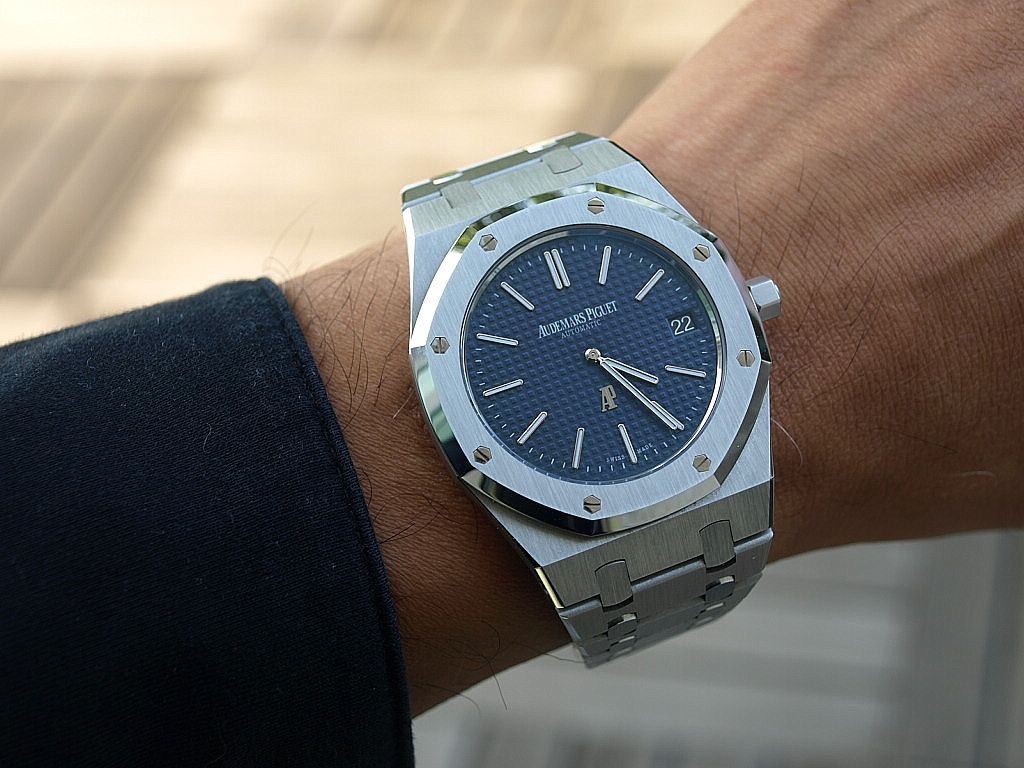
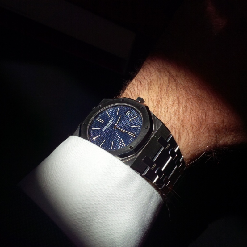
A H-series shot in Feb 2013
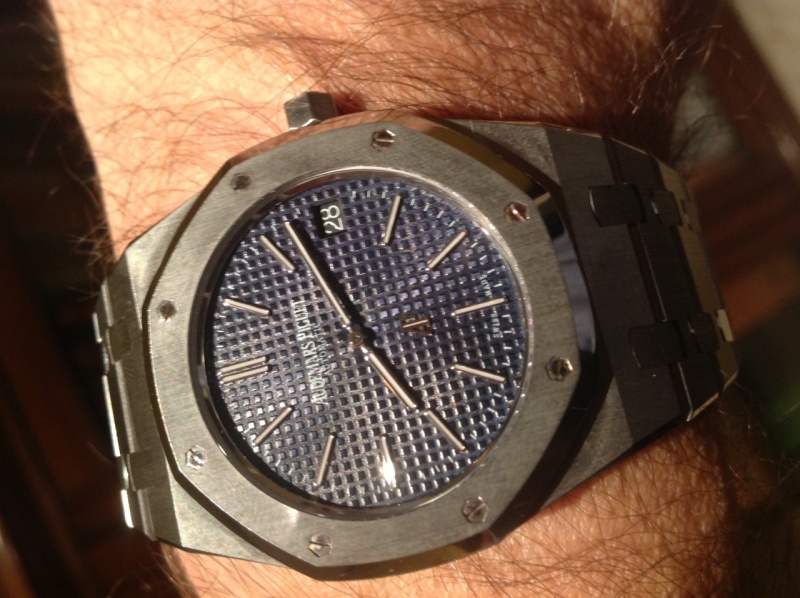
My I-series shot in Dec 2013
Some differences observed:
1. I-series has a denser "tapisserie" pattern on the dial.
2. I-series uses a different font for "SWISS MADE", which looks nicer IMO.
3. I-series has a wider AP logo, with a larger spacing between the A & P. I like the thinner AP logo on the H-series better.
4. There's a slight difference in the hue of the blue dials. I prefer the I-series one.
Whichever version it is, the jumbo is still a winner! 
Best,
Wayne
interesting observations!
Thanks for these details, wasn't aware of them and definitely things to consider!
Congrats on your new purchase!
The new I series appears to be moving (even more) towards the original 5402 (with its ca. 32 'square' density per dial
Great photos as usual! Continue to share your experiences with this great watch!
Happy New Year!
S
Thanks for sharing this information.
I guess mine is the earlier version.
cheers
fernando
Intriguing , very intriguing...
Adds more to the jumbo legend....
Like them both really,,,,,
Mo
Good work Wayne. My own I series is a cross between the two
It has the old logo and updated SWISS MADE font, and less squares on the dial than yours.
It sure would be interesting to know the actual production numbers of each variation - there must be some very rare versions now I imagine. All adds to the lore of the AP Jumbo
Not too sure which version is mine...
Wearing it for the first time today, but I have had it since July...so I guess it could be the first one.
Seeing it on the "big screen" I find it clearer it is the first version... [nt]
No message body
I had actually read a very negative review about the performance of the 15202
I think it was in the magazine Watchtime.
It talked about large variations in the chronometry of the 15202 depending on the position of the watch.
Does this have anything to do with these changes that you mention on the dial? Should I take mine to be serviced and have the dial replaced or does this not make sense?
It talked about large variations in the chronometry of the 15202 depending on the position of the watch.
Does this have anything to do with these changes that you mention on the dial? Should I take mine to be serviced and have the dial replaced or does this not make sense?
It does not make sense to me.
Does your watch function OK? Is it keeping time well? If so, why send it for service or a different dial when these variations are so subtle? I'm quite certain the dial updates have nothing to do with the performance of the movement.
Mine seems to keep great time on the wrist, lying on its side, after having stopped for a few days, etc. And I rather like that perhaps my dial will be an "oddity" if the future production will all be made with the new changes.
it was about the perf. of a cal. 2120 in another AP line
I remember that watchtime article from back in the day (I googled it after you mentioend it!)
It is definitely not related to performance of the watch.
It could have been that the tolerance might have been to little for 'fail/safe'... but most probably, the change of dial design is
more probably related to different batch productions, and tweaking the design in the process.... the amount of people involved in the design of
the dial is not that large at AP, we mostly know who the 'culprits' are 
very nice changes of dial! I like the bigger 'squares' personally!
S
Thanks for your reply! However I am fairly sure it is about the cal of the 15202
If my memory does not fail me, it was on the November-December issue of 2012.
I am abroad now, but I will check it up when I go back home and I will post separately if I find it.
I just feel a little "let down" if I have bought a watch which is found defective after just 6 months and then AP introduces a modification to sort it out. If so, I would like the modification to be offered to the people who have been buying the watch just before...
I may be too "perfectionist", but then again I believe many of us around here are!
Let's not get carried away here.
You did not buy a "defective" watch from AP. And rest assured, if anything were wrong with the watch, it would be taken care of under its proper warranty (assuming, of course, the watch was purchased through an authorized point of sale).
Please, enjoy your Jumbo and don't worry about it
I don't think I am getting carried away, Michael.
If a watch comes out with a lower-than-expected accuracy and the dial needs to be modified in just over 6 months I don't know how to call it but "defective".
It is only my opinion, of course.
I will enjoy thoroughly my Jumbo, of course. But that doesn't mean I cannot criticise what I think is wrong.
This message has been edited by sanro on 2013-12-30 07:33:23
It is only my opinion, of course.
I will enjoy thoroughly my Jumbo, of course. But that doesn't mean I cannot criticise what I think is wrong.
This message has been edited by sanro on 2013-12-30 07:33:23
Perhaps I am not understanding you.
Does your specific watch run erratically? Does it show movement accuracy issues? Do you think a new dial with more squares on the guilloche will help the accuracy of the movement?? Of course you can criticize - we promote honesty here and don't skirt real issues. But can I ask what you are criticizing on your sample, and not just noting a negative article?
Sanro, my sample is identical to yours except for the SWISS MADE font. Mine works fine and has not showed any problems in the first months of ownership. If my sample does start running poorly, I will send it in for service and specifically ask to keep my current dial.
I am hoping to add "official" information to this thread shortly to clarify why the dial alterations have been implemented.
I can report surprisingly excellent accuracy on mine
I don't give much importance to accuracy and I am used to periodically resetting the time on my watches. So I didn't expect much in that area when I purchased my lovely 15202...
But I am extremely pleased to report less than a quarter of a minute deviation after two weeks of use. This is truly excellent by any standard.
For me, the new 15202 is flawless. It is my first AP and I am finding it nothing short of a PERFECT watch.
I wouldn't worry about differences in the dials, if there is any. To the contrary, that would make the watch more interesting, more "humane" and worthy of love.
I love this watch.
Frank
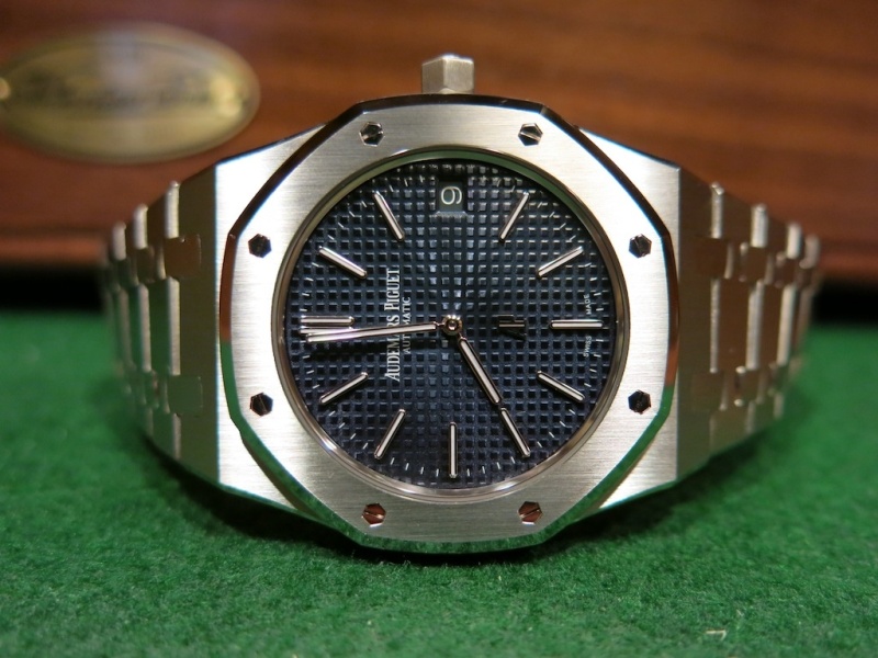
Even within H series there are dial differences...
... only just now I came across the topic, and of course I had to check my own 15202 Anniversary, which is from late 2012 and may therefore be one of the earlier ones...

I do not have front pic available, but may I point your attention to 2 differences I detected compared with the H seriies watches shown in this thread:
a. on my dial the 26 "squares" line ends sharp at the end, whereas the others seem to show some space.
b. the Audemars Piguet" print sits at a slightly different spot ( which seems logical if my 26 square theory is correct) and is printed even thinner than on the other H series models.
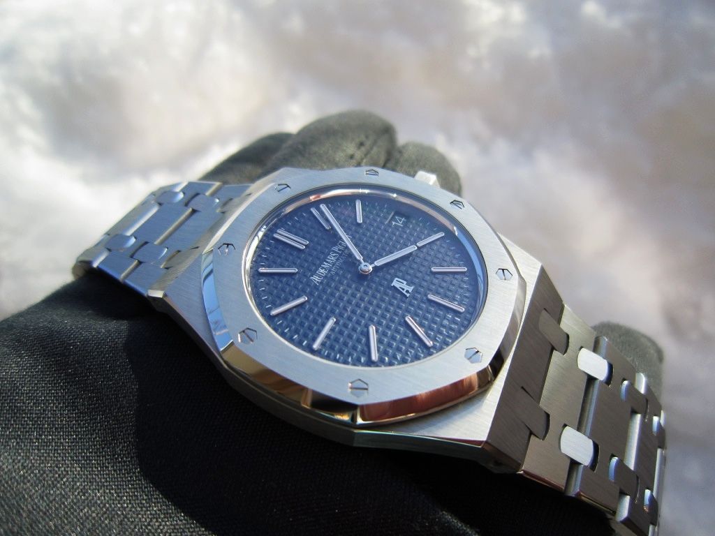
Here are two pics I have ready, I will try to take a front shot shortly.
Best,
Henrik
front close up pic
Maybe this makes it easier to detect the differences I mentioned...

Thanks for bringing back this old thread! How time flies! It's been almost 3 years and...
I'm very happy to share that my RO Extra Thin ref.15202ST is running as reliable as it should... it even passed the "dip test" recently

Yes! The RO 15202ST is waterproof

Almost 3 years of pure joy!
Best,
Yes! The RO 15202ST is waterproof
Almost 3 years of pure joy!
Best,
Wayne
Excellent to hear the report.
Found this thread looking up details on the 15202. Does it have a screw down crown?
Blue dials
Regarding the blue hue of the dials which versions are more blue. I am looking at two 15202 blue dials for sale and one seems more black and the other is more bluer.

