
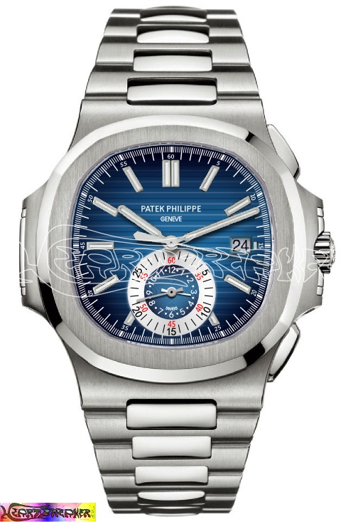
Ref. 5980 + 1.5 mm. = Ref. 5995
The Patek Philippe Nautilus Ref. 5980 is one of the most appreciated chronograph in the whole market. A lot of watch-lovers celebrate its iconic design, its supreme comfort, its unrivalled exclusivity. It seems that this reference produce a true, universal approval, especially by the lucky ones that try it on the wrist, being completely enchanted. I yet hadn’t this opportunity and I have to judge only by the pictures. Well, in brief I must confess that I’ve never fallen in love with it. The main reason of my coldness towards the 5980 is its dial: I find it cluttered and a bit lost in the watch face. AFAIK this dial has exactly the same size of the one in the standard Nautilus Ref. 5711: the designers have decided not to take advantage of the (really slightly indeed: +0,5 mm. 10/4; +1 mm. 9/3) bigger case, so they had to enlarge the bezel. I think it’s the same choice made for the Nautilus annual calendar Ref. 5726. I’ve then decided to try to give this chronograph better aesthetical proportions..........risking to be blamed of lese-majesty-crime (hey, is there a lawyer out there?)..........
Ok, stop chatting, here’s my proposal for a “5995” with a slightly more spacious dial, that now has gained 1,5 mm. It isn’t simply made larger, since it would have been technically wrong, because we have to respect the position of the chronograph hands axle and of the date aperture. You can immediately recognize the new dial observing that it has gained 3 applied indices (2 of which are luminous, too). All the central hands have been stretched out to match the indices and the outer scale.
Any comment will be appreciated.
Ciao!

I see what you mean, but no...
The balance of an original design can hardly resist to any change in the proportions... IMO.
The 5980 is already a big and thick watch, but still appealing. Making it bigger would be risky.
Best,
Nicolas.
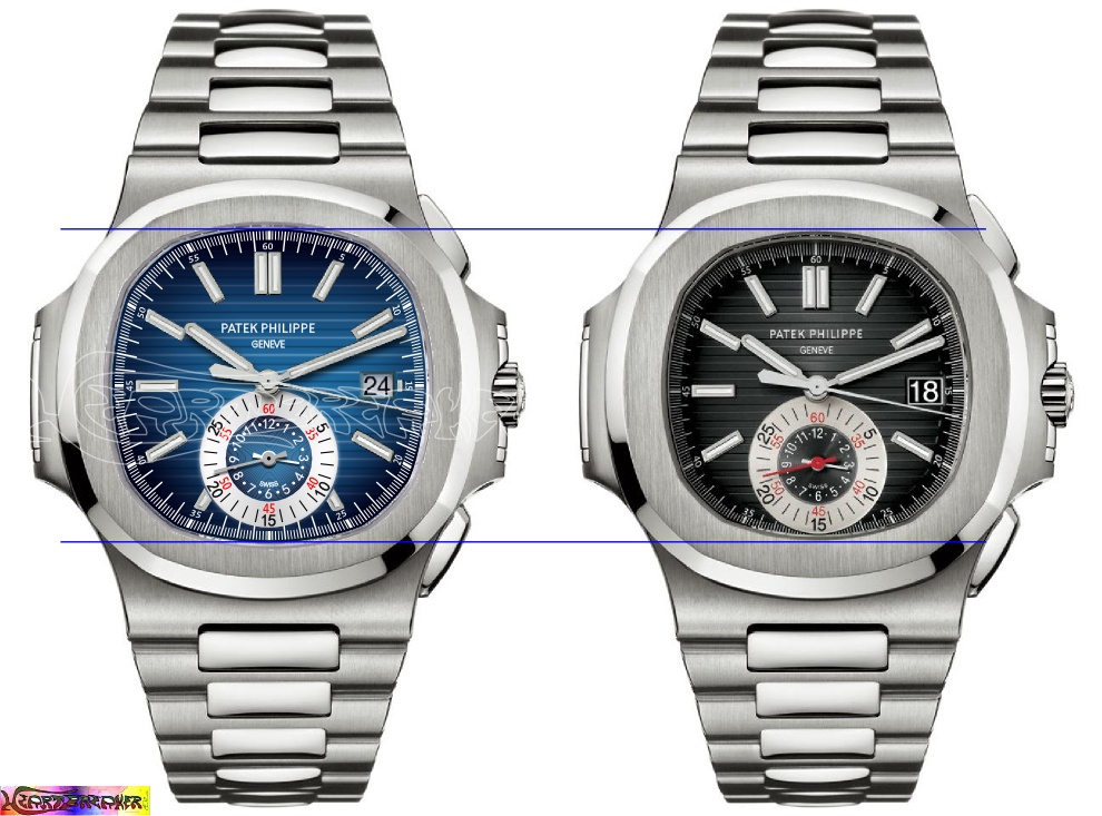
The case is not bigger than the original
The case proportions aren't changed, except the bezel width.
For a better comparison, please look this side-by-side picture, where the two watches (the original and mine) are represented with a 1:1 scale.
That said, you could still find more appealing the original dial layout and its "face" proportions. No problem, every comment and judgement is wanted and welcomed. That's why I thank you all for your attention.
Ciao!

I can live with either design
But I don't quite like the date, and find it quite useless, just as in other brands. So I will get rid of it, in an academic design discussion.
Your version vary only slightly from the original, and the only visible difference is at 6 o'clock, where the scale rail is complete versus the cut off from the original. Guess I like that.
But I disagree with your thesis that this watch is "cluttered and a bit lost". The single sub dial is just ABSOBLOODILUTELY BRILLIANT!!! In fact, it's just the opposite of what you said...it actually reduces dial clutter!! Pother chronos have got 2-3 sub dials just to tell same info. The dual use of the counter is just another master stroke by Patek.
Best,
Horo
"I find it cluttered and a bit lost in the watch face"
Dear Horo, when I used the expression "I find it cluttered and a bit lost in the watch face" I wanted to say that:
1. I find the dial cluttered because the indices are too centered. It results from having used the same (big) indices of the classical Nautilus but moved to the center of the dial to let the outer scale have enough room.
2. I find the dial a bit lost in the watch face because it displays a low dial/case size ratio. This ratio isn't much changed from the classical Nautilus, but the design chosen for the 5980 has changed this feeling. According to the design, proportions and sizes may indeed appear different.
3. I didn't want to criticize the single sub dial, since me too I find it very pleasant. However, we could point out that the Ref. 5960 - having a similar case size - even if it has a bigger chrono subdial, a bigger Patek Philippe/Genève logo, two more apertures and a RDM indicator, to my eyes doesn't look cluttered, simply because its dial is bigger.
That said, I've proposed a very light maquillage with the aim of a better balanced design. I haven't reached the goal? No problem, my only goal was having fun!!!
In conclusion... you don't like the date? You're served!
excellent rendering!!
i am actually quite impressed with your considered approach, are you design or architecture trained??
best,
Horo
Your compliments drive me to briefly share my story
When I was little, in the '80s, my greatest passions were cars and watches. My myths were Giorgetto Giugiaro and Nicolas Hayek. I admired Giugiaro for his ability to translate both the needs of contemporary men and the Italian culture into automotive design. I admired Hayek for his courage, vision of the future and charisma. I've drawn so much, in my spare time, for myself, especially cars. I've never been very good in freehand drawing, but I think I had decent ideas; in fact, in later years I had the great satisfaction of seeing materialized, by the big car companies, some of my drawings and even some of the names I had invented.
Later, in the '90s, the passion for cars has been replaced by motorbikes, while the interest in watches was focused on the technical/mechanical side. Not to make me miss anything, I’ve found three or four further areas of interest. My myths have become Ducati and the great Swiss watchmaking Manufactures. For my high school and University I’ve chosen Economics, especially with a view to a training useful for my family profession. So, no design studies, nor architecture or engineering. In my spare time, I’ve drawn especially caricatures of teachers... Later, I've found out vector graphics software and – as an absolute self-educated – I’ve put my creativity at the service of my business (marketing needs).
We are arrived at the new century and I have to deal with various events, which make me quite disillusioned (but, that's another story...). I focus more and more on the passion for watches. Some precise facts lead me to appreciate especially Patek Philippe and that's why most of my proposals are now based on this brand. I also designed several new complications and new watches. Again, I had the satisfaction of seeing some of my unpretentious drawings materialized (I am referring to things you've never seen here on the forum). I've recently found out three-dimensional graphics software (once again, self-educated) and for the first time I concretely hope to realize something entirely designed by me. Well, if something have to happen will happen, right?
Thanks you for reading and thank you again for your compliments.
Ciao!
Thanks for sharing this personal story
I think increasingly the world of horology and functional design are colliding. And you could be on the right track here. But perhaps you could look at some CAD/CAM software(I am a ignoramus in matters as such, I don't even know Photoshop!!) that allows you to play with not just dial design, but case, crown, bezel etc.
Cheers,
Horo