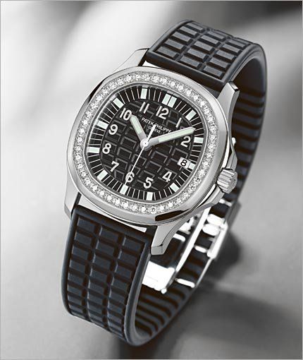
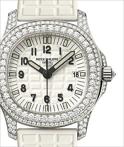
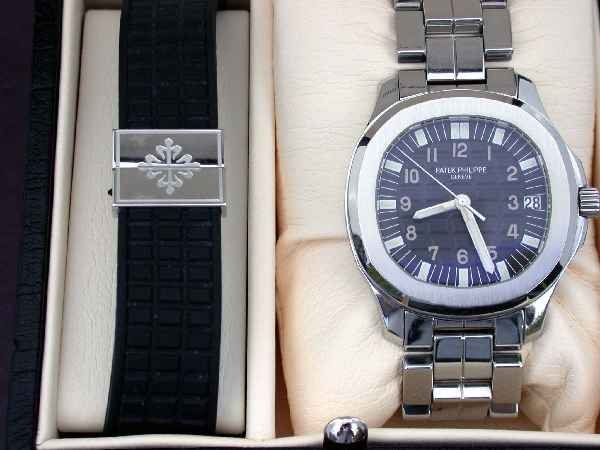
Aquanaut's markers
Some days ago, looking my Patek Philippe nearest retailer's showcase, I noticed a pink gold-extra large Aquanaut's with some of the markers not perfectly radial, like you can usually find in the Aquanaut Luce...
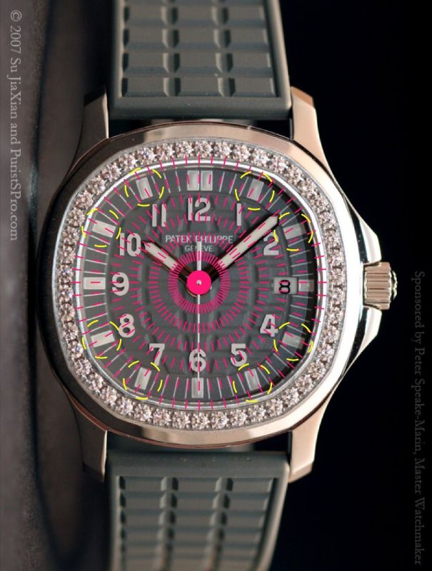
...like these...
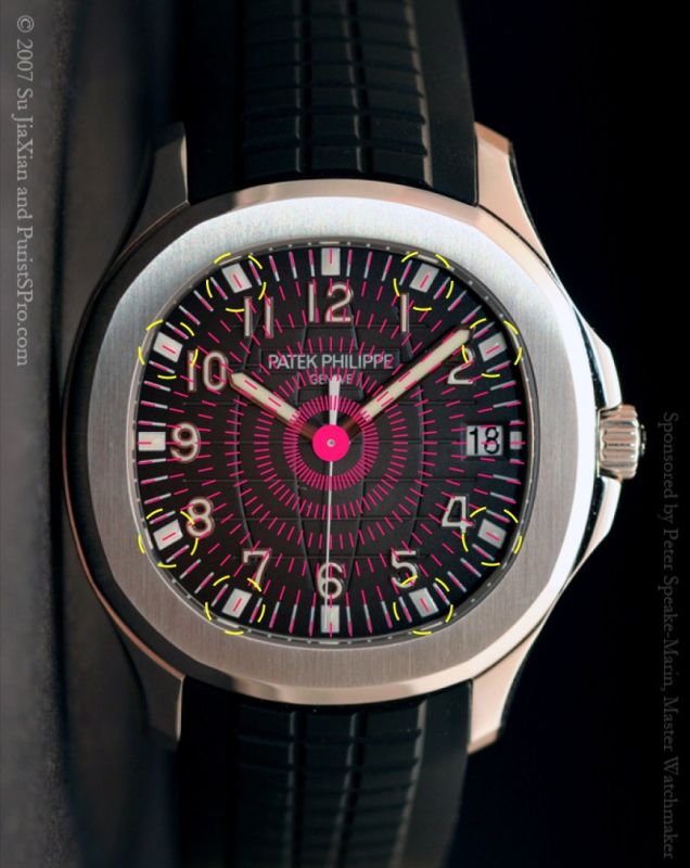
...instead like these...
What do you think about it?
Ciao!

Very interesting question...
Good observation! I can see what you mean - the luminescent coated markers at 1, 2, 4, 5, 7, 8, 10 and 11 positions do not align nicely (they are slanted) with the minute track.
I'd like to know why this small detail wasn't taken care of by PP as well.
Goh
Do you want some other examples?
Here they are:
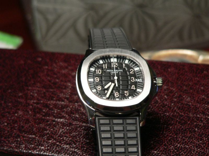
I started thinking that Patek Philippe use this markers' arrangement (that I find very ugly) for quartz movement-equipped Aquanaut.
However, I would point out that this rule - if this IS a rule - does not apply to the Nautilus collection, because they do not show changes in the markers' arrangemet between mechanical-equipped pieces and quartz one.
Does anybody can give us the final explanation???
still don't get it
Let me try explanining.....

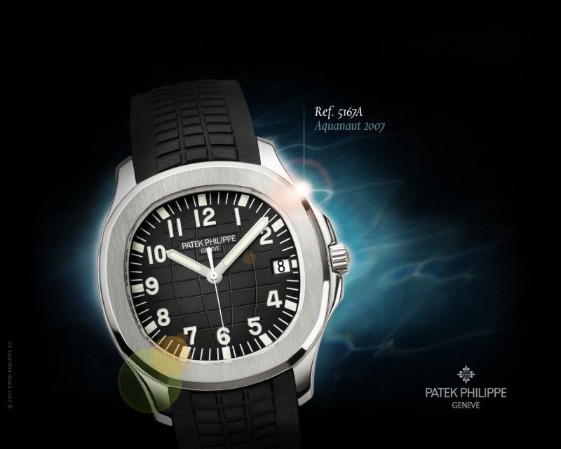
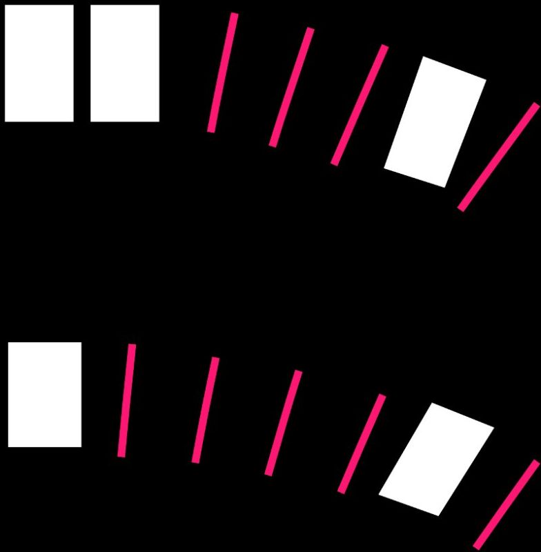
Just look at the minute track, you can clearly see from the above picture that the luminescent coated markers at the 35th minute mark does not incline at an angle that blends with its adjacent minute markers (34th & 36th).
Something like: / / / / I / / / / I / / / /
The phenomenon is also experienced on the earlier versions – 4960, 5065, 5066.
This is what meant by heart349, if I am not wrong.
Goh
Please look at these images
Quoting Goh's message:
<
Imperfect alignment.
Perfect alignment.
The desing of markers at 12 and 1 position in both the above Aquanaut.
Now, I hope I've well explained the matter.
I hope some of the experts Purists could explain us these Patek Philippe's design choises.
Ciao e Buona Pasqua a tutti!
This is a great example and explanation
Now, I would ask the forum moderators...
...could you ask the Manufacture an official explanation about the design choices here highlighted and discussed?
Thank you in advance!
Ciao