Agree here too


First series, wow! They are becomming hard to find.
I like both, but would go for the 3940...
... all day long. The words that immediately came to mind when I saw the pictures of each one in your post were "elegant" (3940) and "cluttered" (5140).
To me, the 3940 is one of the great Patek designs and definitely one of the most beautiful modern era perpetual calendars out there. Hence, it boggled my mind when I saw the limited re-issue 3940 at the Grand Exhibition in London, with a salmon coloured dial (stunning) but 5140 configuration (huh?).
Regards
As always, you are right!
Thanks very much for your original post and for giving us all the opportunity to air our thoughts.
The 2015 "gimmick", as you say, does not, I fear, do justice to an iconic watch and modern classic. The two watches show, very clearly, the differences between the Philippe Stern era and the Thierry Stern era.
Regards
We'll see. We have to give time to the new CEO. I didn't like the 2015 Re Editions, though
I have an absolute love / respect for all what is visible

Simply put……….

Thanks for your input, Topcat. The 3940 seems to be a Classic. [nt]
Now we need a new thread about the merits of the different series!

A simple solution...
...as the very happy owner of the 2015 salmon 3940.....see other thread on this where I (attempt to) analyse that piece: 3940 elements, 5140 elements and some completely unique elements.
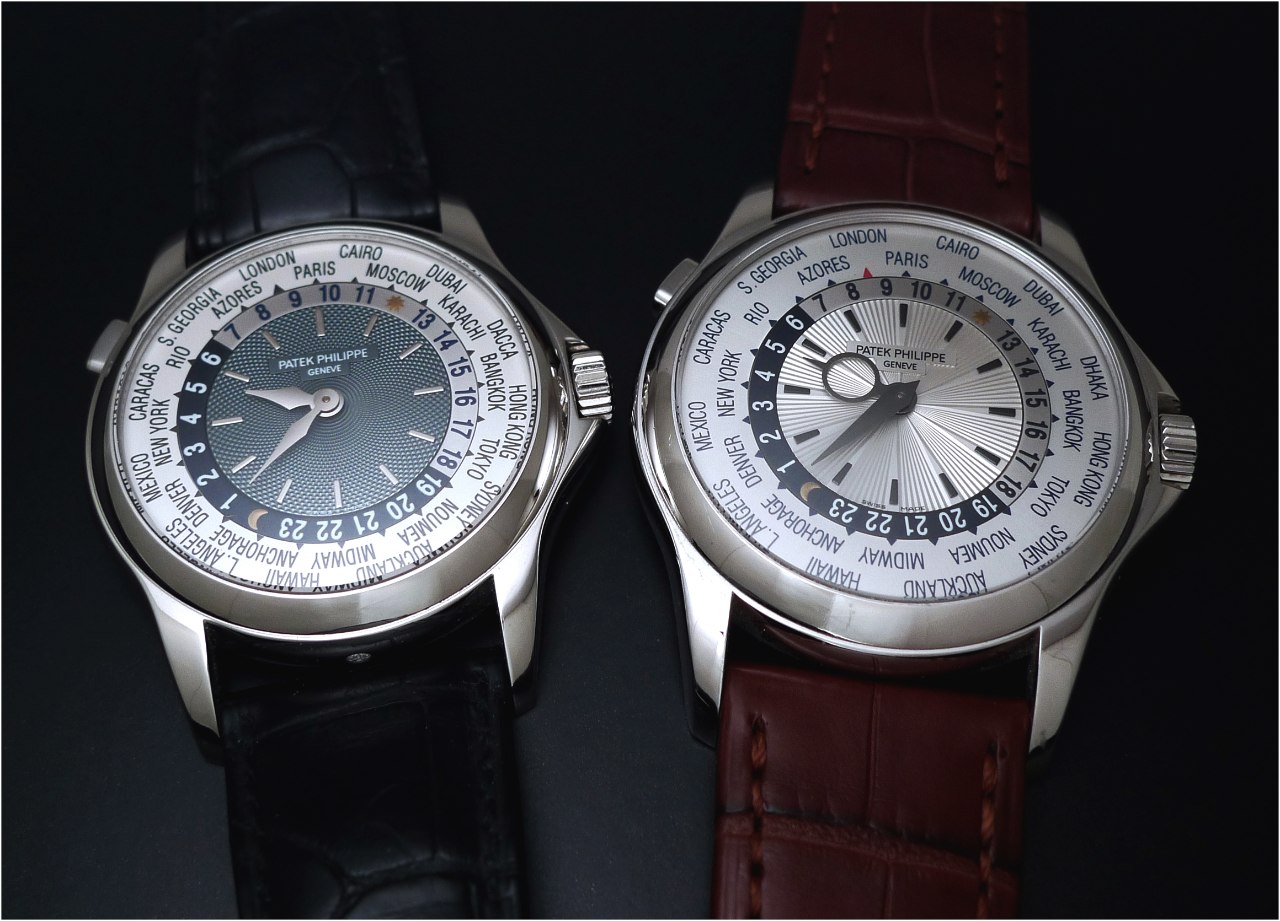
So this is a 3 way choice: 3940, 5140, or 3940 of 2015 (apparently a gimmick, for some, though I think that is a commentary on PP's perceived integrity rather than the piece itself).
For what it's worth, I too love the 3940 first series dial. Problem is that with some of those you have to "put up with" a solid back, hiding a really special movement. So, I guess we'll also have to add the 3941 into the discussion too!
3940, always - and I am hunting for one!
I almost got a 5038 recently. But even though it was very nice and rare with its fantastic black dial, I just did not like the pearls on the bezel.
Small things can spoil a beauty, I guess. And that is my issue with the 5140: just a bit off from true greatness.
So, the 3940 is a classic beauty for me and I would go for a yellow gold one if I could wear it frequently. However, in my business it is better to be a bit more discreet so I am now hunting for a white gold 3940!
3940 Sotheby's
There is a rather nice one in the catalogue for the next Sotheby's Auction in London. Take a look - and laugh at the silly thing they say about the differences (or not) between 3940 and 5140.

A tough call,both have their place, but maybe for nostalgic reason,the 3940 for me. [nt]
 [/URL]
You see... The Advanced Research on the moonphase subdial is tasteless, imo.

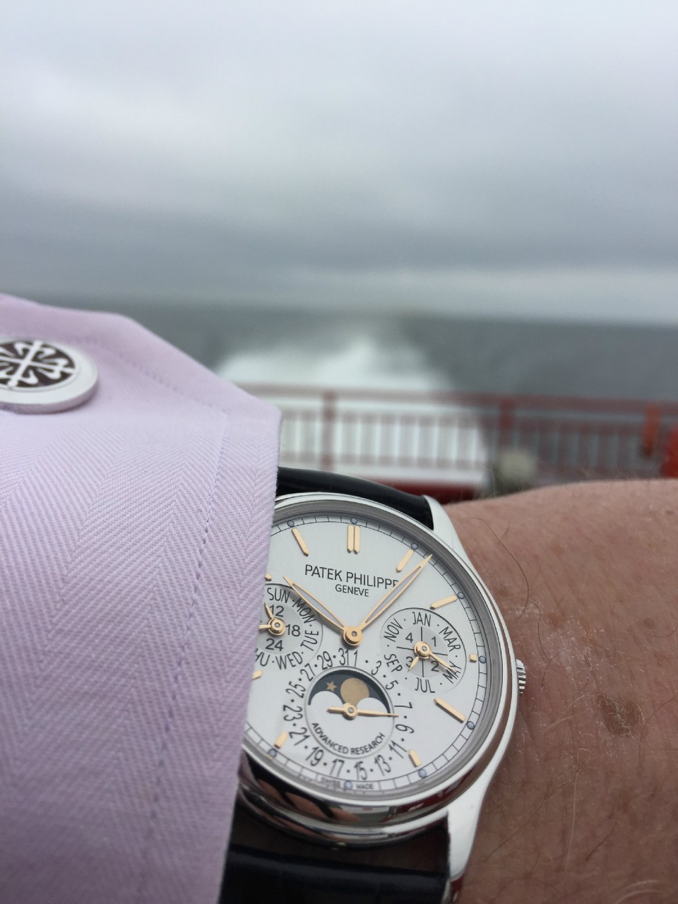
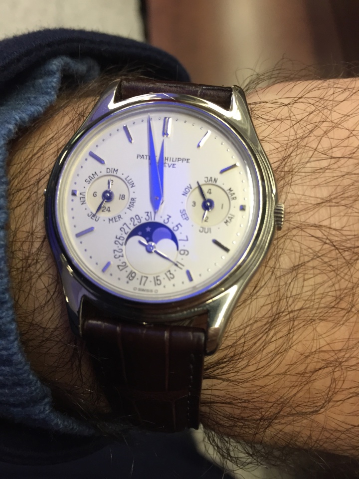
Beautiful picture

Was absent for a few days, I missed that one but...
I suppose you know my answer ;-)))
Needless to say that my vote goes for 3940, and specially the P or the R versions.
The P has a wonderful dial, slightly brushed (a bit like 5235 regulator but less brushed), thus giving a lot of life to the dial, much more than the opaline white of the G version. As for the R version, it is a bit less understated than the P (or G) version but pure beauty as well. Clearly a watch for connoisseur.
Thanks for sharing this pic Nico, even if I have a strange feeling when looking at it as you can imagine...
Best,
Mike
You don't have to regret yours, Mike. Look at your wrist, smile will come back. ;) [nt]

I had 3940j, 3940g, 5140g all at the same time