
stromer
2452

Impressions of the Seventies Chronograph
Only one more week to go until G.O. will reveal their latest novelties in Basel (apart from the Senator Chronometer with the blue dial that has already been presented here.)
To shorten the wait let's look back to Baselworld 2014 when a movement was revealed that many watch enthusiast had been waiting for:
A modern, integrated, automatic chronograph. Until then G.O. chronographs either housed the combination of cal. 39 with a DD module or they were designed to a very special dial layout and/or highly sophisticated and highly priced (not to forget the Rattrapante).
Cal. 37 was designed to fill the gap. It was targeted to be reliable and stable, as simple as possible and fit for everyday use. As simple as possible sounds interesting considering the 450 parts the movement consists of. What can be simple about a number of parts as large as this in a single movement? That is easier to understand if you take into account the impressive feature list of cal. 37:
- 12 hours column wheel chronograph
- Flyback function
- Power reserve display
- G.O. panorama date
- 70 hours of power reserve
The importance of the movement for the brand was emphasised by the fact that it was launched in two very different watches: The Senator Chronograph, playing the formal and elegant card, and the Seventies Chronograph, targeting the segment of luxury sports watches.
The Senator Chronograph was the first one that I could see in the metal, more precisely the platinum version with its exquisite argenture grainee dial.
It turned out to be a veritable member of the Senator line if you looked at it from the front or the sides: noble, sophisticated and heavy, maybe a little high for a Senator.
However I must confess that I was a slightly confused by the backside, namely the level of movement decoration which did not really seem to fit into the environment of a gold or platinum Senator. I will come back to this later.
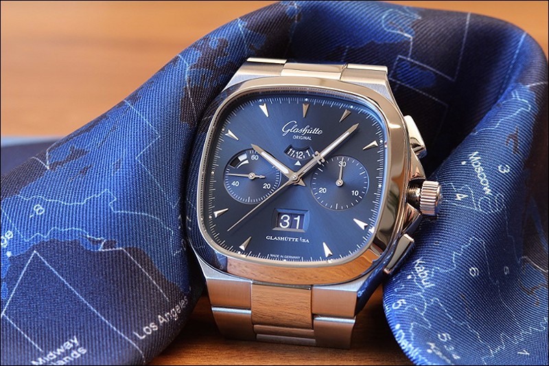
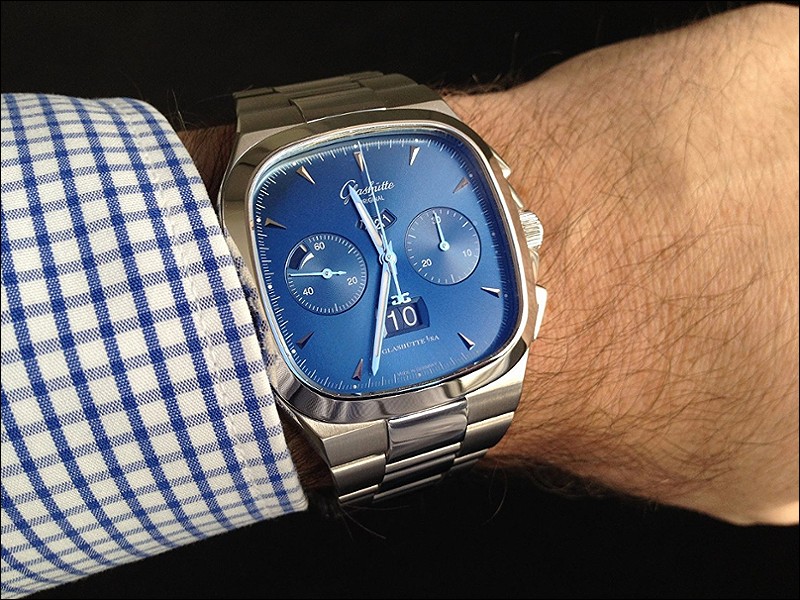
Last summer I was invited to the Dresden Music Festival by the manufacture and visiting the G.O. boutique in Dresden I found the Seventies Chonograph there. Blue dial and on the bracelet. Exactly the version that had caught my eye when it was presented here at PuristS. I tried it on, examined it all the way up and down and I loved it.
„They got everything right.“ were the words, that crossed my mind and stuck there.
Half a year and some visits at my local AD later I pulled the trigger.
Almost three months have passed since then and it is about time to share my impressions with you.
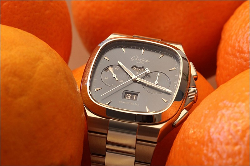
Let's start with the most obvious aspect: The blue dial.
Yes, it is the blue version in the picture above. It is amazing how the dial plays with the light and how it can change brightness, hue and surface structure depending on the light. It can look from grey to very dark blue and even get a tint of turquoise.
The sunburst pattern can pop out and it can vanish completely, the latter especially in low lighting conditions. It is a surprise what you get each time you look at it:
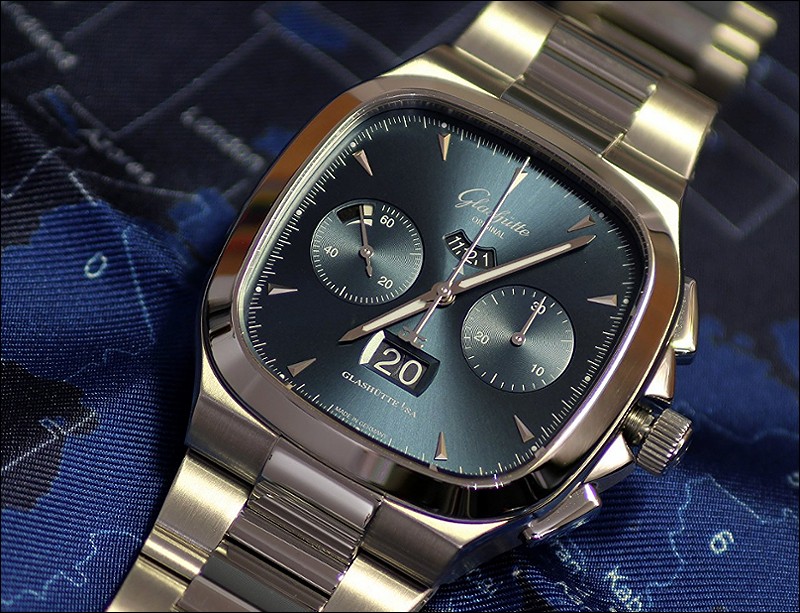
The layout of the dial is a piece of well done design to my taste. I think it was a good decision to replace the 12 hours subdial used in the Senator Chonograph by the hour disk visible through the small dial cutout at 12. (Even if I would need my glasses to read the small numbers in case it ever occured to me to measure a timespan longer than 30 minutes using the chronograph.)
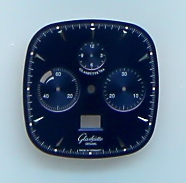
At the manufacture I saw a display of dials which gives proof of the fact that the designers seriously considered the three subdial layout for the Seventies Chronograph:
I think they made the right choice. Although there is a lot of information on display (12 hour chronograph, power reserve, panorama date) the dial layout feels very balanced and clean over the long run. Very well done.
The main hands and indexes are made of white gold. A welcome effect of this is that under low light conditions they seem to keep their luster much better than the steel hands I have known before. Combined with the very dark blue colour that the dial shows under low light this bright colorless luster of the hands and indexes looks superb. Unfortunatly I did not succeed to capture that in a picture.
A propos low light. The lume could be better. While its white color does a very good job at daytime to keep the polished hour and minute hands reliably visible against the blue dial it could be brighter in the dark. The small lume dots marking the hours are barely visible at night.
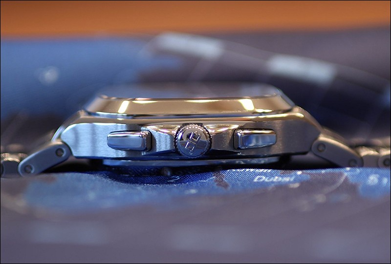
Case and bracelet are superb. The mix of straight and softly curved lines, of brushed and polished surfaces, of sport and elegance are done very, very well. The square dial allows for a wide dial aperture while the case dimensions remain well wearable. 40mm width and the very curved and short „lugs“ make the watch fit for narrow wrists like mine. On the other hand the bracelet is a full 26mm wide where it meets the case and 19mm at the clasp. So it looks massive enough to work on strong wrists also.
The case is 14mm high which is not really much for a sporty chronograph with a water resistance of 10bar. A welcome experience is that the case with its sloped „lugs“ and the strongly tapered bezel work together to form a layered, pyramid like shape which makes that watch look much flatter on the wrist than it really is.
G.O. bracelets are well known for their massive build, their wearing comfort and especially the fine adjustment mechanism that I personally consider the best on the market. The bracelet of the Seventies Chronograph makes no exception. In case of the Seventies line it additionally serves as an integral part of the overall watch design. Obviously watch and bracelet were designed together, and I personally did not consider the rubber or the leather strap for a single moment. This is not meant to say anything about the straps. I just did not look at them because it was always clear to me that it had to be the bracelet.
The locking mechanism for the bracelet pins holding the links together is breathtaking. You push a little screw-like head down with a screwdriver, turn it by 90 degrees and it locks in place, releasing the bracelet pin. Then you can push the pin out to size the bracelet. You turn the „screw“ back by 90 degrees, it pops back up into its original position and the pin is locked again. The best mechanism for that purpose I have seen so far. Seems to be as complex to manufacture as it is easy to use. It is almost a pity that you only need to use this mechanism when you are about to take pictures of the movement.
The clasp is almost the same as the one I know from the Sport Evolution. The fine adjustment mechanism is so easy to use that I do so multiple times a day. This results in a perfect fit of the watch at any time and the best wearing comfort I have experienced so far (together with the Sport Evo).
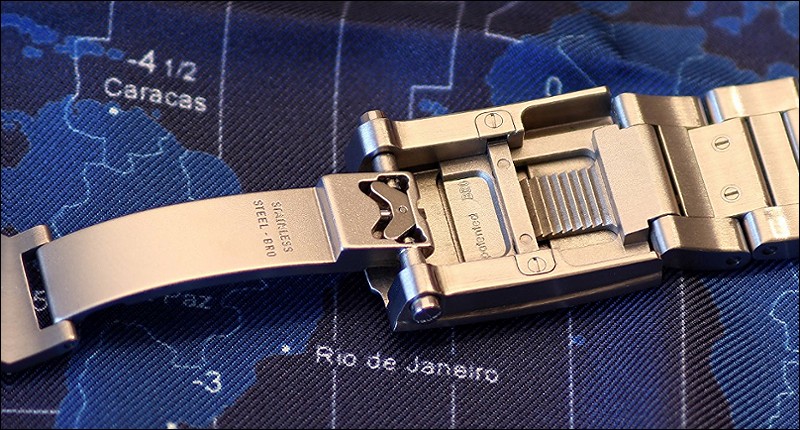
The current G.O. clasps add an interesting detail to the ones used in the 2000s: It has always required an simultaneous push on both buttons to release the clasp. But on the old clasps you were able to push one individual button in. Just that the clasp did not open because it was held closed by the second button. On the new ones you cannot even push in one button alone. As long as you try to push one button alone, this button will simply not move. I think this small difference is worth noting because it highlights the attention that is paid to improving details that worked well before.
Talking about attention: There are some sharp edges on the clasp's wristward side that obviously have not been smoothed in production and I cannot tell why. A little piece of fine sanding paper helped settled that issue.
Staying with the details brings me to the back of the watch:
Let's stay with the screws fixing the case back for a moment.
These screw heads have a diameter of about 1.5mm. Cutting Torx slots into screw heads that small must be a royal pain. Why, I wonder, would they do that when normal slotted screws would have done the job as well? I think the answer is simply: Because they can! And because it looks great, of course!
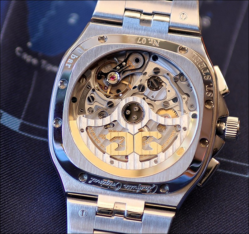
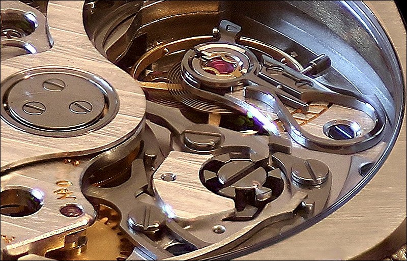
The movement matches the entire watch perfectly if you ask me. As I mentioned before, reliability, stability and precision were major design goals for cal. 37. Reducing the number of parts as far as possible, preferring flat parts that are not subject to torsion forces and giving generous dimensions to the chronograph parts were among the measures taken to implement these goals. The result is well visible: Very sober, almost stern, but unmistakably Glashütte Original.
The decoration is as functional as the movement itself. We have Glashütte ribbings on the rotor and the automatic winding bridge. We have polished and some blued screws, the tin polished swan neck regulator (for adjusting the beat error, not the rate, which is done by four regulator screw on the balance rim) and a sunburst pattern on the winding wheel.
But we have only very few – unpolished - bevelled edges on the plates, we have the least necessary engraving on the balance cock, we have simple grained or brushed plates and levers.
Knowing what G.O. is able to do in terms of finish I would say we have a „No games, just sports“ movement here.
Is this a good or a bad thing? I think there are two answers depending on the surroundings you put cal. 37 in.
Looking at the Seventies Chronograph I think it is a good thing for two reasons.
First because it helps to keep the watch a little more affordable. Would they have added all the possible bells and whistles and at the same time have increased the price tag by – lets say – 20% I would probably have been out of business.
Second because I feel it is coherent with the spirit of the movement and of the watch.
Looking at the Senator Chronograph I see things a little differently. Being asked as much as 25.000€ (RG) / 45.000€ (Pt) for a Senator Chronograph I would expect more in terms of movement decoration and delicacy. The perceived „No games, just sports“ approach of cal. 37 did not really match the Platinum Senator when I held it in my hands. Would it have been a good idea to apply a higher level of finish to cal. 37-01, the Senator version? Probably not because that would have meant setting back cal. 37-02 in direct comparison. But that is all just my two cents.
Back to the Seventies Chronograph. It gives me a real lot of owning and wearing pleasure. I perceive it as a luxury sports watch that has its own modern elegance. The impressive set of features and the execution of the watch are unrivalled at the price point if you ask me. To me it is clearly a watch to own.
Thank you for staying with me and happy waiting for Basel!
All the best,
Martin
This message has been edited by Dr No on 2016-03-10 12:03:41
Impressions of the Seventies Chronograph

I don't like to be a victim.
That is a problem with G.O watches.

This has everything I want in a watch.
Excellent review!
Thanks a lot your insights!

Thank you for this wonderful review.
Well, the crystal sits 14mm above the wrist, bit it looks and feels more like 12.

Thanks for this though, very informative review!
I tend get carried away a little :-)
Yes, that's one of the assets. But the good thing is that it is not the only one but in balance with the rest of the watch.

A true in depth review
Thanks a lot, Damian!

Great review of a beautiful watch!
Thanks, blomman!
Thanks for your wonderful report
It turned out to be a daily wearer.

Wonderful and spot-on review Martin - but 'no games, just sport' ...