Discussion
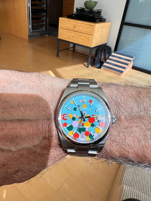
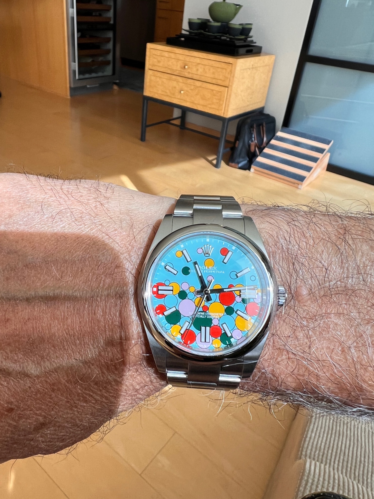
Chicolini's recent acquisition, a vibrant Rolex Oyster Perpetual, sparks a lively debate among collectors about Rolex's evolving design philosophy. This article explores the community's reaction to a timepiece that challenges traditional Rolex aesthetics, highlighting its unique appeal and the intricate craftsmanship behind its distinctive dial. Chicolini's post serves as a catalyst for discussing how a luxury brand can introduce playful elements while maintaining its horological integrity.

This watch is a little too bubbly for my slightly Germanic/serious personality. I'd probably give it to "Sophie" and turn her into a "WATCHDOG!" I just love making this joke!
Have a wonderful weekend my friend!
that it’s one of the most difficult Rolex dials to produce. The reason is that they are unable to pad print all the bubbles in different colors at the same time. So each color must be printed one after another and the tolerances are minuscule between the bubbles. Interesting.
I asked for one, and my AD told me after a few months that I shouldn't hold my breath. Enjoy!
No man you’re blessed!
Lots of egg spatulas! Black, yellow, red, tongue pink, white, and peach face. So at least six different prints for this Micky dial, assuming they do the numbers and the logo with the rest of the black prints. The Rolex dial is probably a similar process, I'm guessing.
This thread is active on the Rolex forum with 54 replies. Share your knowledge with fellow collectors.
Join the Discussion →