Chrisfrombyron
65

I think its a stunning watching .....
Certainly snapping at the heels of Patek and a few others ....
The writing on the dial is a tad busy but nowhere like the mini essays on the faces of some watches , ala Rolex .
Any indication of price ?
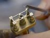
BaselWorld 2014 : L.U.Chopard Qualité Fleurier -10 years of certification in a chronometer
The Fleurier Quality Foundation label is undoubtedly the most demanding of all watch certifications. It combines the COSC, Chronofiable and Fleuritest trials. The latest Chopard L.U.C Qualit Fleurier chronometer perfectly embodies the essence of Haute Ho...

Good input ...
Agree with you. Perhaps just the logo 'Q' is sufficient, but to have it balance it got to be placed after Chronometer. But in term of 'ranking', QF is higher and more stringent, so it may need to place just below the brand logo. Perhaps the 'Q' could be i...
If it was up to me..
If it was up to me, I will prefer just L.U.Chopard printed on the dial. No 'chronometer', no other logo. Don't Need to advertise qualite fleurier on the dial.
That's also the reason that ...
the dial of the L.U.C 1963 Chronograph PuristS Edition is clean, even though the piece is both COSC and Poinçon de Genève certified. Thanks for viewing. Kong
The dial should be cleaner.
Actually, I can accept the logo on the dial but not the words "qualite fleurier". To me, it is redundant and repetition. As you said, the logo should be placed on sub dial instead. Regards Ling
After ...
the model L.U.C Tech QF, the full word “Qualité Fleurier” in capital letter/uppercase appeared. Placing the logo beside the word, seems to tipped the balance... but the piece in metal is good looking. A pic for you :-) Enjoy your first edition of QF ... t...

This is gorgeous
I especially like the case which looks like a modern interpretation of the tear drop lugged cases on the 1950's. I think it is fair to mention L.U.Chopard in the same breath as Patek, Vacheron, AL&S and AP. Understood the FQF cert, but between this an...
Both are superb indeed!
Two of my favorite watches from Basel 2014 and a tough battle between both. Still the 1963 is twice the price of the QF so it would depend on the budget. Anyway, great to see the LUC collection being extended so nicely and congrats Chopard! Best, Carl
I think its a stunning watching .....
Certainly snapping at the heels of Patek and a few others .... The writing on the dial is a tad busy but nowhere like the mini essays on the faces of some watches , ala Rolex . Any indication of price ?
Glad it attracts you ...
the work is in the same league, just need to beef up the brand equity. Only has list-price in SGD, just an approximation, converted to about AUD21,000 . Kong

Up to ...
the brand... the previous QF edition ever in white gold before, so it can be done. Perhaps the brand should issue a total of 250 pieces of WG and RG. Kong