Discussion
quattro's imaginative post playfully explores a horological 'nightmare' where his vibrant watch collection transforms into a monochrome palette, with a micro-rotor evolving into a tourbillon. This thought experiment invites readers to consider the aesthetic impact of color versus black and white in watch design, particularly when applied to iconic references like the Vacheron Constantin Cornes de Vache and Chopard L.U.C Quattro. His post serves as a creative prompt for the community to reflect on the visual allure and mechanical intricacies of their own collections.


Cheers Marc
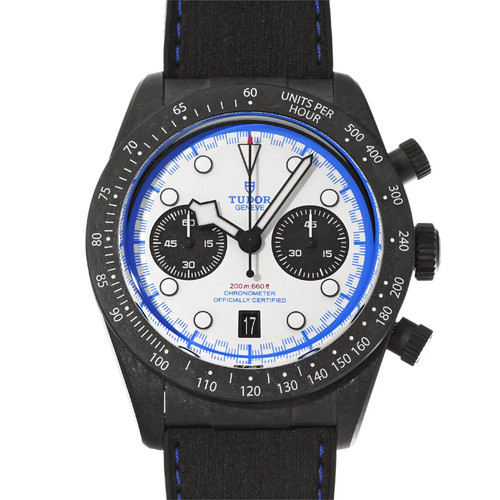
all things balanced and considered, as much as I appreciate the strong and ascetic aesthetic of the black & white look, I think it might just not be me, I'm afraid...
This thread is active on the Horological Meandering forum with 20 replies. Share your knowledge with fellow collectors.
Join the Discussion →