
Discussion
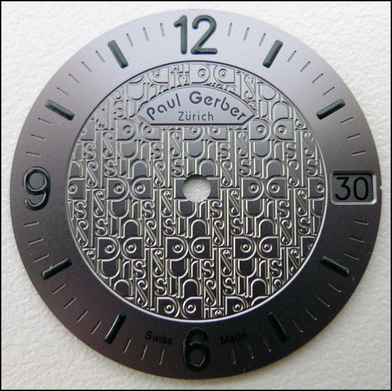
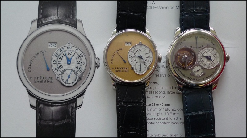
AndrewD's 2012 post delves into the often-overlooked yet crucial detail of font design on watch dials, using F.P. Journe and Paul Gerber as prime examples. This discussion highlights how typography reflects a watchmaker's aesthetic priorities and significantly impacts a watch's overall appeal and character.

How important to you is the font used on a watch?
As I live with my watches for longer and longer periods I find that it is the little details that keep my interest. And the fonts used by F.P.Journe and Paul Gerber were designed by the men, themselves, and must therefore reflect something about their aesthetic priorities.
What fonts work, or don't work, for you?
Andrew
If there were less text it wouldn't be an issue - it's a watch dial, dammit, not a school blackboard I do like many of the fonts, such as the Gerber, especially when they almost become a design element rather than just text plonked on the dial. Or the Nomos font, which is perfect for the design ethos used. On the other hand I've never been convinced by the pseudo-gothic Grand Seiko font as it seems to clash with the almost utilitarian feel of the watches. nick
it looks exactly like a school blackboard. i dont really think of font unless its a subconscious thing and if i dont like the look of the dial the font might have something to do with it. i must look at what i own and see if the fonts are pleasing to the eye. G
... I feel that the manufacturer election of the type of font makes for a very important part of the design, and adds beauty to the dial. I´m specially attracted by the font used by A. Lange, so elegant and minimalist. Beyond the high quality of design and mechanics of these watches, I really love the font selected for those so clean & neat inscriptions with the brand name on the dial. By the other hand, as much as I love Rolex products, I feel that their beautiful dials are much clutte
Except when the dial designer (and there are many) is extra creative and trades function (it's a dial!) for the form. I checked my current watches and most of then or have just marks or sanserif numbers. An example of extra creativity: My wife says that this is a watch for rich persons, that don't need to count minutes. Cheers, Nilo
Here are some favorites for text - the script Geneve on many geneve models prior to mid 60s. Gruen late 50s Grand Seiko - early 60s - in this case a faithful commemorative Numerals Pre spaceflight Soviet alarm My absolute favorite - Wittnauer alarm early 60s Also love the GO Senator Sixties (faithful rendering of original cold war design) Ginger
. . . and block lettering on Seamasters . . . [photo credit: Dr No / wrist: Omega boutique staff] . . . like this one, a white gold annual calendar model from 2011. Art This message has been edited by Dr No on 2012-02-24 18:51:28
This thread is active on the Horological Meandering forum with 23 replies. Share your knowledge with fellow collectors.
Join the Discussion →