Reference Guide
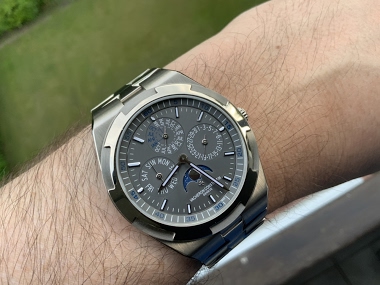
Emmanuel, known as quattro on the forums, presents a compelling visual comparison of two Vacheron Constantin Overseas Perpetual Calendar Ultra-Thin references. His post delves into the aesthetic nuances between the white gold and rose gold variants, each paired with distinct dial colors. This exploration is particularly valuable for collectors considering these ultra-thin perpetual calendars, highlighting how subtle material and dial choices profoundly impact a watch's character.


I totally understand Ed, but I am partial to the burgundy dial 100% 🙂
While both are enticing, the burgundy at least on pictures appeals to me more 😊👌🏻👍🏻
Best, Emmanuel
seems more settled and more soothing on the long term. The red dial is perhaps the most catchy and bright one at first glance and the excitement drops to fast and far.
Best, Emmanuel
This thread is active on the Vacheron Constantin forum with 37 replies. Share your knowledge with fellow collectors.
Join the Discussion →