Collection
Jrwong23 (aka watchthebin) shares his passion for rose, red, and pink gold watches, offering a comparative look at various pieces from his collection. This article delves into the nuances of gold alloys, explaining how different compositions of copper and silver create distinct hues, and explores the aesthetic appeal of these warm-toned metals in luxury watchmaking.


On a wristscan some weeks back, I shared my "squadron" of rose / red gold watches.
Rose gold has always been my favorite color for watch metals due to its warmth and glow but it doesn't mean I always choose Rose gold watches. There are some watches that needs to be practical in steel for sports, travels or outdoor activities and there will be some watches with dials and hands that go better with white metals (for example I tend to feel blued steel hands go better with white metals case and a silver/white dial).
I'm sure many of you have read some write ups on various types of gold alloys used in jewelry and watch cases (as well as hands, dials, rotors and sometimes even in movements) before so I won't go into the details here but will just give a bit of summary to the new Purist or watch collector in our community. I am also not a metallurgist so have to do some research myself! J
We all know that pure gold is yellow in color and is defined as 24 karat gold, being 100% gold.
To achieve alloys of Rose, Red, Champagne, Honey, White, Green, Purple (yes, there’s purple gold in Singapore!), etc gold, some alloys of gold have to be created. Typically for jewelry and watches, the gold alloy will be 18 karat (18k) gold, which means 75% pure yellow gold mix with 25% of other metals to give the desired color, hardness and malleability.
For this write-up, I will focus on Rose / Red /Pink gold and some comparisons in their color hues amongst my RG/PG gold pieces. Some articles had tried to define the difference between rose, red and pink gold in terms of differences in alloys. Wiki defined it as follow:
18K Red gold: 75% gold, 25% copper
18K Rose gold: 75% gold, 22.25% copper, 2.75% silver
18K Pink gold: 75% gold, 20% copper, 5% silver
My understanding is all watch brands/case manufactures have their own formula for Rose, Red or Pink gold and it’s not often the case they disclose in full details the composition of other metals in the alloys. Some brands for example Panerai, does disclose a bit more info, e.g. their special red gold alloy is called 5NPT and it has a very high percentage of copper, at 24.1%, to give it a more intense red hue. Platinum has to be added to stabilize the 5NPT Red Gold so it doesn’t oxidize that easily (copper, whilst giving that nice red hue is more susceptible to oxidization compared to gold and platinum).
I also believe various brands choose to call their “reddish” gold Pink, Red or Rose gold depending on their choice and it’s not always based on Wiki’s definition above. In addition, there are some finer definitions of Red/Rose/Pink gold and often we see 3N, 4N and 5N being used. My understanding is that 5N is redder whereas 4N is more yellow. Not all brands specify this detail as well.
Anyway, enough of theories… time for some photos and
comparisons! 

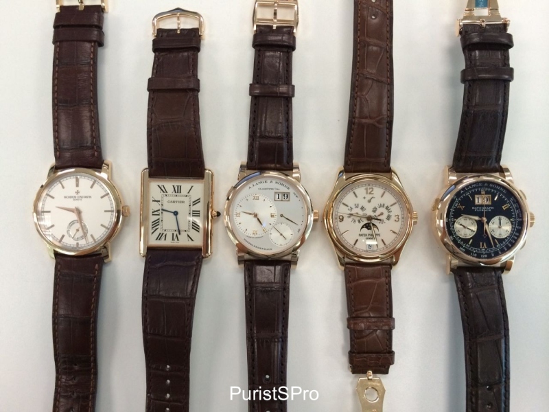
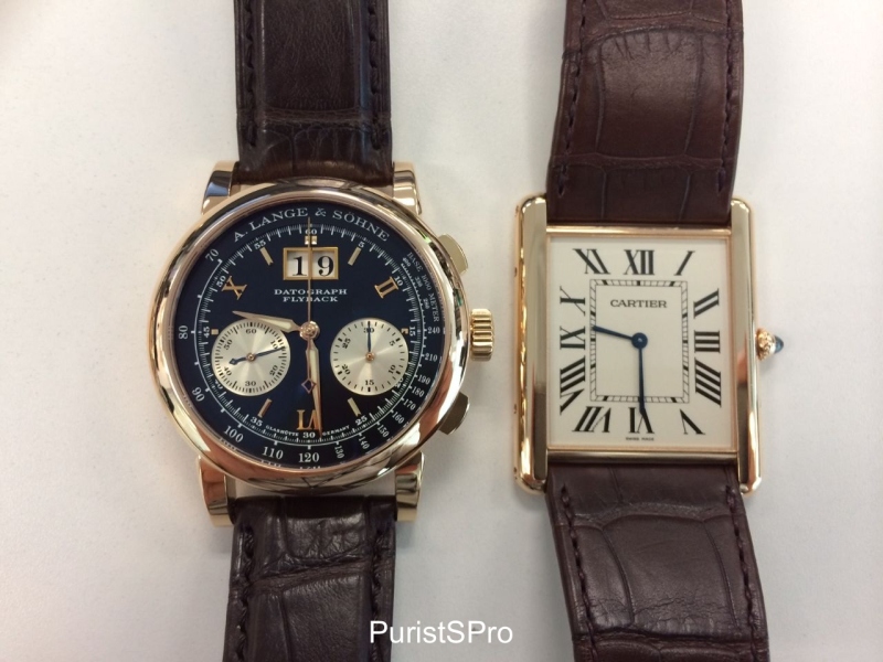
Some weeks ago, after I got my Lange 1 in pink gold, I decided to compare my various pink/rose gold watches and see how they look side by side under white light, on a white table/white cloth. They are the Cartier Tank Louis Cartier XL ultra flat, Vacheron Constantin Traditionelle, Patek Philippe annual calendar 5146R, Lange 1 and Datograph in rose gold (aka Dufour Datograph). Officially on their websites, Lange, Cartier and Vacheron Constantin call theirs Pink Gold wheres Patek Phillipe calls theirs Rose Gold, terminology wise. I suspect all of them are 5N Pink/Rose Gold but I couldn’t find all the details on this. Also please note these are just my watches and they do not represent all PG/RG models of the 4 brands here.
When looking at all 5 together, it seems that the Langes are more “Rose” (like in the Rose wine) in color whereas the PP and Cartier seem redder with a deeper hue. The VC seems most “balanced” in its color hue.
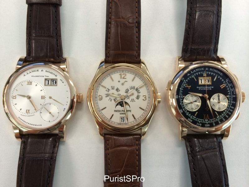
When I looked at the 2 Langes vs the PP (in the center), it looks like the PP is deeper in his red but also a bit mixed with yellow hue. The Lange 1 seems more champagne color now. The Dufourgraph seems more pink but I guess the black dial played an optical role.

Now let’s look at the VC vs the Cartier vs the Lange 1. Here, it looks like the Lange is more pink/rose. The Cartier looks a little “red” but also more yellow than the Lange relatively. The VC again looks quite balanced, but closer to the Cartier than the Lange, which stands out as more pink/rose in hue.
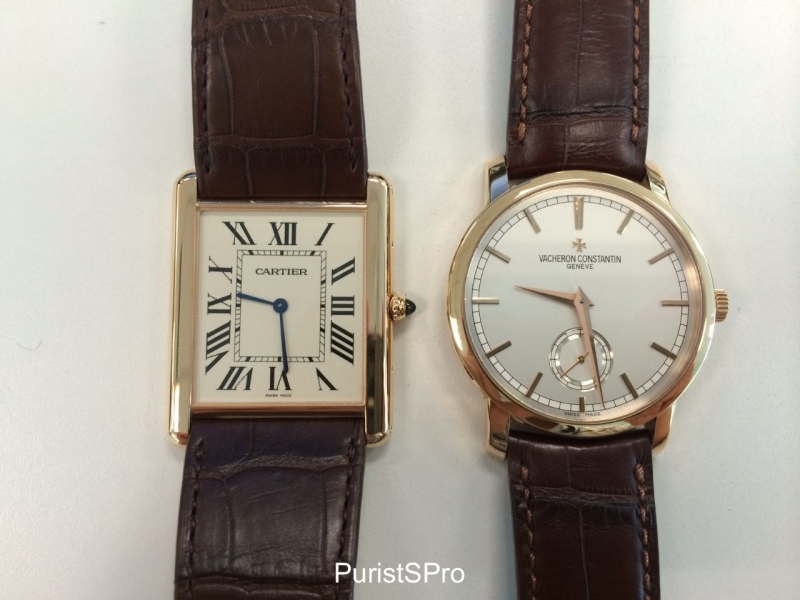
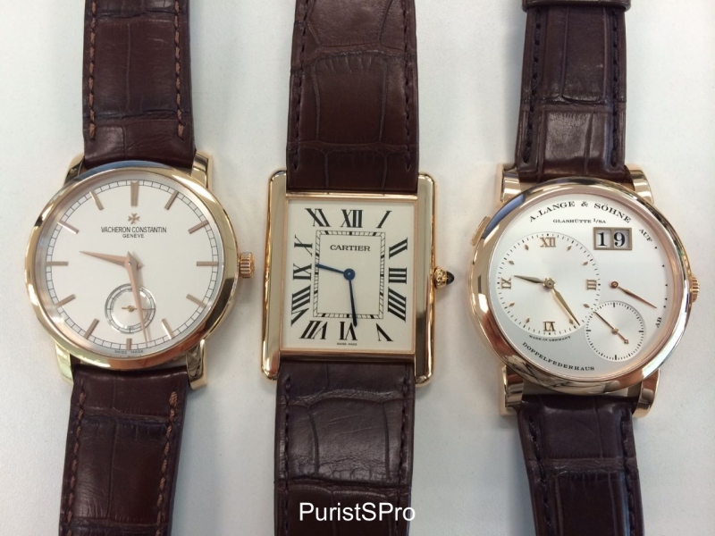
Now I drill down to the Cartier vs the VC. When looking at just these 2 side by side, I couldn’t tell much difference. I think these 2 pink gold are the closest in color hues amongst the 5 watches. The polishing of the Cartier Tank may have affected the way it reflected light so it looks a bit more pink here compared to the VC.
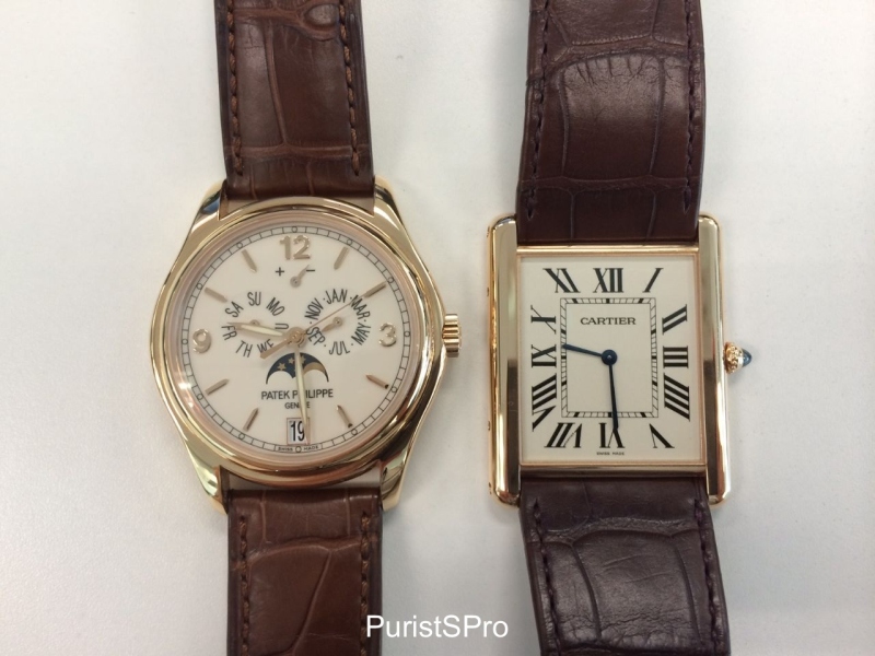
Next I compared the PP and Cartier. The PP looked more yellow beside the Langes but here, it is less obvious. Everything is relative. It does look slightly more “champagne” than the Cartier here but overall the both look quite similar.
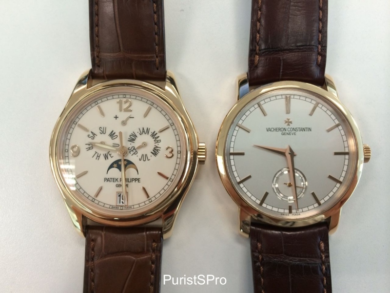
Now if I compare the PP vs the VC…the PP now looks slightly yellower even though it also looks more shiny, which may affect my differentiation of the color hue. The VC does look slightly redder here.
Lange Dato vs Cartier – I think the Lange is more rose/pink and the Cartier slightly yellower but I am struggling to differentiate already at this stage!
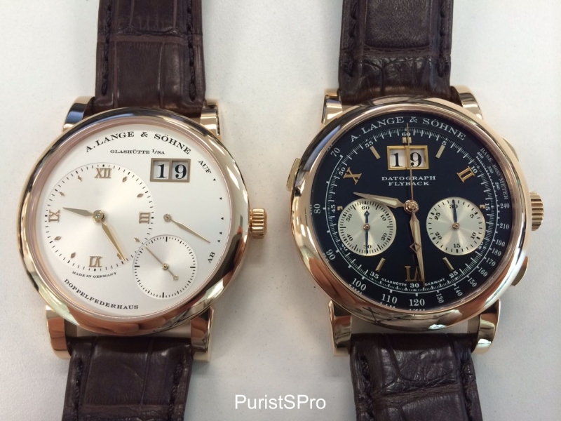
Just to make sure the black dial of the Dufourgraph doesn’t affect my judgement, here you have it side by side a Lange 1. Both look the same to me, with a nice rose/pink hue.
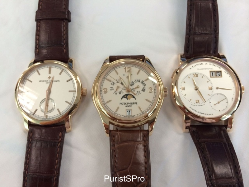
Now to compare Lange, VC and PP together, Here, it looks like the PP is more yellow in between the VC and Lange but it also has a slight “greenish” hue. The Lange 1 is most pink/red with the VC quite balanced.
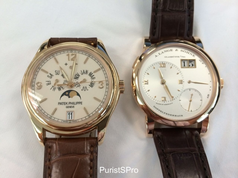
Another shot to compare Lange with PP. It’s quite clear to me Lange is more pink/rose but the PP has its own charm. Yes it looks more yellow but it has a bit of that “greenish” hue that I didn’t find in the other watches I have. I actually quite like this color too.
My personal conclusion is I do like my rose/pink gold to be
less yellow and to have that warm pink/red hue. To this effect, my 2 Langes made
me very happy The Dufourgraph in RG with a black dial is my personal favorite combination
now.
However, the color hue also needs to go well with the case shape, dial color, bezel finishing, etc. It is not just the hue of the RG/PG but also how the whole package is crafted together. E.g. the PP case is more shiny and even though it does look yellower in some of my photos, the curves and polish of the case and bezel, mixed the cream lacquered dial, made it a very charming watch.
The Cartier and VC are most similar in their color hues
and both are very traditional and classic in design and colors with PG and
silver dials. They may not excite but they are extremely enduring in their
looks. I never get bored of them until today to be honest.
So here’s my RG/PG squadron. Which do you like? J
Cheers
robin
PS: Pls feel free to let me know if you disagree with my color assessment - maybe I need to check my eyes for color blindness! At this level of differentiation of various RG/PG hues, we may be splitting hairs already. Anyway, just enjoy the watches if anything else :p
strong preference towards rose gold (specially paired with black dial ,) ) I can tell you that you made killer post :) from what I can see from your pictures and description the hue of Cartier is my fav Yours D
RG with black dial is always a killer :) I wish more brands do this. the RG silver dial is more common amongst various brands I feel - perhaps that's more classic and easier to please Glad you like this post and the Cartier tank! :) Cheers Robin
Thanks for putting this together, Robin. It's very interesting and educational for me, especially as I'm more of a white metal (with a very high preference for steel) person, so I've not studied this at all. I do like the hue and tone of the Lange 1 among these - just because at some angles, it looks almost white with a nice light golden hue. I think it matches the dial and hands beautifully.
gathering of watches. Very interesting post! Important data about percentage of metals that make colors of gold. It definitely stimulated my thinking on what color is my individual preference. As well as admiration for each individual brands designers. Thank You very much. Regards Edward
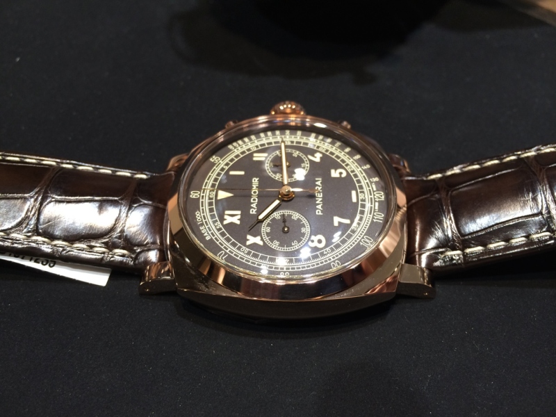
The composition of metals was just a guide I believe. Each brand/case manufacture will have their own proprietary composition to achieve their desired color/hardness :) I do appreciate brands like panerai with their 5NPT and Rolex with their everose gold. :) Cheers Robin
I agree, the redish gold is wery well composed in to the entire desing. ei. the Panerai. I also noticed on your pictures that the Cartiers golds color looks most delicate. Almost pale , yet it does not take away from its beauty, goes well with its square desing. Not to mention the Vacherons and Pateks gold. Which on both watches looks subtly different from each other and at the some time perfecly complementing their own desing. Regards E
This thread is active on the Horological Meandering forum with 21 replies. Share your knowledge with fellow collectors.
Join the Discussion →