foversta reports on a Rado event in Paris, offering a fresh perspective on the brand's 2013 collection. He observes Rado's strategic shift towards more ambitious designs and an increased focus on mechanical movements, leveraging their expertise in ceramic materials. This analysis provides valuable insights into Rado's evolving market positioning and distinct brand identity.
Today, I had the opportunity to attend an event organized by the French communication team of Rado to present the 2013 collection. Even if I had already seen it at Basel, I decided to see it again to check if my first feelings were still valid.
Actually, I think that Rado is doing an interesting move. The design of the watches is improving, is more ambitious in order to take more advantage of the specific materials used by the brand. Moreover, good news: the share of mechanic watches is increasing in the collection. But, as you can imagine it, the prices are also doing the same. Without any doubt, Rado has clearly left the entry level of Swatch Group made of brands like Hamilton and Tissot and moves now in the middle segment with its own style based on a design easy to recognize. There is without any doubt a Rado DNA. We like it or not but it is a strong asset for a brand when we are able to guess that a watch comes from it with only a few details.
I would say that the Rado equation is as follows: ceramic + dark atmosphere + uncluttered dials=Rado style
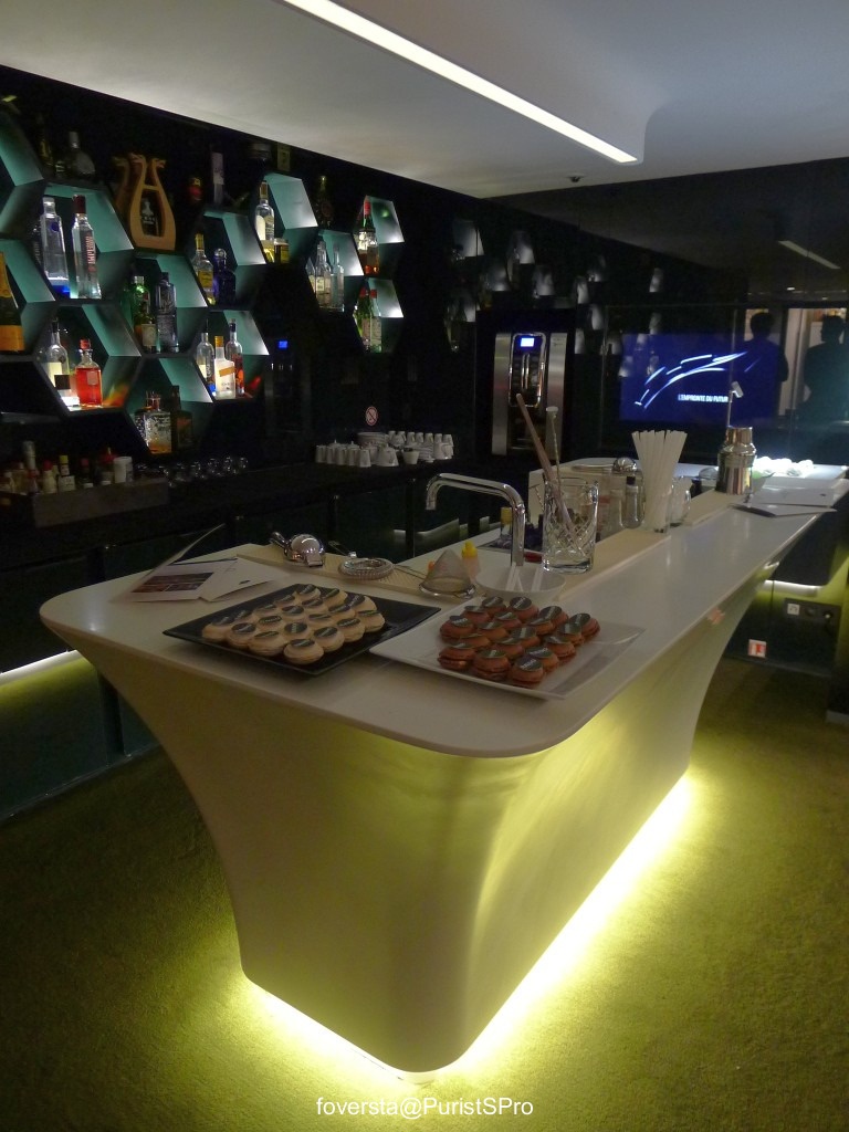
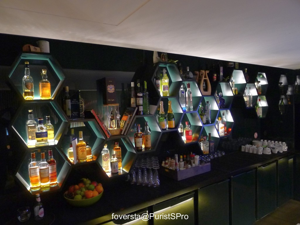
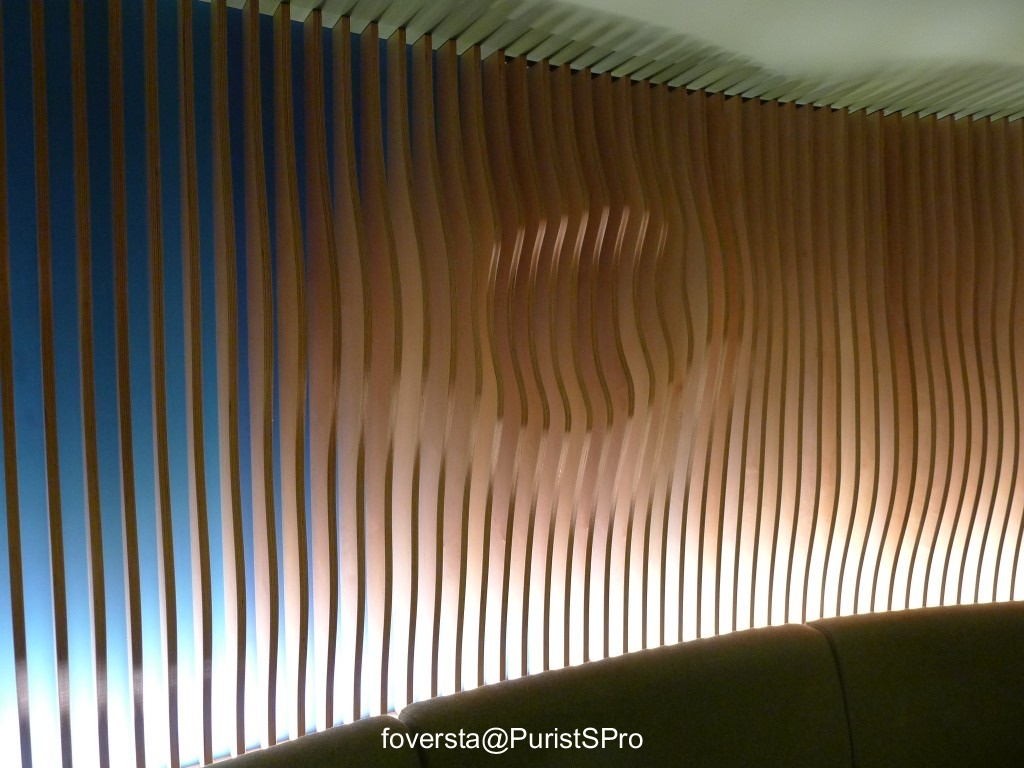
There is something I really appreciate with the Rado French team: they always organize the events in nice contemporary hotels which are most of the time still unkown. A good way to discover new addresses at the same time!
Today, at the end of the afternoon, I headed to the Hotel O which was designed by Ora-Ito.
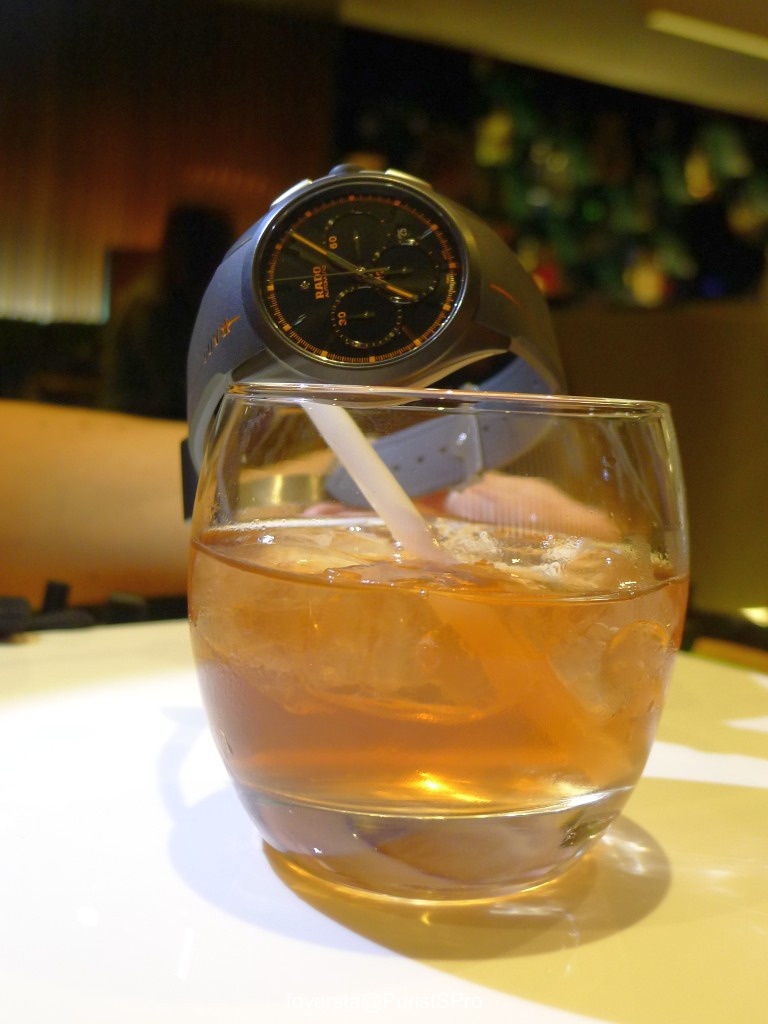
Believe me, I could appreciate the decoration, the furnitures... the bar and the wonderful cocktails!
Having a nice bar is not enough. The skills of the barman is much more important. He has some excellent and unusual cocktails recipes but since I was here to prepare a watches report, I only drank a glass of fruit cocktail. I hope you will appreciate my dedication.
Yum-Yum!
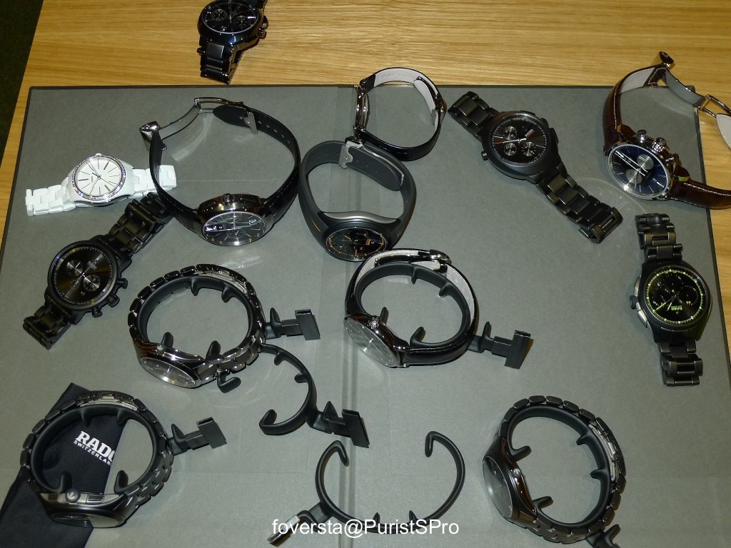
Let's browse the pieces I shot during the event.
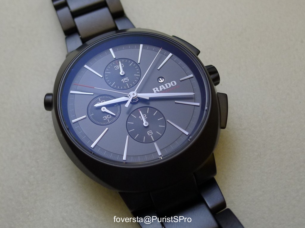
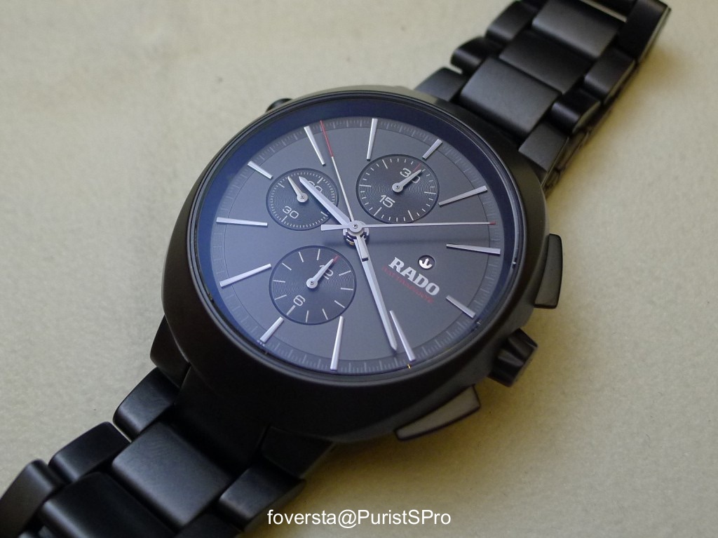
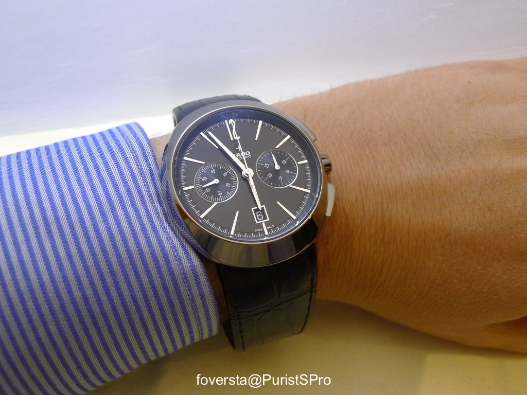
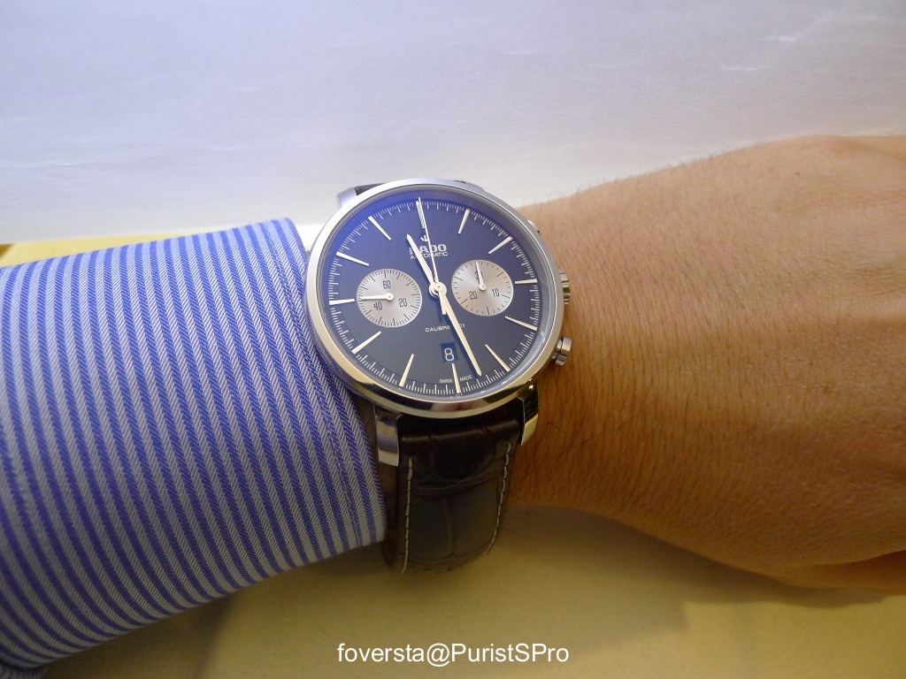
I would like to start with this D-Star Rattrapante. I think it is the perfect symbol of what Rado wishes to achieve: a rise of the horological contents and an improvement of the perceived and actual quality.
Even if the pushers are a bit too stiff, I could enjoy the case design of the watch and the pure and legible dial.
The case is made of black ceramic. Its diameter is 44mm. Maybe one of my fav current Rado.
Do you like tennis? The US Open is over now but the indoor season will start very soon. Even if Andy Murray lost his US Open title a few days ago in quarter-finals against Wawrinka, this 2013 season will remain unforgetable for him since he won his first Wimbledon title!
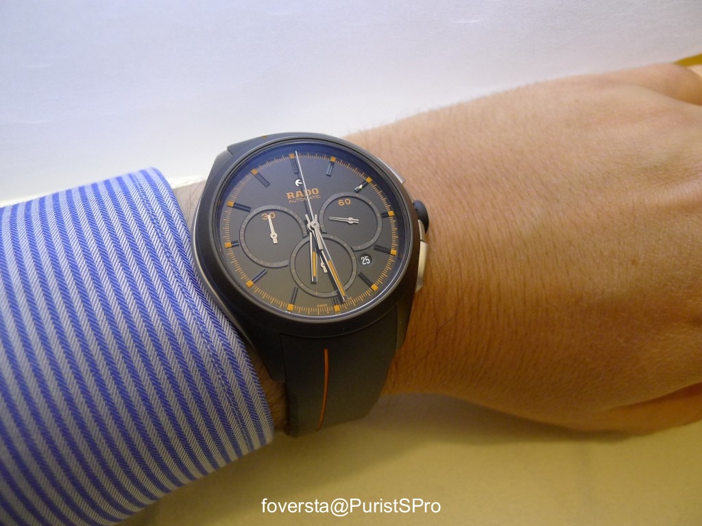
With the Hyperchrome Court collection, you choose your fav Grand Slam Tournement. The colors give you a hint about the tournement each watch symbolizes... clay, grass, hard court... choose your fav surface!
Wimbledon and US Open, the two Grand Slam Tournements won by Andy Murray:
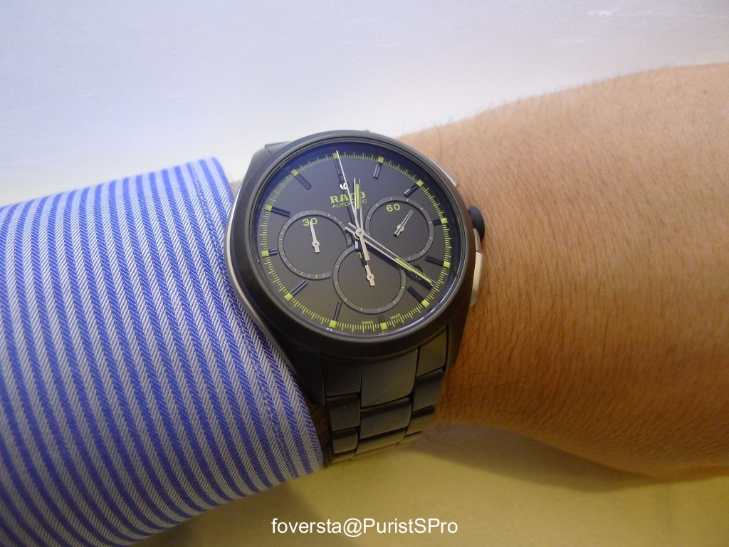
Even if I like the dial design, I much confess that the overlapping subdials are not very practical if we need to use the chronograph especially due to the minutes counter which is cut.
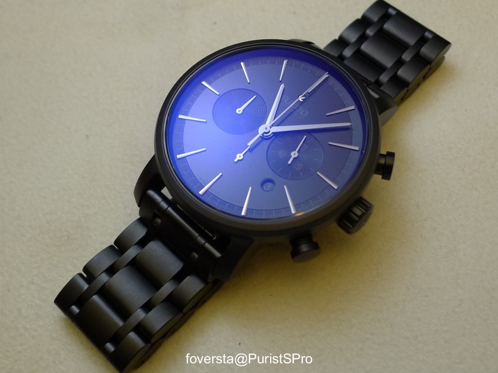
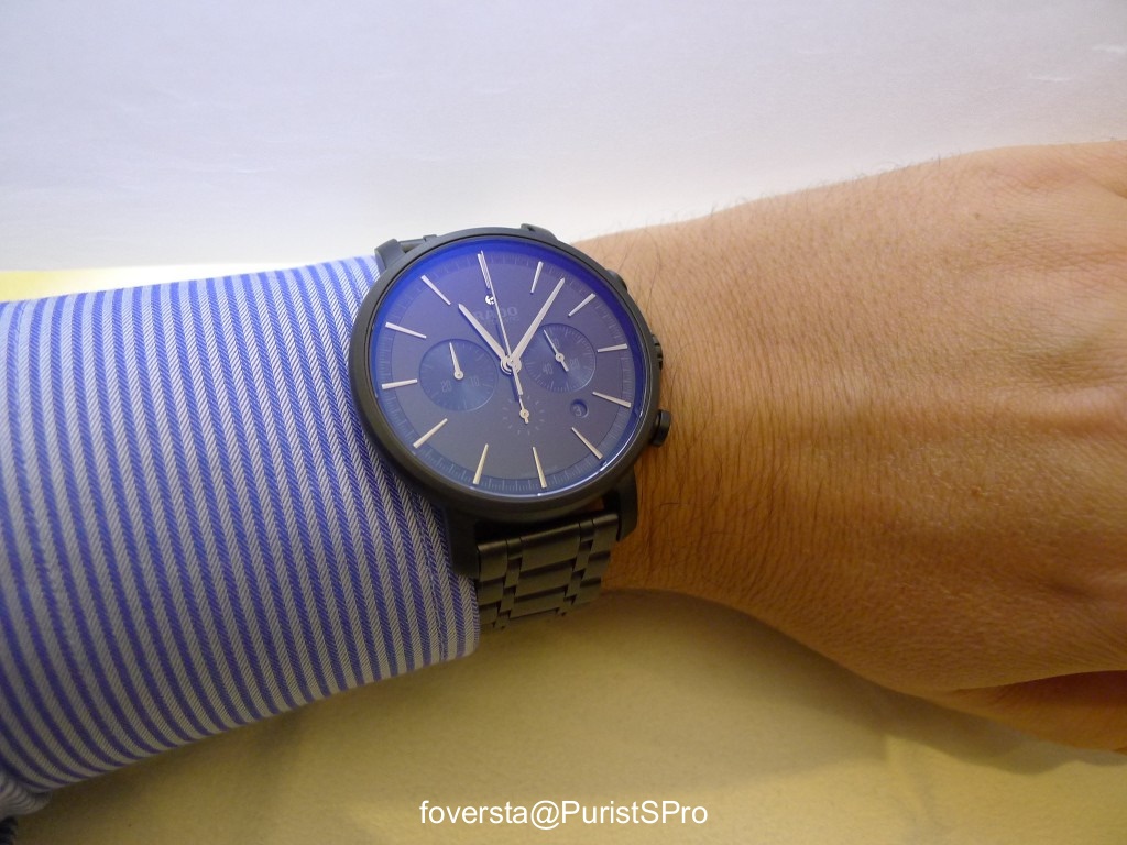
I prefer the blue touch:
The 45mm case is made of ceramic and stainless steel.
Two types of bracelet are available: rubber strap or ceramic. Of course, the ceramic bracelet is more coherent with the Rado style but the rubber strap works pretty well.
Roland-Garros... with the clay color and the rubber strap.
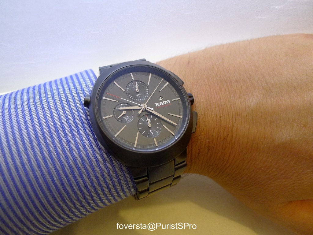
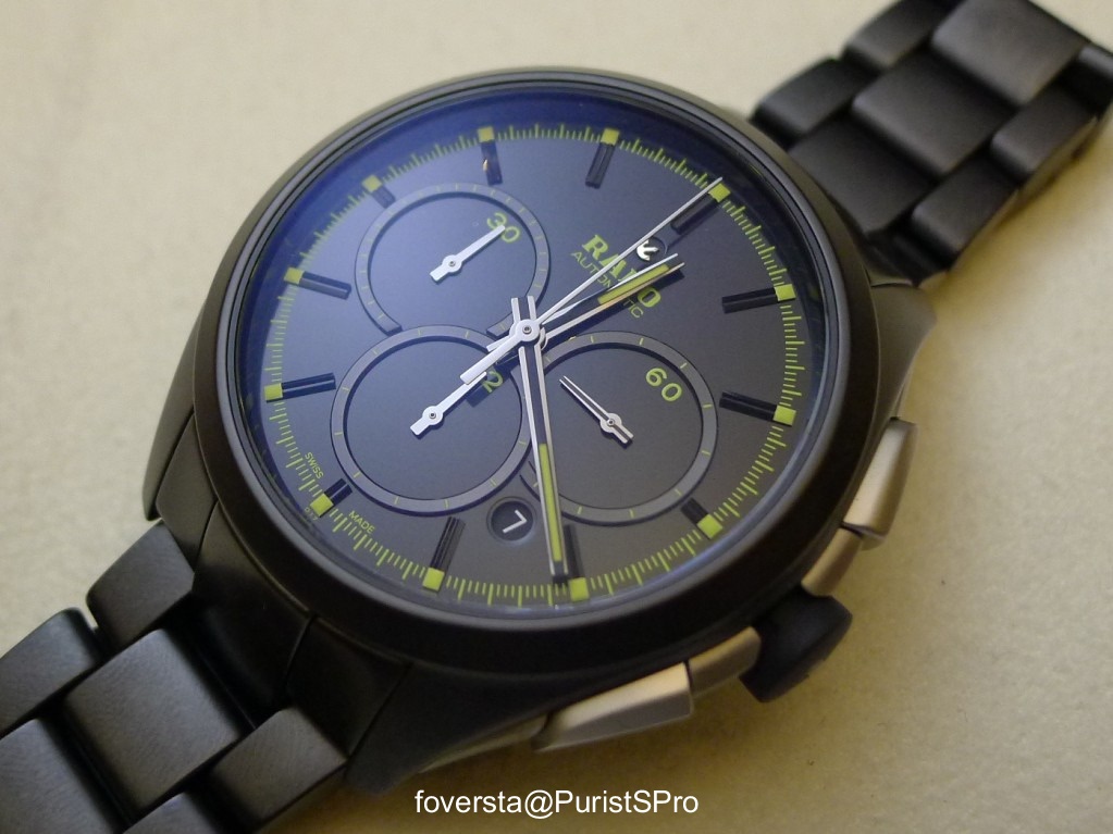
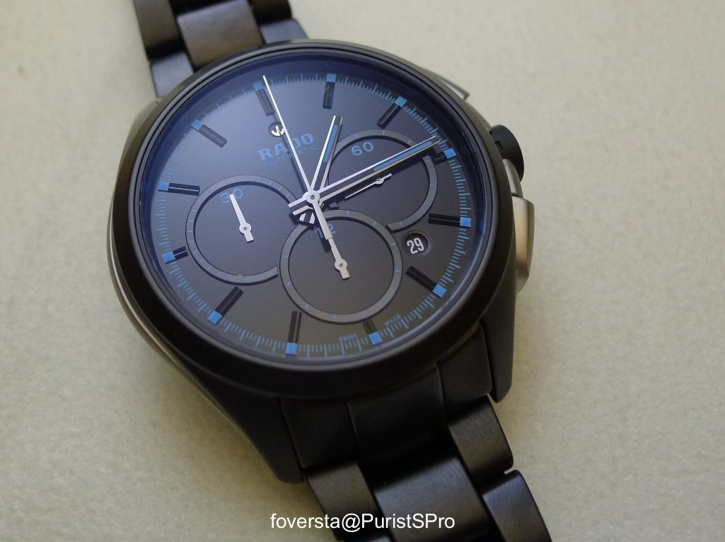
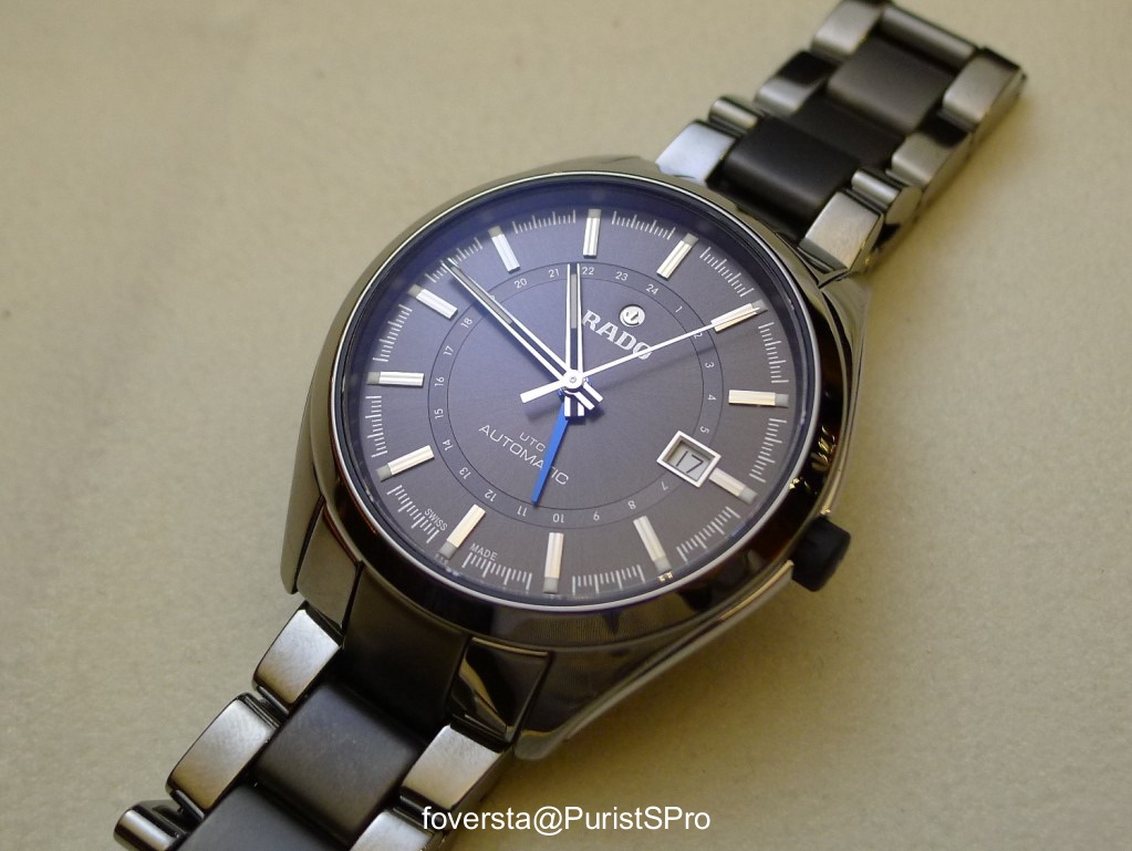
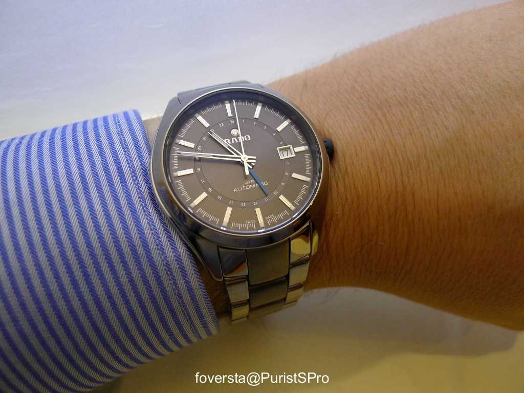
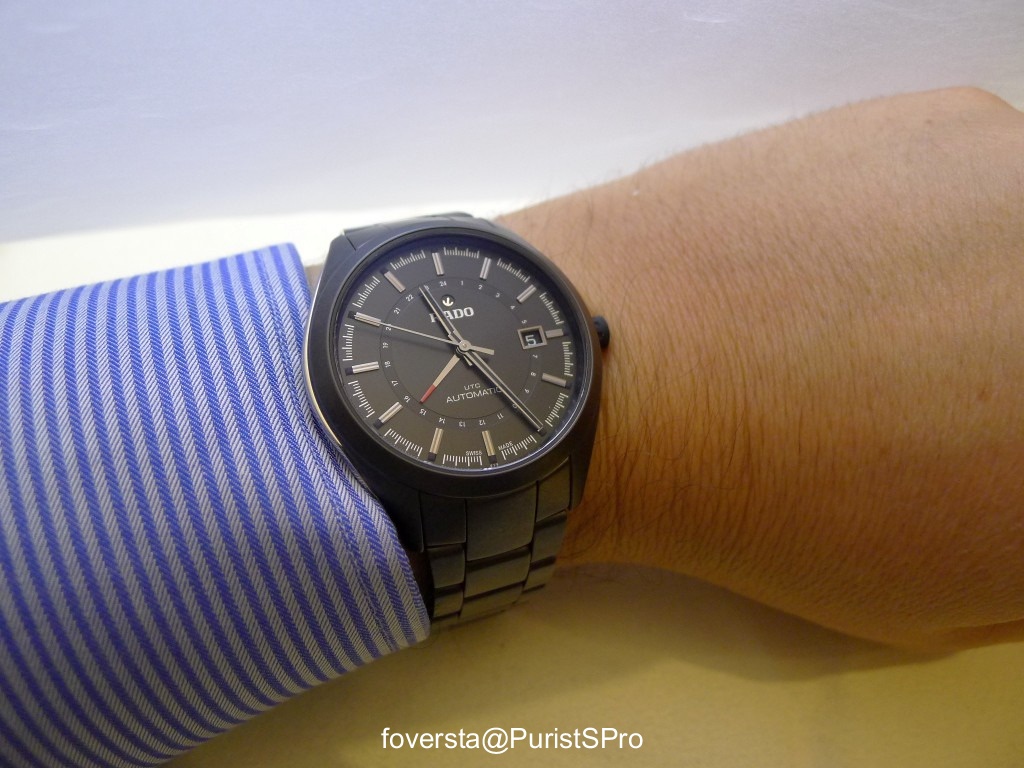
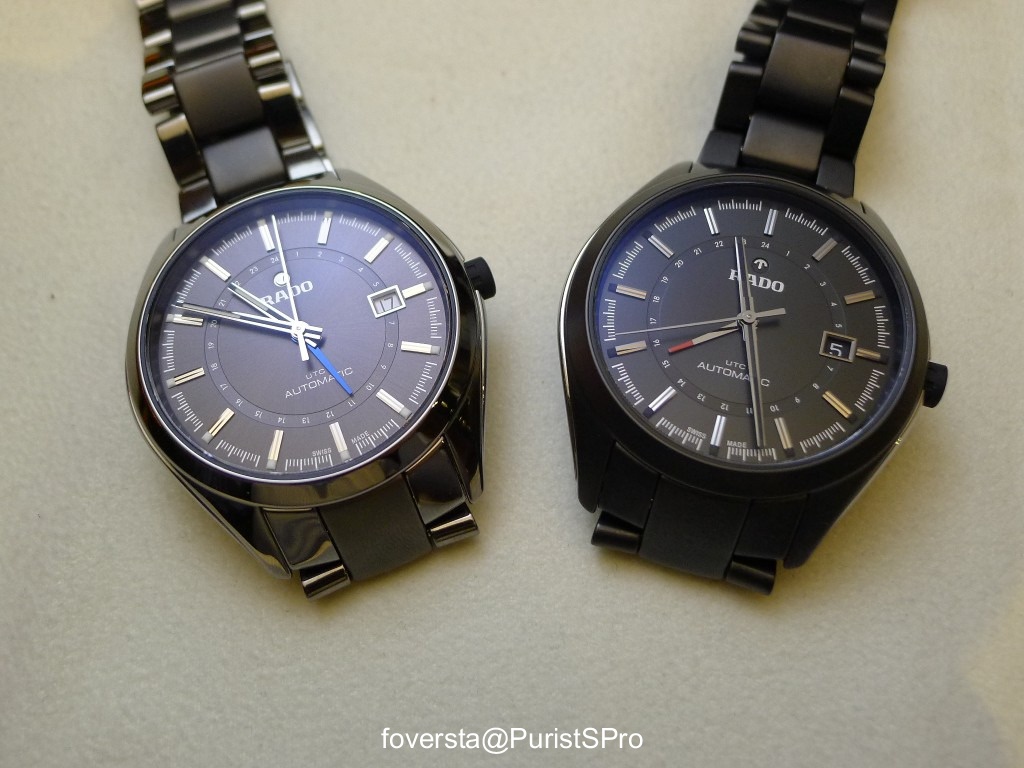
A tennis player travels a lot. So he may need a watch with a second timezone display. That's the purpose of the Hyperchrome UTC.
The second timezone is indicated thanks to an inner circular scale and a colored hand.
The case diameter is 42mm. The complication works well in the context of the Rado design because all the dial data remain very legible. Even the date window, which however cuts the scale seems to be well integrated.
My fav version is maybe this one with a black matt ceramic case:
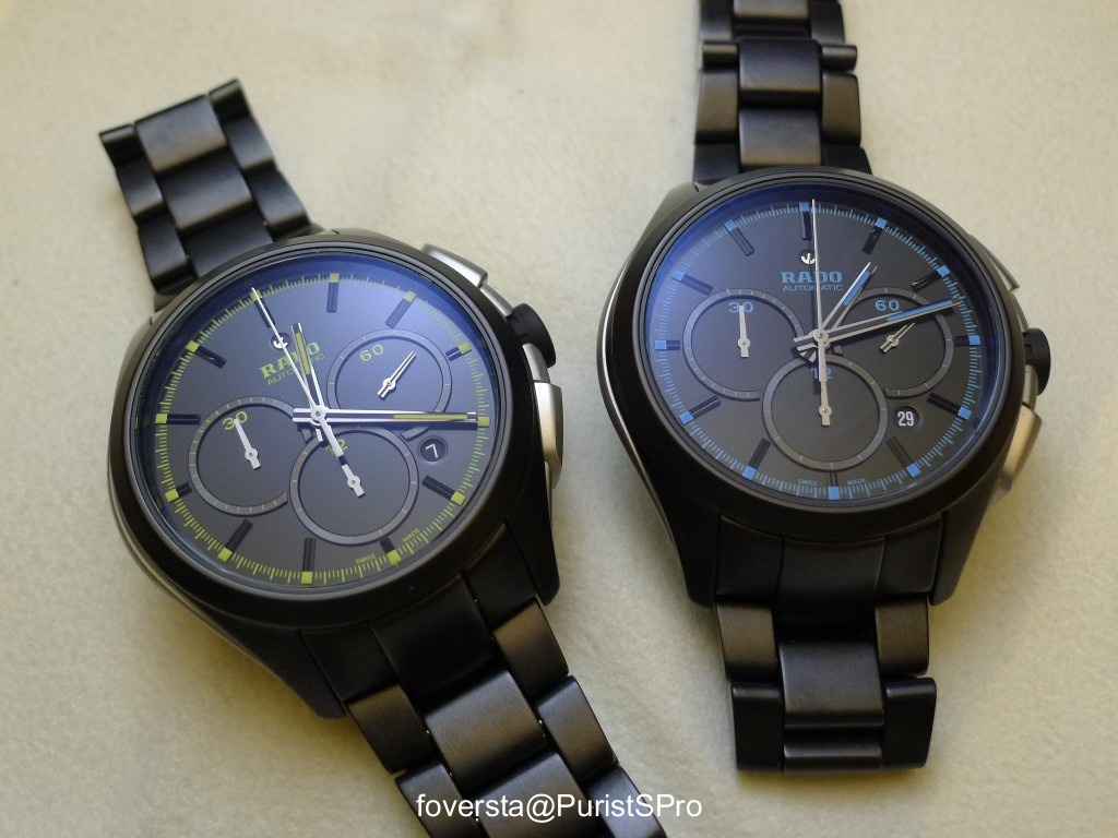
Two versions together but some more are also available, including with leather straps.
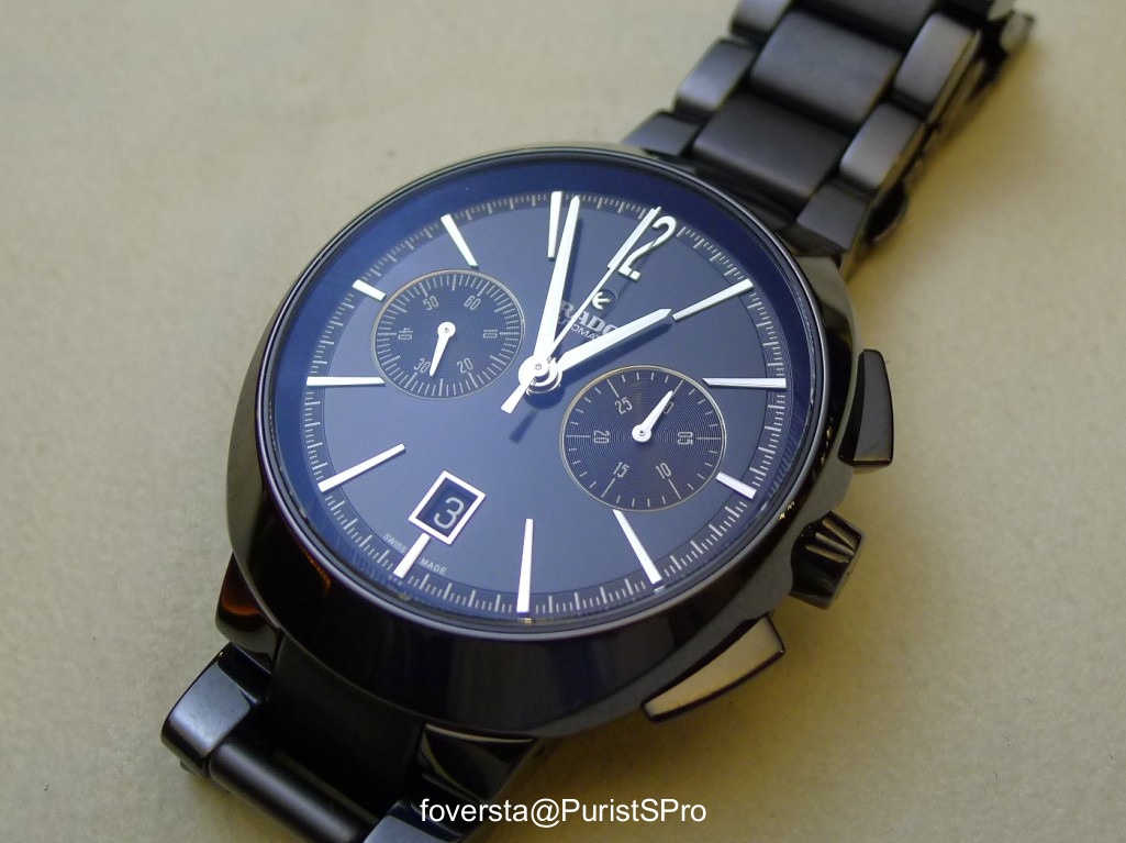
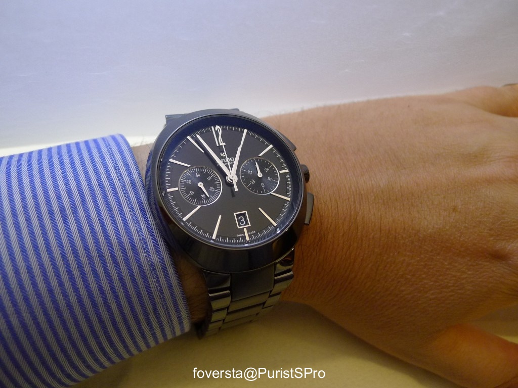
This is the D-Star Automatic Chronograph. I like the shape of the pushers and despite a 44mm case, the two subdials don't seem to be lost on the dial. The designers did a great job I must confess! Of course, one of the tricks was to put very long indexes...
Another detail I like is the date window: its size is fine and I find it well located.
A version with a leather strap which is quite unusual with a D-Star case:
If I like the D-Star chronograph, I can't say the same about this Diamaster chronograph.
The case lacks of character, I don't like the date window and the pushers seem to be out of context.
This watch is absolutely not my cup of tea despite a well made bracelet:
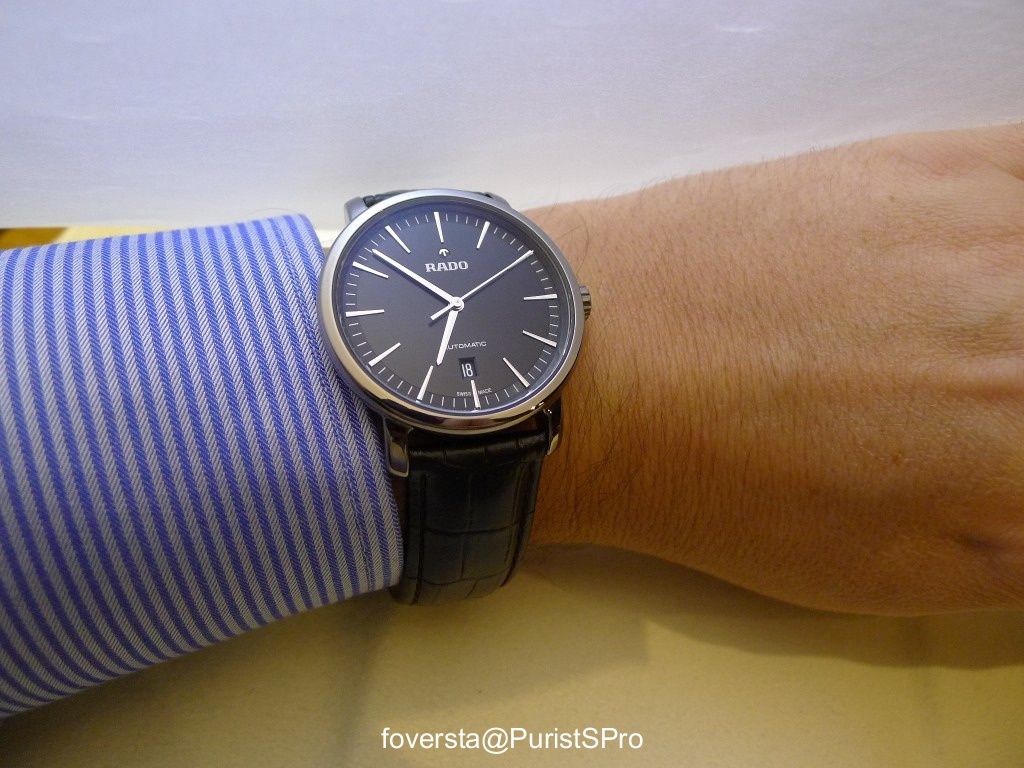
On the other hand, the Diamaster Automatic is much nicer. I think that the characteristics of the Diamaster line are more suitable to simple watches. The case diameter is 41mm.
Another Diamaster chronograph: I find it more interesting than the other. The date window fits better the dial with its 6 o'clock location and the way the two subdials are highlighted makes it nicer. But the whole design is a bit boring. Rado design is much more efficient and attractive when it dares. I know that these Diamaster are inspired by watches from the past but the contemporary approach based on the sensual curves is perfect for the use of ceramic.
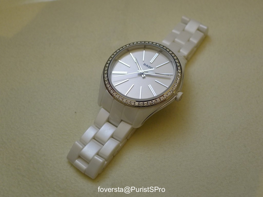
Ladies were not forgotten! in order to put an end to this report, I propose you two pics of Ladies' watches.
This white ceramic Hyperchrome features a set bezel:
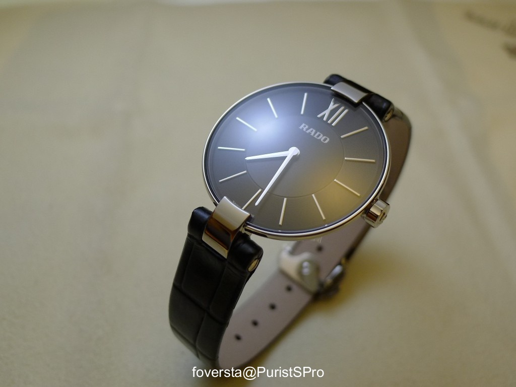
The Coupole is a classic now in the Rado collection being launched in 1987.
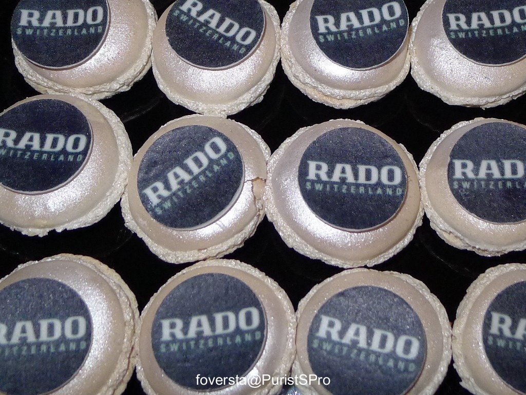
I was very busy during the event because I didn't want to miss any opportunity to shoot a novelty... I'm afraid I made a mess on the table... but this new Rado collection was worth the effort!
I would like to thank a lot the Rado French Communication team for its kindness and availability.
Fr.Xavier