
Collection
In the world of Patek Philippe perpetual calendars, the choice between references can be a deeply personal one, often sparking lively debate among collectors. @Patek_Ambassador presents a classic dilemma, seeking community input on two distinct perpetual calendar models: the Ref. 5140 and the Ref. 5327. This article delves into the aesthetic and design nuances that differentiate these highly coveted timepieces, as seen through the eyes of an owner considering his next acquisition.


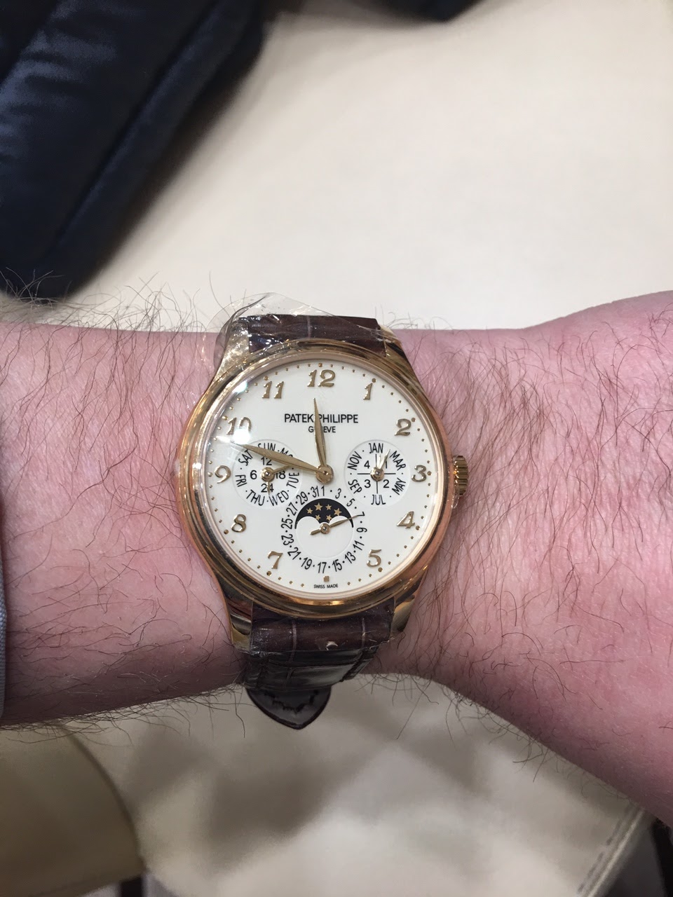
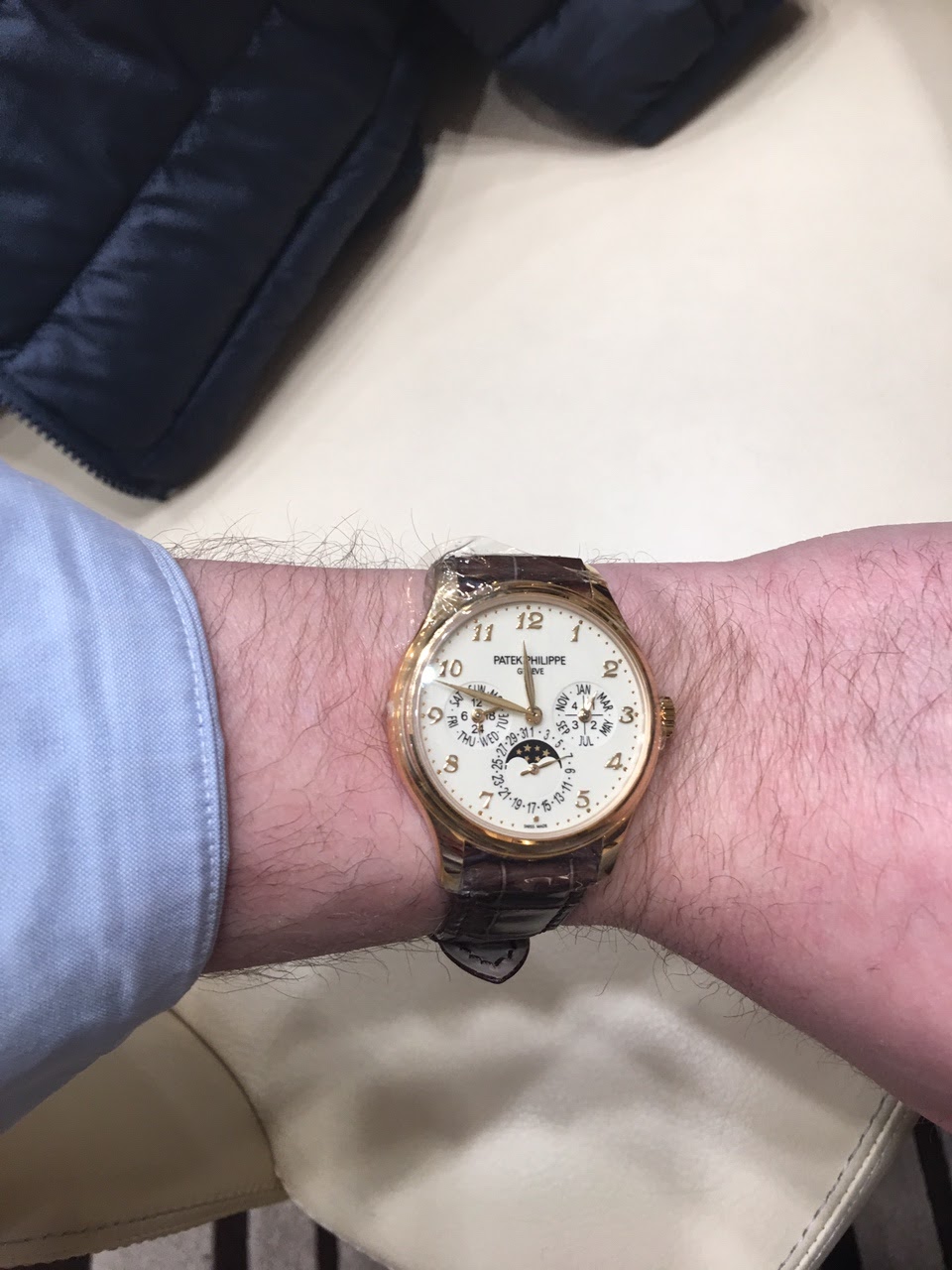


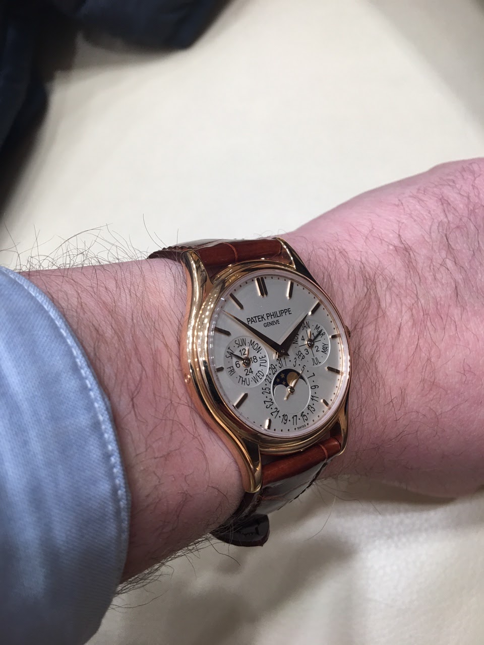
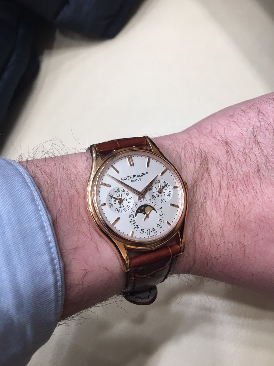
The Patek Philippe Reference 5140 is a perpetual calendar wristwatch, succeeding the highly regarded Reference 3940. It maintains the classic Patek Philippe perpetual calendar layout, featuring day, date, month, leap year, and moon phase indications. The 5140 was introduced with a slightly larger case diameter than its predecessor, reflecting contemporary preferences while retaining a traditional aesthetic.
This reference is powered by the ultra-thin self-winding Caliber 240 Q, known for its micro-rotor construction which allows for a slender case profile. The movement provides a power reserve of 48 hours. The watch is presented in 18k white gold, rose gold, or yellow gold cases, measuring 39 mm in diameter, and is fitted with a sapphire crystal. It offers water resistance to 30 meters.
The 5140 appeals to collectors seeking a modern perpetual calendar with a direct lineage to Patek Philippe's established complications. Its production run from 2006 to 2019 saw various dial configurations, including opaline and silvery finishes. The watch is typically paired with a leather strap and a deployant clasp, consistent with Patek Philippe's classic offerings.
When I look at a 5140, lovely as it is, all I can think is that it's a slightly larger and less perfect version of the 3940. The 5327 does its own thing, and it's a good thing. Love those numerals and the swoopy scalloped case.
I keep going back-and-forth between 5140 and5327. I really like the slightly larger size of the latter and the slightly more modern look. So I think 5327 is it. The cream colored dial with the rose gold is beautiful too.
I thought I'd prefer the 5327, but the 5140 looks more classic and timeless. Maybe it's the LED (?) lighting, but the 5327 looks washed out and a bit plain.
too "black". It seems to stand out too much relative to the beautiful rose Breguet numerals. The black printing on the silver dial looks more natural. Just a comment after a quick look.
... and between the 5140 and the 3940 it is just 1.2mm IIRC. In my eyes Patek's three sub-dial PC has been getting a little less attractive with every new iteration. The beautiful balance of the 3940 has been lost on the way of upsizing the watch w/o modifying the movement. Reminds me of IWC's pilot watches that continued to get bigger and less attractive after the Mark XV or XII before they turned the corner to some extent with the current Mark XVIII.
3940. You'll thank me later : )
This thread is active on the Patek Philippe forum with 26 replies. Share your knowledge with fellow collectors.
Join the Discussion →


