
New Release
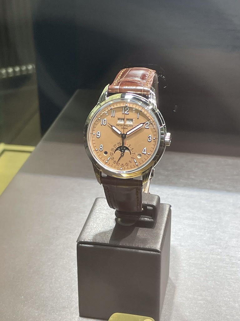
Penfriend's initial impressions of the Patek Philippe Ref. 5320G with its new dial color sparked a lively debate among collectors. His firsthand account from Watches & Wonders, highlighting a 'copper/dark tone' rather than a true salmon, provides crucial early insight for those considering this reference. This discussion explores whether Patek Philippe's latest dial choice for the 5320G and other references aligns with collector expectations and brand heritage.


The Patek Philippe Grand Complications reference 5270 is a perpetual calendar chronograph, succeeding the highly regarded reference 5970. It represents a significant evolution in Patek Philippe's grand complications lineup, being the first perpetual calendar chronograph to feature an in-house developed movement. This transition from a modified Nouvelle Lemania base caliber to a fully integrated Patek Philippe movement marks a notable advancement in the brand's technical independence and horological prowess. The 5270 maintains the classic aesthetic of its predecessors while introducing subtle design refinements.
The reference 5270 is housed in a 41 mm case, available in 18k white gold, rose gold, or yellow gold. The case design is characterized by a concave bezel and two-tier lugs, contributing to its distinctive profile. It is powered by the manual-winding caliber CH 29-535 PS Q, an integrated chronograph movement with a perpetual calendar mechanism. This movement offers a power reserve of approximately 55 hours and is protected by a sapphire crystal, ensuring water resistance up to 30 meters.
This reference appeals to collectors seeking a modern interpretation of a classic grand complication from Patek Philippe. Its in-house movement and refined case details distinguish it within the brand's offerings. Multiple dial variants have been produced, including silver, blue, and opaline, providing collectors with a range of aesthetic choices. The 5270 continues the tradition of Patek Philippe's perpetual calendar chronographs, offering a blend of technical sophistication and traditional design.
That's not the shade of "salmon" I would want! So strange, Patek Philippe used to do such a great job in design!
I personnaly do not like them if they go too much into pink.
In your hands and on the wrist to make s fair judgement.
...just after it was released. I love the hands and the cream dial, but I really don't like the way the 5 and 7 markers are handled. So the dial color doesn't matter to me...
Salmon looks great on the 5270p but not so fond of it on this one or the 5172.
But don't have to take it as the AD will offer me the first that arrives and this will surely find another buyer quickly in case I decline
This thread is active on the Patek Philippe forum with 21 replies. Share your knowledge with fellow collectors.
Join the Discussion →


