Reference Guide
small-luxury-world's comprehensive post from 2013 offers a crucial look at the Patek Philippe Ref. 5270G, specifically detailing the initial 5270G-001 and the limited edition 5270G-015, alongside the 5270G-013 and 5270G-014. This article remains highly relevant for collectors seeking to understand the early variations and design evolution of this significant perpetual calendar chronograph reference.


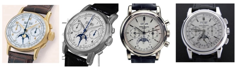
Let´s have a more detailed look.
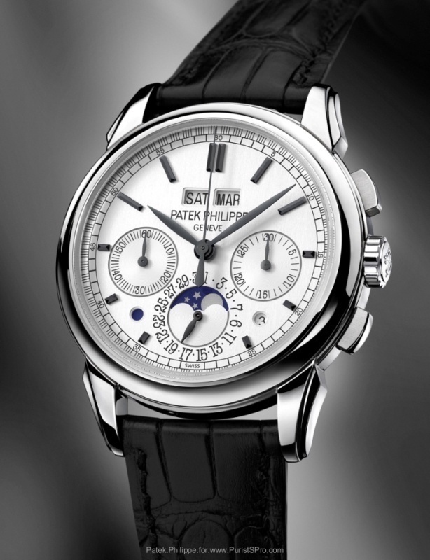
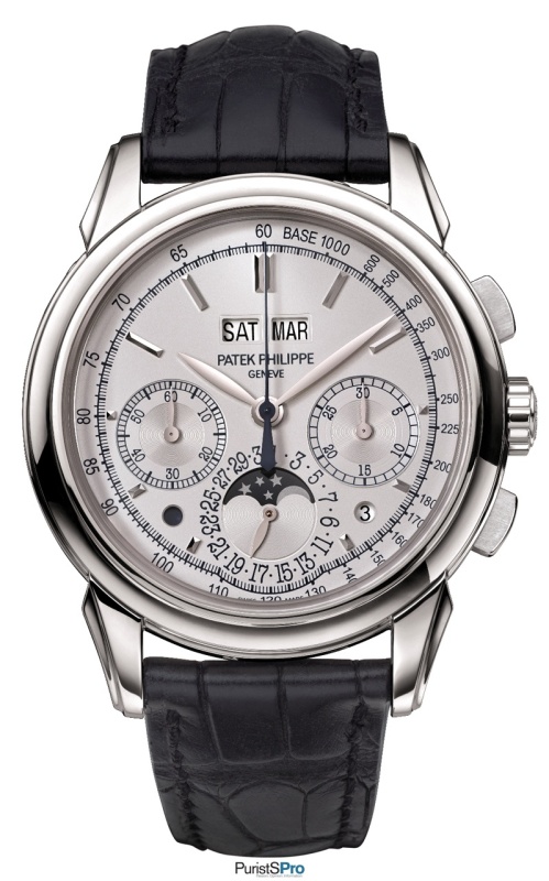
The first one (5270G-001) was introduced in Basel 2011:
The second one (5270G-015) was introduced as a Limited Edition (50 pieces) at the KunstWerkUhr exhibition in Munich, in October 2013:
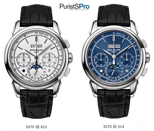
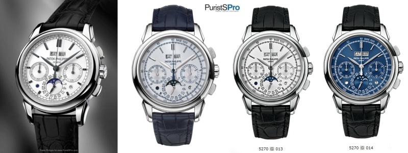
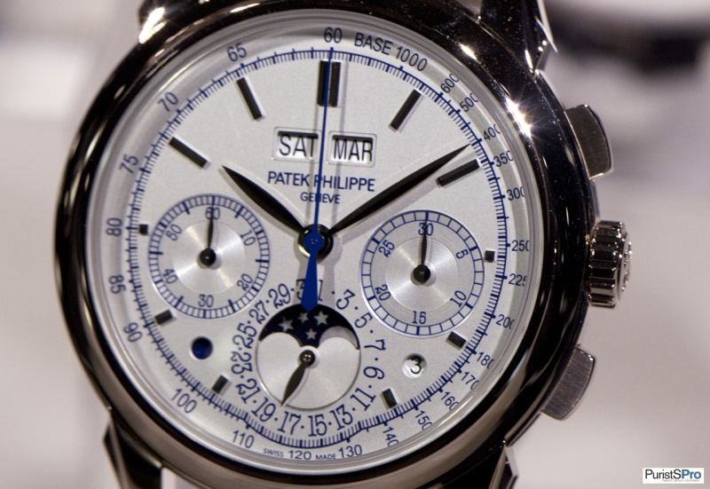
The third and the fourth one …
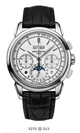
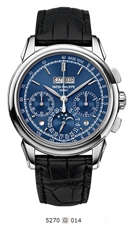
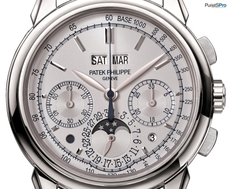
5270G-014
… introduced (just?!) online at the official Patek Philippe internet page, in November 2013.
What shall I say? I am surprised and pleased at the same time.
We had quite a few discussions about the new design back in 2011 and we had quite controversial discussions recently, when the Limited Edition from Munich poped up.
At live pictures it was like this:
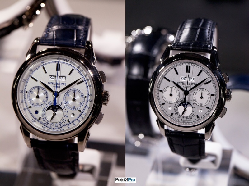
In detail the LE (015) looked like this:
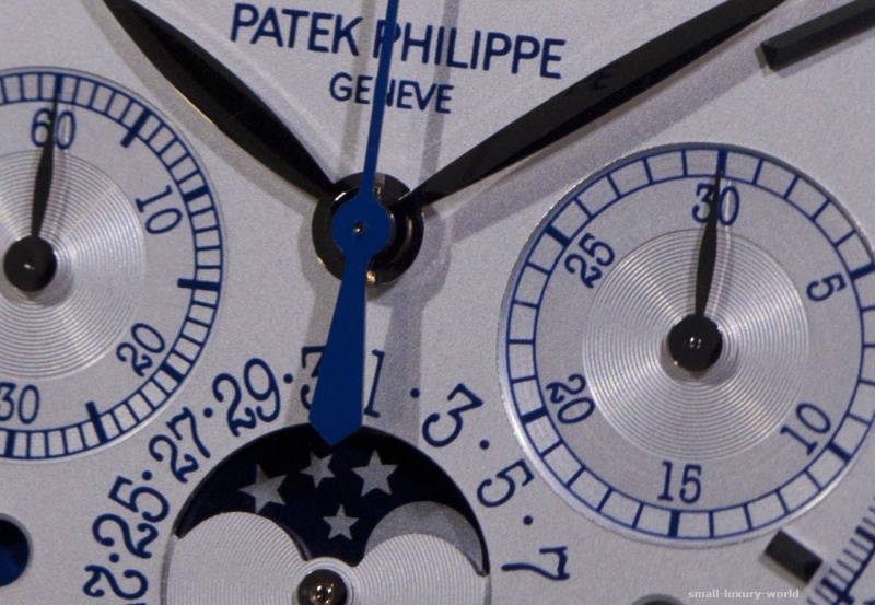
The light was far from being perfect to take pictures and it looked much better in reality. Especially I liked the subtle blue details – at indexes, numbers and hands.
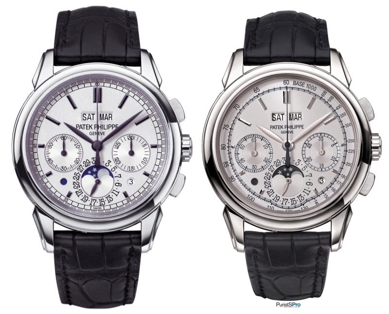
What is the difference between the version 015 and 013? Is it “only” blue versus black/dark grey at some details? One is limited and the other one is regular production?
Additional new products throughout the year are what we get from ambitious brands and also independents. Is it because (almost) everybody is hunting for the very special/limited piece and the demand for regular production is weaker because of this?
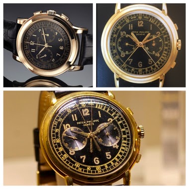
The predecessors (1518, 2499, 3970 and 5970) …
… have been in production for quite some time, without minor or major changes, haven´t they?
So far we only had several versions in WG, nothing more nothing less.
To be honest, at the moment I have more questions than
answers. But nonetheless my personal favorite versions are so far 015 for its blue
subtle details (also the smaller PP logo on the dial I liked a lot, but this is
shown at the two latest versions as well) and of course the “magic” blue 014 
Looking forward to your thoughts!
Oliver
The Patek Philippe Reference 1518 holds a significant place in horological history as the world's first perpetual calendar chronograph produced in a series. Introduced in 1941, it established a foundational complication for the brand, preceding other notable perpetual calendar chronographs such as the 2499 and 3970. This reference is recognized for its pioneering role in combining these two complex mechanisms in a wristwatch.
This reference was primarily offered in yellow gold, with a limited number produced in rose gold and an even smaller quantity in stainless steel. The case typically measures 35mm in diameter, housing the manual-winding caliber 13''' Q. The movement features a column-wheel chronograph mechanism integrated with the perpetual calendar complication. The dial often presents with applied Arabic numerals or bâton indexes, and a tachymeter scale on the outer periphery.
For collectors, the 1518 represents a landmark Patek Philippe reference, highly sought after for its historical importance and rarity, particularly examples in alternative metals. Its design language and technical sophistication set a precedent for subsequent perpetual calendar chronograph models, making it a cornerstone for understanding the evolution of this complication within the brand's catalog.
The blue one is by for the most beautifull. But why all these variations. Thinking about the 5070 or 5970, these were 1 color and one dial. Do we really want all these dials in just one white gold reference. What if they make another one with a black dial? And then all of these in red and yallow gold? And to finish a few in platinum? I asked myself the same question when all the 5960 were available. Less is more
totally agree. Rolex is a good example of how simplicity, when it works, becomes timeless beauty. 5960 is good example. They should have done a Wg very instead of 3 platinums. It would have been more affordable and accessible for some people, and in the same time, more comfortable especially for a watch whose purpose is to be a daily beater. Too much in short time for a same model. But i can see a Rg with opaline dial and Yg with the creamy dial of the 5940J.... As for the platinum, black would
I haven't seen the Munich one in the flesh but I'm not sure about the blue color. I think I prefer the grey markers version better, and of course the full blue one. I guess the blue 5270 really needs to be seen in the metal to prefectly observe the colors and light reflections. I'm happy to see this new offer from PP. You're right, it's been quite an amount of changes in a short period of time. Maybe the 3970 can compete in that field with the 3 series and the special orders from clients. Thanks
This is what happens when you go in house and have to get your ROI on your R&D. Combine that with a soft market for the original, you get these type of tactics. It's like changing the headlights on a car before the change to a new model to spur some late demand. I suspect we will see a totally new perp calendar from Patek next year at Basel or for the 175 anniversary. That tack is awful. The dip under the date apature is down right silly. You should always float the apature over the tach lik
...........the original is the best. I think the curvature at 6pm doesn't work, and even if it did the blue face (probably the best of the three variations) should be reserved for the P model in my opinion.
The original is the best. Just like movies, sequels are rarely as good.
This thread is active on the Patek Philippe forum with 35 replies. Share your knowledge with fellow collectors.
Join the Discussion →