Patek Philippe 5270G-013 vs. 5270G-014 Comparison
Reference Guide

Patek Philippe 5270G-013 vs. 5270G-014 Comparison

By Mark in Paris · Apr 26, 2015 · 23 replies
Mark in Paris
WPS member · Patek Philippe forum
23 replies21873 views10 photos
f 𝕏 in 💬 🔗

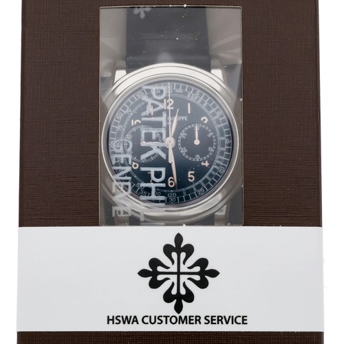
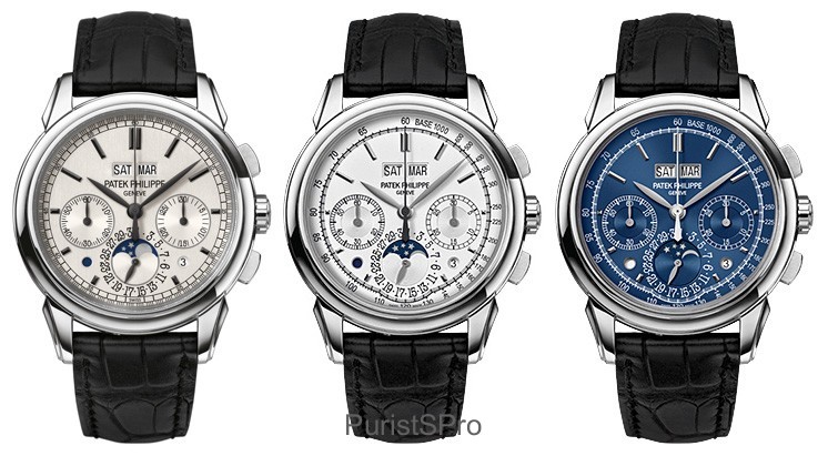
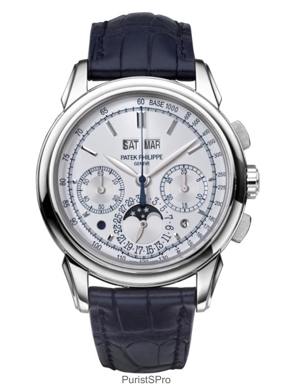
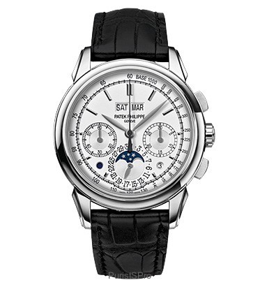
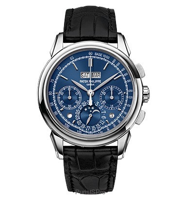
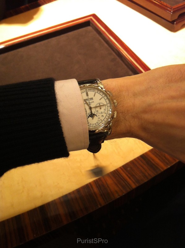
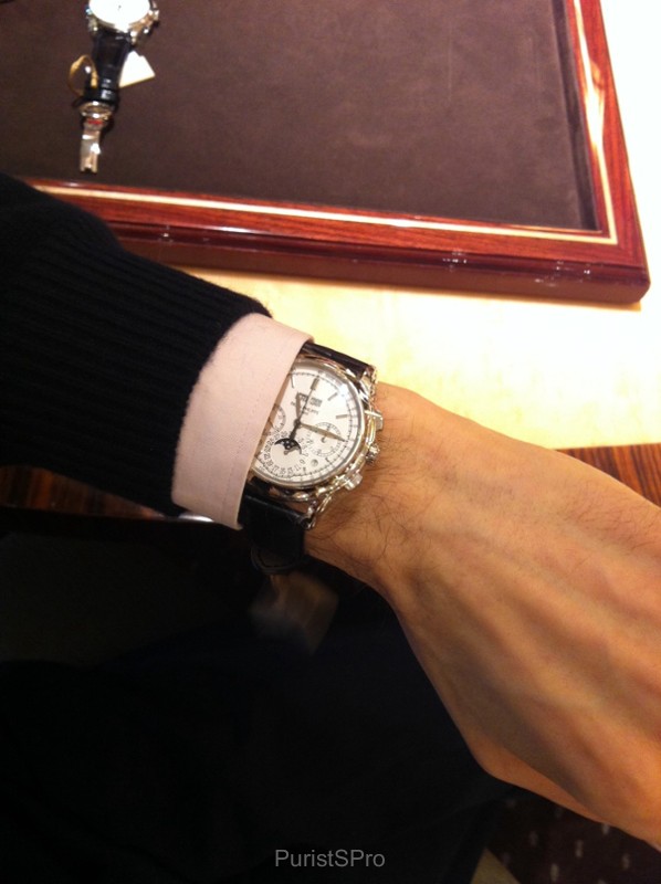
Mark in Paris offers a comparative analysis of the Patek Philippe Ref. 5270G-013 (silver dial) and 5270G-014 (blue dial) from 2013, as these versions were replaced at Baselworld 2015. He meticulously details the design differences from the original 2011 5270G and shares his in-person impressions, emphasizing the importance of seeing these perpetual calendar chronographs in the metal.

23 collectors discussing this on the WatchProSite forumJoin the Conversation →
Gentlemen,

The 5270G-013 (Silver dial) and 5270-014 (blue dial) have been replaced during the Baselworld Fair 2015.

I think it'll be nice to come back to these versions to say good bye.


The late 2013 three new 5270G versions


First version of the 5270G on the left - Late 2013 two new 5270G versions on the right


As you know, the new perpetual calendar chronograph 5270, iconic model of Patek Philippe, was launched in 2011 with a new exclusive and completely in-house movement, the CH 29-535, to replace the legendary 5970 and its Lemania-based caliber.

It was back then available in a unique white gold version with a brushed silver dial and darkened markers and hands.

In late 2013, the brand had launched two new standard versions of the first white gold model with a silvery (5270G-013) and a blue dial (5270G-014).

They were unveiled 2 months after the Munich Watch Art Grand Exhibition held in October 2013 when Patek Philippe presented in the first place the 5270G-015 limited edition (50 pieces).

This limited edition had the same characteristics as the following "013" (Silvery) but with dark blue printings instead of the black ones.


5270G 'Munich'


5270G 'Munich'


The main differences between the first 2011 5270G and the two new iterations, aside from the dial color, were:

 - The applied markers and hands were not darkened anymore;

- Addition of a Tachometer scale, without much reducing the room in the center of the dial;

- Modification of the numerals and scale ring's style in the two subsidiary dials;

- Downsize of the "Patek Philippe, Genève" logo at 12 o'clock.

- Addition of an extension of the tachometer scale at 6 o'clock, following the date subsidiary dial's curve and allowing a more precise reading of the chronograph measures in that area.


I was very curious to see how these two watches looked like and I decided to have a look at them to make my own opinion.

The blue dial choice is a very attractive one when considering other Patek Philippe models in the recent history (5070P, 5200G...). It gives a more casual touch to the watch and can very well match with jeans, summer time clothing or even a grey suit.


The silvery dial is absolutely beautiful, especially when under daylight when it comes to a whiter color.

Furthermore, I wanted to have a look at the tachometer scale curve at 6 o'clock as it was quite an unusual characteristic to say the least.


Well, handled it confirmed (if it has to be) that looking at a watch in the metal is always mandatory compared to pictures viewing experience only.

This is not an exception.

In live, the dial is of course much less magnified than on the material we can see on the internet. Thus, all the details are much smaller and take much less importance in the whole picture.


I was very positively surprised and even said to myself that it looked really good. I must say this new scale is not what comes to your attention at first and it is definitely not the main element you see when you look at the watch.

The date windows, hands and sub-dials are clearly coming in first position and grab your attention. In the end, as I always do to make a global idea of a watch, I asked myself "would I be buying this one if looking for a Patek Philippe Chronograph Perpetual Calendar?": the answer is definitely yes.


I would have chosen the Silvery dial over the Blue one, but this is really a matter of taste of course.

As a conclusion, I wanted to shed a little light over these two versions we didn't talk that much about, excepted at the beginning as the tachometer scale addition at 6 o'clock generated many questions from the watch fans.


I imagine any of these two versions, in ten or twenty years from now, may very well become a great collectible 5270.

I wonder what is your opinion: did some of view had a look at it, or as time goes by, did your opinion evolve on these two specific watches, as I did? Feel free to share your comments!

Cheers,

Mark


This message has been edited by Mark in Paris on 2015-06-24 07:44:41

About the Patek Philippe Ref. 5070

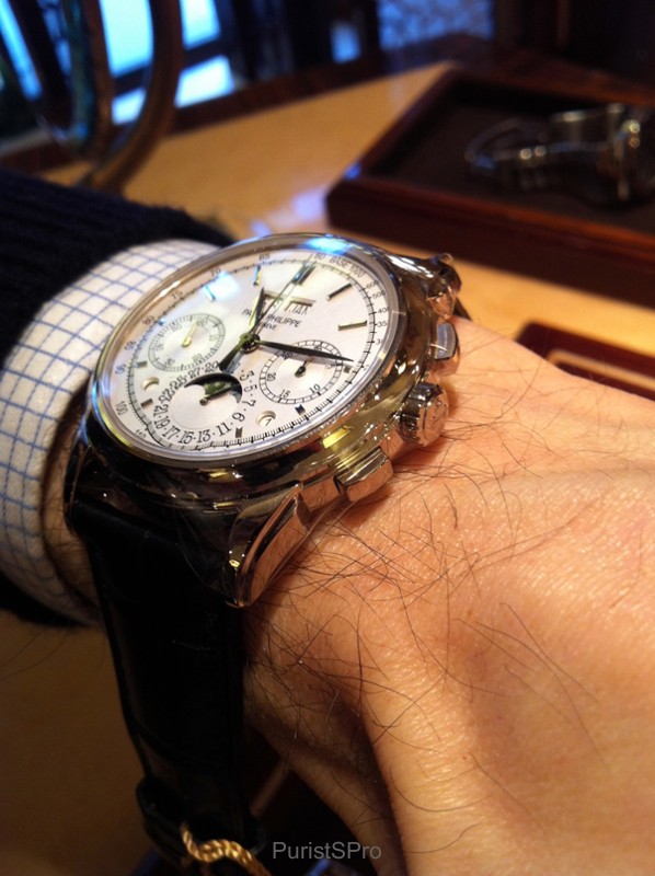
The Patek Philippe reference 5070, part of the Complications collection, marked a significant return for the brand to large-format chronographs. Introduced in 1998, it was the first non-perpetual calendar chronograph produced by Patek Philippe since the reference 1463, which ceased production in the early 1960s. Its design drew inspiration from a unique Patek Philippe aviator's watch from the 1940s, characterized by its prominent case and dial layout, yet reinterpreted for a contemporary audience. This reference established a new aesthetic direction for the brand's chronographs, moving towards more substantial case dimensions.

The watch features a 42mm case, initially offered in 18k yellow gold, housing the manual-winding Caliber CH 27-70. This movement, based on a Nouvelle Lémania ébauche, was extensively finished and modified by Patek Philippe, meeting the brand's stringent quality standards. It provides a power reserve of approximately 55 hours. The dial, in this specific configuration, is black, protected by a sapphire crystal, and the watch is water-resistant to 30 meters. The fixed bezel frames the dial, and the watch is typically fitted with a leather strap.

Reference 5070 appeals to collectors interested in modern Patek Philippe chronographs that combine traditional movement architecture with a more contemporary case size. Its limited production run and the subsequent introduction of variants in other precious metals contribute to its collectibility. The reference represents a distinct period in Patek Philippe's chronograph history, bridging vintage inspirations with a new era of larger watch designs.

Specifications

Caliber
Cal.CH 27-70
Case
18k yellow gold
Diameter
42mm
Dial
black
Water Resist.
30m
Crystal
Sapphire

Key Points from the Discussion

Advertisement
The Discussion
PA
patrickh
Apr 26, 2015
Like the blue one

and the pregnant tachymeter scale does not hurt me. Most of men love their "pregnant" woman, isn't it? ;-))) Nice post Mark, Cheers, Patrickh

MA
Mark in Paris
Apr 26, 2015
That's an excellent argument Patrick

I think it indeed deserves to be worn :) Cheers, Mark

CL
Club
May 10, 2015
5270g-014

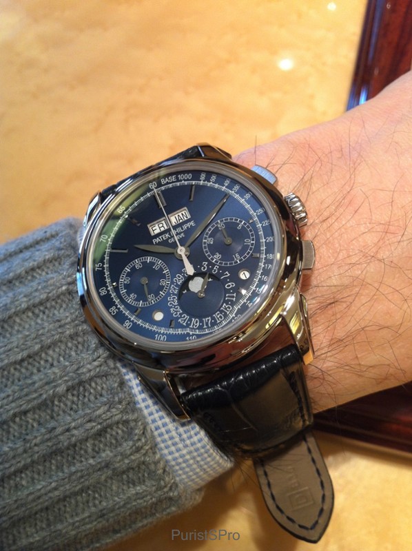
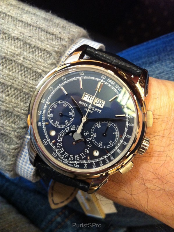
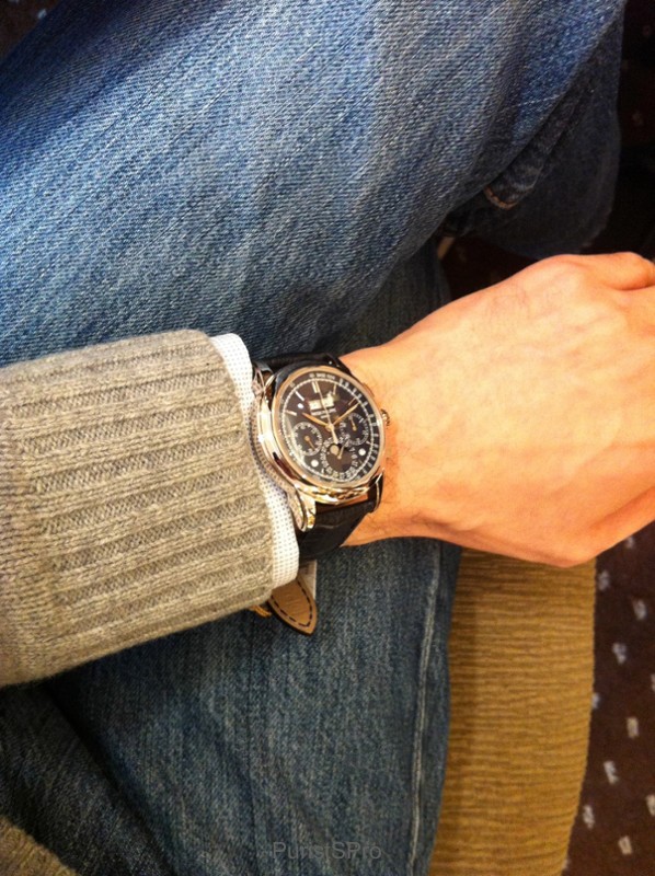
Thank you for the post Mark 5270g-014 received a fair share criticism over the last year. I would like to add several details trying to be objective: 1. The blue color on this model looks very different under different light. It is nearly black in a dimly lit room, but brings deep blue like an ocean under direct bright light. Some radiant appearance seems to come only under the bright sun, when the watch is moving. Most of the time it appears as plain blue, perfect for my taste - not too shiny t

PA
patrickh
May 10, 2015
Thanks Club. Comments from an owner and lover of this marvelous watch is really

a + and very appreciated, Welcome here. Please share some wristshots to illustrate different blue you mentionned. Cheers, Patrickh

MA
Mark in Paris
May 10, 2015
Very interesting feedback

First, welcome on PuristSPro! As for the "empty matter", well it is how people try to express how they feel: some say "empty" when others say "pure and light". On the other hand some may say "busy" while others may like it a lot that way as it is more decorated. I really don't feel that way about the 5270's dial. So, in the end it is clearly not an objective judgment but more a way to discribe how they feel concerning a watch (and what watch they held before). You mention a very interesting poin

CL
Club
May 14, 2015
Different shades of 5270 blue

Thank you Patrickh and Mark I attempted to capture the blue in different shades - under the sun, different light conditions (it appears as near black sometimes) and to demonstrate how the part of the dial and the hands "disappear" in a dark environment. Interestingly, the blue of day/night indicator is different from the blue of the main dial. Hard to capture on camera, but I guess, provides some idea. Mark's idea of experimenting with different straps is great, will try to get to that in the ne

Available on the marketplace

Continue the conversation

This thread is active on the Patek Philippe forum with 23 replies. Share your knowledge with fellow collectors.

Join the Discussion →