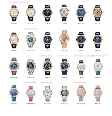
Collection
Amanico initiates a compelling comparison between two significant Patek Philippe chronographs, the Ref. 5070P London Edition and the Ref. 5170P. His post, featuring a comparative photo by Gary G, delves into the aesthetic and technical distinctions that continue to spark debate among collectors. This discussion highlights how subtle design choices and movement architecture profoundly influence a watch's character and collector appeal.
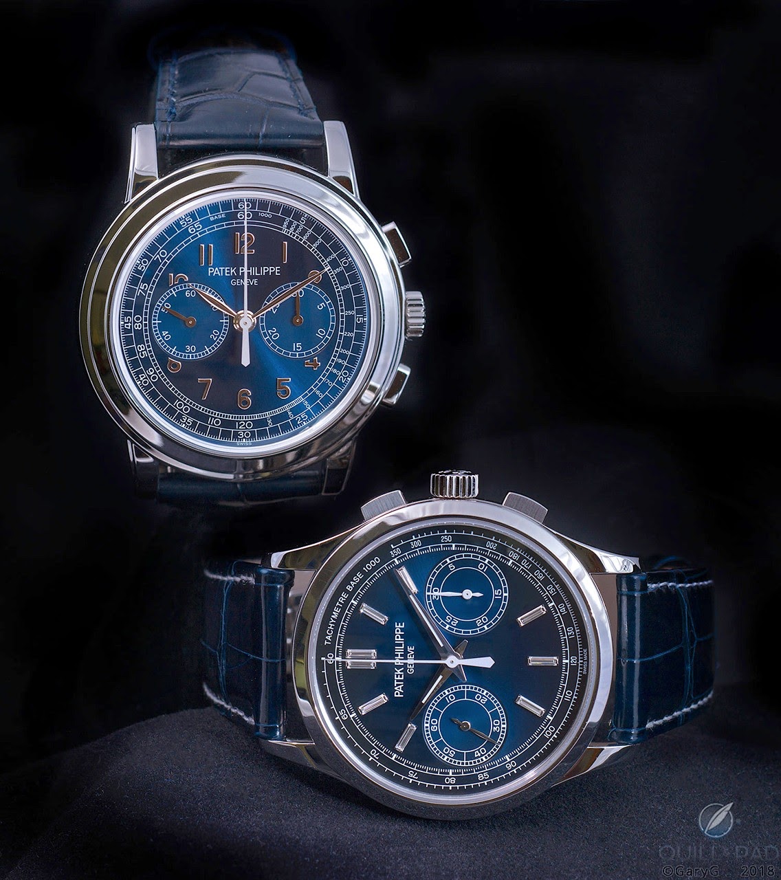
The Patek Philippe reference 5070, part of the Complications collection, marked a significant return for the brand to large-format chronographs. Introduced in 1998, it was the first non-perpetual calendar chronograph produced by Patek Philippe since the reference 1463, which ceased production in the early 1960s. Its design drew inspiration from a unique Patek Philippe aviator's watch from the 1940s, characterized by its prominent case and dial layout, yet reinterpreted for a contemporary audience. This reference established a new aesthetic direction for the brand's chronographs, moving towards more substantial case dimensions.
The watch features a 42mm case, initially offered in 18k yellow gold, housing the manual-winding Caliber CH 27-70. This movement, based on a Nouvelle Lémania ébauche, was extensively finished and modified by Patek Philippe, meeting the brand's stringent quality standards. It provides a power reserve of approximately 55 hours. The dial, in this specific configuration, is black, protected by a sapphire crystal, and the watch is water-resistant to 30 meters. The fixed bezel frames the dial, and the watch is typically fitted with a leather strap.
Reference 5070 appeals to collectors interested in modern Patek Philippe chronographs that combine traditional movement architecture with a more contemporary case size. Its limited production run and the subsequent introduction of variants in other precious metals contribute to its collectibility. The reference represents a distinct period in Patek Philippe's chronograph history, bridging vintage inspirations with a new era of larger watch designs.
this isn’t even a comparison and the market recongnizes greatness in how prices evolve and punishes overproduction.... London exhibition re-editions are an unsettling thing for us collectors. Have a good weekend.
But any re-edition is unpure in my book. Best
I feel, that perhaps, they made it too close to the original P - as beautiful as it is...the salmon is an other story- being totally it’s own.
This thread is active on the Patek Philippe forum with 69 replies. Share your knowledge with fellow collectors.
Join the Discussion →