I've been fortunate enough to add a couple more pieces to my very humble collection this year and even though both models have the word "Rail" associated with them, it most certainly was not intentional. Ever since the Longines Railroad was introduced at Baselworld 2016, it immediately piqued my int
I've been fortunate enough to add a couple more pieces to my very humble collection this year and even though both models have the word "Rail" associated with them, it most certainly was not intentional.
Ever since the Longines Railroad was introduced at Baselworld 2016, it immediately piqued my interest from an aesthetic standpoint. The warm-white dial, black lacquered lance shaped hands and the use of "0" and "12" rather than "12" and "24" really stood out to me. The absence of a date window, the laser etched steam locomotive on back and the applied wings & hourglass logo elevated this piece up to must-have territory. However, I didn't get an opportunity to see the Railroad in person for the remainder of 2016 so it was filed away in my mental wishlist. In July of this year, I took a short trip to the Pacific Northwest with my wife and 4-year-old son and decided to take an Amtrak from Seattle to Portland. I figured it would be a great experience for my son as the only trains he's ridden before were at Disneyland and our local shopping mall. Long story short, he had an absolute blast and we all thoroughly enjoyed the beautiful scenery. It has definitely become one of my fondest memories of 2017. Sometime in September, I finally got the chance to handle one at a nearby AD and knew it was the perfect piece to commemorate our simple yet special train ride.
The 40mm case allows the Longines Railroad to sit fairly flat on my 6.75" wrist and the strap (pin & buckle) takes only a couple wears to break in. The dial may appear busy at first glance but when you see it in person, the large Arabic numerals and smaller text play off each other well and the layout is nicely symmetrical and perfectly legible. I know some purists would've liked to have seen a manual wind movement like it's predecessor (Longines R.R. 280) but this watch follows the same formula as most modern heritage inspired pieces where the outside looks vintage-esque and the inside is all modern. Speaking of movements, this watch is powered by Cal. L888.2 (ETA based from what I've read) and so far has been gaining 10 seconds per day. I don't know if it'll calm down a bit after some time but for a non-COSC ETA movement, I think +10 is reasonable. But in all honesty, my knowledge of movements is very minimal and I purchase my watches based more on aesthetics and personal meaning. I do have three small criticisms: 1) The hands could stand to be a tiny bit longer. Maybe the minute hand could at least touch upon the inside edge of the seconds track? 2) I have a few automatic watches and this one is particularly noisy when the rotor spins. 3) The engraved picture of the steam train on the case back is a fine detail and bonus eye candy but due to a sunburst finish, it's hard to get a clear view because of the way light reflects off of it. I couldn't even take a decent picture of it.
But that's just some nit-picking on my part and overall, I'm very happy with the Longines Railroad. Only a few months old but already has a ton of sentimental value

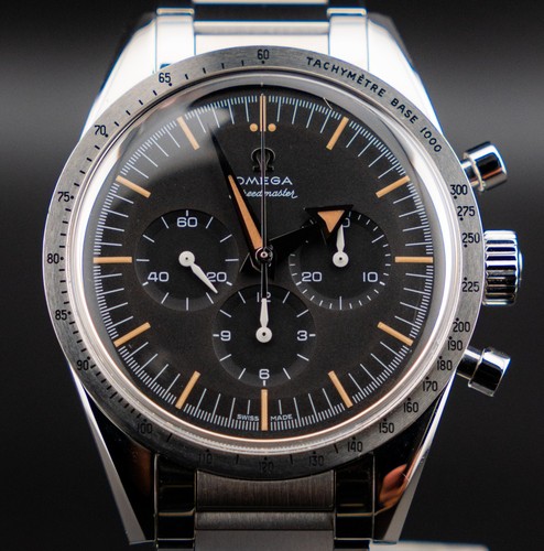
The second watch I picked up very recently is the Omega Railmaster 60th Anniversary LE. This was yet another watch that I was instantly drawn to during it's introduction at Baselworld 2017. I don't know why but the more popular Speedmaster and Seamaster 300 models never spoke to me even though I'm a big fan of chronographs and especially divers. I'll spare everybody the specs of this watch as there are countless reviews and articles written about the new Trilogy. All I can say is that it felt right from the moment I tried it on and I've never made such a quick decision on a big-ticket purchase (at least to me.)

What I find interesting about both watches is that they are exponentially more handsome in person as opposed to pictures. Admittedly, the Omega looks a bit plain in all their marketing materials - especially when displayed alongside it's more famous siblings - but in the metal, the watch combines the perfect amount of design restraint with a hint of tasteful "bling". The "bling" being provided by the highly polished upper portion of the case (the sides of the case are brushed) and the outer links of the bracelet. I've read that some people feel the clasp is a bit too big proportionally to the case. In my short experience with the Railmaster, I found the clasp to be an effective counterweight and very comfortable to wear since they built in a micro-adjust mechanism. In my opinion, the bracelet on the Railmaster was just as much of a selling point as the dial.
Critics of the watch seem to point out it's usage of "faux-tina" as a deal-breaker but this tan colored lume hasn't bothered me whatsoever. Considering that it was Omega's intention to recreate the original even down to it's 38mm case size, I think this watch would look strange if white or green lume were used. But this is all a subjective matter - as with all aspects of the hobby - and as I've seen on this site, I'm just one more in a growing number of fans. Since we've been given a barrage of heritage inspired pieces this year, I'm hoping the industry surprises us with stunning modern designs for 2018. We shall see...with fingers crossed.
My apologies to the Purist community if my post seemed a little light on the specs and lackluster in the photo quality department. This was meant to show my new watches rather than write a review as I don't feel qualified to offer the latter. I am still a beginner/intermediate student of this hobby and I am grateful to learn from the veteran contributors on this wonderful site. Thank you very much for taking a look!