Kong introduces the Linde Werdelin Oktopus II Titanium Blue & Yellow, marking the brand's ten-year anniversary. This post highlights Linde Werdelin's commitment to functional, highly-crafted watches for diving and skiing, emphasizing their unique "Analogue for time-reading, Digital for measurement" ethos. The Oktopus II showcases innovative modular case design and pioneering use of ceramic in a non-flat, brushed bezel.
LINDE WERDELIN is ten-year-young
this year. The company by both founders, Morten Linde and Jorn
Werdelin, have come a long way with the intention of making functional
highly-crafted good looking watches which will accompany them for their
favourite activites - diving and skiing, which indirectly, has enable
the brand to cover the three worlds - sea, land and mid-air. The
pragmatic duo understands, for performance time-keeping in both these
activities/sports, digital measurement is preferred, thus they adopted
"Analogue for time-reading, and Digital for measurement". With this
ethos, the three pillars of the brand are Oktopus (for sea or diving
series), Spido (for land or mid-air i.e. mountaineering and skiing
series) and the Instruments.
The new slightly evolved design of the O
ktopus II (Double Date) was based on a air-tight pressure chamber used to test the watches in their laboraotry. The single-block case designed is now fabricated in modules ( as illustrated in the diagram below), combined together and securely screwed to the centre movement-chamber.
Case is of titanium while the bezel is of ceramic, their first inroad to use new materials. However, LW is adventurous to fabricate a non-flat top-profile and non-gloss surface ceramic bezel with eight cut-out slots. Tedious processes are added to machine the tapered bezel top and complete it with a brush-finish to blend with the brushed microbillé titanium caseband. To fasten the bezel to the caseband also needs extra thoughts. The alley-key screws will place tremendous pressure onto the hard and yet brittle ceramic surface when tightened and over time, screws may loosen by itself as there is less grip between the alley-key and smooth ceramic surface. To ensure both side-effects do not crop up, tension rings were introduced. Not just plain steel rings were used but matching colours laminated tension-rings were specially ordered to provide both the functional and aesthetic aspects. Indeed the Danish industrial design philosophy of design must be useful and functional besides pleasing to the eyes.
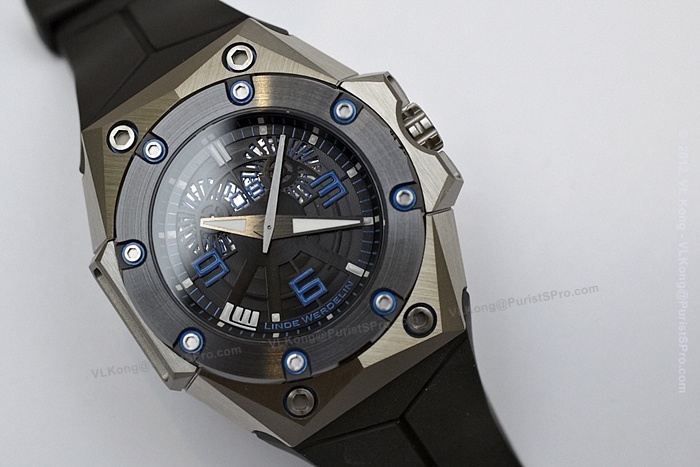
Currently, three variations for this Oktopus II - Rose Gold, Titanium Yellow & Titanium Blue, limited to 88 pieces per each variation. Gold, Titanium and ceramic were chosen as they are able to withstand corrosion effect of sea-water besides their hypoallergenic properties.
Below are some photographs of the Titanium Blue and Titanium Yellow ... Titanium Blue 
Case is brushed or satin finish with microbillé for the industrial
and rugged look. Dimension 44mm (w) by 46mm (l) by 15.25mm (h).
2.5mm thick sapphire crystal with anti-reflective coating on second-surface to reduce glare.
Water-resistance is rated to 300m.

8 pieces of blue laminated screws securing the ceramic bezel to the caseband ...

Seamless rubber strap securely bolted to the case with two screws ...
The side latch-attachment units is for mounting of their Instrument - The Reef ( a dive computer) on top of the Oktopus....


The crown is laser-engraved with an Octopus logo, away from typical signed "LW" ...
See
the attention to design details ... satin finish on the crown top, cut
grooves with chamfered edges for better gripping of the crown and yet
not hurt the fingers of the owner.

Octopus
has always fascinated co-founder and designer, Morten Linde. Octopus, a
mysterious creature with no bones and yet could jet down great depth in
a fast time. Able to defend itself with expulsion of ink or use of
startling deimatic displays to frighten off predators. Perhaps that one
of the reasons the brand name one of their models and now placing the
motif on the crown.

The
crown guard (also double as latch attachment for the instrument) has
improved too, with tapered edges, which previously may pinch some skins
of the owners while adjusting the time/date...


Crown unscrewed ... for time & date adjustment ...


Solid caseback with Octopus motif newly designed by Morten.

Serial number engraved onto caseback ...
Notice the tight joining seams of the new case-modular blocks... evident of precision engineering.
Housing within is automatic Dubois Dépraz caliber 14580 with 44 hour power reserve beating at 28,800bph (4Hz) .


The dial is made up of two layers .... could observe clearer with pictures below ...

The main concern about this Oktopus II is the legibility of the date (located just below hour index '12') ...

From my observation, under indoor-lighting, reading the date is a challenger, with brighter ambience , it is alright ...
(Above date is '23') ...

While the above date is '18'.
Back
to the two-layer dial ... the lower layer is of circular Côtes de
Genève, and immediately above is a skeletonised with the hour-markers
and a motif of a small octopus

The luminiscent coated hands are also brush-finished.

Next is the
Titanium Yellow ...

Same specification as the Titanium Blue, but exudes different personality for the wearer.
Bright and cheerful, while the blue is more understated.

The two side attachment-units were DLC treated for the Titanium Yellow model ...

The legibility of the date is better with the Yellow version ...


Black DLC treated attachment unit (and watch guard) ...

Matching yellow rubber straps ...
Two
lume shots to illustrate which other parts would glow besides the hands ....


A pic of Jorn Werdelin with a Titanium Blue posing in Aston Martin
This
Oktopus II was initially named as Double Date, somehow naming does not
really coherent with the watch (as most of our friends here have feedback). Even on LW's website, the naming seems to be just Oktopus II
Rose Gold, Titanium Yellow or Titanium Blue.Another
gripe is the legibility of the date. The Titanium Yellow is easier to
read than the Blue. Some how to one owner of the Blue, the legibility
is not his main concern, but the design and colour which match his
personality As
for the modular case-design, I think it is intelligent. My guess it
may help in after-sale service response time, especially in polishing of
such difficult multi-faceted case. Probably just swap the module/s
which is/are scratched.Kong


