Independents
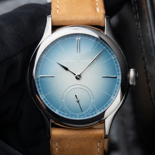
Nicolas (amanico) shares new photos and impressions of the Laurent Ferrier Classic Origin Blue, a watch that continues to captivate with its titanium case, striking blue dial, and refined movement. His post invites a discussion on the aesthetic merits of its blue versus opaline dial options, a common delightful dilemma for collectors of independent haute horlogerie.


10 Laurent Ferrier listings are live on the eBay market and 8 collector listings on the WatchProSite marketplace.
This thread is active on the Independents forum with 28 replies. Share your knowledge with fellow collectors.
Join the Discussion →