
Independents
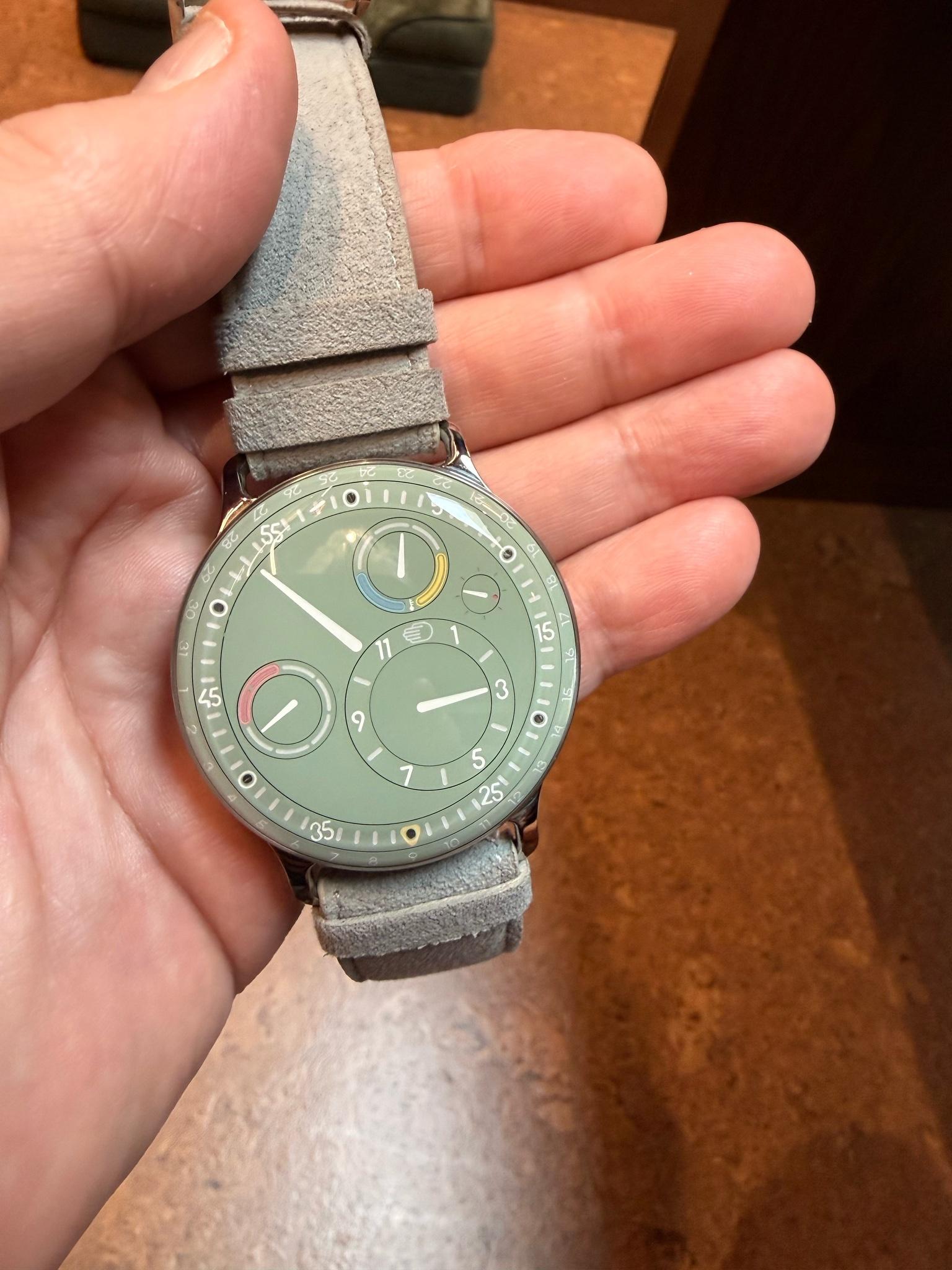
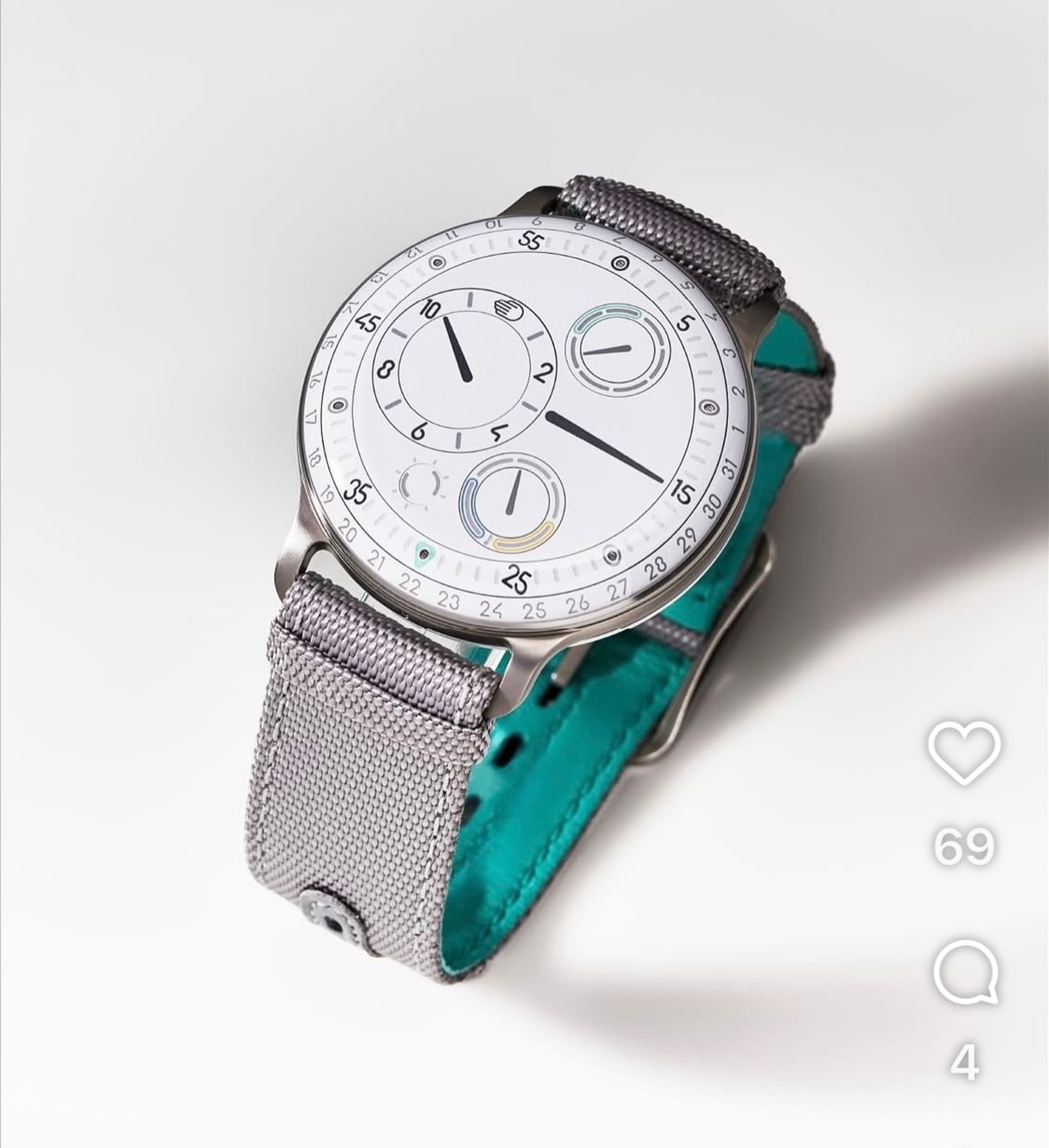
Chicolini’s quest to choose between the Eucalyptus and White dials for the Ressence Type 3 highlights a common dilemma for collectors: balancing personal preference with long-term wearability and versatility. This discussion explores how dial color profoundly impacts a watch's character, transforming it from a casual statement piece to a more formal or timeless accessory. Chicolini's original post, featuring compelling imagery, invites the community to weigh in on this nuanced decision.


Ressence's Type 3 series represents the Belgian brand's most technically ambitious chapter since Benoît Mintiens founded the company in 2010. Building upon the original Type 1's oil-filled display concept, the Type 3 introduced a revolutionary bi-axial complication that eliminates traditional hands entirely. The BB2 variant, launched as part of the brand's ongoing exploration of fluid timekeeping, demonstrates Ressence's commitment to redefining how we perceive horological display through its proprietary Orbital Convex System.
The technical foundation rests on a modified ETA 2824/2 base movement driving Ressence's patented display system, where time indication occurs through rotating discs submerged in oil. This fluid medium creates an optical effect that makes the dial appear to merge seamlessly with the sapphire crystal. The 44mm titanium case houses this complex mechanism while maintaining the brand's signature crown-free aesthetic, with all adjustments made via the caseback lever system. The oil-filled upper chamber operates independently from the mechanical movement below, connected through a magnetic coupling system.
Within the contemporary independent watchmaking landscape, the Type 3 BB2 occupies a distinctive position as both technical showcase and design statement. Production numbers remain deliberately limited, reinforcing Ressence's boutique status among collectors who prioritize conceptual innovation over traditional complications. The model appeals particularly to enthusiasts seeking alternatives to conventional Swiss haute horlogerie, with secondary market values reflecting the brand's growing recognition in the independent sector.
It seems a bit more fun and it also feels like a casual wear. For me the white seems a bit formal. I presume you have other watches to fill that role. If this is your only watch, then get the white as it could be worn in a more formal setting if push came to shove.
I think you might eventually grow tired of the green. I also find the white dial aesthetically more pleasing. And it’s simply more timeless.
given your huge collections. It seems more special and fits the spirit of the watch.
Personally, i like the green dial.
The white dial is a little too white for me.
This thread is active on the Independents forum with 24 replies. Share your knowledge with fellow collectors.
Join the Discussion →


