New Release
blomman Mr Blue introduces three new versions of the Girard-Perregaux Traveller Large Date, Moon Phases & GMT, expanding on the previously highlighted John Harrison Edition. This post offers a focused look at the aesthetic differences, particularly dial colors and case materials, while confirming the consistent technical specifications across the collection. It serves as a valuable guide for collectors considering these new Traveller models.


Friends,
Last week we focused a lot on the Traveller, John Harrison Edition, but at the same time three other versions of the Traveller Large Date, Moon Phases & GMT was released.
All three versions have the same technical specifications like the John Harrison edition except for a few details I like to point out in this post.
The most obvious differences being the dial color and case material.
As mentioned, the same functions and layout of the functions.
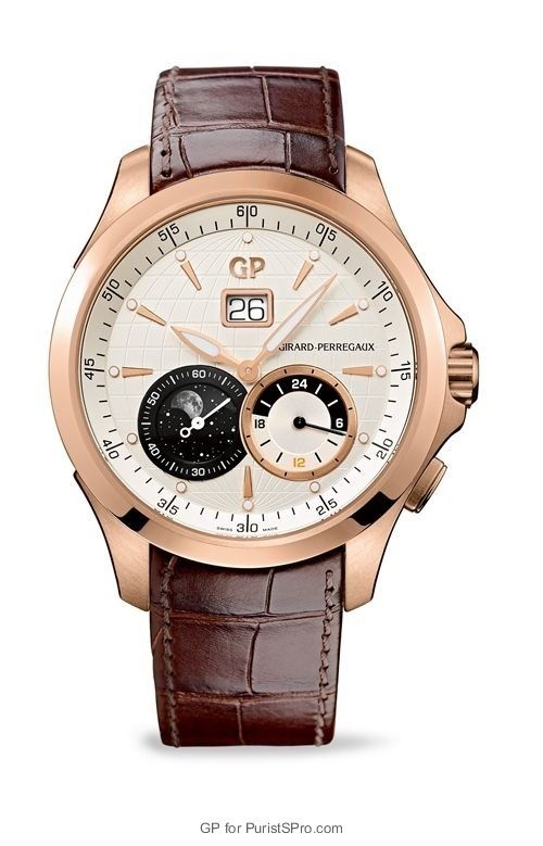
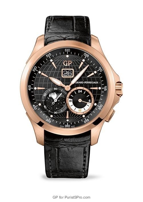
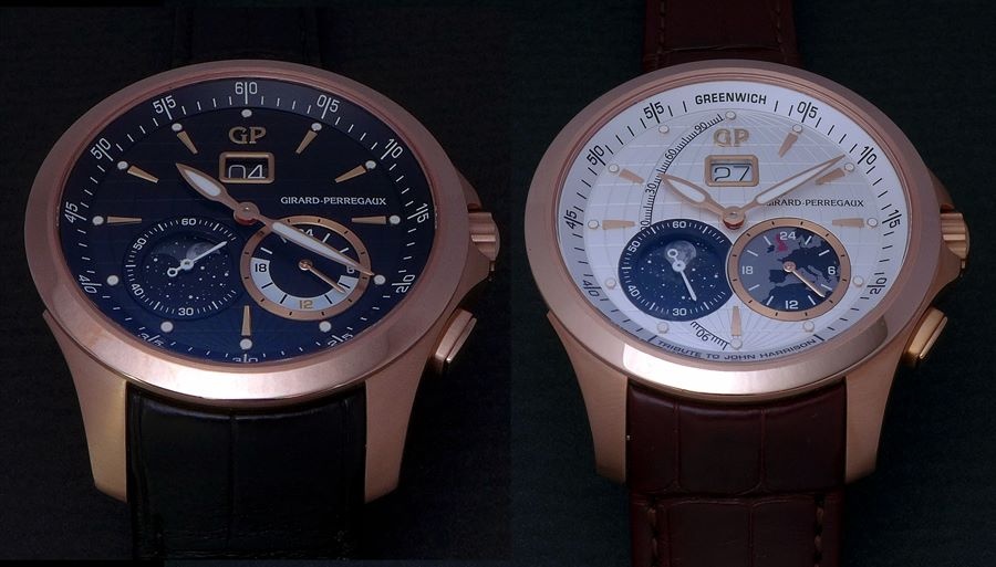
Off-white dial, Pink gold case, reference: 49655-52-131-BB6A.
The Off-white dial, Pink gold case version is identical to the john Harrison except for the JH details.
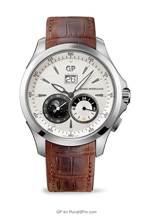
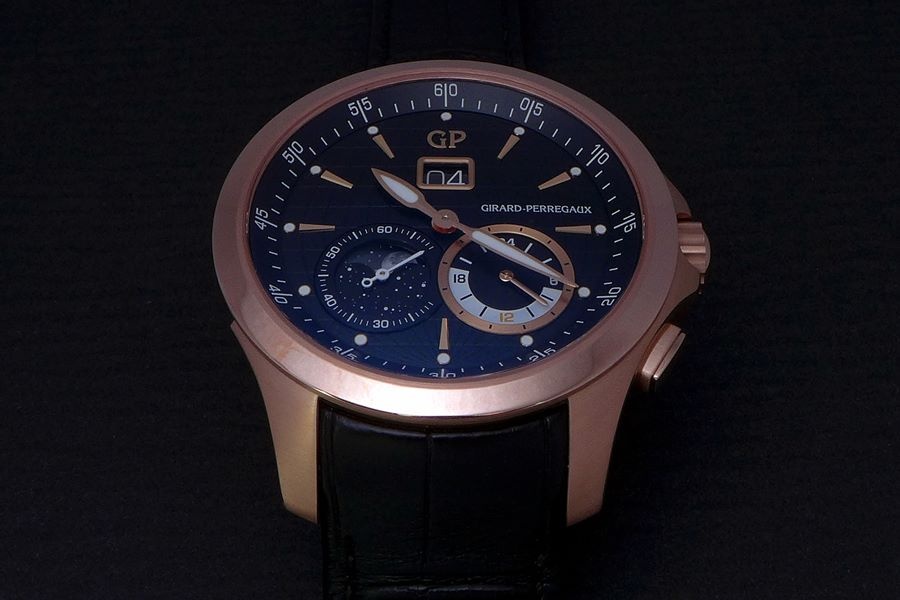
Opaline silvered dial, Stainless steel case, reference: 49655-11-132-BB6A.
A more “cold” version is the Stainless steel version with its Opaline silvered dial. The white metal case, whiter dial and darker hands and indexes gives this version a cold more technical look compared to the others, IMO.
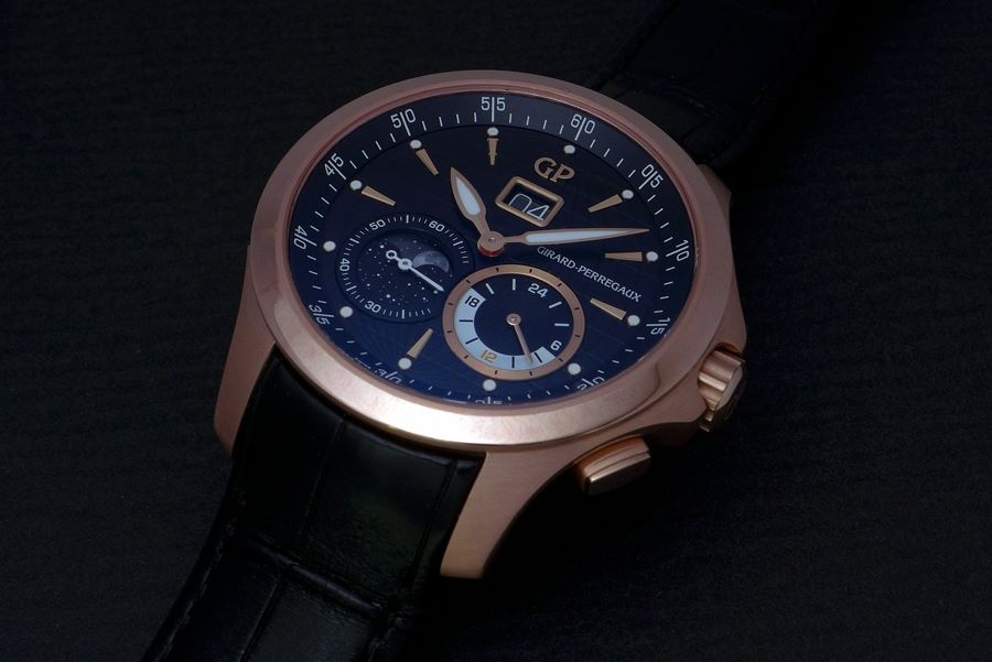
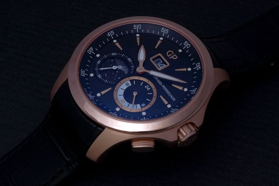
Galvanic black dial, Pink Gold case, reference: 49655-52-631-BB6A.
OK, let’s have a closer look at the black versions to see the details.
Removed are the “Greenwich” and the name “John Harrison” from the inner bezel.
This gives rooms for the minute track to be uncut in a full circle, giving the dial a more symmetric look.
Gone is also the Longitude on the left hand side. Supposable making the dial even more symmetric, but instead leaving the “GIRARD-PERREGAUX” hanging by itself on the right hand side…
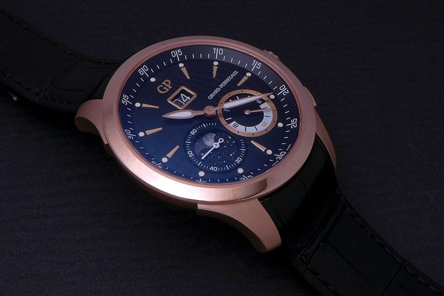
While looking at this dial I start wondering if it would have been a good idea to move the GP-text down to the minute track between 35 and 25..?
That would have made this dial more homogeny.
But the biggest change is the sub-dial to the right holding the second time zone. Here we find a black and white 24 hour scale.
No map, no highlighted England. Too bad, IMO.
I really liked to map paired with the Moon Phase! Made me dream about space and travel…. Made me long for adventures far away…
With this pair, all I can do is howl to the Moon!

Jokes aside, I would have loved to see parts of the world map here. Different map depending on region the watch about to be shipped to?
The funny thing is that this kind of thoughts is running through my mind when I look closely on a watch like this…
Comparing every little detail into absurdum… Thinking “what if..?”, “could it be done..?”
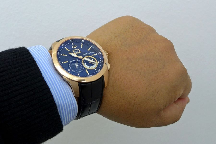
But once I strap it on my wrist…
All I can think is, “Damn, this is a really comfortable, great looking watch”!

So, what do you think?
Do you prefer the John Harrison or any of the normal versions?
What is your key? Case material? Dial color? Dial design?
I would love to hear what checks your boxes!
Best
Blomman
The Girard-Perregaux Vintage 1945 line, introduced in 1994, draws inspiration from historical models, specifically a 1945 Art Deco piece. This collection is characterized by its rectangular or tonneau-shaped cases and a design language that evokes mid-20th century aesthetics. The Vintage 1945 series quickly became a cornerstone of Girard-Perregaux's offerings in the 1990s, reinterpreting classic forms with contemporary watchmaking standards. It represents a significant period for the brand in re-establishing its heritage-inspired collections.
Early models in the Vintage 1945 series typically featured stainless steel cases, though gold variants were also produced. The case dimensions varied depending on the specific model, often presenting a balanced profile suitable for dress wear. These watches were frequently equipped with automatic movements, showcasing Girard-Perregaux's in-house capabilities or finely finished outsourced calibers. The crystal was commonly sapphire, ensuring durability and legibility, while water resistance was generally suitable for daily wear rather than aquatic activities.
For collectors, the Vintage 1945 series appeals to those interested in neo-vintage watches that successfully blend historical design with modern execution. The 1994 introduction year marks it as one of the earlier and more influential lines from Girard-Perregaux's resurgence in the 1990s. Its various iterations, including time-only, small seconds, and later complicated versions, offer a range of choices for enthusiasts seeking a distinctive rectangular watch with a clear lineage.
.. I have to say, that I might rather go for the cool ss/ version, when staying with this model, - or even stick to the JH, with these niceties ( Greenwich, longitude etc) - could you maybe also indicate about the difference(s) in retail prizes, or at least in relative terms, to get a feel for " how much " worth" is this & that feature to someone considering an acquisition .. Just some little 0,2 cents.. Bezt, hs
white dial and the vintage look strap is the best of them all in my opinion. If only it had not overlapping dials, something I do not like at all. CC
Great looking watches! :) The coolness of the SS is a great choice. I will try to find prices and get back to you, my friend. Best Blomman
Luckily you are not collecting Zenith! They have a lot of that... ;) More serious, I must say that I didn't find that detail disturbing. But we all have our own likes and dislikes... One PROS with overlapping dials is that the dials are bigger and able to show more details. Best, my friend Blomman
fully understand the pro's and con's but in the end, it's personal taste. Yes, Zenith El Primero is the mother of all overlapping dial :)
This thread is active on the Girard Perregaux forum with 5 replies. Share your knowledge with fellow collectors.
Join the Discussion →