Collection
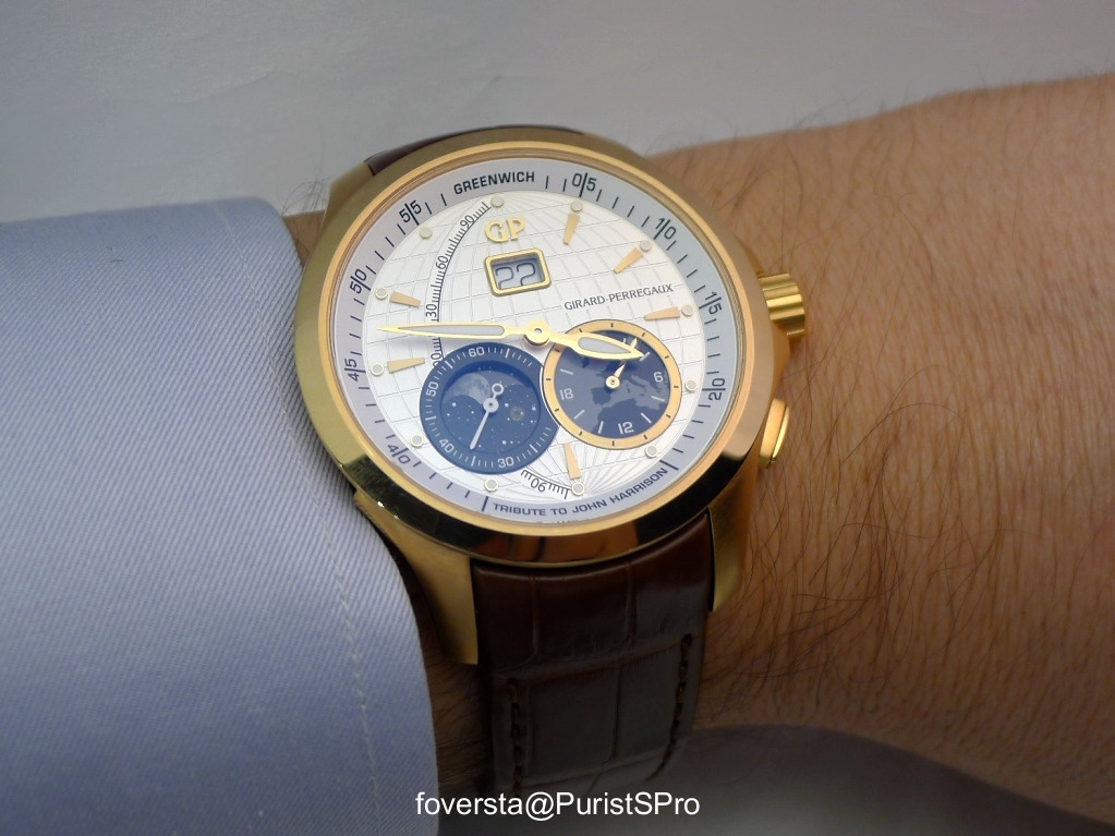
foversta introduces the Girard-Perregaux Traveller 'Tribute to John Harrison' with a focus on its unique dial and complications. This post highlights how the watch's design perfectly embodies its name, offering a fresh take on the Traveller series.
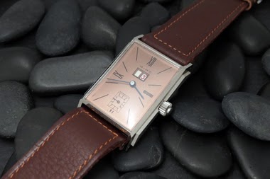
The Girard-Perregaux Vintage 1945 line, introduced in 1994, draws inspiration from historical models, specifically a 1945 Art Deco piece. This collection is characterized by its rectangular or tonneau-shaped cases and a design language that evokes mid-20th century aesthetics. The Vintage 1945 series quickly became a cornerstone of Girard-Perregaux's offerings in the 1990s, reinterpreting classic forms with contemporary watchmaking standards. It represents a significant period for the brand in re-establishing its heritage-inspired collections.
Early models in the Vintage 1945 series typically featured stainless steel cases, though gold variants were also produced. The case dimensions varied depending on the specific model, often presenting a balanced profile suitable for dress wear. These watches were frequently equipped with automatic movements, showcasing Girard-Perregaux's in-house capabilities or finely finished outsourced calibers. The crystal was commonly sapphire, ensuring durability and legibility, while water resistance was generally suitable for daily wear rather than aquatic activities.
For collectors, the Vintage 1945 series appeals to those interested in neo-vintage watches that successfully blend historical design with modern execution. The 1994 introduction year marks it as one of the earlier and more influential lines from Girard-Perregaux's resurgence in the 1990s. Its various iterations, including time-only, small seconds, and later complicated versions, offer a range of choices for enthusiasts seeking a distinctive rectangular watch with a clear lineage.
Looking forward to your review on the Tribute to John Harrison! :) Best Blomman
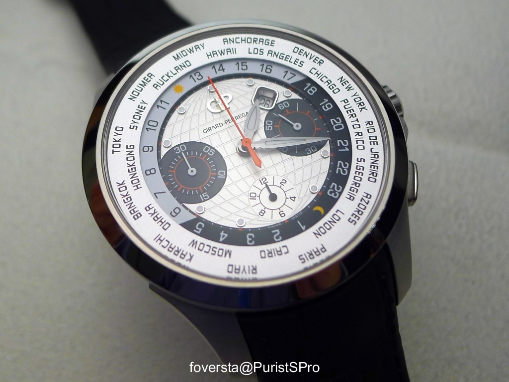
The second time zone´s really a more suitable complication than the power reserve indicator from the regular Traveller. Nice picture by the way. However, I couldn´t help noticing the large arc on the left side of the dial. I keep wondering what´s that -105 to +105 track line for? Is there a hidden hand for this register? Thank you, Ramon
The scale arc correcponds with the network of degrees engraved into the dial, so I assume it is located to symbolize the Zero degree line at Greenwich. But then I am still puzzled by the subdivision and marking in 115 degrees each North and South ... Marcus
Let's say that the World Time has a great dial, and the absence of a second crown at 9 o'clock is a big plus, but I am not seduced by this case, not at all. As for the other members of this family, not my cup of tea at all, once again. Funny how things have changed when looking at these watches in the real. I got the confirmation that the Traveller was not my cup of tea, but I changed my mind on the Sea Hawk, totally, while I found them too bulky for my taste, and now, I feel they are pretty coo
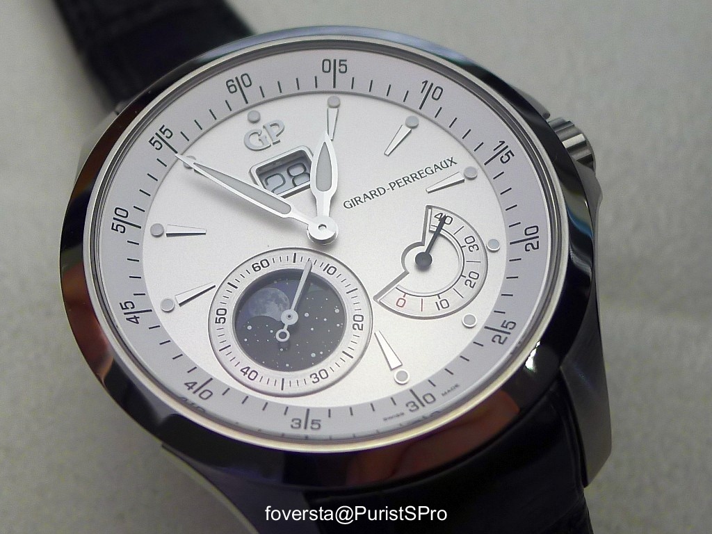
the proportions of the traveller case are not right to my eyes. The second timezone dial I think makes it even worse and why match it with a gold case? Not my cup of tea at all. CC
this Traveller II has everything the new Traveller doesn't: perfectly sized 40mm case practical, more durable Stainless Steel perfect second timezone display, doubling up as 24h indicator unobtrusive and perfectly placed date display at 6 o'clock classic cream dial with a nice ring stripe structure (bearly visible on photos) classic dauphine hands and a blued central sweep seconds hand applied Breguet numerals alarm function! ah, I could go on... CC
This thread is active on the Girard Perregaux forum with 10 replies. Share your knowledge with fellow collectors.
Join the Discussion →