Review
Blomman Mr Blue presents a detailed review of the Girard-Perregaux 1966 Large Date with Moon Phases, urging readers to look beyond initial impressions. He challenges common criticisms regarding case-to-movement ratio and dial text, offering an in-depth look at this classic yet nuanced timepiece through a series of live shots.


Friends,
As announced yesterday, here is the review of the GP 1966 Large Date with Moon Phases!

I would like to start to say the following: please don’t be too quick to judge this watch and dismiss it as yet another classic looking date/moon phase watch!
It is easy to just pick on the regular things we use to pick on… Too big case, too small movement, why not steel? Please, manual movement. Don’t print “Automatic” on the dial… And then move on!
We are a very picky bunch and we should be – we are PuristS!
BUT… Yes this time there is a “but”…
I had the opportunity to see this watch on several different occasions and situations. After each time my thoughts about this watch changed…
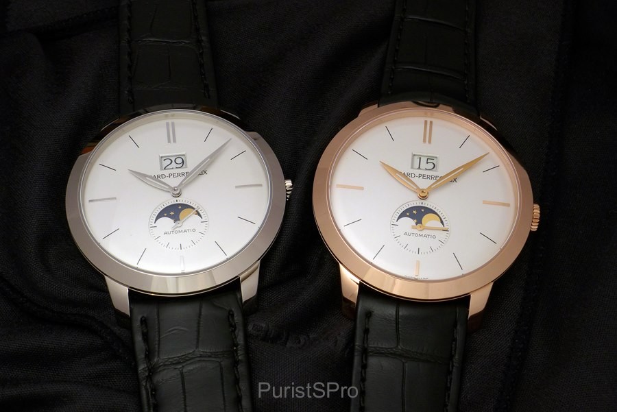
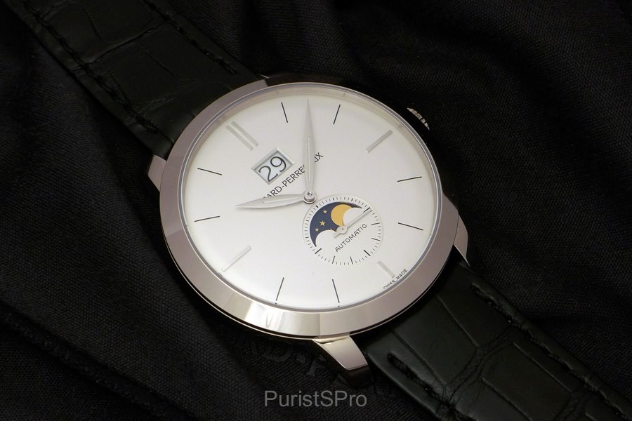
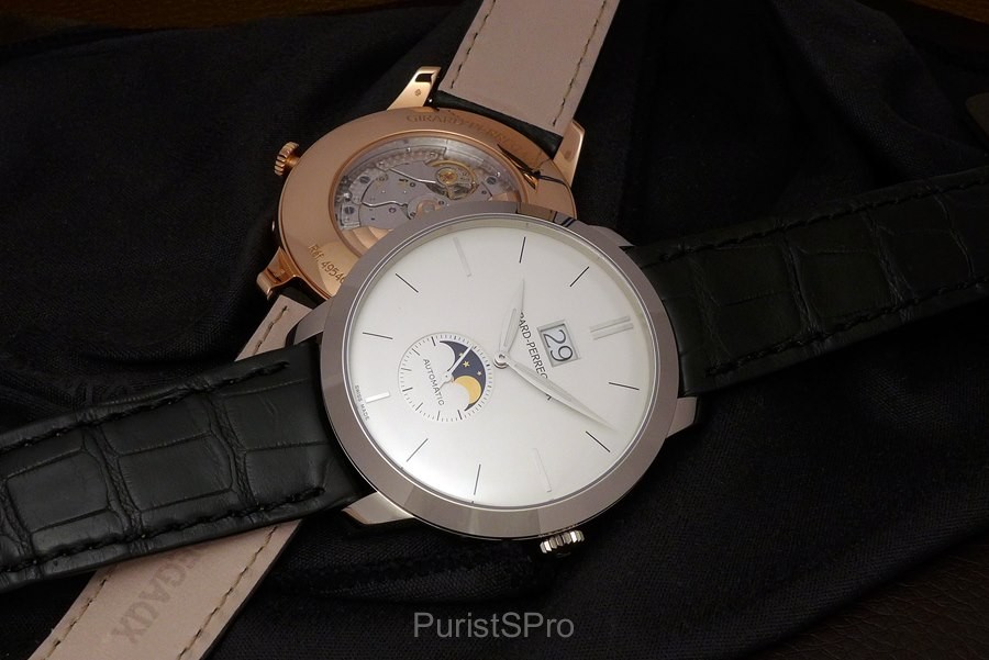
So before jumping to any conclusions, let us start and have a look at the live shots of this new GP 1966. First there is the White Gold version:
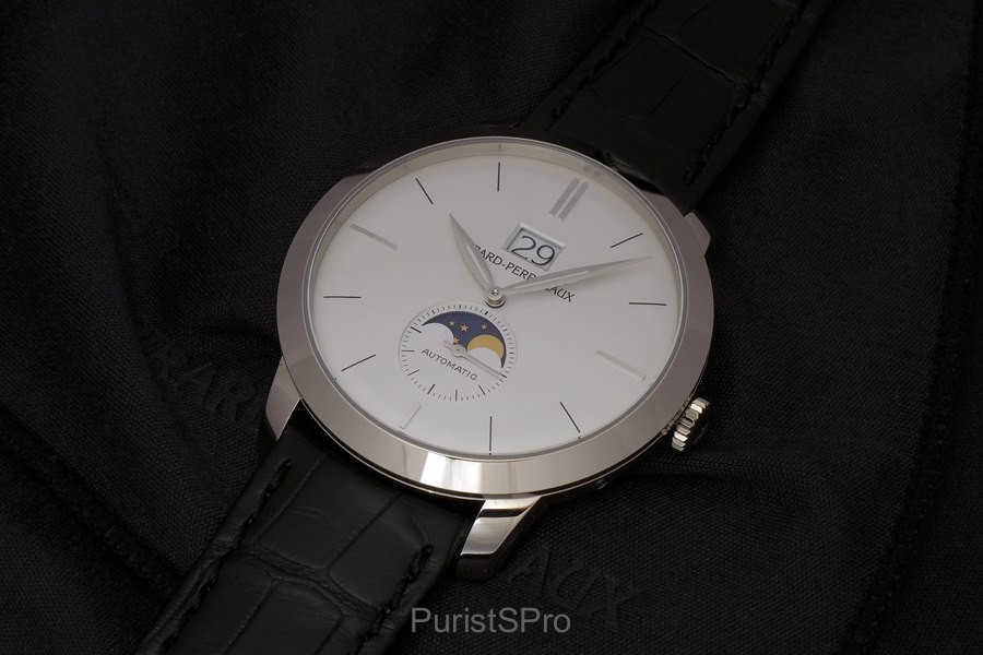
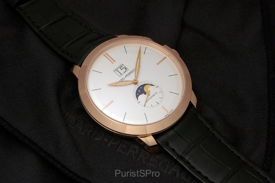
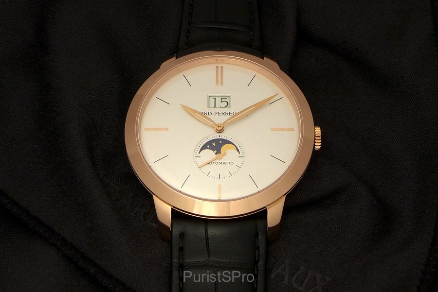
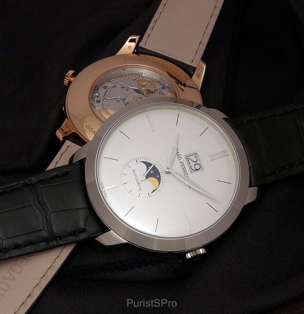
Very classic looking at first sight! The combination of Large Date and Mon Phases gives the dial of the watch very nice balance.
The focus is really on the complications! The Large Date overpowers the Girard-Perregaux logo and the sub-second with the golden moon face gives the dial the perfect harmony a classic watch should have.
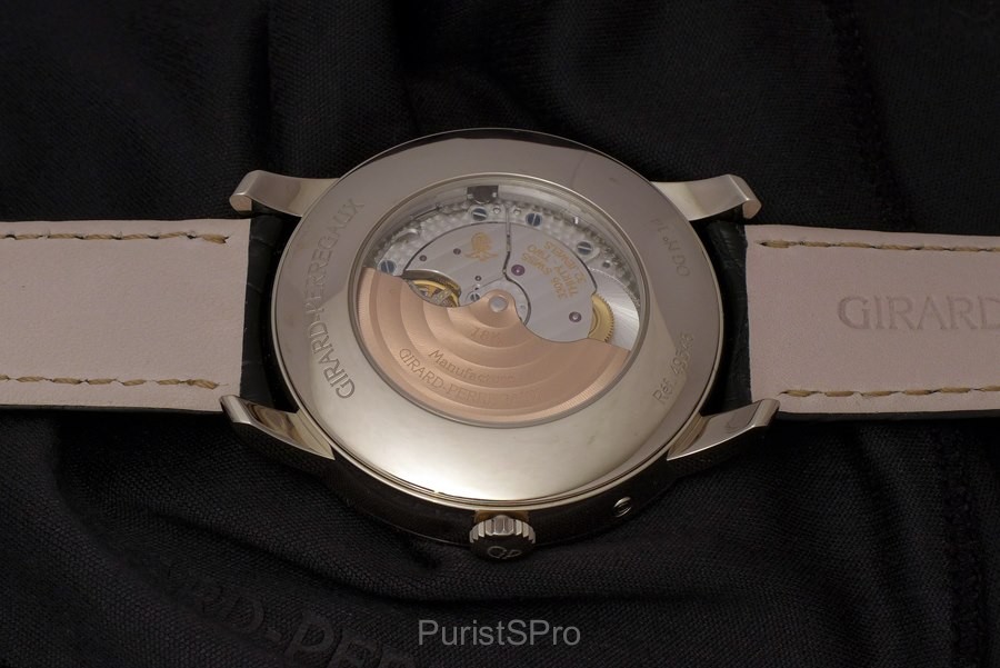
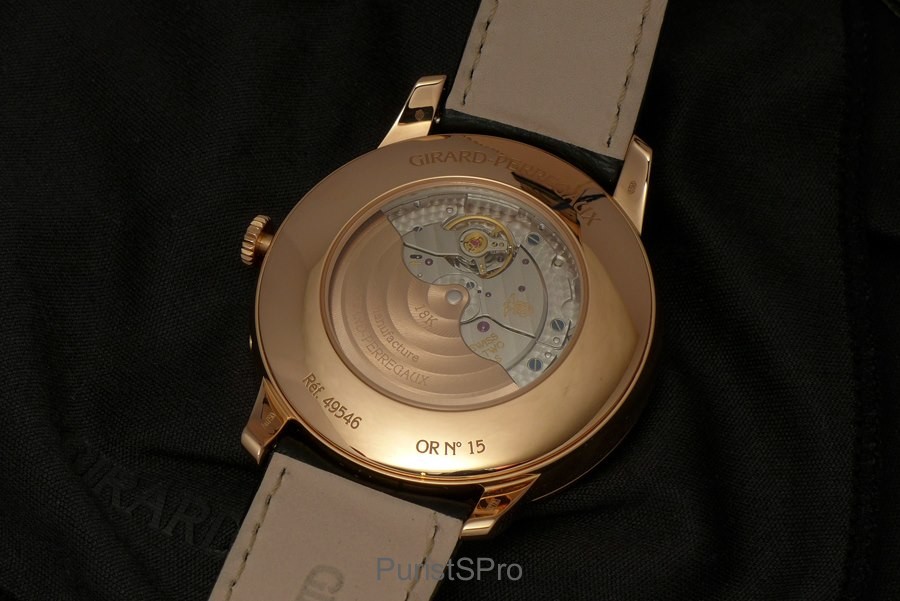
Inside is the automatic caliber GP03300-0110. Somewhat small, 25.60 mm, compared to the 41 mm case. At least the opening has a good ration to the diameter and shows the beautiful decorated Pink Gold rotor.
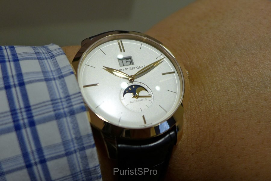
On the wrist – I choose two shots to show the different characters of the watch. One distant shot, notice what stands out and shows on the dial: the enhanced Leaf hands, Indexes at 12/3/6/9, the Large Date and the Moon Phases! Again, balance…
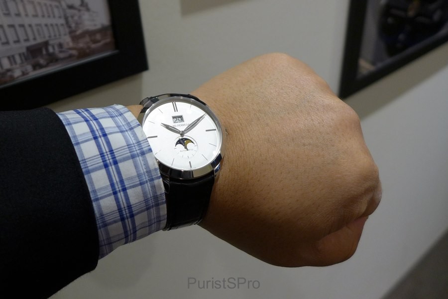
Second shot is more up close and personal! Still the same elements are the one most noticeable, but now you also notice the GP logo and the “Automatic”…
Are the complications too centric, located too much into the dial? At first I thought so, but the more I look at this watch the more I think not! Will explain in a minute…
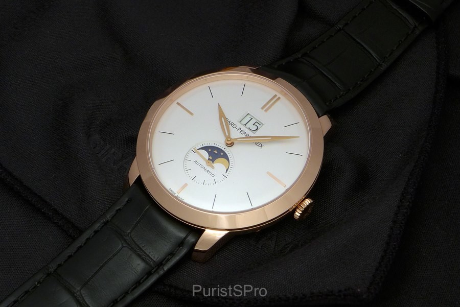
Secondly is the Pink Gold version.
Now I start to realize something… This is not just another classic looking watch, this is a Statement watch!
Why the 41 mm case and wide bezel? The movement would easily fit into the 40 mm or even the 38 mm case…
Why did GP not opt for any of the smaller cases? Make the watch go under the radar, make it more classic?
Yes, this is a classic looking watch, BUT, it is not a classic under the radar watch. This is a STATEMENT watch!
There is one expression that I find very suiting here: Show ’em if you got ’em!
Now the size makes sense, IMO! To avoid falling into the same category as many other similar watches from GP and from other brands… Here is a watch that shows off what it got!
The enhanced case, the wide bezel makes you look! The centered complications give room for both 12 and 6 index. Without any minute track the dial looks very clean and gives room for the enhanced leaf hands to really stretch out.
Yes, the word “Automatic” feels redundant here… But have you ever questioned the “V 70” on the back of your car (or whatever car you drive)?
At least the text is quite small…
Another interesting detail is that while “showing off” the logo is not in focus. On the contrary, the broad leaf hands obscure the Girard-Perregaux text quite a lot between ten to and ten past each hour and even more between 10 – 14 and 22 – 02.
A quick look on the back shows the same caliber GP 03300-0110 but framed by a Pink Gold case back.
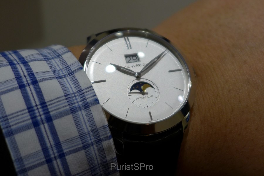
On the wrist I selected again, two shots showing the character of the watch. Focus on the complications, the four quarters enhanced, easy to read time…
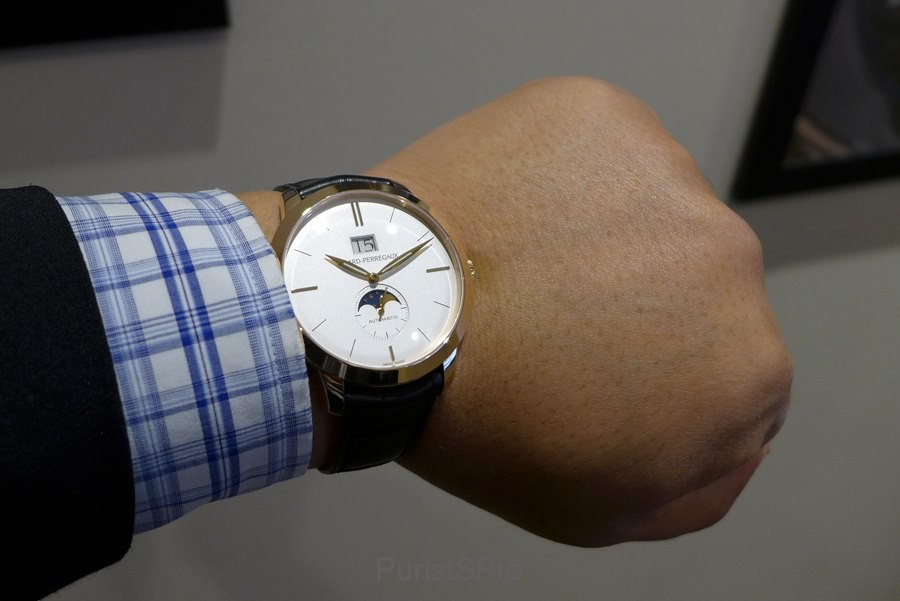
Up close, notice the reflections on the hands… In my On-the-wrist review I will talk more about these hands…
As CrownComfort picked up from yesterday’s announcement shot… Yes, there will be an On-the-wrist review Blomman-style!
Girard-Perregaux had again the kindness to let me have this watch for a deeper experience.
But I wanted to ease you into to this watch the same way I “discovered” this GP 1966 Large Date with Moon Phases…
So I will stop here and let you take in and digest your first impressions, which I hope you will share with us here now…
Once everybody had a chance to have a closer look on these two watches I will come back with even more thoughts about one of them in my “On-the-wrist review”…
Best
Blomman
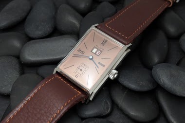
The Girard-Perregaux Vintage 1945 line, introduced in 1994, draws inspiration from historical models, specifically a 1945 Art Deco piece. This collection is characterized by its rectangular or tonneau-shaped cases and a design language that evokes mid-20th century aesthetics. The Vintage 1945 series quickly became a cornerstone of Girard-Perregaux's offerings in the 1990s, reinterpreting classic forms with contemporary watchmaking standards. It represents a significant period for the brand in re-establishing its heritage-inspired collections.
Early models in the Vintage 1945 series typically featured stainless steel cases, though gold variants were also produced. The case dimensions varied depending on the specific model, often presenting a balanced profile suitable for dress wear. These watches were frequently equipped with automatic movements, showcasing Girard-Perregaux's in-house capabilities or finely finished outsourced calibers. The crystal was commonly sapphire, ensuring durability and legibility, while water resistance was generally suitable for daily wear rather than aquatic activities.
For collectors, the Vintage 1945 series appeals to those interested in neo-vintage watches that successfully blend historical design with modern execution. The 1994 introduction year marks it as one of the earlier and more influential lines from Girard-Perregaux's resurgence in the 1990s. Its various iterations, including time-only, small seconds, and later complicated versions, offer a range of choices for enthusiasts seeking a distinctive rectangular watch with a clear lineage.
I kind of like this emptiness of the dial, I must say. Yes, I would like to see GP working on a more coherent ratio between their cases and movements, especially on the automatic ones, but I like this one ofr what it is. Will I buy it? No. I have other targets, at GP. A 1966 Chrono, for example, or a Vintage 45 Mechanics of Art, or a Richeville night and Day. Not to speak of my GP dreams, which are too many. But I can like it without feeling the need to buy it, luckily. :) Aaaah, I am happy to s
Have a base caliber foe each case size. But I guess that would require a lot of development... On the other hand, as long as the case opening on the back show as much as on this watch, I don't mind that much the smaller movement. What I do object to is when the case back opening is so small that you don't even see anything! Best, my friend Blomman
I really like this novelty. If it comes with a date, why not make it readable forthe short-sighted ;) I think the large date mechansim from GP is the best solution that exists without visible discs or worse, framed windows (no names ;)) I prefer this version even over the 1966 with full calendar as the moonphase is better proportioned and I do like the large date. White Gold version is my favourite. Maybe one day GP will turn this into an even bigger statement watch by adding more complications,
My choice is this one! :) Especially considering the time only I already have... Love the hands - will go more into details in my on-the-wrist review. Best, my friend Blomman
would go with the Big Date rather than the Full Calendar. What would be really interesting to compare it with its real predecossor the Ref 49530. CC
I was just comparing photos in my archive with the 49530! The 49530 case is one millimeter smaller, 40 mm. But the case is not as refined as the GP 1966 case, IMO. Another interesting detail is the lack of "Automatic" on the dial - I for one can't say that I find the space under the Moon Phases more attractive than the with the "Automatic"... What do you think? Best Blomman
This thread is active on the Girard Perregaux forum with 18 replies. Share your knowledge with fellow collectors.
Join the Discussion →