Girard-Perregaux 1966 Doctor's Watch Chronograph
Complications

Girard-Perregaux 1966 Doctor's Watch Chronograph

By foversta · Mar 17, 2013 · 18 replies
foversta
WPS member · Girard Perregaux forum
18 replies8422 views9 photos
f 𝕏 in 💬 🔗

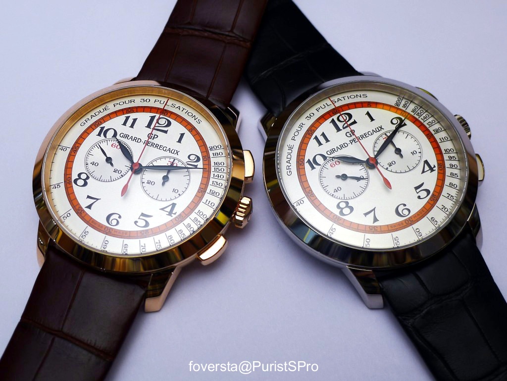
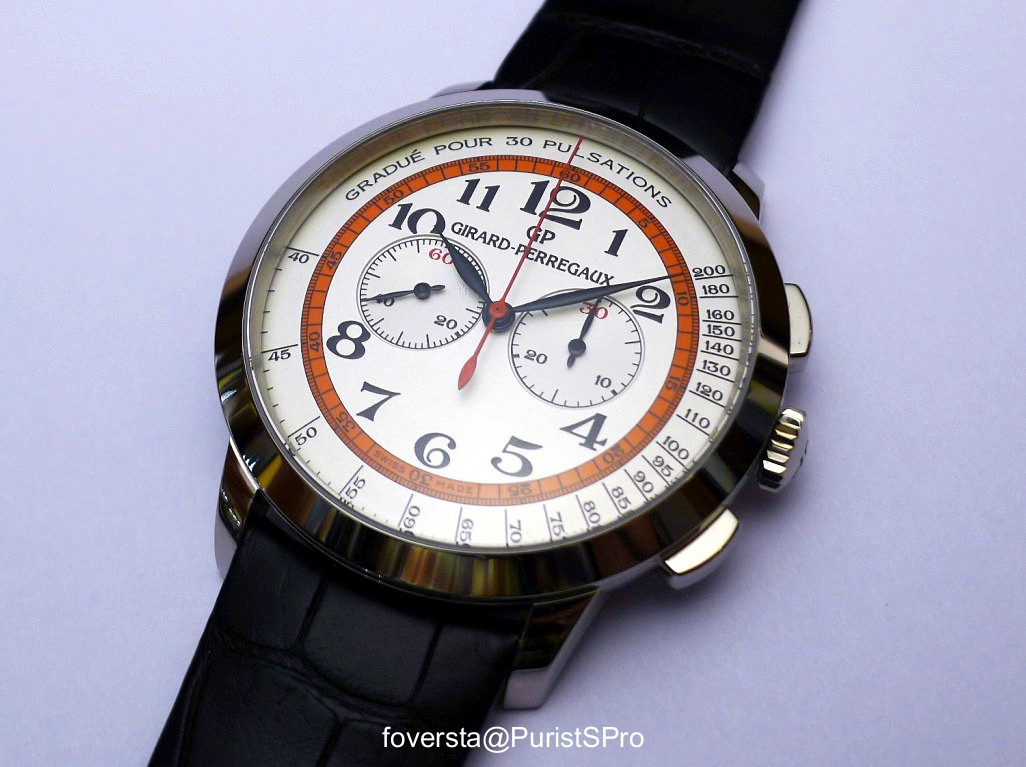
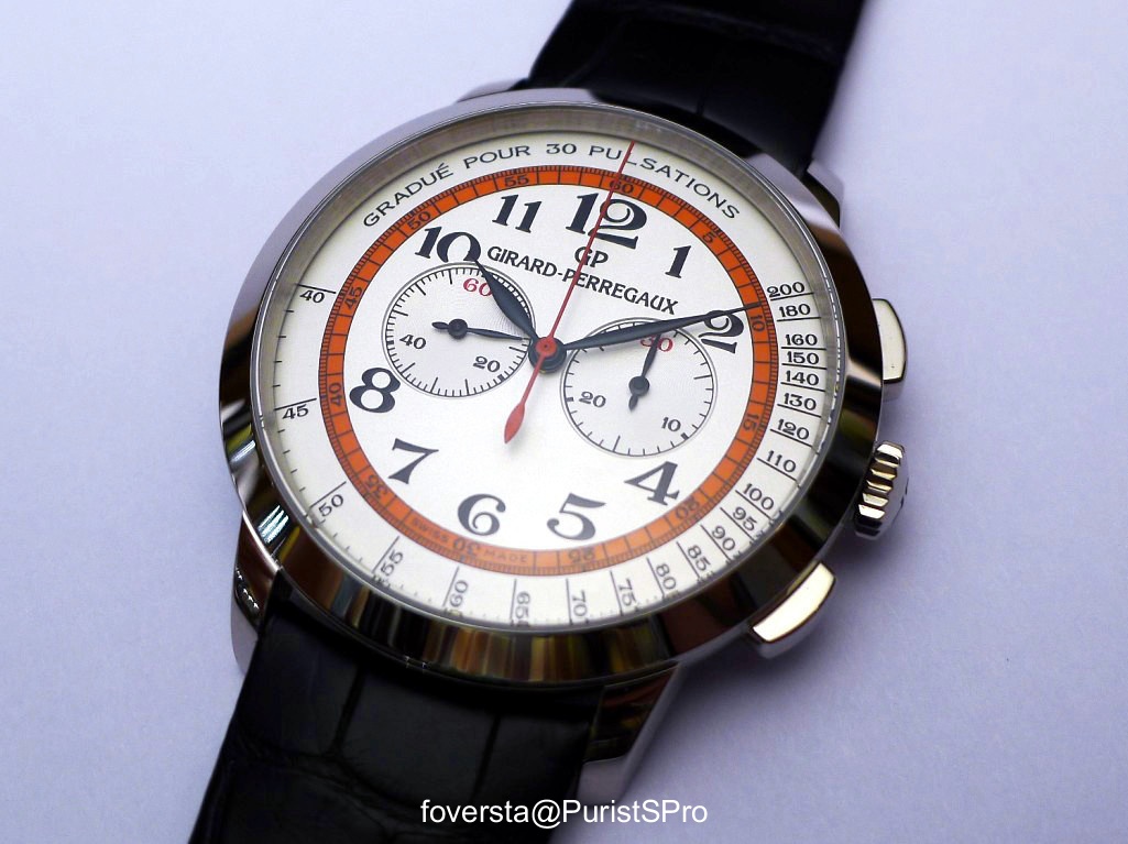
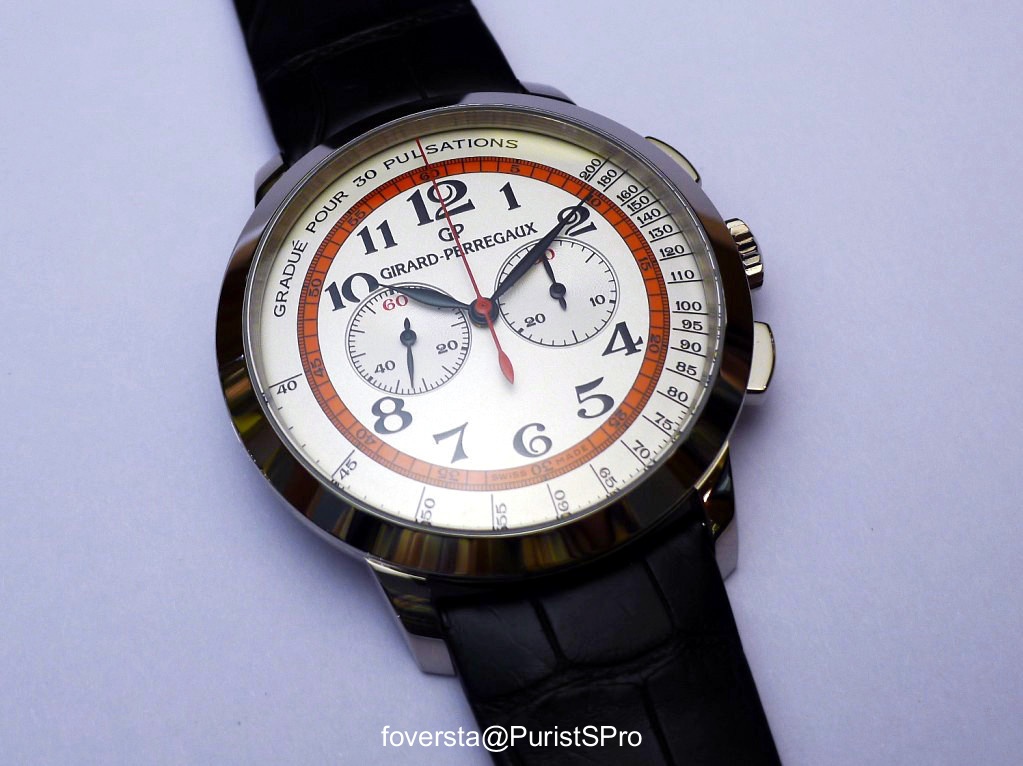
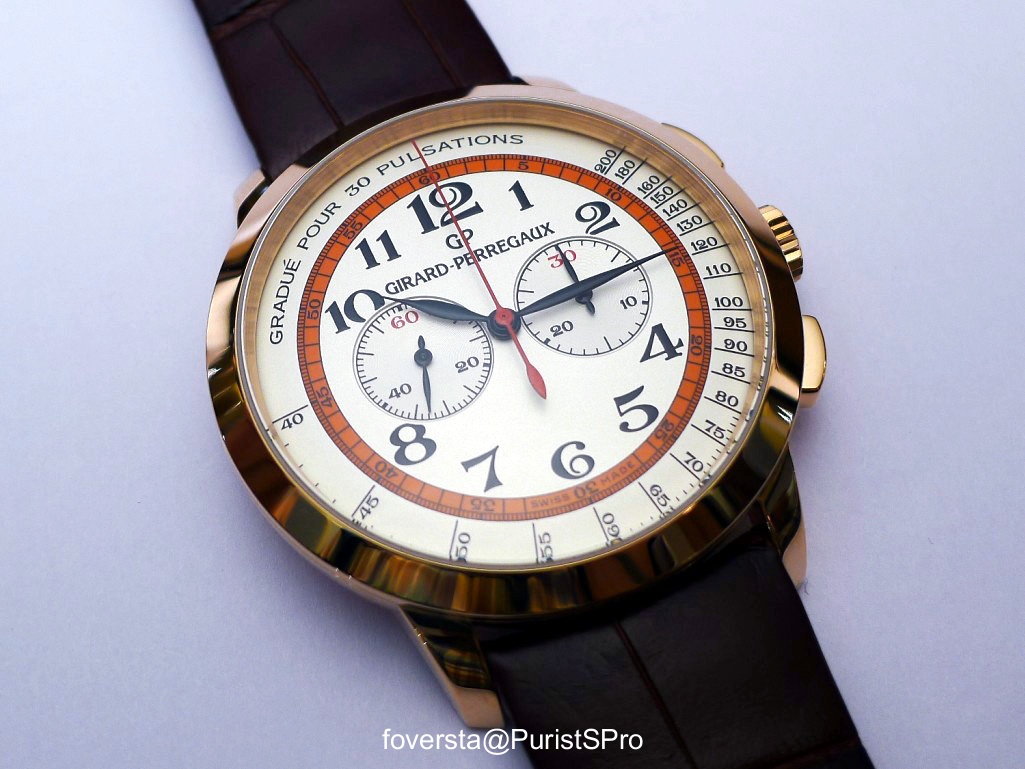
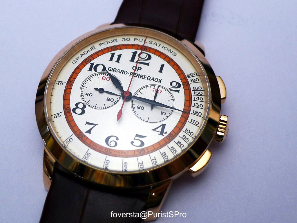
Foversta introduces the Girard-Perregaux 1966 Chronograph "Doctor's Watch," a limited edition for Dubail that reinterprets the classic pulsimetric chronograph. He delves into the dial's unique design elements, such as the distinct font, the inner orange/red circle, and the French pulsimetric scale, which collectively create a deliciously retro aesthetic.

18 collectors discussing this on the WatchProSite forumJoin the Conversation →
This is a nice surprise proposed by Girard-Perregaux at the end of the first quarter of the year  with a new interpretation of the 1966 Chronograph which has been created in the context of a limited series of 10 PG and 10 WG watches for Dubail, the famous Parisian AD.

The main interest of the 1966 Chronograph "Doctor's Watch" lies in the dial design that brings a different dimension. Of course, it keeps the same lay-out as previously. First, a peripheral scale. In intermediate position, the scale of the chronograph second hand. Then the two sub-dials. But the purpose of the scale is no longer the same and some aesthetical details have been deeply reviewed.


The "Doctor's Watch" takes its name from the watches used by doctors to measure the heart rate of patients with a pulsimetric scale. Just take the pulse, start the chronograph and count the number of pulses equal to the reference indicated on the dial (here: 30). At the thirtieth pulsation, the chronograph is stopped and the hand indicates through direct reading the heart rate. Obviously, a chronograph is not mandatory (a central second hand watch can be used in the same way) but it makes the process much easier and more precise. Girard-Perregaux has a long tradition in similar watches since the Manufacture presented its first "Doctor's Watch" in the 1930s. The limited series for Dubail was inspired by one of these models from the past and it is the reason why  a deliciously retro atmosphere arises.


Many elements contribute to this particular style. The first element is obviously the font of the dial figures. They replace the 1966 Chronograph applied indexes. In fact, only 6 and 12 are present in the traditional 40mm diameter version. The dial appears more flat and at the first glance, I regretted the loss of feeling of depth. Hopefully, other details balanced my point of view about the dial.

The second element is the colour of the chronograph second hand graduation. The inner deep orange/red circle plays an important role because it separates clearly the usual functions of the chronograph from the pulsimetric scale. It decreases the perceived size of the dial and in a sense makes it more harmonious. Indeed, it breaks the impression of slight unbalance due to the proximity of the Sub-dials to the center of the watch due to the diameter of the chronograph module. I consider this circle as very original in the context of contemporary watches, and it strongly contributes to the aesthetical achievement of the whole dial.


The third element is the red chronograph second hand. It is obviously in coherence with the scale and it brings a sportive touch.

The fourth element is the way the brand name is written on the dial. It is becoming more visible as present on two lines and being wider. It is less discreet than on the original 1966 Chronograph dial  but the size of the font is consistent with the letters of the pulsimetric scale reference.


Finally, the fifth and final element is of course the pulsimetric scale by itself. I highly appreciate that the indication of the reference is written in French. The use of my language is certainly due in part to the "Dubail" and "vintage" contexts of the limited series, but it is very nice to see that Girard-Perregaux has been able to resist the temptation to English. After all, French is the watchmaking language!


It is surprising to note how the change in dial style  makes the 1966 Chronograph so different. At the beginning, with its figures and applied indexes, its sobriety, the 1966 Chronograph is a discreet and refined watch which embodies the complication with great elegance. The 1966 Chronograph "Doctor's Watch" is more bold, less formal as its colors, the size of the figures prove it. It shakes the tranquillity of the original model by giving it a much more aggressive style without losing elegance. Hopefully, the 1966 Chronograph "Doctor's Watch" is based on the 40 mm version of the 1966 Chronograph, which is good news for me because I find it more balanced and it doesn't have any date window. This is immediately felt on the wrist: the watch is worn with comfort and the usual curves of the 1966 case give it a lot of charm. I especially like the PG version because the case colour combines very well with the red touch of the dial. The WG version is less warm but just as successful in adopting a more sportive style.


The movement remains the GP030C0 with a modular architecture. Although I regret that Girard-Perregaux still doesnt have an integrated chronograph in-house movement, the GP030C0 fulfills its mission without problem thanks in particular to the winding efficiency of the basic caliber and the quality of the column wheel module. On the other hand, its power reserve is rather short (minimum 36 hours) and obviously, it is a little frustrating aesthetically speaking because the module is located behind the dial: despite the  good quality of the sober finishings , this GP030C0 gets inevitably the appearance of a three-hand movement. Its diameter (23, 9 mm) remains small for the case and I would have preferred a solid caseback with a beautiful engraving instead of the see-through sapphire.


Despite this last remark, the 1966 Chronograph "Doctor's Watch" seduced me thanks to its successful design, the coherence between the dial and the curves of the case and the slightly old-fashioned charm it exudes. This limited series as its own interest as it transforms the original style of the 1966 Chronograph while revisiting a part of the history of the Manufacture.


Pros:
- a very nicely redesigned dial which gives a new dimension to the 1966 Chronograph
- the use of the 40mm version as a base
- the curves of the 1966 case and its comfort on the wrist

Cons:
- an engraved caseback should have been better in the context of the modular movement
- the low power reserve of the movement

Fr.Xavier

This message has been edited by foversta on 2013-03-17 05:05:25

About the Girard Perregaux Ref. 1966Chronograph

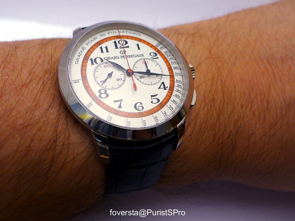
The Girard Perregaux 1966 Chronograph is a notable offering within the brand's classically styled 1966 collection, distinguished by its integrated chronograph function. This reference emphasizes traditional watchmaking aesthetics combined with a practical complication, positioning it as a more technically involved piece compared to time-only or simple date models within the same line. It represents Girard Perregaux's commitment to horological complications in a refined, understated package. The design adheres to the collection's established visual language, ensuring continuity while introducing enhanced functionality.

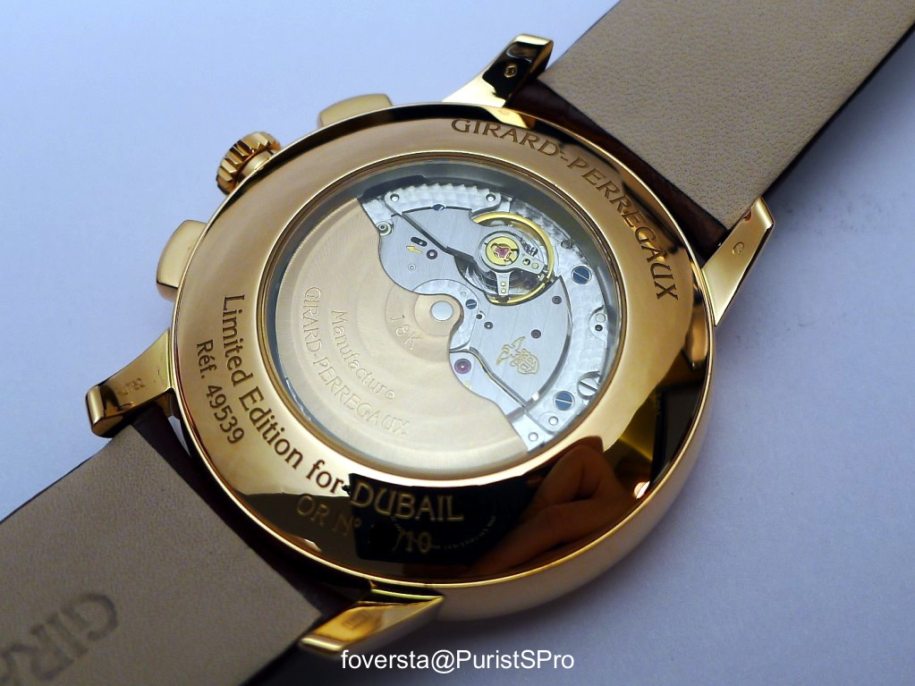
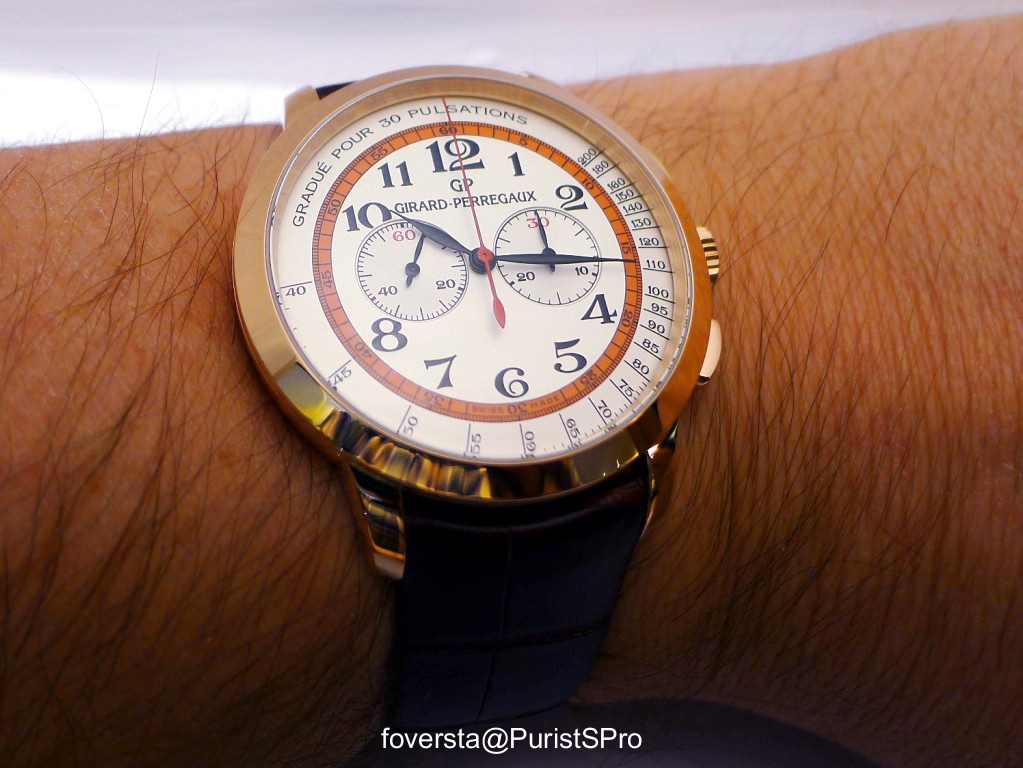
This particular iteration features a 40 mm case crafted from white gold, providing a substantial yet luxurious feel on the wrist. The watch is powered by an automatic mechanical movement, the GP03300-0064 caliber, which is visible through a sapphire case back. This movement offers a power reserve of approximately 46 hours. A sapphire crystal protects the dial, ensuring clarity and scratch resistance. The case dimensions contribute to a balanced presence, aligning with contemporary preferences for moderately sized chronographs.

For collectors, the 1966 Chronograph appeals to those seeking a sophisticated chronograph from a respected manufacture, without overt sporting pretensions. Its white gold case and classic design make it suitable for formal wear, while the chronograph complication adds a layer of horological interest. The choice of a display case back allows appreciation of the movement's finishing. This reference stands as a solid example of Girard Perregaux's capabilities in producing complicated watches with a focus on traditional design principles.

Specifications

Caliber
GP03300-0064
Case
White gold
Diameter
40 mm
Dial
Silver
Water Resist.
30 m
Crystal
Sapphire

Key Points from the Discussion

Advertisement
The Discussion
PP
pplater
Mar 17, 2013
A successful variant...

It would, however, be very interesting to see a blue rather than red/orange theme used for the WG version. First world problem! Cheers, pplater.

FO
foversta
Mar 17, 2013
Yes, it is a valid point.

A different colour atmosphere for the WG version would have create a larger difference between the two versions. Fx

FO
foversta
Mar 17, 2013
Please find a picture of a Vintage GP "Doctor"s Watch"

I found it on the Web: You can notice a similar dial lay-out but also some differences like the 45mn minutes counter with an highlight on the first 3 minutes sections. Credits: Antique Scientifica Fx

AM
amanico
Mar 17, 2013
That was the picture I had in mind. Superb. [nt]

OP
optionc
Mar 17, 2013
It's a winner

I like this version better than the current 1966 40mm. As you point out, the inner orange circle is a significant improvement in helping the dial look more balanced as the min/sec counters are quite close together. Well done GP... too bad it is only for Dubail. OpC

FO
foversta
Mar 18, 2013
Thanks Option!

So take the opportunity of an upcoming trip to France to see it! ;) fx

Continue the conversation

This thread is active on the Girard Perregaux forum with 18 replies. Share your knowledge with fellow collectors.

Join the Discussion →