
Review
Pingtsai's comparison of the original Gerald Genta Gefica Bi-retro with its Bulgari-redesigned successor offers a critical look at how a brand can evolve an iconic design while preserving its core identity. This analysis highlights the subtle yet impactful changes made to the dial, sparking a community discussion on balancing heritage with contemporary appeal. The article synthesizes these insights, providing a comprehensive understanding of the Gefica's transformation.


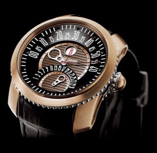
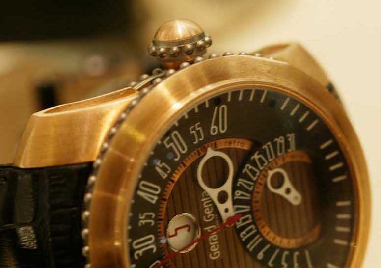
A quick comparison of the original Gerald Genta Gefica Bi-retro and the new version by Bulgari reveals some minor changes that make a prominent overall impact. The new Gefica, which was unveiled at Basel this year and likely available in the fall, sports the same characteristic bronze case and titanium beading around the case and crown as the original one. The variations lie solely in the dial. By tinkering with only one part of the watch, in this case the dial, and leaving the most characteristic parts, the case and crown untouched, Bulgari was able to preserve the DNA of this unique Gerald Genta watch.


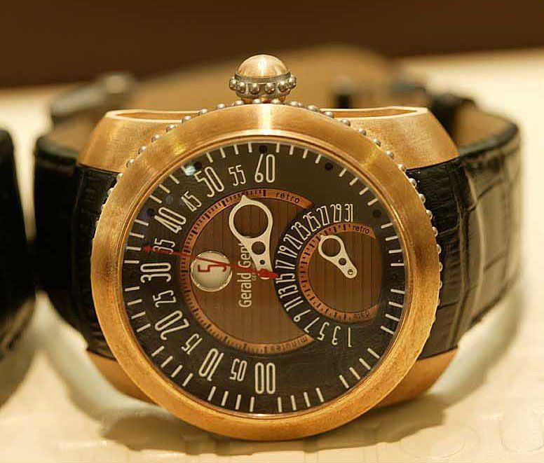
Photo courtesy of Dr. Bernard Cheong


In Bulgari’s re-design of this watch, they kept the layout of the dial exactly the same and simply changed the look of the individual elements. They retained the multi-leveled dial but differed the coloring slightly. The original Gefica has a striped bronze colored base whereas the new one has a more uniformed look with an all black dial. The two-toned dial in the original gives the watch a more dynamic look. Bulgari’s version however, achieves this as well with greater subtlety by varying the textures between the base and retrograde bands. Slight contrast is still achieved with the smooth, reflective surface of the base alongside the bead-blasted matte finish of the retrograde bands. The overall result is a cleaner look on the new Bulgari Gefica.


Another altered element was the line of small minute indices which was moved from the outer edge of the central base dial to the inner edge of the large retrograde display. The same holds true for the markers under the date retrograde. Bulgari moved all the ticking marks off the base dial to enhance the cleaner look they were trying to achieve.


Photo courtesy of Dr. Bernard Cheong
Seemingly the most instrumental change to the overall look of the dial is the font of the numbers. The art-decoish styled font in the original gave the watch a distinctly vintage look. The new version uses a wider squared font that gives it a sportier, more contemporary look. This is also true for the jumping hour which now takes on a more subdued black tone rather than red.
Also adding to the sporty look and feel is the addition of numbers indicating seconds to the outer edge of the dial. The red central seconds hand and signature minutes and date retrograde hands have remained unchanged.
And finally, the most meaningful change of all to the dial is of course the addition of the Bulgari logo to the dial. The Gerald Genta logo has been moved to the lower area of the dial just under the retrograde date hand. The changes to the Gefica are relatively minor but they were made in the right way, dosage and areas to give the watch a sporty character that will likely garner a wider audience appeal.
Which version do you prefer and why?
Some additional photos of the new Bulgari Gerald Genta Gefica courtesy of Kong


This message has been edited by AnthonyTsai on 2010-06-24 20:07:41
I must say the first wrist shot actually looks pretty good. Overall the dial has been tidied up but has probably lost some character in the process. I love the original font used for the numerals in the GG version. It's pretty difficult to make a yes/no desision on the two designs because I think a lot of the appeal of the watch lies also with how the glass dome crystal interacts with the dial as you move it around. Definitely one to see in the flesh regards Tim
actually looks better to me. Will show it to my wife and see if it sways her...Thanks for this post.
I liked the black dialed version of the Gerald Genta Gefica very much. To me when I saw it in person, it's probably was the most "Genta" watch that I liked and possibly the "perfect" Genta that best suited me. But with this new Bulgari designed Gefica, I do also like this cleaner look. The new font on the dial is more modern and and slightly reminds me of the futuristic looking Montblanc TimeWalker font. One thing which I think plays a decent role in the change of the look is the color of the nu
Simply because i think the redesign is abit busy with all the different numbers. Maybe take out one row? Also i still dont understand the reason for putting the caliber type in each of the new bulgari watches. Why?
sigh. The dial is now reflective, so how can i hunt for animals with a mirror surface?
i personally would describe it as contemporary alterations, i would say the word vintage was taken so seriously by GG , that they locked the watch into a certain frame .... and in that frame the watch used to evoke with vintage feeling that's unbearable sometimes , and at some point .... " that's my own opinion" the recent one, with the alterations it got it came out as a harmonic piece ....it looks vintage but contemporarily vintage . well done bulgari Faisal
This thread is active on the Bulgari forum with 29 replies. Share your knowledge with fellow collectors.
Join the Discussion →


