Review
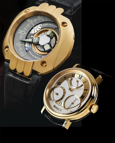
Bernard Cheong's detailed photographic essay on the Bulgari 303 chronograph offers a compelling argument for its place in high horology. His macro photography reveals the exceptional finishing and multi-layered dial construction, challenging perceptions of Bulgari as solely a fashion brand. Cheong's analysis, comparing it to established luxury watchmakers, underscores the 303's unexpected quality and value.


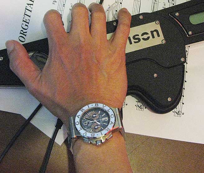
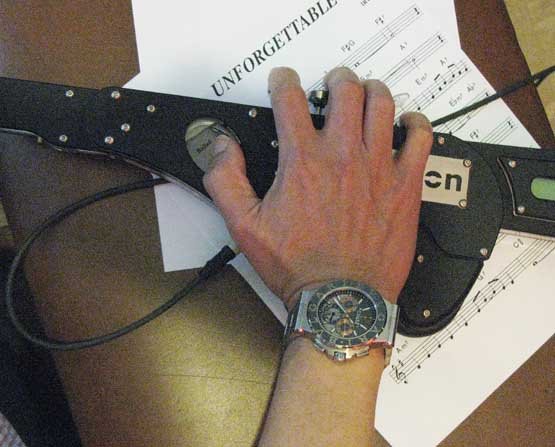
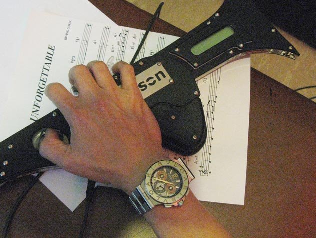
First, a natural look at the 303 after 5 days on my wrist, including the times I played the MDT with pals!
Now, the Morrison Digital Trumpet is one awesome machine. But look at the 303!!! In natural light, the Bulgari words appear as a design, the change of font alone was enough..but what the heck..
If you don't have hIGH speed load up, this is one post worth the wait for the pics below!
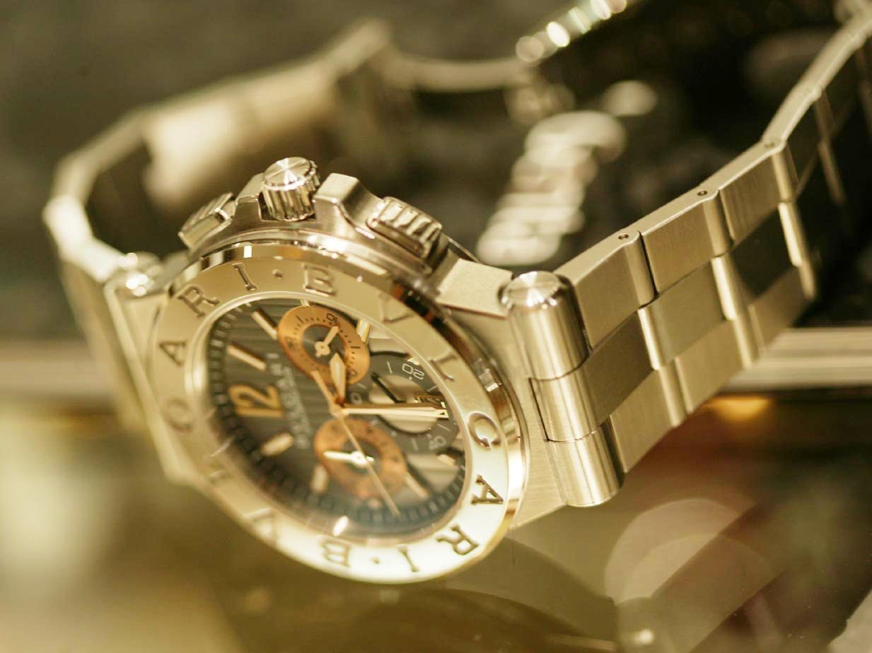
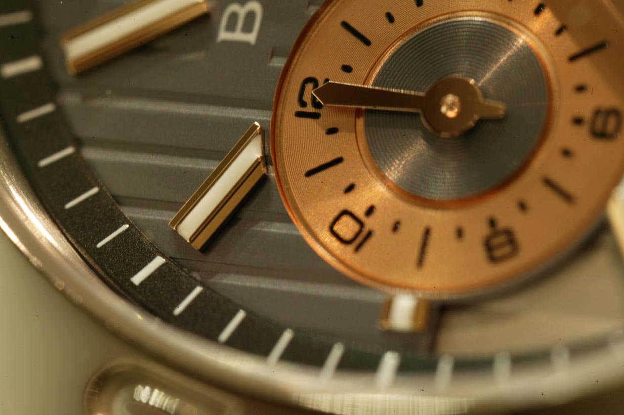
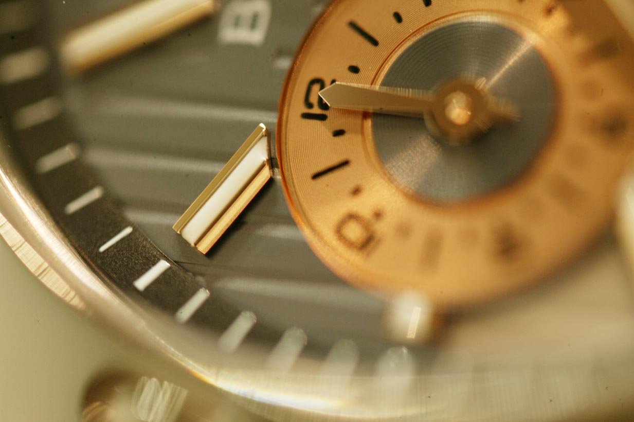
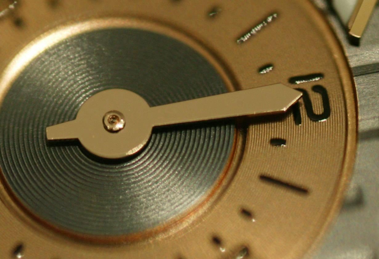
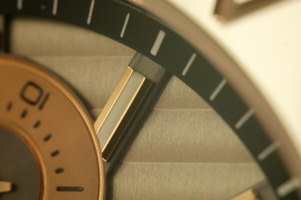
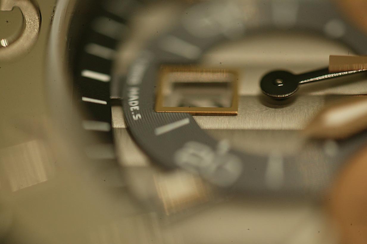
There are very few dials abd work that is THIS good...at any price.
Have a look!
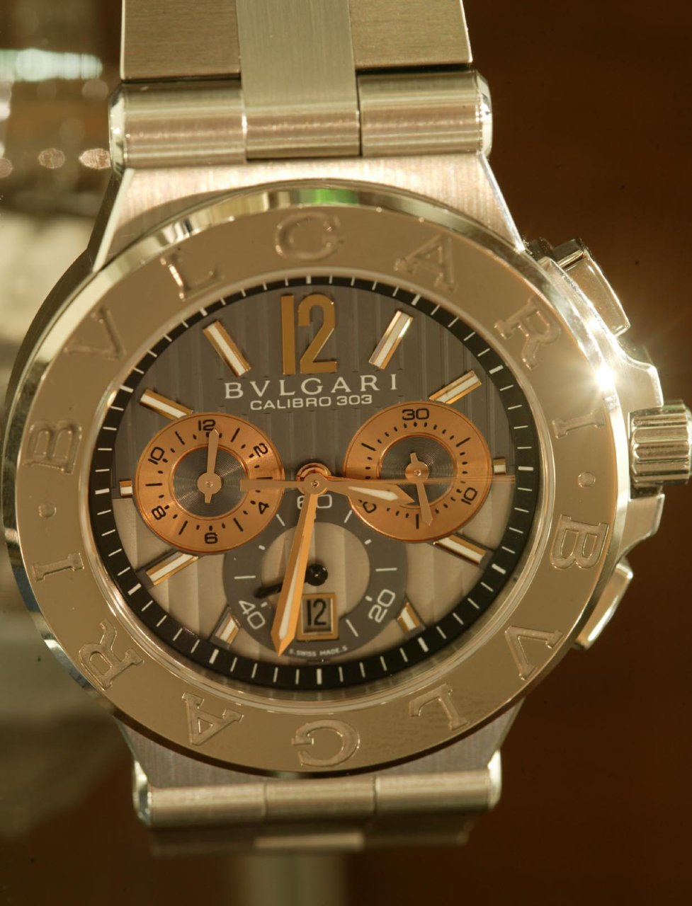
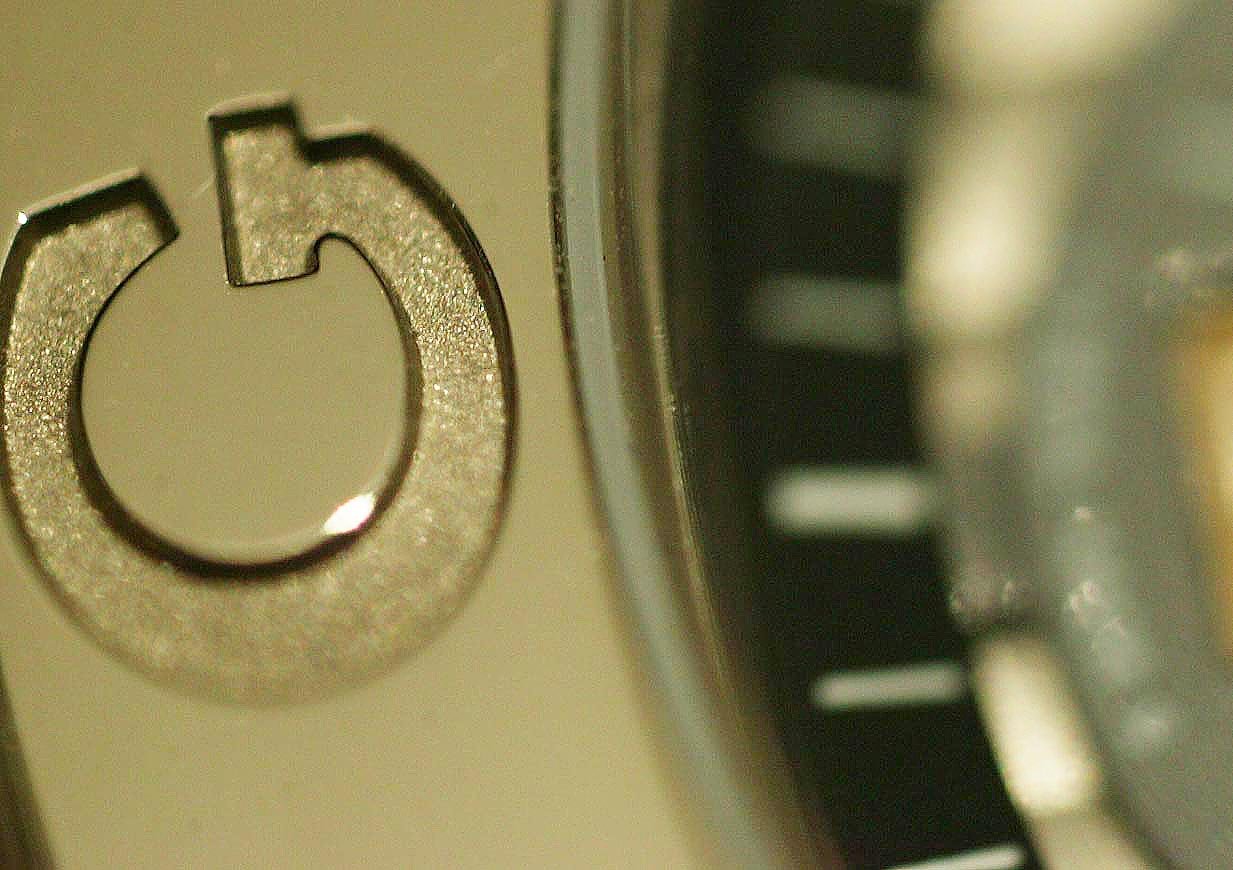
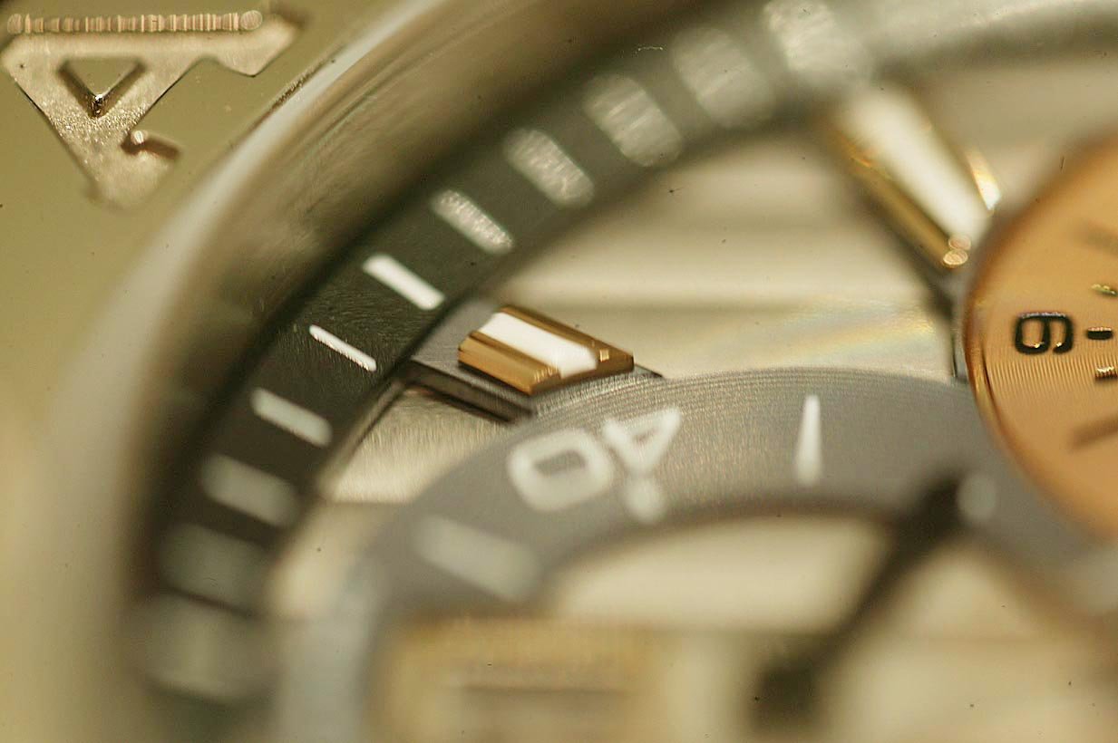
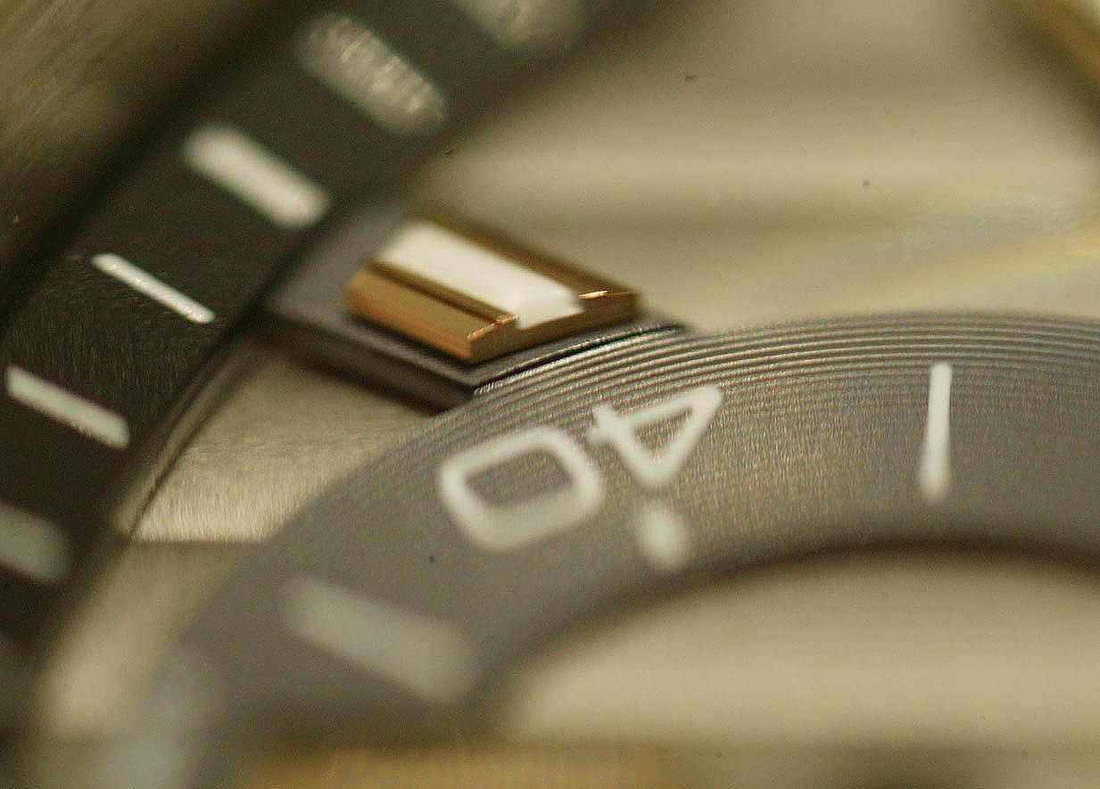
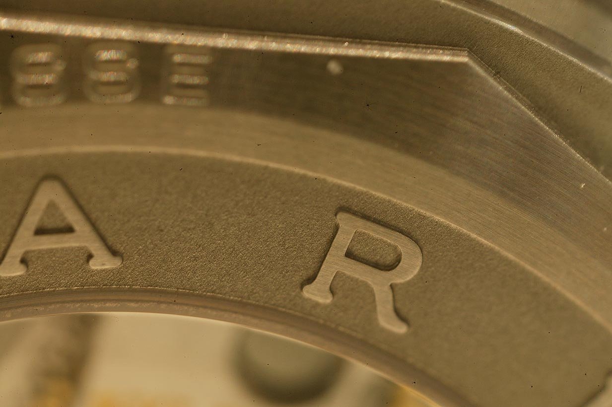
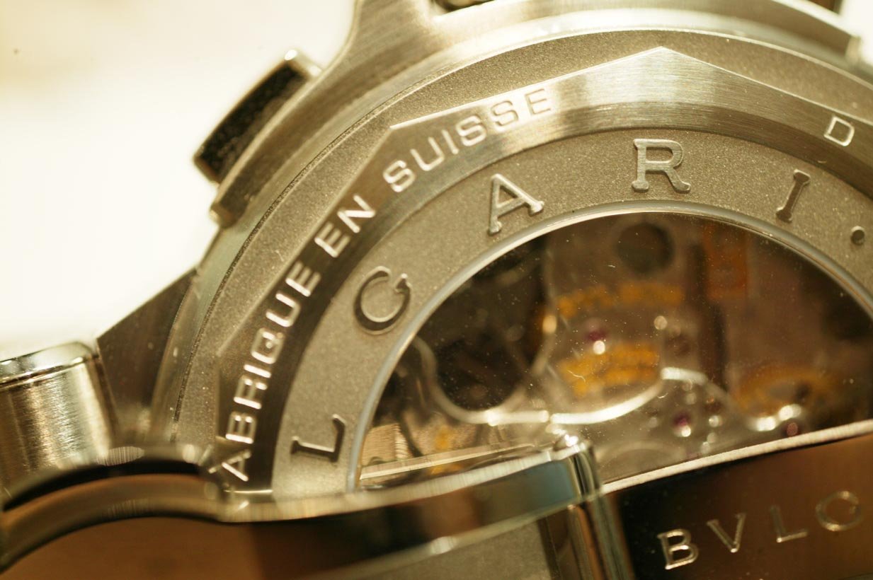
Note that the reflective high polish of the bezel of pure white gold gives the ring any color, according to what it reflects.
Hence, the watch adopts a "non color" that allows it to merge and match any clothing, skin tone and background very well indeed.
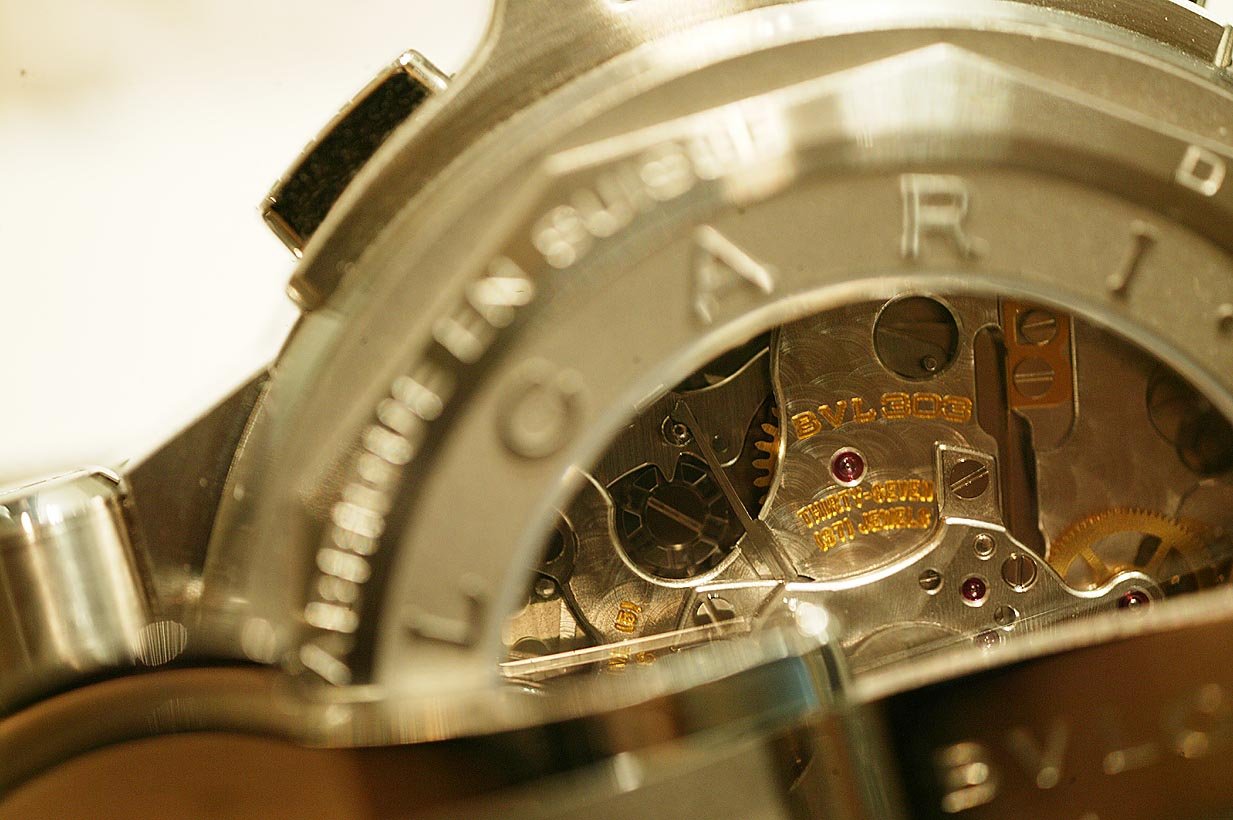
Now for the SUPER close ups to demonstrate what I found in the watch..remember..I am an IWC, Vianney, Urwerk, MBF and of course gerald Genta type of collector, who begand with Patek, Journe and Lange..in fact, I have much more of the last three than any other brands.
So Bulgari for me is a discovery.
There are 30 pics here..in close up done with no touch ups.
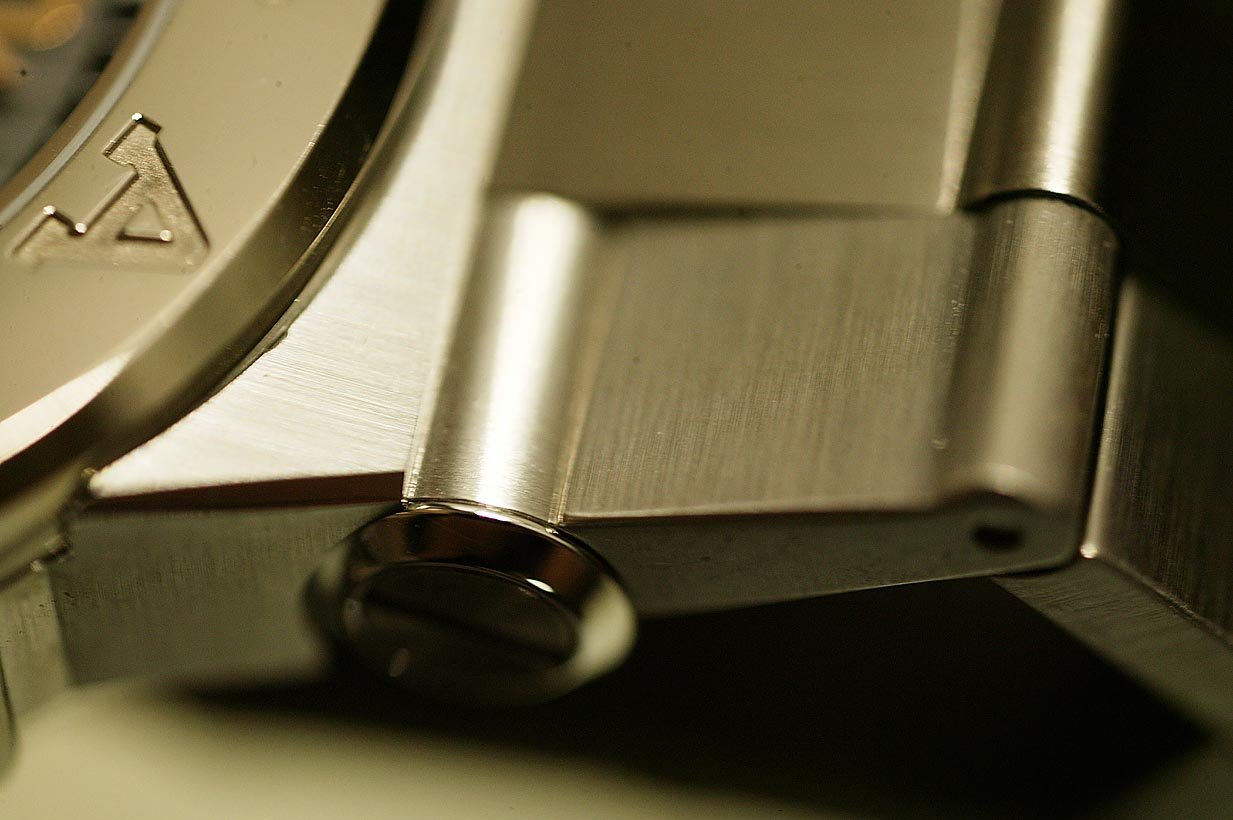
The watch is INCREDIBLY clean and well finished. A Rolex level of finesse. The watch is also incredibly solid and heavy, the type of feel you get from a solid gold Rolex.
As you are waiting for the down load...reflect on the fact that Bulgari has had a challenging time to fight its way back into high horology. It could have gone the Cartier way, or the LV way. It could have chosen the LUC chopard way, or HWRT's Opus way. The company is wealthy.
It has chosen the Rolex path, a direct no high flying products way. Direct assault with super high quality on a simple watch.
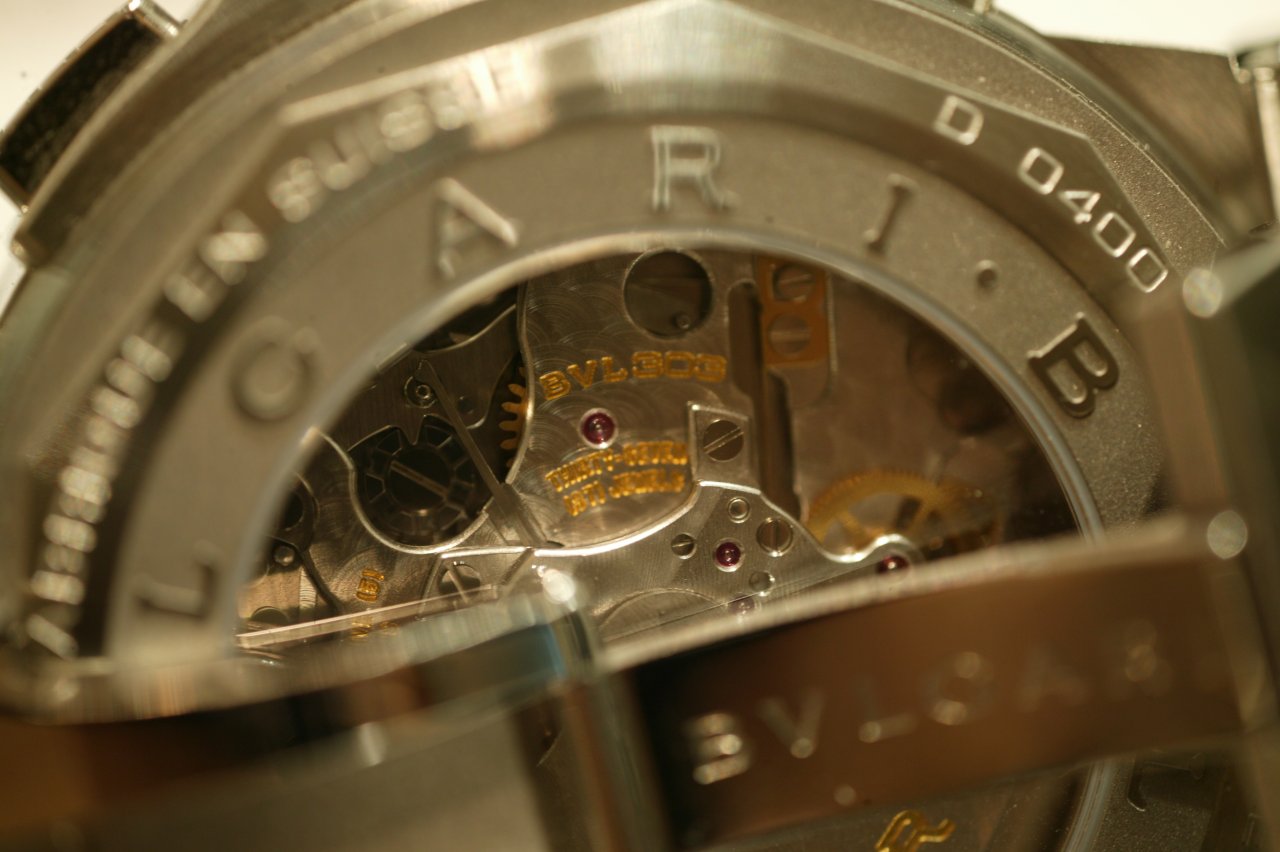
Instead of Daytona's use of the Zenith in the first days of Rolex Daytonas, Bulgari has used the FP base with an in house vertical clutch and an OH SO SMOOTH activator!
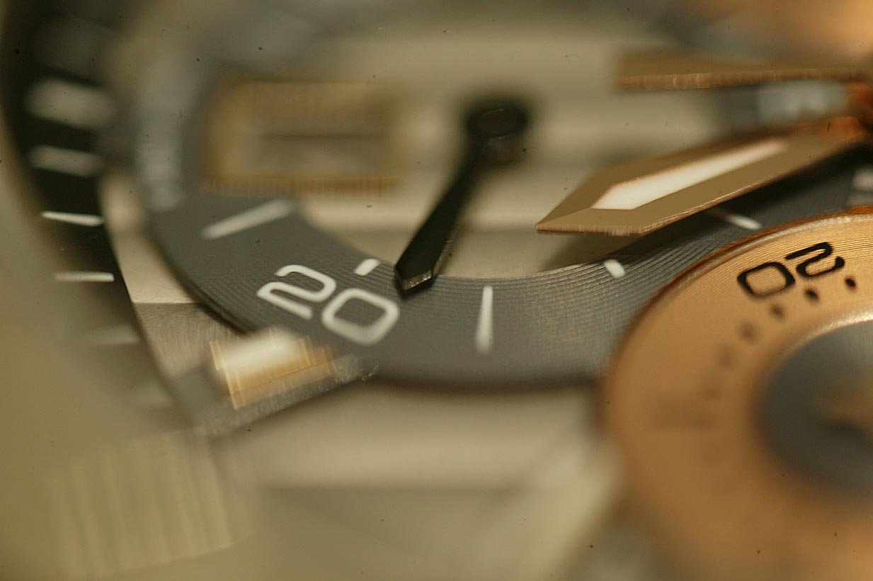
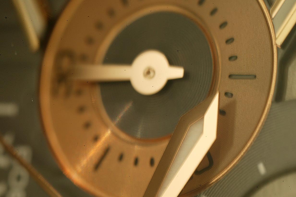
It has chosen to do the Rolex way of making the ultimate perfect no flaws dial...but with a super complex multi layer.
It has used the Rolex way of using precious metal on the bezel..discreet, but with a touch of gloss where it matters to the owner's eye.
This is one of the watches of 2008. It is easier to make a $1,000,000 USD super watch, than to make one of these at $12,000 USD
I am speechless.
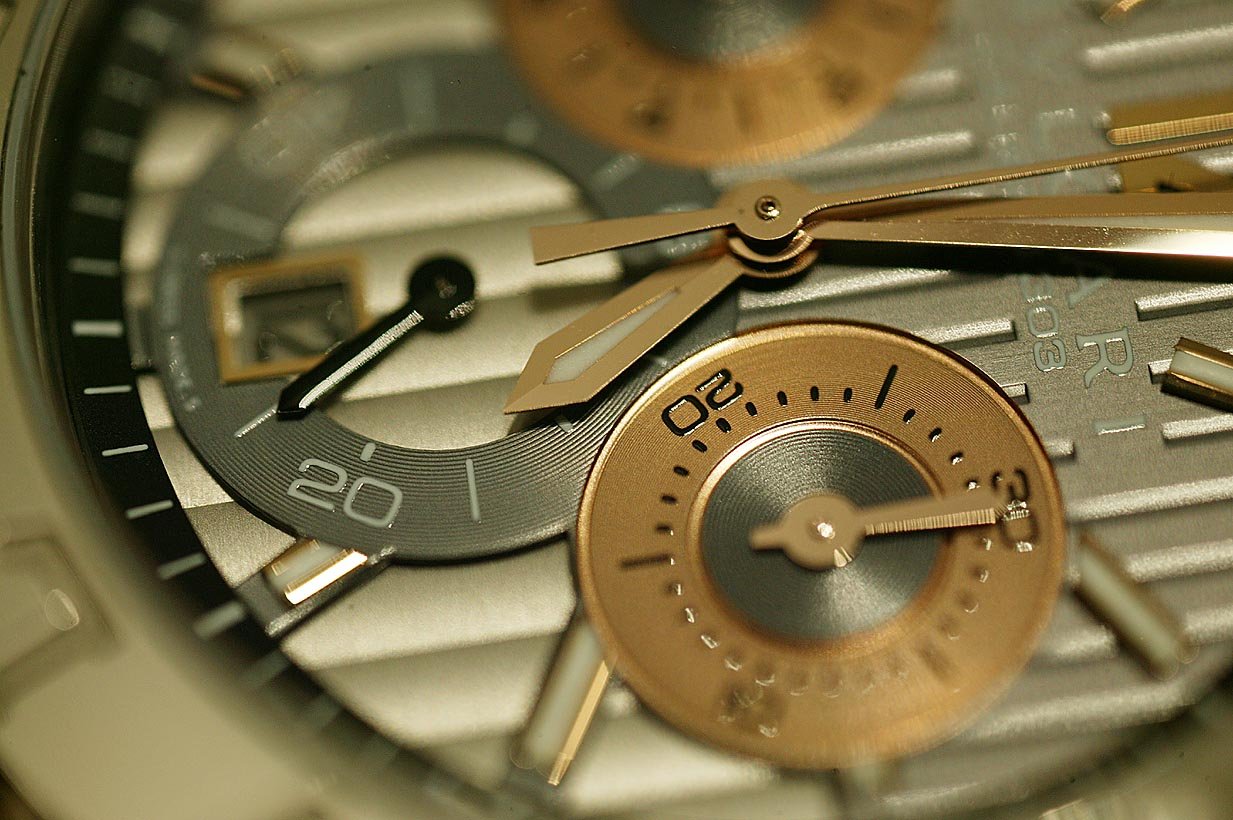
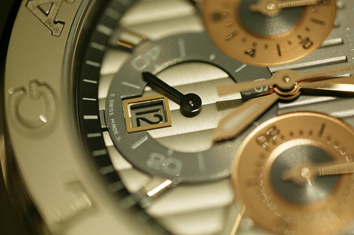
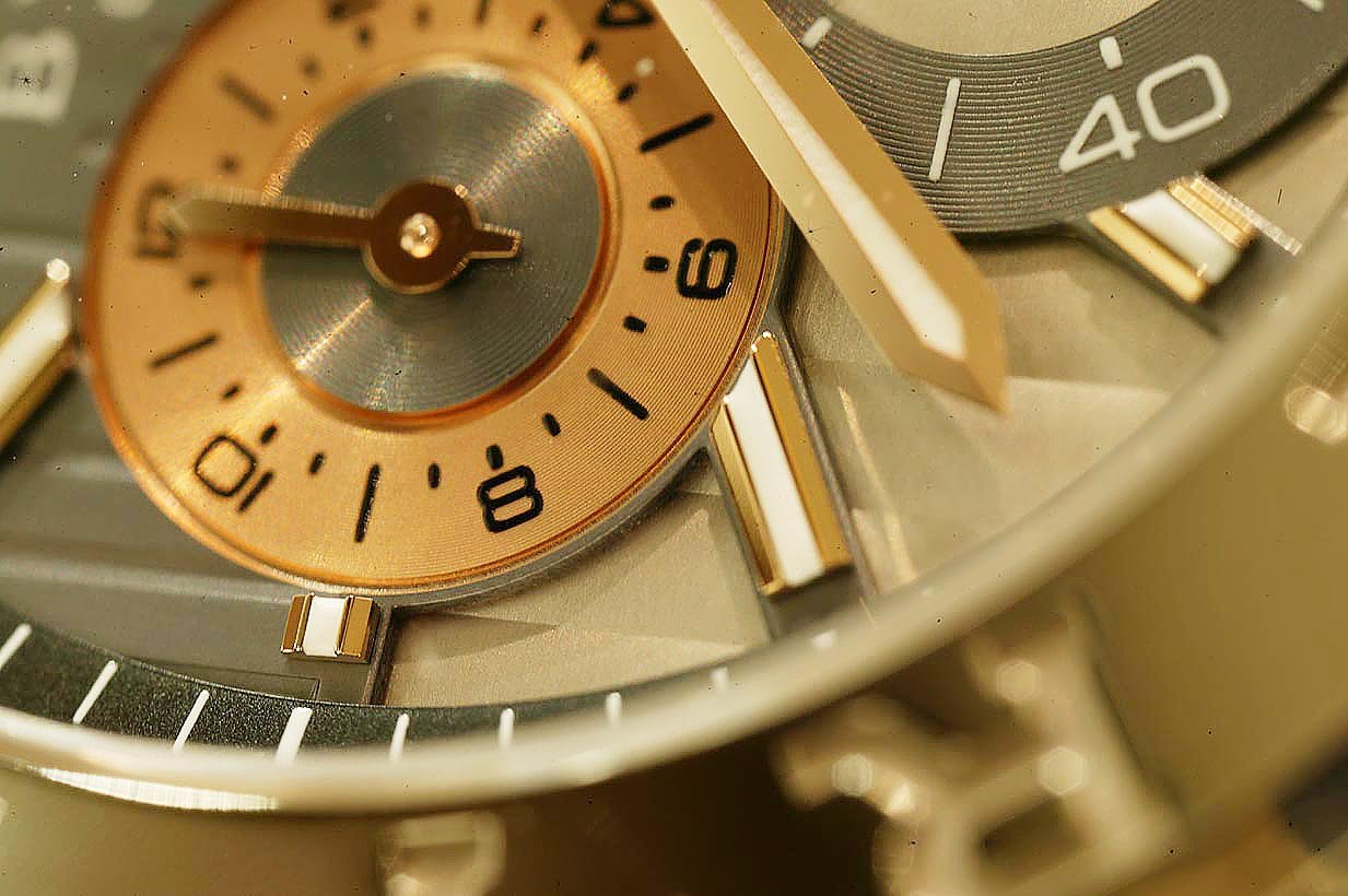
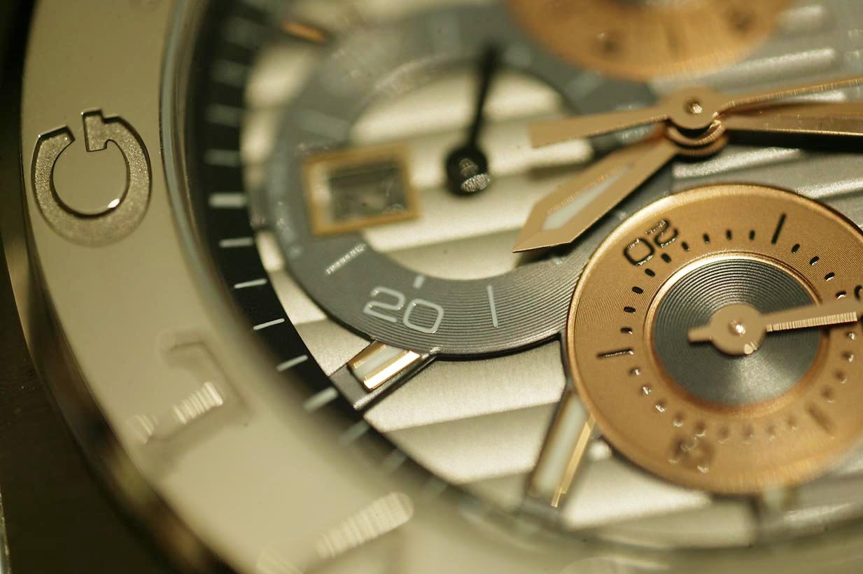
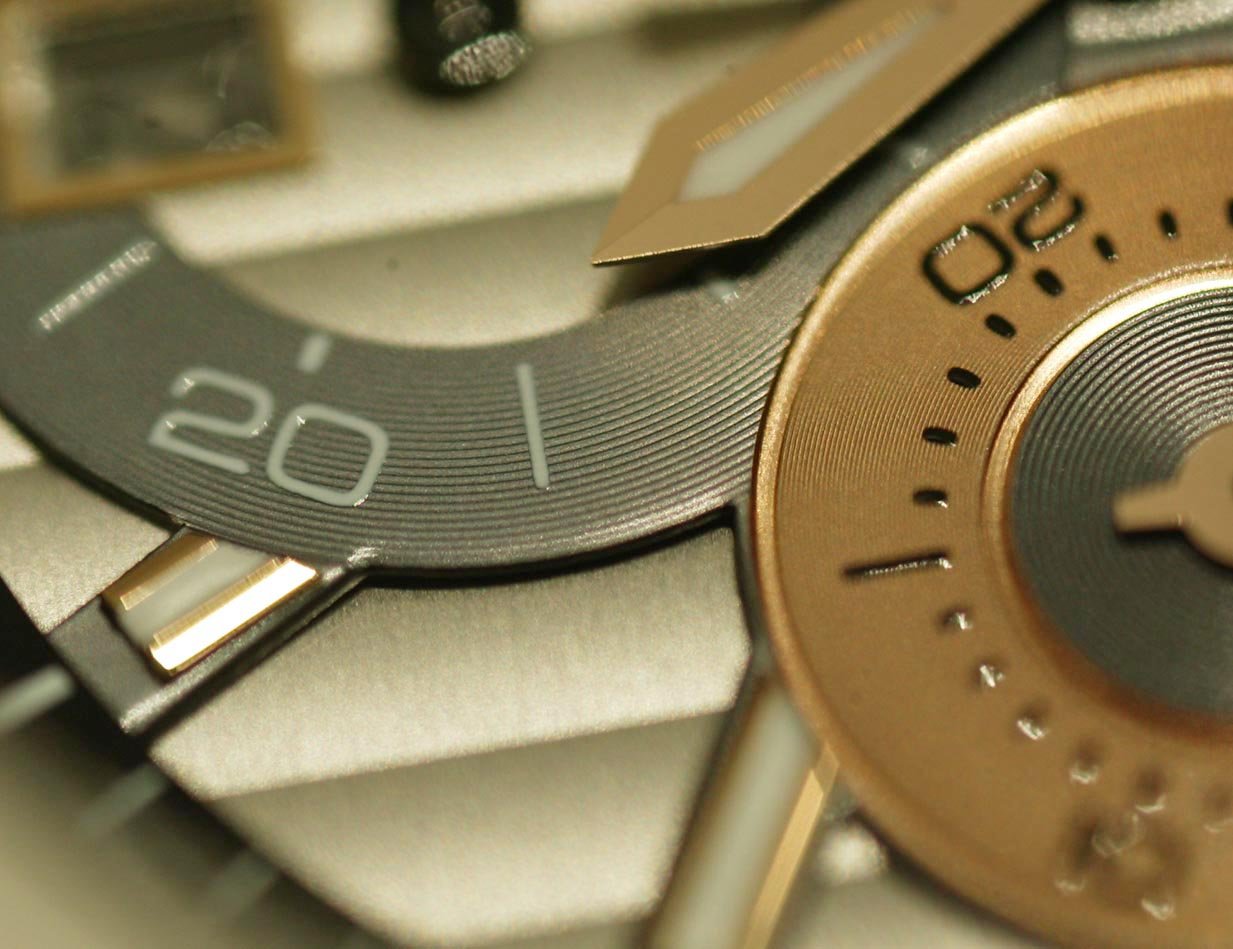
The luminous material is Rolex style..precise and deep and generous..not like a splosh of paint as in others. Completely flat and precise.
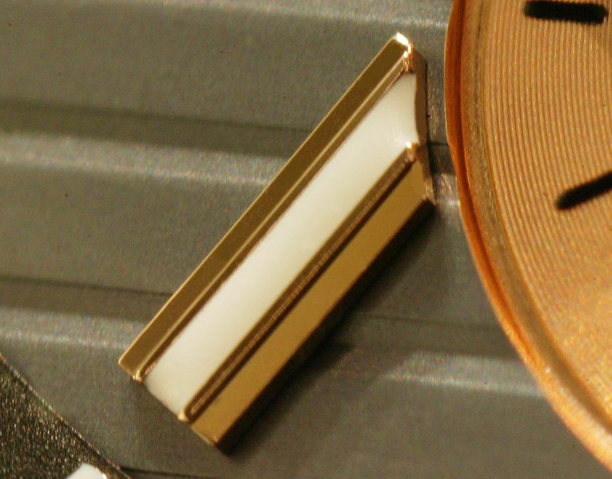
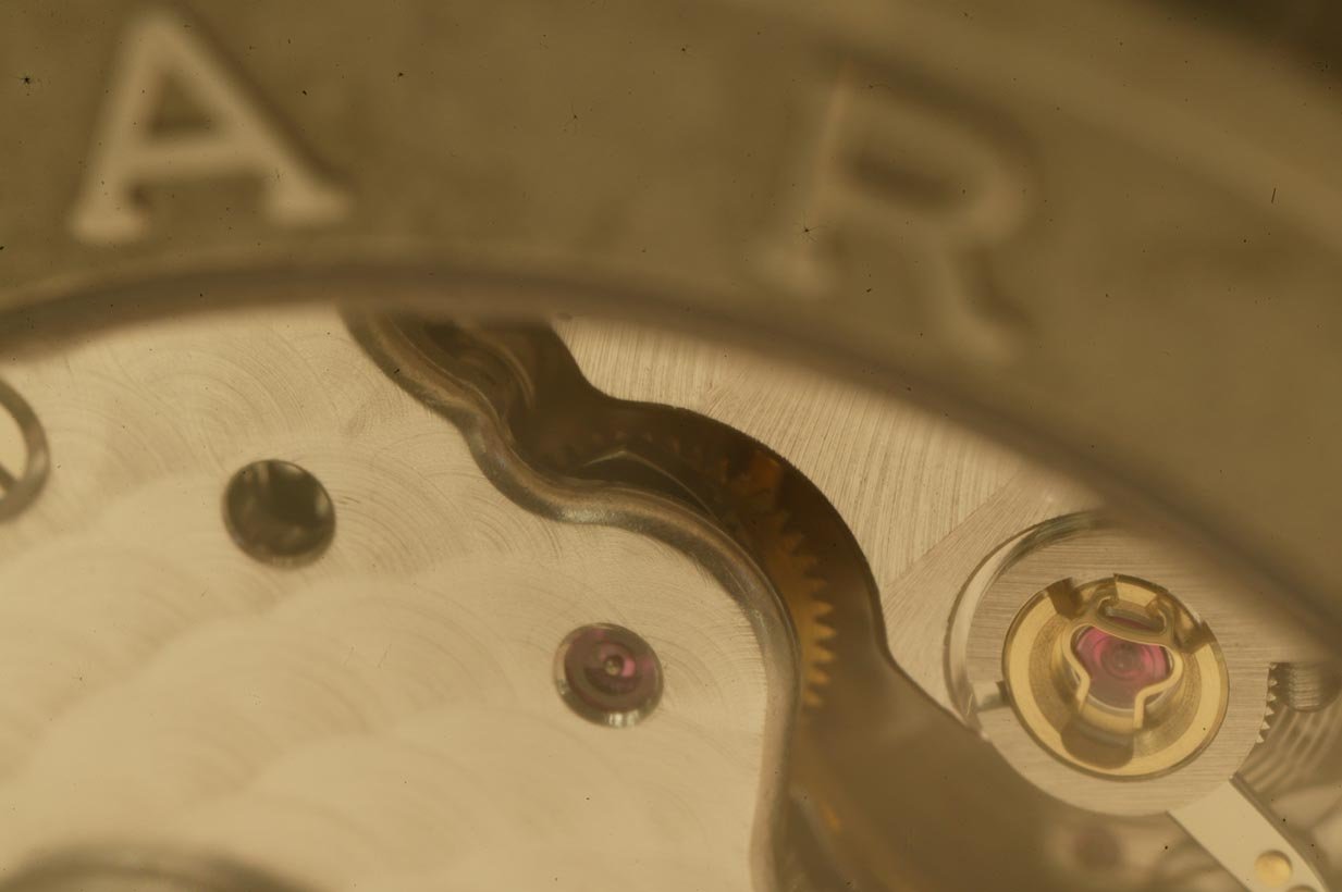
Note the solid gold index is multi faceted!!!
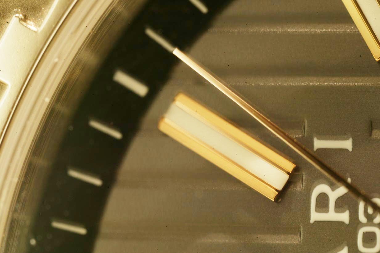
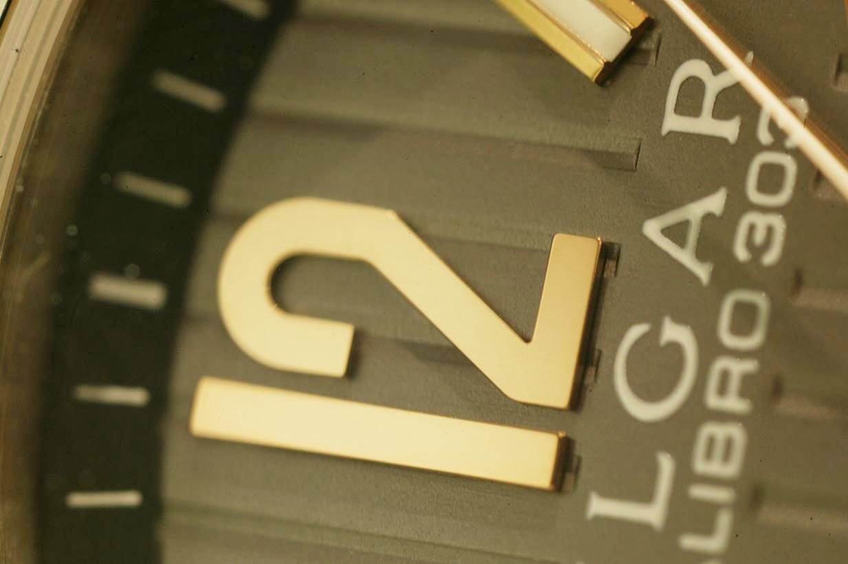
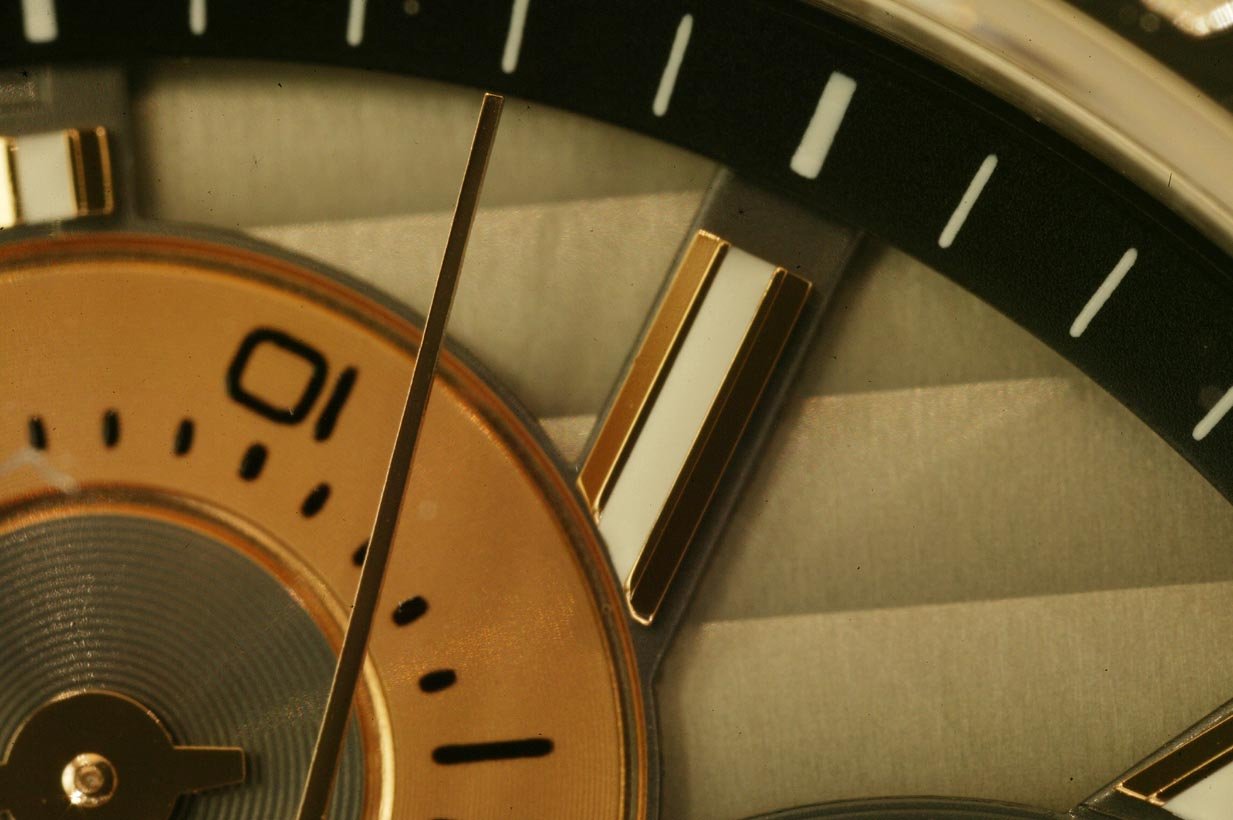
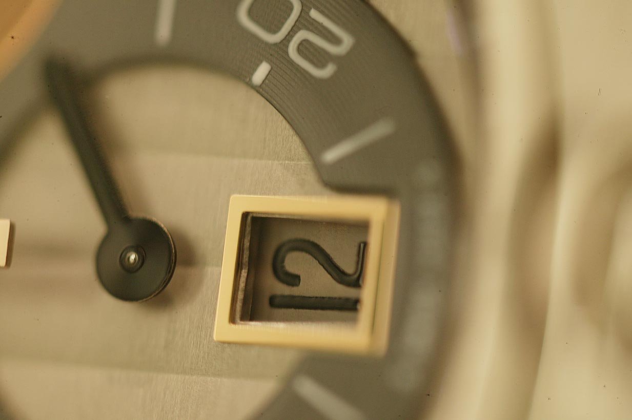
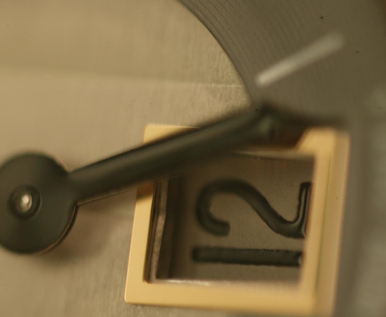
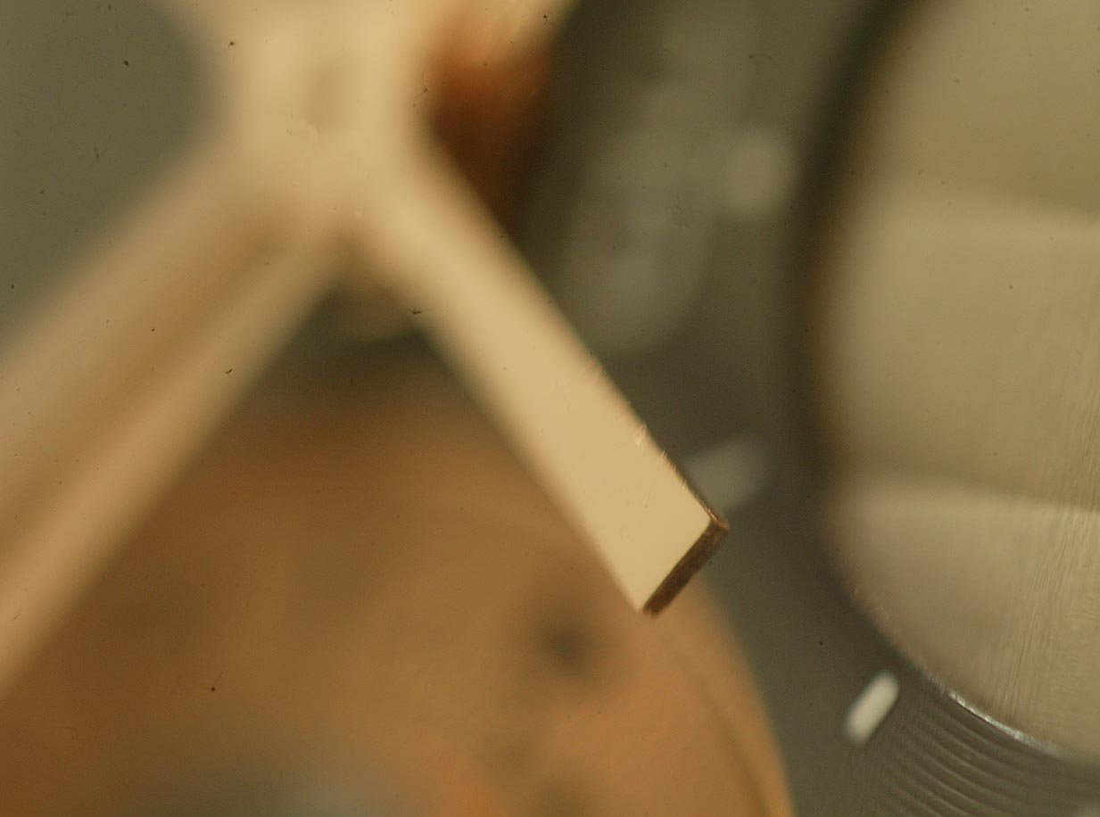
Super sharp hand details.
The anglage of movement is not mirror polished like Dufour or Patek..much closer to Journe, and I would say cleaner than Journe.
I don't judge a watch by the brand...and I would be blown away by an Oris if it was this well made.
A super watch for the collector who appreciates the absolute ultimate best, but not at 6 figure price tags.
It is ironic that it takes Bulgari, a group known for the MOST EXPENSIVE things, to make the watch world sit up and look at the price of the watches today. This watch is that good..at an affordable real world luxury price.
This message has been edited by bernard cheong on 2008-07-22 21:24:51The 3-level dial (a decorated grayish metal base, gold subdials & indices sitting on top of the anthracite vertically decorated stripes plate) is well executed, sharp definition and no burrs. The Superluminova on the indices are pretty thick! I believe the superluminova will be very bright and last pretty long if well-charged, as thickness is a factor for brightness and 'luminescent-duration'. Actually very cleanly applied too, as could not see any edge spilled over. Why was the Swiss Made label
your pictures and insights enlarge further add to this watch' (instant) legendary status. Really great pics!! Thank you. It is quite well done.
Because I'm damn curious about this watch now. (but I have to admit I still don't agree with that bezel!)
No message body
True to being a fashion label, the company takes every opportunity to advertise its name on the dial as well as the bezel. Perhaps they can tone down their enthusiasm and concentrate on making the watch less ostentatious. Rolex's reputation wasn't built up in a mere few years. This message has been edited by VPREGULATOR on 2008-07-15 20:27:33
That is why I find them fascinating. The brand itself is a culture isolated from watch making. It is steeped in the culture of luxury goods and quality. Look at their attention to details in their products. They are run like a military organisation..and this is interesting. I looked at several things about the Bulgari with which I am a total outsider, looking in. Rolex is excellent. I have just delivered a 2 page writeup on Rolex this morning. However, watch making is Rolex only trade. They shou
This thread is active on the Bulgari forum with 31 replies. Share your knowledge with fellow collectors.
Join the Discussion →