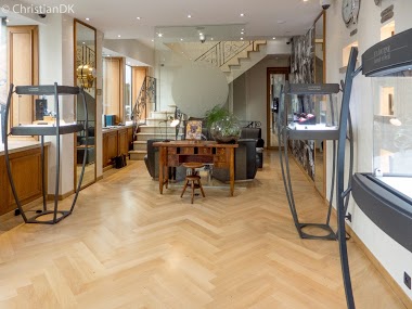
Collection
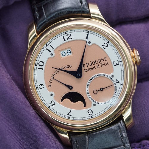
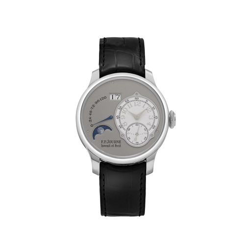
Moka-Tiger (Ron), a discerning collector, initiated a compelling discussion on the F.P. Journe forum, grappling with a choice between two exquisite F.P. Journe Classique models: the Octa Automatique and the Octa Lune. His original post delves into the aesthetic nuances of each, particularly the dial's perceived 'bareness' on the Automatique versus the 'filled' look of the Lune with its moon phase complication. This exploration highlights the subtle yet significant design considerations that captivate luxury watch enthusiasts.


This is DEFINITELY a 'no wrong answers' situation... but I really love the intentional use of empty dial space on the Octa dial, and that's at its strongest in the Automatique.
Power reserve alone is taking too much space. The moonphase is a welcoming and cool complicatiom. For me clearly the second one 🤗
Just to chime in and create more data. Cheers Marc
This thread is active on the F.P. Journe forum with 34 replies. Share your knowledge with fellow collectors.
Join the Discussion →