
Review
Pingtsai's original post delves into the Bulgari Daniel Roth Papillon Voyageur, a watch that challenges conventional time display with its unique Papillon® mechanism. This piece examines how Bulgari reinvents existing concepts while maintaining technical craftsmanship. The discussion explores collector reactions to its innovative design and visual appeal.
How do you take an existing concept, reinvent it, and incorporate it into a design that is new but not too new and then put your own signature stamp on it so that you can at least take a tiny bit of the credit and a great deal of the reward? It seems that the watchmakers and designers over at Bulgari are faced with this challenge all too often with each watch that is produced for the new Daniel Roth collection. Whether the pieces are hits or misses in terms of how the public receives them, one thing remains for sure. They are admirable works of superb technical craftsmanship.
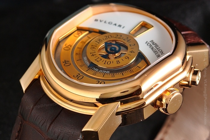
In January Bulgari announced the release of the Bulgari Daniel Roth Papillon Voyageur. My feelings toward the watch are somewhat torn. This is because technically, it is incredibly interesting. In fact, the technicality of the watch adds to its visual appeal. The watch has a prominent central jumping hours function along with the Papillon® mechanism, a unique patented device that is partially visible on the dial and serves as the minute indicator for the watch. Even the name of the watch, Papillon®, makes a visual reference by labeling it after the French word for butterfly, because the shape of the double pointed hands resembles butterfly wings.

The Papillon® device is positioned at the center of the dial and displays the measured minutes by way of an ingenious device connected to the bearing disc. The disc performs a complete 360° rotation in two hours, and bears two independent retractable diamond-shaped hands running in turn over two 180-degree segments. Whereas the first marks off the 60 minutes in an hour, the second signals the minutes in tens rather than units.

While the tip of hand A points to the minutes, hand B remains retracted throughout the disc rotation. When hand A reaches the 55th minute on the display segment, hand B makes a progressive quarter-turn to position itself parallel with hand A. As soon as the minutes start off again from zero, hand A then progressively retracts to remain that way for the next 55 minutes. The entire mechanism of course works in combination with the hour disc. The Papillon® system is creatively crafted and fun to look at in process. The ingenuity of the feature comes with making a simple seconds function into something much more complicated. It’s the type of function that watch connoisseurs love to possess. They understand and admire the complicated mechanics and marvel in its charming and delightful display. To any non-watch enthusiast, they are just diamond shaped hands, numbers and markings. To a true WIS however, it’s a masterful piece of horologic art operating with playful synchronicity and fluttering in perfect tandem motion. AlbertS, former Daniel Roth forum moderator for The PuristS quoted the watchmaker and inventor of the Papillon in his review. The quote expresses Mr. Roth’s sentiments about the original Papillon watch.

“This watch posed a lot of difficulties for me. It is very mathematical – precision wheels rather than fine-tuning. It’s almost like a small automaton, an attractive and useful toy.”
What makes the Papillon Voyageur interesting is the addition of the GMT function. Daniel Roth did not previously have a GMT in combination with a Papillon and I do wonder just how far in the works was the proposed combo before Bulgari’s integration, if at all. The GMT on this watch is found on a central subdial with an open teardrop shaped indicator hand, which makes it the obvious focal point. GMT indicators are often found on the outer rim of the dial so having it small and centrally located makes it more subtle and less obviousthat it is a second time zone. The placement along with the name “Papillon Voyageur” instead of simply “Papillon GMT” adds to the subtlety of what the watch is.

For the Papillon Voyageur Bulgari employs the use of the split-level dial. Its white-lacquered upper part runs along an arc stretching from 9 o'clock to 3 o'clock and highlighting the jumping hour aperture at 12 o'clock. The lower part of the dial has been given a satin-brushed black gold treatment. To me, the use of the split level dial in conjunction with the color contrasts typical of the Daniel Roth Collection, seem slightly off balance to me and I would have preferred that they found a more subtle location for the name of the watch on the dial or leave it off altogether. The mechanics of the watch, however, are what make this piece distinguishable.

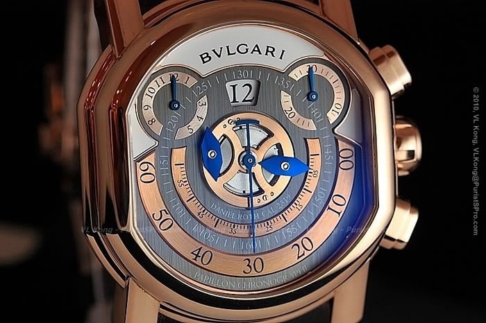
The Papillon Voyageur was the second in the Daniel Roth Papillon series to carry the Bulgari name. Preceding it was the Bulgari Daniel Roth Papillon Chronograph. I remember the original Daniel Roth Papillon Chronograph to be a very popular watch. It was well balanced with just the right amount of excitement happening on the dial. Bulgari paid tribute by creating their version. I can’t say for sure whether it was as popular as the original but I do think that it is one of those watches that have more appeal when seen in person.
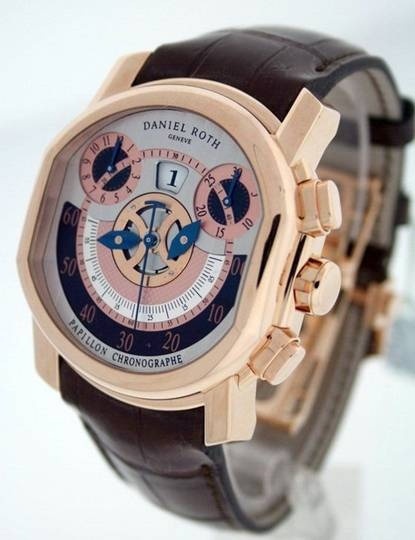
The Papillon device is in full view on the chronograph. There’s a bit more subtlety and classicism to Daniel Roth’s dial. Bulgari’s design is bolder and more contemporary with stark contrasting striations of color. The different elements on the dial seem to fight with each other to stand out. I would have liked to see the white part of the dial continued around the edge towards the bottom half of the watch and perhaps a slightly more subtle BVLGARI logo too. Either that or continue the dark grey towards the top. I feel like the white section on the top part of the dial appears to divide it up. Perhaps there is too much contrast or too little symmetry. The shapes and lines are visually interesting and dynamic. I simply wish I could recolor them.
Bulgari extended this feature to some of their other Daniel Roth pieces as well, the Papillon Voyageur and Grande Lune. The three watches together are cohesive as a collection and clearly carry successful elements that are indicative of Daniel Roth, just more streamlined. Individually, the elements get a little lost and start to become questionable. Nevertheless, the launch of these Daniel Roth watches along with all the others – the Endurer, Tourbillon Lumiere, Grande Sonnerie and most recently Grande Complication proves a great achievement by Bulgari. I look forward to seeing what other variations, new developments and innovations that they come up with in the future. The Papillon Voyageur was a natural progression from the Papillon Chronograph. I guess it remains to be seen whether next in line will be a Papillon Perpetual Calendar.
the two dials on the GMT and chronograph are not for me. Like you I do admire the technical sophistication of the watches, but there are other Daniel Roth watches I would rather have on my wrist. Thanks for the report, comments and pictures. Stewart
designed that the Daniel Roth version of which I absolutely love and have expressed my love for this piece many times in the past when we had our Daniel Roth dinner event in NYC several years ago. It's really a watch to see in the flesh and try on the wrist. As for watch size and weight, it's perfect. Once I strapped on the Papillon Chronograph, I immediately fell in LOVE ... Which one do you guys like better? Cheers, Anthony (Bulgari version) (Daniel Roth version)
The white metal and dial with blue accents is my favorite combination, so it gets my vote.
At first I thought it is fine as is, and when I saw the photos did not think much about it. Now I think maybe the grey going all the way up might look better. Still, as you say, it is the technical prowess of this piece that makes it special. Very well executed, IMO.
This thread is active on the Bulgari forum with 4 replies. Share your knowledge with fellow collectors.
Join the Discussion →