
Ornatus-Mundi
[Zenith]
7136

Holistic watch evolution: Zenith carefully updates the El Primero Tourbillon
For me personally the small modifications, improvements and changes, both of technical as well as aesthetical nature, are the icing on the cake' and distinguish great manufactures from the rest. Zenith has just done this with a new (2015) version of its El Primero Tourbillon.
This article sets out to shed some light into the subtle advancements which demonstrate why watchmaking excellence, judged from a holistic point of view, is ever so often dependent on mastering the details which attest to a really accomplished design.

The watch I chose for this report is the steel version with a black dial (ref. 03.2050.4035/21.C714). It follows exactly the same classical design codes as the already well received El Primero 36'000 vph Chronograph (see report here ).
A black lacquered dial serves as the frame around the tourbillon-cum-date window.

This window arrangement is actually a unique Zenith special and a complication which swiftly combines the fastest (seconds) and the slowest (date) indication on this watch, arranged around the ballet of a delicately constructed tourbillon.

Note the tentaculum-like shape of the balance wheel bridge of the tourbillon cage.

On the back you can admire the movement, an El Primero 4035 D (381 parts, 35 jewels). I am not going into the technical details of this watch, as I have done this already when I presented the El Primero Tourbillon first last year (click here if you want to read & see much more).

The numerous heat-blued screws that adorn this piece are a gorgeous sight:

But now to the core: comparing the new (left) with the old (right) versions:
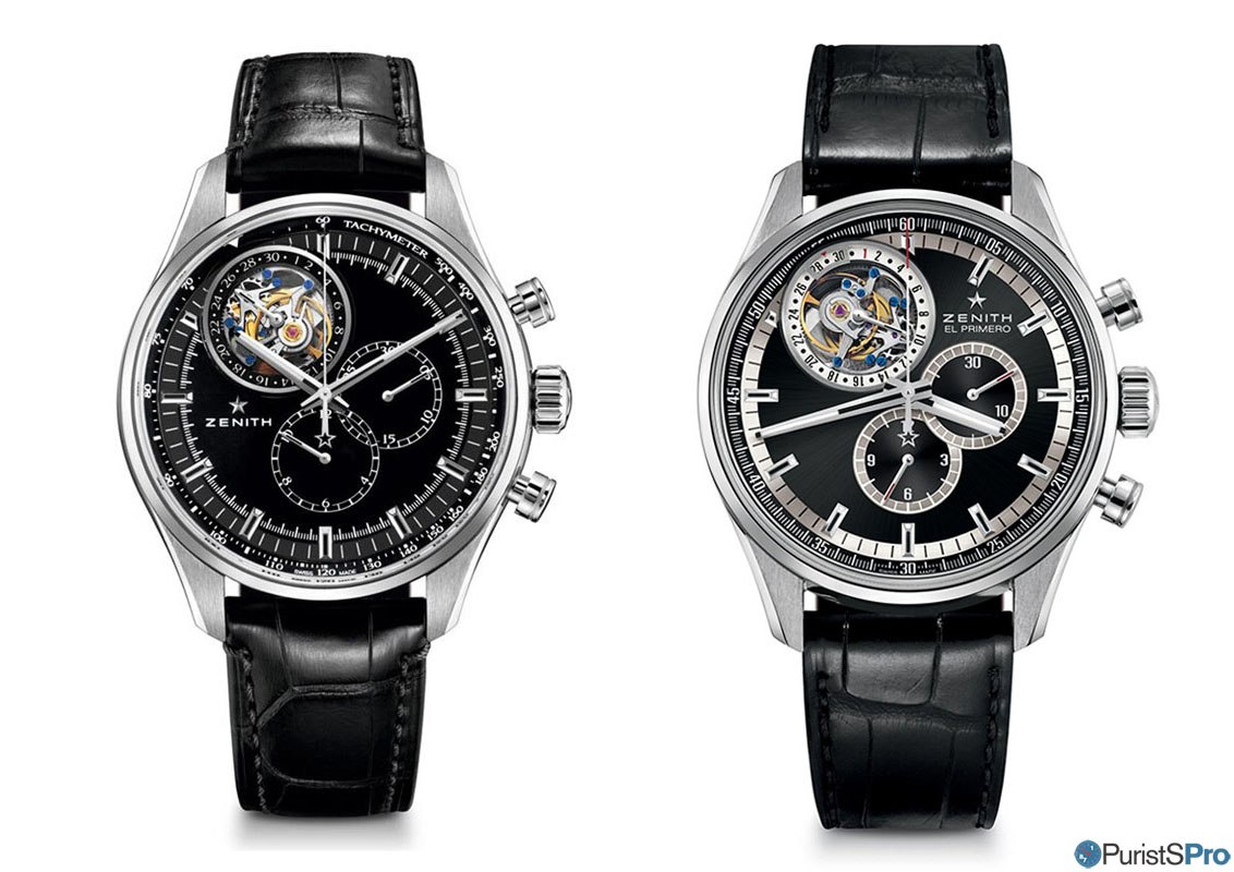 While both watches retain their 44mm case diameter and the general dark hue, pretty much everything else has been reconsidered. In summary:
- the sunburst dark anthracite dial finish is replaced by an enamel-like black lacquered dial
- all silver dial rings are gone
- the 1/5th of a second chronograph indices made way for a tachymetre scale (to time the distance to your nearest thunderstorm) and are relocated inwards
- the hands are much finer and have lost any hint of red colour
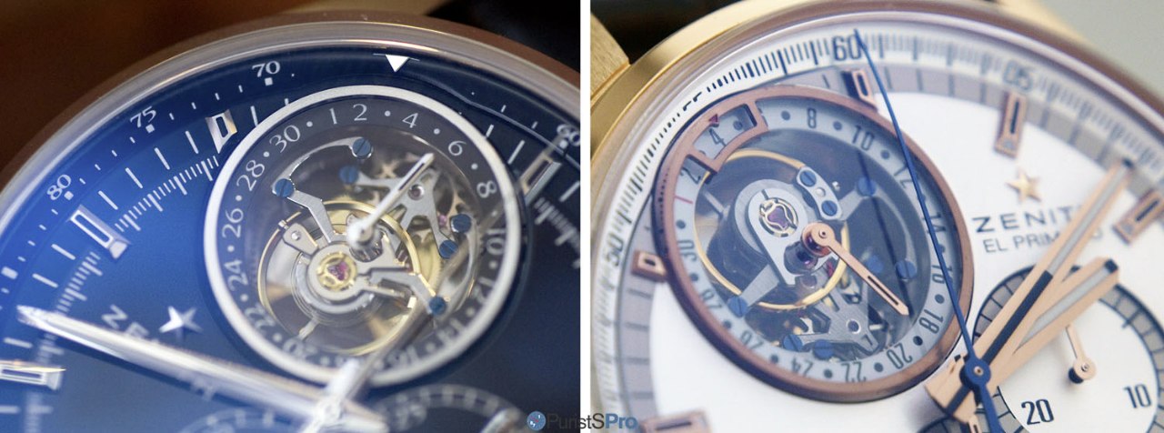
Note also that there are signs of technical advancements on the tourbillon itself - a Triovis regulator and a KIF instead of an Incablock shock absorber (above). Overall, they make the tourbillon appear more delicate and thus even more appealing ;-).
Finally, the slightly right-heavy dial layout has been addressed with two measures: the diagonal repositioning of the Zenith logo from top-right to bottom-left in combination with enlarged and now railroad-track-like chronograph counters. This results in a greatly more balanced dial. This not only enhances aesthetics but brings along a usability benefit as well: elapsed times are now readable throughout the scales, as even the overlapping chapters are fully indexed (in contrast to the previous version, where much guess-work was needed):

Finally, a superb detail which cannot be guessed from the images above: Zenith has reshaped the case construction: In order to enhance the ergonomics (and by extension wearing comfort), Zenith chose to accentuate the curvature of the lugs such as to align them to the shape of the wearer's arm. The case band itself is a tiny bit slimmer, set off by an equally slightly thicker bezel:

Taken together (literally ;-)), all these seeminlgy marginal improvements propel an already very attractive watch into a higher league: A more ergonomical watch with a better balanced design, improved legibility and above all a better fit into the collection combined with an ever more appealing tourbillon complication.
This is a role-model for holistic watch design. Well done and congratulations, Zenith!

Thanks for reading,
Magnus
This message has been edited by Ornatus-Mundi on 2015-12-06 06:16:06
More posts:
Holistic watch evolution: Zenith carefully updates the El Primero Tourbillon
For me personally the small modifications, improvements and changes, both of technical as well as aesthetical nature, are the icing on the cake' and distinguish great manufactures from the rest. Zenith has just done this with a new (2015) version of its E...

Very interesting post Magnus!
And especially thanks for the comparison between the two versions. I like the evolution except on the date display, I don't find it legible now. But maybe it is just me! Thanks! Fx

I had to look again
Magnus, Thanks for the comparison review. I liked the old silver rings around the subdials so my first reaction was....Oh No! Why? After your careful explanation, I agree that the new layout is more legible and especially, the overlapping hours/minutes el...