Features
Spotlight
Featured Forums
Brand Forums
Lifestyle
Resources
Horological Meandering: Thank for the post
I always enjoy hearing about new brands, so thank you for that. The pieces look promising...with the exception of that plate instead of the eight hour marker. I think it throws off the symmetry, and doesn't really add very much to the aesthetic. Assuming these will be produced in very small quantiti
11Y
1
Independents: Execution is fine, focus more on design
I agree will most of the above examples, two-tone would be nice as well as the blued screws. I have no skill in building watches, but since this site is about opinions I'll give what I have. Personally, I would like to see a more pleasing aesthetic with regards to the layout of the skeletonization.
12Y
1
Independents: Recently handled that exact model
And it is a beautiful watch. The cream dial is very nice on the eyes and the case will continue to bring interest for many, many years. Enjoy your good decision.
12Y
0
Independents: Great post
Thanks for posting. Three very nice PSM's. All three embody Speak-Marin well in three very different ways. Thanks Again
12Y
0
Independents: More Pics, Strap Change, 2011-Sibling
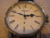
Thanks for the kind words everybody. To clarify it is the stainless steel model. I tried to take a couple more pics with a point and shoot. (again, a feeble attempt compared to others) A shot of the enamel at home.... Here it is under some less yellowish lighting..... The very clean and distinctive
12Y
2
Independents: Santa came early
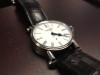
and brought something for daddy..... ...but apparently forgot the pics. well here they are.....my newest a Speake Marin Piccadilly with White Enamel Dial and Blue Roman Numerals. (excuse the poor iphone pics, maybe next year he'll bring a better camera)
12Y
11
Independents: Santa came early...
and this year he delivered a nice little something for daddy.
12Y
0
Independents: I own both
I have been fortunate enough to own both a Dornbluth 99.2 and a Habring manual wind chrono with engraved carinthian bridges. On the movement side I am going to give the edge to Dornbluth. This is purely from a handmade aspect and the warm copper colored glow. I think the overall Saxon aesthetic is v
12Y
2
Independents: I would have said no..
..if you had described it to me. But after seeing the combo, it is a definite yes. Looks great.
12Y
0
Independents: Nice
Interested in seeing more pics when it comes in. Great watch. Not wearing my 99.2 so i can't remember but I think the initials on the movement are a nice, subtle touch.
12Y
0