
Did Panerai Jump the Shark?
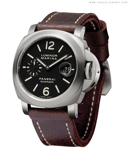
Took this image from p.com as one of the 'rists there claimed that he took it from a Chinese watch magazine. To be released in the Chinese market as PAM 366 and order being taken at the Macau BT (1500 pieces?). Panerai has replaced the 6 with the Chinese character for good fortune. The lume is patinaed like the 339/341/360.

I was pretty excited about the possibility of getting my hands on a Boutique edition that Panerai has recently be rumored to be putting together (HK, Shanghai, etc) as I am Chinese-Taiwanese. I had ideas that it would be the Great Wall/Taipei 101 engraved on the case back, a la 318 and I was seeking ways to get on the list. Until I saw this.
I guess Panerai is going along the paths of AP/JLC with the Boutique Limited editions.
The incorporation of the Chinese on the historical dial (IMHO) is a bit tacky.
Thoughts?

I think this Boutique edition is fine
It's targetted for the Chinese market, so I don't find it tacky that there's a chinese character at 6 o'clock.
- AT

I agree.....
with you. It's different as a "marketing" tool should be, in order to attract local buyers and increase the product awareness. Sometimes, I believe, the diehard Paneristi forget that Panerai has as much need to sell their products as Procter&Gamles with their...soaps... 
Cheers - Sergio
I guess I should be reminded that...
Thanks for the Press Release Anthony!
This is like a Canel Street edition
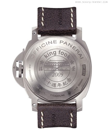
I too thought they're going to do the etched caseback with the Great Wall or the "Bird Nest". I thought the King fook Edition was bad but at least it's on the back.

Here is what I think...
If Panerai decided to use a building as the graphics for King Fook 60th anniversary edition, shouldn’t the King Fook Building in Hong Kong be a better choice than this Tiananmen Square look alike? How about using King Fook’s logo instead of a building? This looks like someone from the design team got lazy and just picked something from China (and a building they’ve seen on the news a thousand times) and put it in the back case.


