Comments:


Such a hard choice...
Maybe after drinking some wine would help me come out to a decision...
I am a fan of the black one...
... THE Datograph original.... And I am a white metal only guy 
But both are splendid pieces!
Ken
But both are splendid pieces!
Ken

Rothschild...
When I was in college I broke into my father's wine collection and drank some of those Rothschilds. The same label and everything as the top one (I think it was from the mid 60s though I could be wrong on the date). I will never forget that label, because when I was caught I was told how much what I drank that night cost. I stuck to stealing his Dom Pérignon after that...
This message has been edited by QueueCumber on 2012-10-12 22:31:12
Mouton with Chagall Label
Hi,
The artwork for the Mouton Rothschild labels is designed by a different artist every year. The year with the Chagall artwork was 1970 (you can see the year on the label in the top photo). The second picture, with the Picasso label, was the 1973 vintage.
The artwork for the Mouton Rothschild labels is designed by a different artist every year. The year with the Chagall artwork was 1970 (you can see the year on the label in the top photo). The second picture, with the Picasso label, was the 1973 vintage.
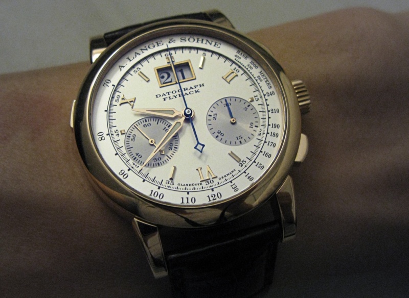
White for the wrist beauty
But definitely Red for the drink!
Although since your white is a Deutsche Riesling, hmm that is a dilemma!
Thank you for such a creative pose!
Tschuss
Stephen
Nice choice to have
Although I own the white one I now have fallen in love for the first time for the red Datograph.
Is that pink gold or yellow gold? Wonderful collection of watches (your wine is not too bad either). E
Tried and once owned almost all versions of Dato....
including the Pisa....excluding he blue dial one.......I find myself loving the red one.
Less sterile , more emotion and a nice contrast and a show of confidence in one's masculinity .
.*CL
well said....
.. unfortunatly the black is too dry, there are deeper blacks, more versatile ( JLC duolunaire for example ) This one is too rigid. I agree with you, the silver dial of the Rg is much more an eye candy.
I Love Them Both
Few watches strike me as having such different "personalities" in different metals. As different as red Bordeaux vs. a sweet Riesling or Sauterne . . . .