kys1944
209

It makes all the NON FAT letterings look odd to me now
Jan 26, 2011,03:06 AM
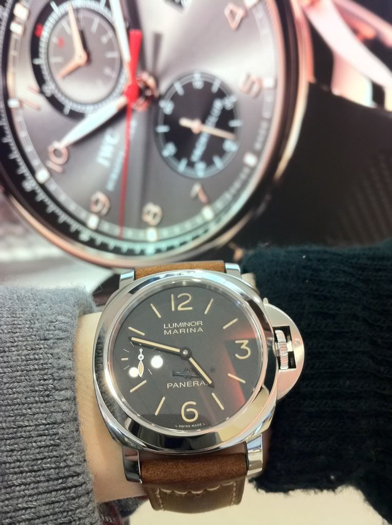
I like it... a few naked shots on my favourites:
A human torpedo under the moon:
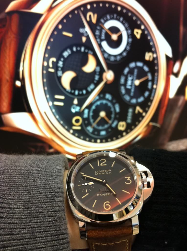
Torpedo vs IWC (Yacht Master and Perpetual calendar:
To me the best FAT is on this with thicker lettering but it is very different from 203a:
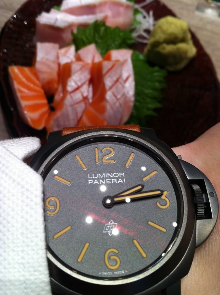
Under bright sunlight
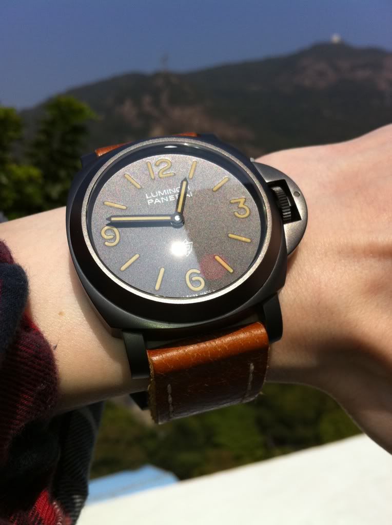
This is also nice:
I must say that I have grown to fall in love with the FAT and these are my quartets again
But I can see that some aren't so happy as they take a little of that specialty out of tritium aged dial but for the trained eyes, they are far from
being similar. The natural tritium aged on my 202 is very different from any of these colorings. However, I do admit that some of them are done up nicer than others on FAT. I think this is the direction as evident from 2011's 372, 375 and the new Daylight Chrono. I think we will see them being more popular. Inputs?
Comments:
view entire thread
After I saw it in person...
By: i_am_Sam : January 25th, 2011-22:48
I don't think I have a problem with it.. It gives more of a vintage look, but then again, it is still not the same as Patina'ed tritium dial.. Especially under the sun... I don't mind if they are keeping this trend... Best, Sam
Kind of...
By: i_am_Sam : January 26th, 2011-08:07
On my 249, which also have "faux" patina, it doesn't have any greenish hue. But I'm not sure on the newer ones. Actually I had a chance to observe my friend's 360 but didn't have much chance to see how the "faux" patina on it looked like under the sun.. B...
I need to add up more...
By: i_am_Sam : January 26th, 2011-08:10
I don't mind if they're keeping this trend, but only for appropriate models.. like the 372, 339, 341.. but not on the "too" contemporary models, like the daylight or the other chrono model.. My 2 cents, Sam
I don't mind the patinated look
By: BluNotte : January 25th, 2011-23:15
Although my only concern is that they seem to not "shine" as bright nor for as long as the non-patinated ones of days gone by. Other than that, for the looks under sunlight, it's perfect! Cheers Stephen
I had somewhere a document showing the Luminova nuances.
By: amanico : January 25th, 2011-23:30
It ins interesting to see all the existing nuances and chromatic differences. From the green to the brown, passing by the white and the yellow, orange there is an amazing variety of possibilities. I will try to find it. Do we have to see it as a trend? We...
Why are you disturbed by....
By: sirjo : January 26th, 2011-03:23
the composite, to such an extent? Would this not be the material, a modern day Guido Panerai would offer the Marina Militare for its special forces? Rugged, tough as nail, lighter than dust....I'm genuinely interested to know.... Ciao - Sergio
I agree
By: Bruno.M1 : January 26th, 2011-09:50
They should have kept it for the 339, it should have been special. Like AP should have kept the forged carbon for the allinghi ,today they use is too much I'm affraid the bronze diver (382) also won't be the only one.
I think we should all bear in mind that
By: Jester : January 26th, 2011-20:20
OP/Richemont is here to make money. There might be fine difference between making quick profit vs. longer term profitability but they're afterall a business. So I can't imagine why they wouldn't want to replicate any successful product to keep up the reve...
Dear Nicolas
By: aldossari_faisal : January 26th, 2011-14:44
i would like to know your opinion on a thought i have in mind... i can understand brands with vintage watches using the VINTAGE looking patina luminova as BRIDGING between a new model and and old one ... but what do you think of those who are using it for...
Hey Nicolas.....
By: sirjo : January 27th, 2011-22:49
what about the 300....what are your thoughts on this piece?...You know I value your...insights. My trusted flipper just offered me one and since he's going to ask for a "demential" amount of money, ask Nicolas....first Ciao - Sergio
Hola Sergio.
By: amanico : January 27th, 2011-22:56
If it is to wear it, go for the Pre V, or the Pam 6, 7 or 8. Or maybe wait for a further reduced Pam 300? Don't get me wrong, I love the Mare, and I love the Pam 300. When I saw it in the display window of the Panerai Booth at the 2010 SIHH, my heart was ...
Thanks Nicolas.....
By: sirjo : January 28th, 2011-01:16
I already have the "bought but don't wear it" 341. I'm curious to find out what will happen....hahahaha Ciao - Sergio
I really love it.
By: Mirian : January 26th, 2011-00:13
I really love it as it matches with my strap very well. I would think watch should be dynamic, plus advocating the Patina or we have to wait years to enjoy the look, kinda too long. T dial has more radiation than L dial, so less harmful for the wearer at ...
pam is pretty well hedged
By: Hororgasm : January 26th, 2011-00:16
They have the platina look and modern "high tech" look offerings as well. I think this whole vintage gig is a over reaction, not REACTION, to the whole financial crisis in 2008 and how we long for a better time etc etc. Not just watches, but cars and bags...
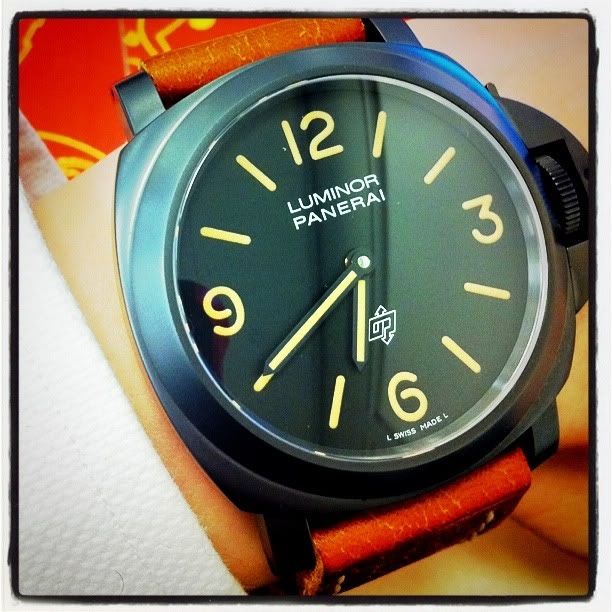
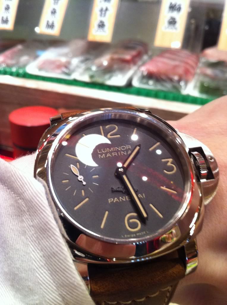
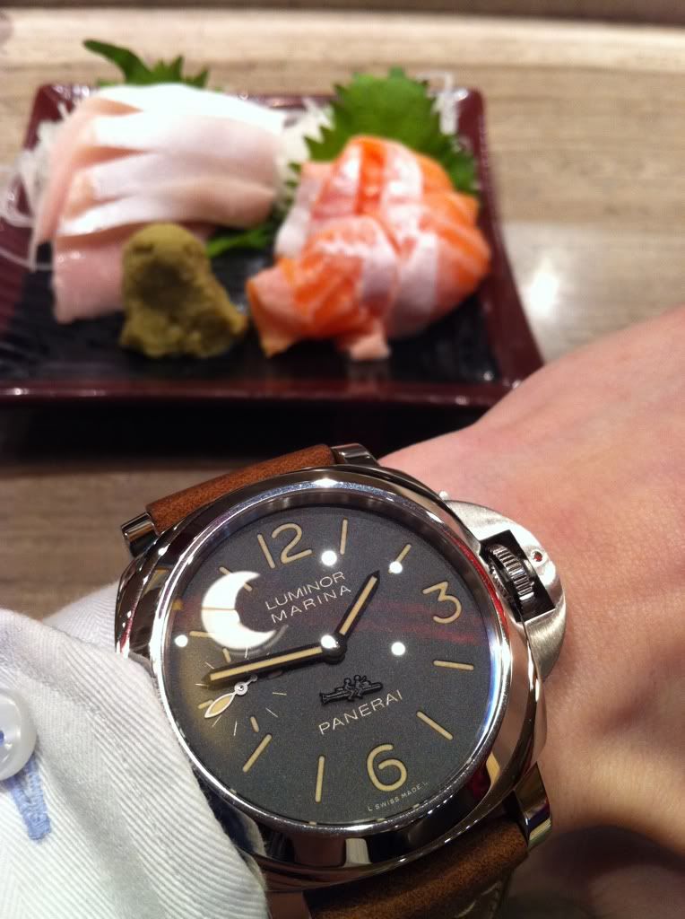
It makes all the NON FAT letterings look odd to me now
By: kys1944 : January 26th, 2011-03:06
I like it... a few naked shots on my favourites: A human torpedo under the moon: Torpedo vs IWC (Yacht Master and Perpetual calendar: To me the best FAT is on this with thicker lettering but it is very different from 203a: Under bright sunlight This is al...
well
By: aldossari_faisal : January 26th, 2011-01:56
i Believe the usage of Vintage looking patina luminova will reach to and end as soon as the going back to the roots era is gone.. as it came out to the light as a mean of bridging element between the vintage watches and their reditions or their look alike...
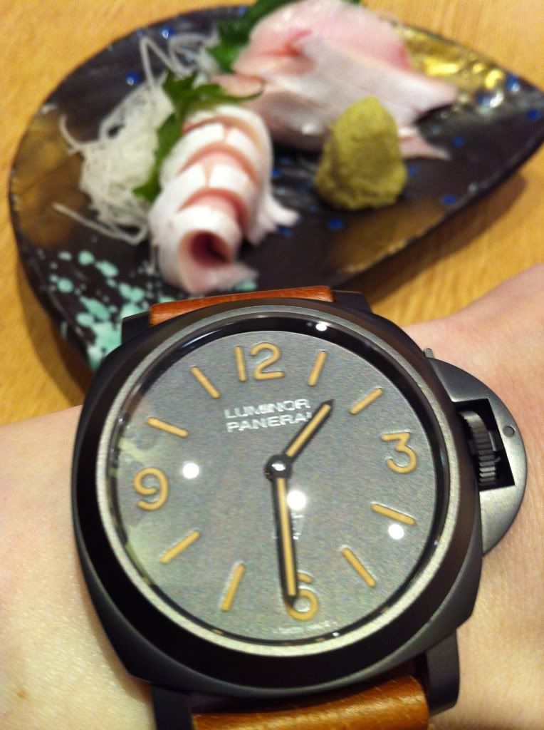
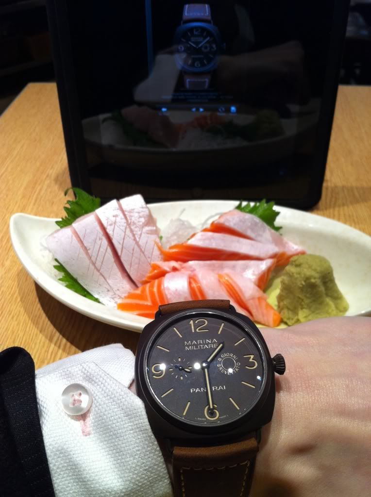
Anthony, the sashimis are there for comparisons
By: kys1944 : January 26th, 2011-03:12
For you and they contrast nicely with the FAKE PATINA. However, it is like thinking about the use of Ceramic or Composite... will this trend continue or fade? I see that we are steering more towards new age innovative materials than PVD/DLC. What is your ...
Not a fan.
By: Pilkington : January 26th, 2011-03:44
Looks pretty good but the ideology behind it pretty lame... fake patina... its in the name really, not cool. My wild guess it will not stand the test of time and will be seen as a step in the wrong direction... give it 5 years or so. White or straight up ...
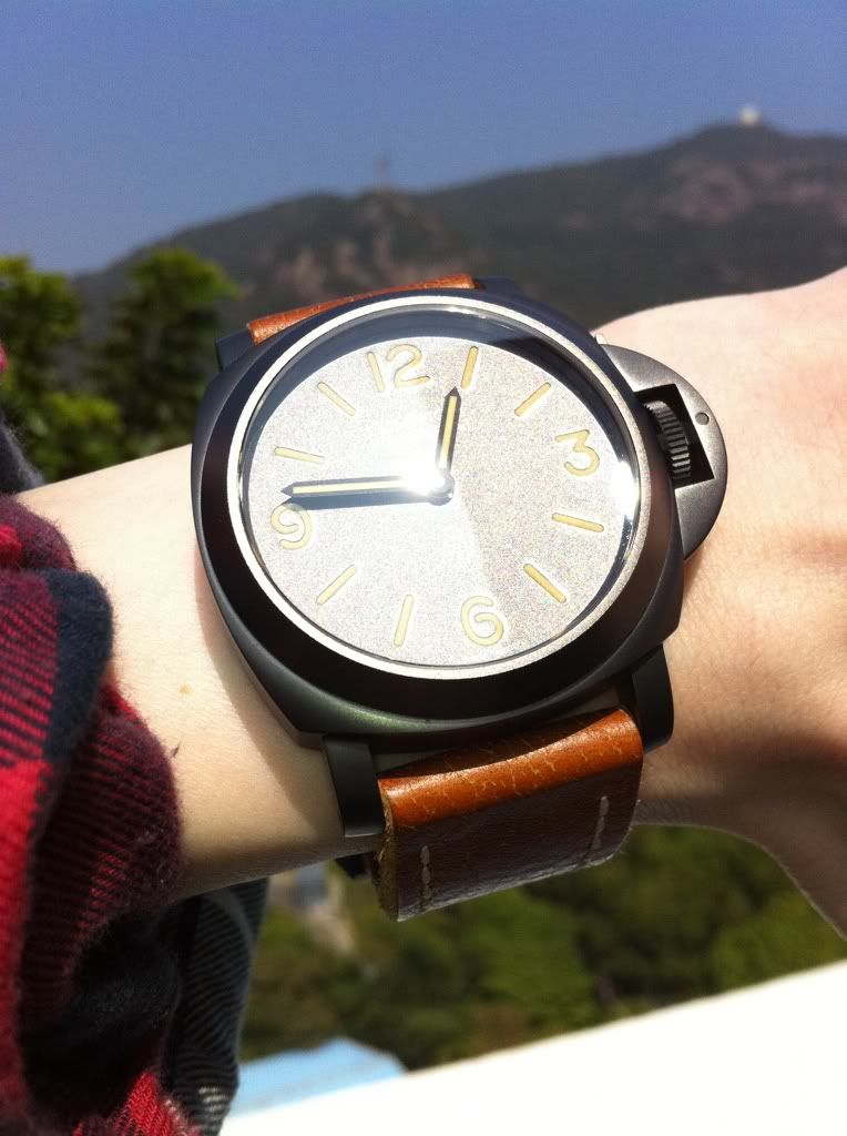
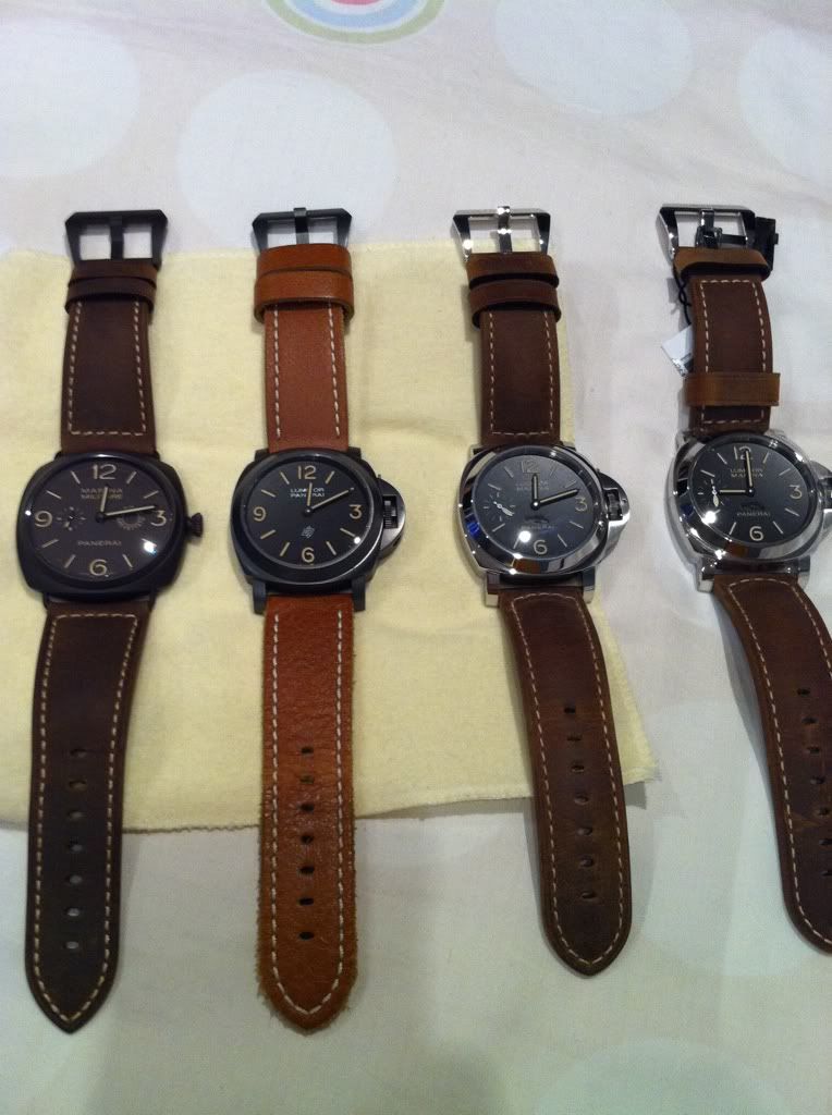
Patina on PVD and Brown
By: kys1944 : January 26th, 2011-06:55
Here's one more based on Brown Hues, Yellow Hues THE FAT does bring out the watch well....
how long will it last ??!
By: Tony A.H : January 26th, 2011-12:41
i have no Idea Anthony. but Hope it's here to Stay for a Good Reason:. it gives a Nice Vintage AND Warm Look to the Watch over all .. Cheers Tony
If you can't stand the radiation...
By: lamemoria : January 26th, 2011-18:53
then you don't deserve the "Faux" Patina. As trendy as those new 47mms. Panerai got it right with the 351 and a few others in 2010, the others are merely "simulacrums" of the vintage (past).
Jester said it aptly
By: kys1944 : January 27th, 2011-19:52
OP and Richemont is here to make a buck and it will last as long as this cash cow keeps churning out cash by having these PATINA FAUX pieces being well received.


