
watercolors
2885

Wow, what an impressive.....
gathering of watches. Very interesting post! Important data about percentage of metals that make colors of gold.
It definitely stimulated my thinking on what color is my individual preference. As well as admiration for each individual brands designers.
Thank You very much.
Regards
Edward
This message has been edited by watercolors on 2014-10-20 05:32:32

My love for Rose/Red/Pink gold - a comparison of various RG/PG pieces
On a wristscan some weeks back, I shared my "squadron" of rose / red gold watches. Rose gold has always been my favorite color for watch metals due to its warmth and glow but it doesn't mean I always choose Rose gold watches. There are some watches that n...

As someone who also has
strong preference towards rose gold (specially paired with black dial ,) ) I can tell you that you made killer post :) from what I can see from your pictures and description the hue of Cartier is my fav Yours D
Thank you Damjan
RG with black dial is always a killer :) I wish more brands do this. the RG silver dial is more common amongst various brands I feel - perhaps that's more classic and easier to please Glad you like this post and the Cartier tank! :) Cheers Robin

Great comparison report. Very educational too.
Thanks for putting this together, Robin. It's very interesting and educational for me, especially as I'm more of a white metal (with a very high preference for steel) person, so I've not studied this at all. I do like the hue and tone of the Lange 1 among...
Wow, what an impressive.....
gathering of watches. Very interesting post! Important data about percentage of metals that make colors of gold. It definitely stimulated my thinking on what color is my individual preference. As well as admiration for each individual brands designers. Th...
Happy you like the post Edward
The composition of metals was just a guide I believe. Each brand/case manufacture will have their own proprietary composition to achieve their desired color/hardness :) I do appreciate brands like panerai with their 5NPT and Rolex with their everose gold....
Thank you....
I agree, the redish gold is wery well composed in to the entire desing. ei. the Panerai. I also noticed on your pictures that the Cartiers golds color looks most delicate. Almost pale , yet it does not take away from its beauty, goes well with its square ...
Agree Richard!
The Lange 1 when hit with sunlight does look like WG with a light champagne color. I believe the dufour graph has the same pink gold but it does look redder due to the color reflection/refraction from the black dial. Agree steel is the most practical meta...

Great Post
For me, I love rose gold with black dial, just perfect color combination imho:-) Your lange with black dial is my favourite... Regards, Ronald
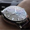
The Dufourgraph...
Is very popular amongst my friends too lol! Along with the old 1815 chrono in PG and other RG or PG with choc or black dials eg the new choc Reverso. Looks like a dark dial with RG is very appealing! Hope more brands read this :) Thanks Ronald for your ki...

Great education reading this post.................
the hue of the two Lange's really stick out. I always wondered why this piece looks almost copperish in person, now I know why! (it's hard to tell from the photo) I'm sure GO used a higher than normal percentage of copper in this blend. Tony ...
Hey Tony thanks for sharing the GO!
It does look like it has more copper :) Nice hue Thanks for your kind comments Tony Cheers Robin

Great post, long time...
... i didn't read such a nice post. Learn a couple of things too, Thanks!
Happy to share info Fricks
That's why we have the forum :) Glad you enjoyed and thank you for your kind feedback Cheers Robin
For the longest time..
.. I had the thinking that Pink, Rose, Red were used interchangeably... now I know the subtle differences.. thanks for taking the time to explain and also to share with us your beautiful collection.. Personally I would stick with yellow gold because of sk...
Thanks for looking Chuck!
Your YG PP looks great on you! Agree on the skin tone match my friend. :) I still feel PG/RGs are used not soley because of the alloy composition which I found on Wiki - I think it also depends on how the brand wants to call it :) Cheers robin
Forgot to welcome you Chuck!
Welcome to PuristSPro! And see you soon bro! Cheers Robin

Hi Robin, great post !! It is..
very informative !! Previously I simply lumped pink, rose and red gold in the same bucket and thought they all referred to the same thing. Now I fully understand the nuances !! Thanks, Gordon
Glad you like it Gordon
I still feel Pink/Red/Rose gold is up to the company to call them :P But yes definitely different manufactures have different hues of red/pink in their RG/PG pieces. Mine is just a small sample :) Cheers robin

Very informative report!
Great topic Robin. I agree that for pink/rose gold pieces, I do like some of the reddish color inside (not too yellow). After all, that is what distinguishes it and gives a unique appearance in comparison to yellow gold. I have tried a few colored gold pi...
AP actually has very a nice RG/PG color
Thanks Michael! I remember you shared an AP RG/PG RO piece before and its pink hue was very strong I remember. Very clearly RG/PG and different from YG. Very attractive color I recall. Cheers robin